September 2013 NEW USER Contest WIP Thread
 Jaderail
Posts: 0
Jaderail
Posts: 0
September 2013 NEW USER Contest WIP Thread.
Sponsored by DAZ3D
Welcome to the monthly NEW Users render contest. Are you new to the 3D World? Are you at the beginning stages of learning 3D art? Have you been around for a little bit but feel you could benefit from some feedback or helpful instruction? Have you been around awhile and would like to help other members start their creative journey's into 3D? Well then come and join the fun as we host our newest contest for this month...
_______________________________________________________________________________________________________
MOOD LIGHTING, Capture the viewers eye with just the lighting in the image.
This months THEME is open ended. Any render you wish to make is OKAY for this contest, the STAR of this month's contest will be the lighting you use and how well the lighting is used to set the mood in the render. What? you say, here this is what we mean.
Sci-Fi renders- You love to do science fiction, do it. A hologram that lights the render will be awesome or other sc-fi stuff.
Fantasy renders- Is that dragon and wizard having a full on fight? The fire and magic tossed around would look so cool.
Horror renders- Creepy up lit creeps? Spooky just enough light to see the evil coming? That has our attention too.
Everyday renders- City scene in mid afternoon? See those great shadows and fill light to soften the dark places, that's great.
Love Scene renders- candle lit dinner for two? Man, I need to do one of those, I love low lighting and great expressions.
Other renders- yes anything you can dream up as long as the lighting is used to MAKE the render speak to the viewer.
For help this month we offer a Quick link to all the old WIP threads from the past. Here is the Master List, you will find help on lighting, posing and other useful render tips in many of the older contests. They are one of the best places for new users to start if you ask me. Not that you did...
I will be checking in on the THIS THREAD as will the rest of the Community Volunteers to try and help with anything you all may need, or to give you any hints and tips you can use if you have more questions or wish for others to give their view on your renders.
The Entries Thread for this Month can be found HERE.
For a list of the current contest rules, please see this thread: New User Contest Rules
Contest Close Date September 30, 2013
_______________________________________________________________________________________________________
For those veterans of the forums that would like to help, because this contest is designed for the beginner to learn from, we will be randomly selecting posts offering helpful tips and/or critiques to receive a special voucher as well so whether you are a seasoned artist or an aspiring one, there is fun for everyone!
Daz 3D is part of 
Connect
DAZ Productions, Inc.
7533 S Center View Ct #4664
West Jordan, UT 84084
Licensing Agreement | Terms of Service | Privacy Policy | EULA
© 2026 Daz Productions Inc. All Rights Reserved.
Comments
Not sure if this is too much mood and not enough lighting. I used the DAZ 4.6 Pro Public Beta version.
Title: MIdnight Snack
Kismet: i like the concept a lot, the side by side soft on black and outline/effigie works quite well. My only critic regards the 'mood' thing, as i can't really associate the scene with any particular emotion/mood (also, before reading the title i thought the character was carrying a laptop ^^)
Thanks. Ideas are one thing...execution is another.
I am really enjoying working on these contest entries. The help being offered really pushes me to try new things and is helping me learn composition, lighting, etc. I love taking photos but have always been weak on lighting and composition.
Experimenting with the anything glows feature in Carrara 8.5. Fireplace flames are 3 vertex objects that were modeled to be jagged, with noise applied to the alpha, and with a yellow/red gradient in the diffuse and glow channels. Anything glows was then applied to the flames. Used the "object color" and facets choices in anything glows. Also applied anythingt glows to some embers replicated below the logs. Only other light is ambient set to 5.
Hologram Report WIP
Even though I have been working with DAZ for over a year, I still consider myself a novice...especially when it comes to lighting. I liked Jaderails' suggestion in the description of the contest -- which brought to mind a 'hologram report' I threw together for a PC Weekly contest.
I wasn't really happy with my entry but I did like the hologram I created.The base was/is a free download over at Sharecg, the model is V4 with Complicated Eve outfit. I then created a Geometry Shell of her and used pwEffect - the model and clothing opacity is moved down to 75 & 50 % respectfully.
Now to my lighting and questions: ATM - I am only using 2 light...a spotlight at the base of the hologram disk pointing up. Tight beam and at about 50% intensity. Then I added a Linerpointlight right in front of the hologram's nose (btw - her name is Athena) at 75% intensity and falloff at 100-200. Both lights are the same (or close) blue as the pwrEffect on the hologram. Only the lpl has shadows turned on.
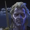
Now my question...why does the Coalition Rapier Armor show a light/reflection coming from behind him? Shouldn't he be cloaked in shadows since I don't have any lights in that area?
Of course, I am always open to suggestions and critiques. Thanks in advance.
They say the Toxic Zones aren't really devoid of life, but that life there is twisted, and hungry...
I tried to give a isolated, hunted, scared feeling for the girl. Satsuki's huge eyes are made to look frightened :)
What do you think?
Well - it appears I got a prize in the August contest (again: Thank you all!), if that means I can no longer participate, then please consider this Not an Entry.
Here is what I have come up with.
The title is
A Quiet Evening
Rendered in Daz 4.5
Lights I used:
an orange spot light from behind (255 180 126 intensity 57.5%)
(there is a fireplace behind her so I thought she gets a little light from there)
a bright yellow spot light on the desk lamp illuminating the paper (255 248 205 intensity 87.3%)
a bright yellow point light under the desk lamp to create the light halo (255 250 184 intensity 43.1%)
and a mid-grey distant light as fill light (141 159 169 intensity 7.7%)
I used deep shadow maps on the spot lights only.
I tried a raytraced version but couldn't see any difference between the two results so I stayed with deep shadow map because it renders faster.
While rendering I get a strange render message:
3Delight message #26 (Severity 2): P1051: [C:0]: invalid context for 'RiAttribute'
I get this each time the shadow map is created and when the final render begins.
I have no idea what this means but apparently my render turns out ok.
What do you think?
Sigrid
Ooh, scary. I love it!
Sigrid
No, you are fine, you haven't had enough placed yet, we will let you know when we feel you should graduate. :coolsmile:
I hope this isn't too risque for here. No nudity but, it is suggestive none the less.
I was actually working on this to play with lighting when I just noticed that it's this month's contest theme.
I used a three point lighting system consisting of :
Main light - Overhead spot
Secondary Light - another Overhead spot, off center and back towards the wall
Backlight - Point light with high intensity to light the candle.
Image Pulled by Moderator. I'm sorry, but yes it's a bit much as voted on by Admins. This is a Family site.
1 Distant light - render in DS
What is it?
What is it?
toon render
When I saw the title, and the style of the render, I thought "Wow, wouldn't it look cool if he was looking inside a fridge?"
The lighting from the fridge would look awesome.
No problem, I still liked the lighting so I think I'll just change the figure a bit. I have a more family friendly idea in mind. Sorry about that. Now I know :)
Would love some feedback. I'm trying for an utterly exhausted feeling.
I like it very much, but maybe more of a frown and lowered outer edges of the brows would convey more fatigue. The expression right now just seems a bit too tense to me. The body language is right but I'm seeing hard concentration in the face.
EDIT: Maybe Droop the shoulders a bit as well and a little forward slump in the upper chest too.
EDIT 2: Great lighting...
all that Jaderail said, plus (imo) less colorful/saturated light would possibly help: the warm fireplace light (i guess it's a fireplace that's giving light to your scene) makes it cozy; so a colder light could possibly make it look more lonely and not contrast with the feelings you are wanting to make stand out.
Yellowish lights can look more 'depressing' than orange and red, so it might be worth a try with a less red dominant light color (without going into yellow-green tints, that would make it look spectral).
So here's the updated version. Drooped the shoulders as much as possible without losing the pose. Smoothed out the frown and changed the lighting to a more yellow -blue scheme.
I think it feels more desolate but maybe not as cohesive. I don't know.
took out the blue and changed the hand pose. I think I like this one better.
This is getting so close, I think maybe too much head droop now. As for the rest all I can add is watch the poke thru. Like the Hair and right hand.
I darkened Satsuki's feet a bit, to blend her in the environment (and to fit in better with the dark ground around the mutant's feet area), and let her face stand out better.
Thoughts?
I am testing a different camera angle. Have changed the pose and played with the lighting.
Comments are appreciated.
Well, not the dark image i was going for, but i think I like this sunrise one better.