Daz 3D is part of 
Connect
DAZ Productions, Inc.
7533 S Center View Ct #4664
West Jordan, UT 84084
Licensing Agreement | Terms of Service | Privacy Policy | EULA
© 2026 Daz Productions Inc. All Rights Reserved.
Comments
Now THAT is another nice gun!! Thank you, I'll definitely be popping over and pick that one up!!
I agree, the mug has tiling texture issues. Might need scaled down a bit as well. I would try some different metal and wood shaders for it. Given the extreme foreshortening on the hands, I would tend to fudge that a little with some hand propagation.
I'm playing around with instancing in Bryce. This is actually my very first finished render in this program. After seeing Rafmer's image, I feel tempted to try to add more visible grass and flowers.
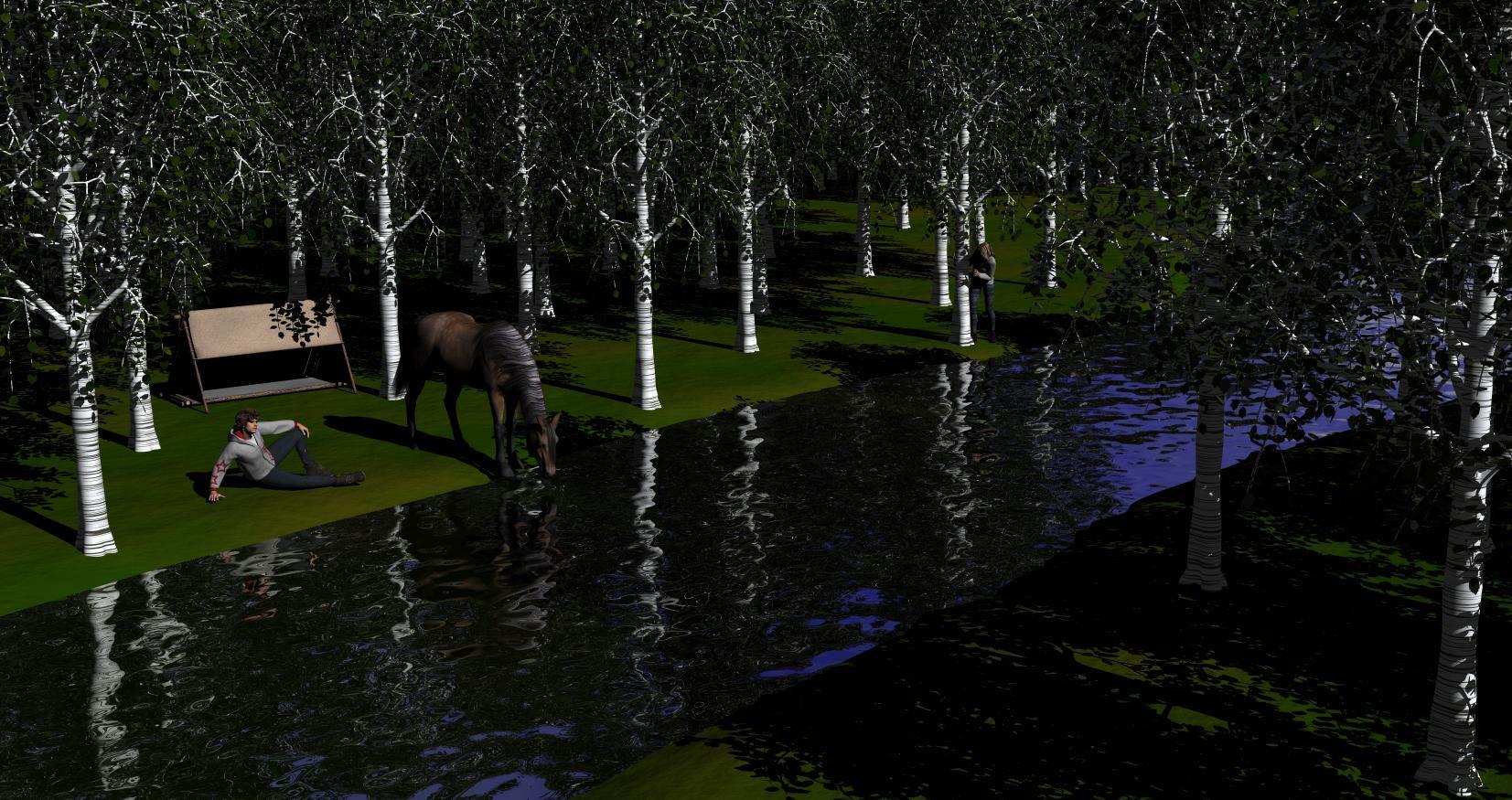
Answering your last question; yes, the trees and plants are all props; I hardly can't do anything when the scene is fully loaded. Rendering eats all my 8gb of RAM and lasted eight hours on CPU only.
About your image; the horse looks great. At least you didn't forgot to add the tail and mane lol. The river banks could benefit from some vegetation though.
Thanks for the comments. I actually thought the tankard might confuse the "suspension of disbelief", in that it might not be the right era to match the rest of the image. The only thing that kept me from swapping it for an actual, transparent glass is (once again), lighting in Iray. I'll give transparency a shot and post the result.
-Fyreheart
I have a question.
Is it allowed to render let's say 4 different poses from the same scene and put them together in The Gimp ? All images are rendered in Daz Studio.
I'm new, so take what I say with a grain of salt, but...
I don't think it matters which program(s) you use. The rules say "YOU MAY: 2. Use any 3D program you choose to create your image."
Can you explain exactly what you mean. You say 4 different poses from the same scene. Are you sure you mean poses, or are you talking about compositing layers rendered with different variants. This is a 3d Art contest. although we do allow postwork.
The way I understood the question is they want to render 1 scene with a different pose each time (4times) then composite them together in Gimp to make one complete scene
Yes that's what I am trying to understand. What is being posed 4 times? Was why I asked if they meant compositing 4 different renders to make one completed image?
This is one image when I had to render it in layers because of the amount of figures and jpg textures I had in the scene. I rendered the background and one figure group, the removed that figure group and added another, did a 2nd render and a mask render So I had exactly the same settings. Carried on in this manner until I had the complete image.
I might add, in all honesty, that it isn't a very good example of Compostion, as meant by the theme for this month. As seen in the 2nd (incomplete) version, not much falls on a golden line to give focal points.
IMHO, "rules" is too strong of a word. "Principles" would be better. For example, you can break the rule of thirds or golden mean in favor of symmetry, and still come out with a great image. On the other hand, following the principles doesn't guarantee a great image. I was once experimenting with circular symmetry using the golden mean, and the resulting image was awful.
I hate Grids and composing to Grid. Yes, Chohole's image doesn't hit the "magical" intersections, yet a person's eye still drawn in to the focal.. a man angry about the depredations of a whole lot of escaped piggies.
I watch too many people mechanically plug in "interesting" items at each point, following some "rule", and ending up with a cluttered, ininspired mess.
They aren't "rules" despite the title. They are rough guidelines. Art is not Rigid.
Lol, that just reminded me of "Priates of the carribean" (...Parley...)
Well let's parley about those design aids, I would call them. And as this contest is about composition, one could say its about learning to use the tools at hand. There is certainly no use to force something into each corner of an intersection in a render but it helps when you put a render together to choose the angle for the camera. Or If you have a scene and its not as interesting as one would wish, to look at it from different aspects (greyscale, empty space, light control) These tools can help you to see with a different set of eyes at something you have looked at for too long already.
Now I'm going to try and get up to date with this fast evolvin thread.
Welcome to the contest Rafmer, you started with a lovely render with an awesome amount of wilderness, I guess my computer would overheat at that.. Now the question is what story do you want to tell with your image. While I like looking at it there is nothing to keep my interest. Are the man and the horse just relaxing, enjoying free time? are they on the run looking out for enemies? Try to put a bit of drama in your story. You could use different brightness for this for example
Well said!
Wow...you guys have been busy in here.
I tend to agree, at least to some extent. As a beginner, I try to follow the golden rules and other rules of composition. However, there are times when I'm working on a render that has followed all of the rules and I'm not satisfied with how it looks, but when I change it up and things don't always line up, I find that I have a render that is actually better. Or, at least, I think it is visually better. This isn't always the case, but I'm finding as I find my own style more that there are times when I will purposely ignore the rules for something that I think looks better and appeals more to my artistic sense. I definitely think there is a place for rules especially as we are first learning. I do enjoy breaking rules on occasion, though.
Sorry I haven't posted much. I got distracted by a project in Iray and haven't even started on my entry for the contest yet. As I mentioned, somewhere, I'm determined to learn 3Delight so my image this month will be rendered in that, but it is so hard for me to stay out of Iray because I love using it so much.
Sonja (and anyone else trying Iray for the first time) - here are some useful lighting links to help figure out Emission Temperatures, Lumens, and other useful lighting tricks that I've found in my research. Hopefully, they can help you, too.
FollyFool over on DeviantArt did wonderful job with the following visuals:
Emission Temperatures Visual
Emission Types
Great article with good visual by Atlanta Light Bulbs Color Temperature Scale for Light Bulbs
Another great article with helpful visuals on understanding lighting and color temperature
Color Temperature of Light
These are all visuals and articles that helped me so much in lighting with Iray. I hope you guys all find something useful in there. Just try to remember that the temperature is in (k)elvins and the lumens is the intensity. That was a hard one for me to keep remembering when I first started out.
So far, I see some promising renders. Now, I just need to get started on my own. Then I can start asking all of the 3Delight experts some questions of which I'm sure there will be plenty!
Welcome Fyreheart. Very nice idea! I'm sorry I can not help you with the weatheres skin for Iray, as I'm using 3dlight for everything. You already had some feedback on the mug and the composition, so I will mainly comment on the posing. The way he holds the mug seems very unconfortable to me. I understand you wanted the mus positioned as not to interfere with the picture frame. I would think you could increase the bent of the ellbow and reduce the bet on the hand, moving the mug closer to the man. There seems to be a bit much forward on the shoulder/collarbone as well. Additionally I would try to let the hand with the frame renst on the table, the frame boder supported by the table as well, the pose as it is in the moment costing a lot of energy. And last the eyes should focus on the picture frame. These are just my ideas, I hope it helps.
Pretty sure that's what they mean. One scene with one figure in 4 different poses. Rendered 4 times then compiled in Gimp. And I like your render even if it doesn't follow the rules. I like the guidelines but have no problem with bending (or even breaking) them if necessary. But the guidelines are helpful in laying things out in an orderly fashion and then tweaking and moving things about from there.
Thank you Knittingmommy most helpful indeed. I have been watching sickleyeilds videos as well, also most helpful although some of it is still hard to keep straight
Lighting adjustments but now I'm back on the hand pose, not happy with it.
Her outfit looks better not so shiny new. Can't help at all with hand pose though I would love to learn archery myself lol.
Thanks for the welcome! About the story behind, it's supposed to be a stop in the journey, for relaxing and getting the arse off the horse saddle :P. I didn't want to focus the figures too much, hence the low DoF but I don't want them to remain unnoticiable (does this word even exist?). What do you mean by different brightness? a brighter whole scene? a specific lightning for the figures? or just a a different ambient lightning?
HitMan - Can you put up shots of the grip from different angles? If I can also see it from the angle that she sites the bow and from the left side, I might be able to give you some pointers on your grip, if you want. From this angle, it looks like the forearm needs to be selected, twisted towards her outside slightly so the 'V' where the bow rests has a straight line with the palm resting against the side of the bow more. The bow rests in tha 'V' made by the thumb and index finger and the bow rests loosely against the palm while preparing to shoot always ready to grab the bow after the arrow has been shot. The wrist shouldbe angled up slightly more so that the fingers are point more at a 45 degree angle. The fingers can wrap around the bow more, but keep them loose so she doesn't appear to be tensing up while shooting. Typically, the bow string hand is closer to the cheek, but you might have a problem with collision and the hood on her cape and I've seen a lot of archers make nice shots with similar arm positions so I wouldn't worry about the bow string hand too much. Typically the notch on the arrow (the part that holds on to the bow string) rests between the index and middle fingers in real life to keep the arrow from slipping. Since this is 3D, you don't have to worry about slippage and there are lots of arrows with notches that keep the arrow fairly secure so that hand position isn't critical on the back end. There are variations and a lot of archers are successful with a hand position similar to what you have there.
You shouldn't worry about getting it perfect for any one style of shooting. As long as you can get it looking close, no one will probably notice if it isn't perfect. Most people aren't archers and usually only see it on TV or in the movies. As has been pointed out, even my direction for a grip is based on current grip methods and isn't the only way to grip a bow. I am happy to help in any way you feel comfortable. I don't want to overstep. As always, any advice I give on anything is from my perspective I'm okay if that advice isn't needed. I won't be offended in the slightest and only wish to help.
Rafmer, I found the scene to be very peaceful and relaxing so if that was what you were going for it worked for me at any rate. Can't help with the lighting though sorry.
Thanks Knittingmommy, maybe I shouldn't be so concerned with it but it bugs me for some reason. I did adjust it some more. Here is another render as well as some of the grip renders. Yes, I tried placing the hand closer ot the cheek. I need to stop being lazy and do that then adjust the hood in Zbrush, but I haven't. Thanks so much for the feedback.
Okay, so from most of the angles, the grip actually looks pretty good. The fingers look much better. Before I offer any suggestions, I need to know if you have a target in mind and where that might be as shown in Grip3.jpg. If you don't have a target, that is fine, but I need to know so I can tell you the best way to try to modify the grip. What I tell you will depend on if you have a target picked out or not. If you don't have a target, then it won't matter which way I suggest you modify the grip. But if you are targeting, I need to know where the target is in the picture so I can offer suggestions that won't interfere with your aim at the target. Make sense? I'm shutting down now and will check back tomorrow afternoon. I have to take my boys to karate class in the morning.
Deleted. What was meant as a comment at all was taken personally.
I still think we should not inject our standards of what is "real" into a critique of a fantasy image. Or flatly telling someone they are wrong because of that.
But I do apologize as I Failed to make myself clear.
Why did I even make the post? A few years ago (not here) I did an image of a warrior using a short stabbing spear with an underhand grip. Think Zulu. I mentioned fiddling with the grip. At that point I was told I was wrong. NO one ever, in the history of ever, had held a spear that way. From an SCA'er with "real life" expertise they beat me over the head with, in spite of links showing the other grip. Links that did not matter as they had "real life" experience. I dropped working on the image. I haven't touched a spear pose since. That is why I said something.
What I mean is take a scene with a pose at keyframe 30. Then you render let's say the figure at keyframe 20 then 10 then 5 then 1 without the background and then put them together in Gimp. But anyway have fun everyone
You made an unfortunate faux pas in your argument there. The church tower and the man are both on the left thirds line and the man in the white shirt, who is drawing the eye, is on the intersection between the left third and bottom third so is using, intentionally or not, the rule of thirds. There are also lead in lines from the two bottom corners. The left one from the pigs running off in that direction, and from the bottom right, from the cart moving off in that direction, that intersect at the man running towards the white shirted man.
We, as humans, see things that balance and that is why the rules are there. Yes they can be broken but then something else comes into play to balance the image or else it doesn't work and will always look as if there is something wrong with it.