Daz 3D is part of 
Connect
DAZ Productions, Inc.
7533 S Center View Ct #4664
West Jordan, UT 84084
Licensing Agreement | Terms of Service | Privacy Policy | EULA
© 2026 Daz Productions Inc. All Rights Reserved.
Comments
I'm glad you like it.
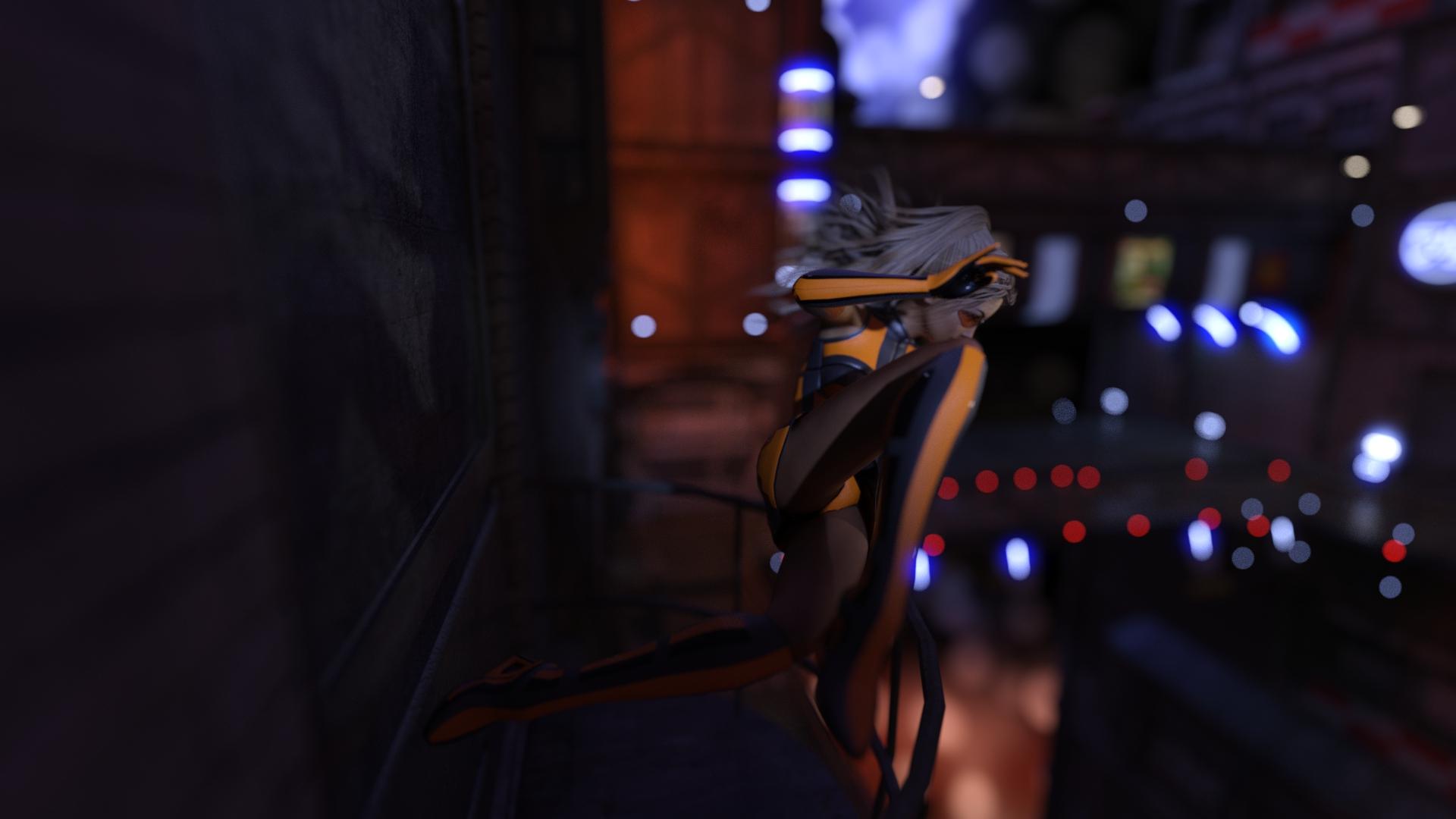
Right now her head is near the top right intersection when following the rule of thirds. If I try to move her to the top left corner, the wall gets in the way when I try to rotate the view to show more of the city--sorry if that doesn't make any sense, I just can't think of a better way to explain it. In short, the only way to move her to the left without rotating the camera towards the wall is to move the camera closer to the wall; however, when I orbit the camera to get a better angle, the camera ends up inside the wall.
There may be a better way to do it, but nothing that I tried worked out for me. I did notice camera shift controls with the latest version of DAZ, I just haven't played around with them yet.
I generally follow the rule of thirds as a general guidline and then adjust to the scene / pose.
I'm glad you like it. Here's one that's even wider.
And here's the same scene with the DOF blur removed (but Iray bloom still on).
Finally found matches to light the candles with ;-)
Also turned on the built-in thirds view that Kismet mentioned and made adjustments. Finally, some DOF and lighting changes. Suggestions welcomed.
This has a wonderful sense of movement to it.
The empty spot in the background on (my) left pulls me to that corner. And the light green leaf by her face and the one right over the dog's ear. is a bit of a distraction. I actually like the brightness, its very appropriate for childrens art. And I like the background as well it fits except for what i mentioned.
Is this Iray? I am just beginning to learn how to model in carrara (think simple spear lol) but you could model the flame for the camera and then make it emmissive in Studio if you are using Iray.
The blue gloves really stand out and draw the attention in this especially since the character is dressed in white. And I am very curious what it is that has drawn their attention!
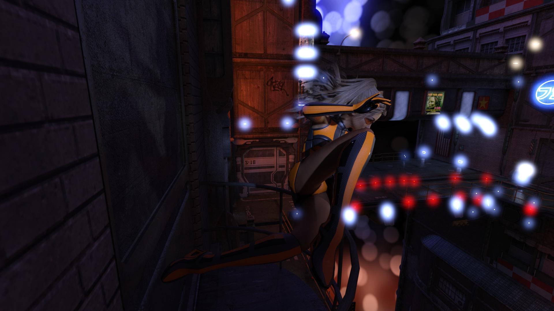
I decided to try a move her to the left side of the picture. I had to change the field of view quite a bit to keep her legs in the frame. It certainly makes for an interesting picture.
Is this Iray? I am just beginning to learn how to model in carrara (think simple spear lol) but you could model the flame for the camera and then make it emmissive in Studio if you are using Iray.
Yes, Sonja, it is rendered in Iray - the new version that comes with the latest release of Studio. A while ago, between a sale and a bout of overconfidence, I bought Carrara 8.5 Pro thinking I would model my own props and things. Well the sale was valid, but my confidence was not. It's been sitting on the desktop gathering digital dust, so I figured I'd try to do some simple things to bring into my Daz compositions. I've used Hexagon in the past, and even though it was an easier interface, my lack of understanding the fundamental concepts of modeling make it equally challenging. I find Carrara easier to assemble objects with multiple pieces/surfaces to import to Daz, although at this point it's still very simple things. A simple spear might be a next challenge for me.
I did what you suggested in my latest render - I created flame objects (two layers - solid core and semi-transparent outer shell) and made the core emissive. Still working on how to integrate into the lighting of the scene - photography by candle light must have been tough in medieval times.
Bright colous are very appropriate for children's art. Especially when it is toon art.
When I look at the image I am drawn right to the girl's eyes but I can see how the light coloured leaves, especially the one to the right (my left) of the girl could be a distraction.
I do not use a lot of post work myself so cannot really offer any suggestions for you there.
I really like this one because it has less all black spots in it than the other renders had. Although, I must admit I kinda miss the motion feel the very first render gave. The image has a much more static feel now, maybe because there's so much static background? Not sure how to put my finger on it...
Maybe zoom in a bit more or change the aspect ratio to a more "letterbox" style could help here? So there's more focus on the girl?
Here's my first attempt this month. I'm very keen to hear what you all think.
Dubbed it "Those darn tresspassing selfie-tourists!" – on tourists who'd do nearly anything for that ubercool selfie for their social networks..
Details: 3Delight (can't render in iray). No postwork (yet). Did read up on a lot of "Golden Rules" and tried to stick with them (see a couple of the Golden Rule renders I included).
There is DOF; although I realize it's not that visible. Except for where I didn't really want it; in the angry man on the bridge. I'm affraid he's more blurred than I wanted him to be but, then again, he's not close either. I think I need to learn quite a bit on DOF; especially F/Stops and Focal Lenght. These are the ones I've been playing with the most as the camera is quite near to the girl.
I did put an extra spotlight on the far bridge (can be seen under the first bridge) to have more depth in the image. And a very soft spotlight on the girls face to make it stick out better.
Have you been over to the Carrara forums here? There is a TON of information. I will post some links for you later if you haven't been over there yet, I'm at work right now and just popping in for a few minutes here and there. Will check back when I get home if you need the links.
Have you tried hiding the wall that the camera is getting imbedded in? It might work it or it might change the lighting completely but if you can hide it, it will give you a bit more in the way of options for the angle you are looking for. To hide the wall, look in your scene tab and track down which wall it is (sometimes you can click on the wall and it will highlight in the scene tab, sometimes you just have to turn things on and off until you find the right one). Just click on the eye next to the appropriate wall.
The composition is somewhat limited by the HDRI I used, but I'm not sure if I hit it within those limits
Thanks. That's an easy fix.
The poor model in the large fur coat was asked to take off her coat for a bikini shot in the middle of the snowy forest by an artist who treats his models as if they weren't even human. It's shocking, really.
I read up on quite a number of photography websites and I think I now kinda know what F/Stop and Focal Length is all about. So, changing the camera position (and the model's possition as well), I now managed to get this with the help of a little post-work in Pixelmator.
I'm not sure the actual picture got better with the new position; the sharpness of the angry man on the bridge improved dramatically though.
This is so cool! You totally nailed it. I like the composition and the humor and the depth. If I had any suggestion it would be to try to make the model pop just a little more, but that's about it. really nice work!
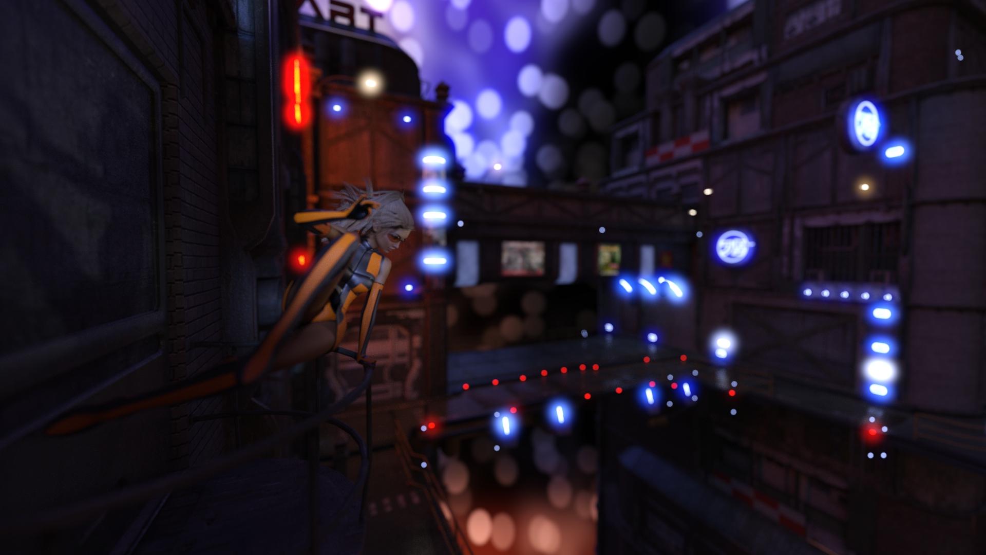
I'm not sure if this is what you had in mind, but I changed the aspect ratio from 16:9 Widescreen to 8:3 Panorama/Cinemascope, and then adjusted the camera.
Yup! This is what I meant. I personally think this one is really cool; it's got the dynamics of the first render and you actually get a feel for where she's jumping into to. And the aspect ration for me gives the gloomy feel of one of those old film-noir kinda movies as well which matches the lighting on the ground/in the background perfectly. I love it.
Oh good, thanks. Those are exactly the things I was thinking was wrong with it. I was considering postworking out the entire background but will try just adding foliage in the top corner and getting rid of those leaves and see if that helps.
I'm seeing so many flaws in some of my older art now too. I guess I'm getting more discriminating with time...
I have lurked in the forums, mostly via web searches trying to figure things out, but I appreciate any helpful links or suggestions.
Here's a couple to get you started. Jump in and ask questions, they are a very helpful bunch. Modelling Learning Carrara Shaders and my thread, which has just about every brand new user question you can think of lol. And you are welcome to ask anything in my thread as well. I'm perfectly fine with tangents. And there are a ton of links in these threads for even more information and tutorials and videos.
Thank-you. I'll head on over to them.
In the mean time, I turned off the lights and just let the two candles light the scene...some interesting effects, not all of it positive.
Maybe turn down the candle light a bit and add an ambien fill light. Just something soft to lighten the whole scene and it will help with not blowing out the candle light.
Thought I'd share my attempt at getting the lighting from an advert for the new borne movie.
Thank-you. For the record, I'm surprised the whole room hasn't burnt down - I just did the math and the lumens of those candles are equivalent to 30,000 candles in real life (http://www.theledlight.com/lumens.html). Also, another learning is that using the flames as emissive objects - each surface is considered it's own light, so all the work to make the flame shape fancy adds a lot more time to the render.
I seem to be stuck on lighting, and I know this challenge is about composition. So here are some composition related questions (about lighting)...from some of the articles, the rule seems to be that the foreground is darker, background is lighter, and the middle...well, middle-ish. Is this reverse for night scenes? Or is it more about tones/contrast in those distances?
Also, I admit I may be more fascinated with my own poorly made props than is warranted...the extra jugs are supposed to imply he's well into his third one, so drinking heavily. Is it working or distracting?
Here's a short render (forgive the graininess - see above comment on self-inflicted slow candles) with an iRay Ghost Light added for fill, and the candles turned down a bit. It seems to be helping as promised, but is leading to my questions on foreground/background.
Wow - very dramatic. For some reason, I keep looing in the shadows for a Cheetah ;-)
I really like the single spot. You might want to frame it with him a bit more to the right, and possibly higher up to put the lit part of his face in the 1/3 position. I went to a movie review site to see the poster for reference (http://comicbook.com/2016/02/08/matt-damon-steps-out-of-the-shadows-for-first-jason-bourne-poste/) and it's amazing to see that they use the rule of thirds...I see it everywhere I look now...
@yhzmurphy " from some of the articles, the rule seems to be that the foreground is darker, background is lighter, and the middle...well, middle-ish. "
Actually, it doesn't have to be in that order, it could be the foreground is lighter, the middle is middle and the background is darker, or any mix of the three, the idea is just that there is a mix of the three to balance the render.
I think your three bottles are fine (although a couple of them look like they may not be touching the table top - A lot of the time I will sink the prop a tiny bit into the surface its supposed to be on then slowly bring it up until its just not merged. And make sure that you look at them from different angles, rotate your perspective view up and down and all the way around to check if they are solidly on the surface)
Using instances works and DOF will help. You may want to consider just rotating the instances as well (I'm fairly certain you can rotate them even though it is an instance) that would help with "variation" as well
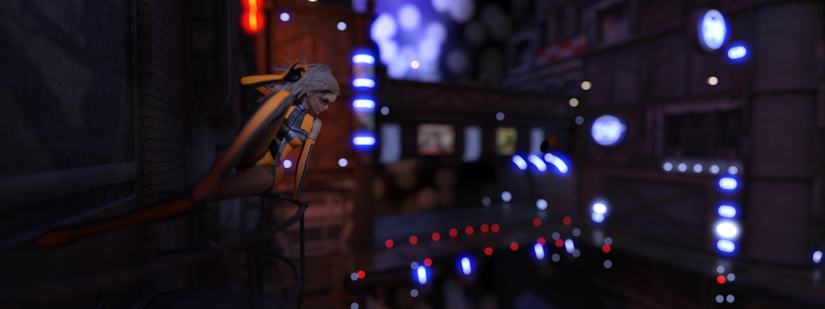
Honestly, I am more partial to that top image shown here. The perspective is unique, you can see more of what is going on and it still seems to be within the topic since it seems that view is very close to "Rule of 3rds" Really all the views look great though but I think the top image here is a bit more engaging (draws you into the action a bit more) Granted that is a matter of opinion though/ my personal preference.