January 2017 - Daz 3D New User Challenge - Composition

13468912

Comments

  • daybirddaybird Posts: 645


    I really like how the light is bouncing and the shapes etc it is picking up and the shadows those create. As for the darkness it's maybe a little dark. Personally I tend towards brighter blue lights for anything that is "night lit" Obviously the light on the wall wouldn't be that but if she is outdoors there would be some moonlight so a touch of blue lighting tends to add that it is night/dark but still brighten the image. Granted there are lots of ways to accomplish a bit more brightness. You could try turning up the emission on the outside light or even add a spotlight right by that light to direct the light a bit more towards her. Really nice job though. The shadow play especially is very cool smiley

    Thx for the advices. I will try today a few new settings. Until now I am not realy happy with the camera angle in the scene, but I have a few ideas in mind and hope I got a testrender, that I can post today.

  • Thank you Chohole and Knittingmommy! I think I have edited and corrected the previous posts to fit the requirements. :) 

    Thanks Daz_ann0314. :) I fought with the lighting forever with this one. I played with it for a while and couldn't quite get anything I liked better. It's hard to keep his hair in his face and some shadowing, and get the light up under it too. LOL

  • rosselianirosseliani Posts: 374
    edited January 2017
    lolitojfr said:


    hehe really cute so far. Great job on the expression..makes me wonder what is over yonder smiley I think the neck on both may need played with a little bit possibly but Posing is something we get more in depth on in later months and it can be tough sometimes to get certain poses. Id try maybe twisting a little less at the neck and a bit more at the head maybe and see if that works. Really cute so far though. The lighting and the colors etc all look really nice so far smiley As far as the spiral...you could make the render a tiny bit wider possible to add to the spiral (IE so a bit more of the background is visible) Nice job so far! smiley

    Thanks DAZ_ann0314!

    I reworked both neck/head posing, and it shows much better, especially for the younger girl's neck. I also moved back my cam, and reduced DOF a bit. Then I changed the older girl's right collar's pose to get her hand closer to the spiral origin.

    I still wonder what scary thing is over there on the trees, in fact it is the main subject of the scene.

    Post edited by rosseliani on
  • Santa
    44.png
    1540 x 701 - 639K
  • ShortcutShortcut Posts: 68
    edited January 2017

    A black & white portrait of a Woodland Elf


    Hello!

    This is my first post to the DAZ forums, and I’m a beginner to rendering, but not new to photos/digital images. After installing DAZ it sat on my hard drive for more than a year before I properly tried to do anything with it. The last few weeks have been my real start on the learning curve by diving into tutorials and tips online to see what other people are doing and how their work turns out. The more I learn the more I get hooked :-) It’s great software and like having a virtual photo studio or cinema set, which is very cool!

    I’d like to offer this as an entry, a portrait using a golden spiral, black&white, and limited DOF to aid the composition. Postwork in PS at this stage includes adding a vignette, a little dodging and burning, and some softening of the elf’s skin to give it that glow. I welcome and appreciate any comments or tips!

    Title: Woodland Elf

    Software Used: DAZ Studio 4.9, Photoshop CS6

    Woodland Elf.jpg
    1024 x 1024 - 439K
    Post edited by Shortcut on
  • SaphirewildSaphirewild Posts: 6,643
    magen boo said:
    Santa

    That just proves that Santa is a dirty old man giggles!!!!

    What a great start to this render although it looks like it is a bit twisted.

    When I look right on at it it looks like it is melting a bit, did you ever see those 60's films where when it goes from one scene to another it has those distortions like wavey lines.

  • SaphirewildSaphirewild Posts: 6,643
    lolitojfr said:
    lolitojfr said:


    hehe really cute so far. Great job on the expression..makes me wonder what is over yonder smiley I think the neck on both may need played with a little bit possibly but Posing is something we get more in depth on in later months and it can be tough sometimes to get certain poses. Id try maybe twisting a little less at the neck and a bit more at the head maybe and see if that works. Really cute so far though. The lighting and the colors etc all look really nice so far smiley As far as the spiral...you could make the render a tiny bit wider possible to add to the spiral (IE so a bit more of the background is visible) Nice job so far! smiley

    Thanks DAZ_ann0314!

    I reworked both neck/head posing, and it shows much better, especially for the younger girl's neck. I also moved back my cam, and reduced DOF a bit. Then I changed the older girl's right collar's pose to get her hand closer to the spiral origin.

    I still wonder what scary thing is over there on the trees, in fact it is the main subject of the scene.

    Why does the little girls arm look like she has no elbow at all did you maybe pose it a little too hard?

  • daybirddaybird Posts: 645
    magen boo said:
    Santa

    Mhh, for me this looks kind of strange, as if it were cut out of a picture. Maybe you should change the camera angle and insert a background.

  • rosselianirosseliani Posts: 374
    edited January 2017
    lolitojfr said:
    lolitojfr said:


    Why does the little girls arm look like she has no elbow at all did you maybe pose it a little too hard?


    Not sure to understand what you mean ... No elbow at all?  I can see she has an elbow!

    Post edited by rosseliani on
  • ChoholeChohole Posts: 33,604
    lolitojfr said:
    lolitojfr said:
    lolitojfr said:


    Why does the little girls arm look like she has no elbow at all did you maybe pose it a little too hard?


    Not sure to understand what you mean ... No elbow at all?  I can see she has an elbow!

    I can understand what Shapire means,  the elbow looks to be deformed, not like a normal elbow should be

  • Chohole said:
    yhzmurphy said:
    yhzmurphy said:
    yhzmurphy said:
    daybird said:
     

    You've got some good lights and shadows.  Which rendering engine are you using?  Composition looks good at first glance.  I'll let others comment more about composition, though, as it isn't my strong suit.

    Thank you! I used 3DLight for this one

  • daybirddaybird Posts: 645
    Shortcut said:

    Hello!

    This is my first post to the DAZ forums, and I’m a beginner to rendering, but not new to photos/digital images. After installing DAZ it sat on my hard drive for more than a year before I properly tried to do anything with it. The last few weeks have been my real start on the learning curve by diving into tutorials and tips online to see what other people are doing and how their work turns out. The more I learn the more I get hooked :-) It’s great software and like having a virtual photo studio or cinema set, which is very cool!

    I’d like to offer this as an entry, a portrait using a golden spiral, black&white, and limited DOF to aid the composition. Postwork in PS at this stage includes adding a vignette, a little dodging and burning, and some softening of the elf’s skin to give it that glow. I welcome and appreciate any comments or tips!

    Title: Woodland Elf

    Software Used: DAZ Studio 4.9, Photoshop CS6

    What a wonderful work. I see nothing that could be improved.

  • lolitojfr said:
    lolitojfr said:


    Why does the little girls arm look like she has no elbow at all did you maybe pose it a little too hard?

    Not sure to understand what you mean ... No elbow at all?  I can see she has an elbow!


    Chohole said:
    lolitojfr said:
    lolitojfr said:
    lolitojfr said:


    Why does the little girls arm look like she has no elbow at all did you maybe pose it a little too hard?


    Not sure to understand what you mean ... No elbow at all?  I can see she has an elbow!

    I can understand what Shapire means,  the elbow looks to be deformed, not like a normal elbow should be

    Maybe the shadows of the leaves are the cause of what you see as a deformation, but in my opinion nothing is wrong... I will make a test render without the tree!

  • rosselianirosseliani Posts: 374
    edited January 2017
    lolitojfr said:
    lolitojfr said:
    lolitojfr said:


    Why does the little girls arm look like she has no elbow at all did you maybe pose it a little too hard?

    Not sure to understand what you mean ... No elbow at all?  I can see she has an elbow!


    Chohole said:
    lolitojfr said:
    lolitojfr said:
    lolitojfr said:


    Why does the little girls arm look like she has no elbow at all did you maybe pose it a little too hard?


    Not sure to understand what you mean ... No elbow at all?  I can see she has an elbow!

    I can understand what Shapire means,  the elbow looks to be deformed, not like a normal elbow should be


    Maybe the shadows of the leaves are the cause of what you see as a deformation, but in my opinion nothing is wrong... I will make a test render without the tree!

    So here is that elbow without shadows


    Post edited by rosseliani on
  • daybirddaybird Posts: 645
    edited January 2017

    Lot of changes since my last post and I hope, I don't have overdone it, but I was in a great creativity mode.
    I'm still not pleased with the light, but think, the camera angle works quite well. Maybe I should adjust the DoF a bit, to bring the fallen guard more in focus, or should I completly erase him from the pic?

    Januar 11.jpg
    2000 x 3236 - 3M
    Post edited by daybird on
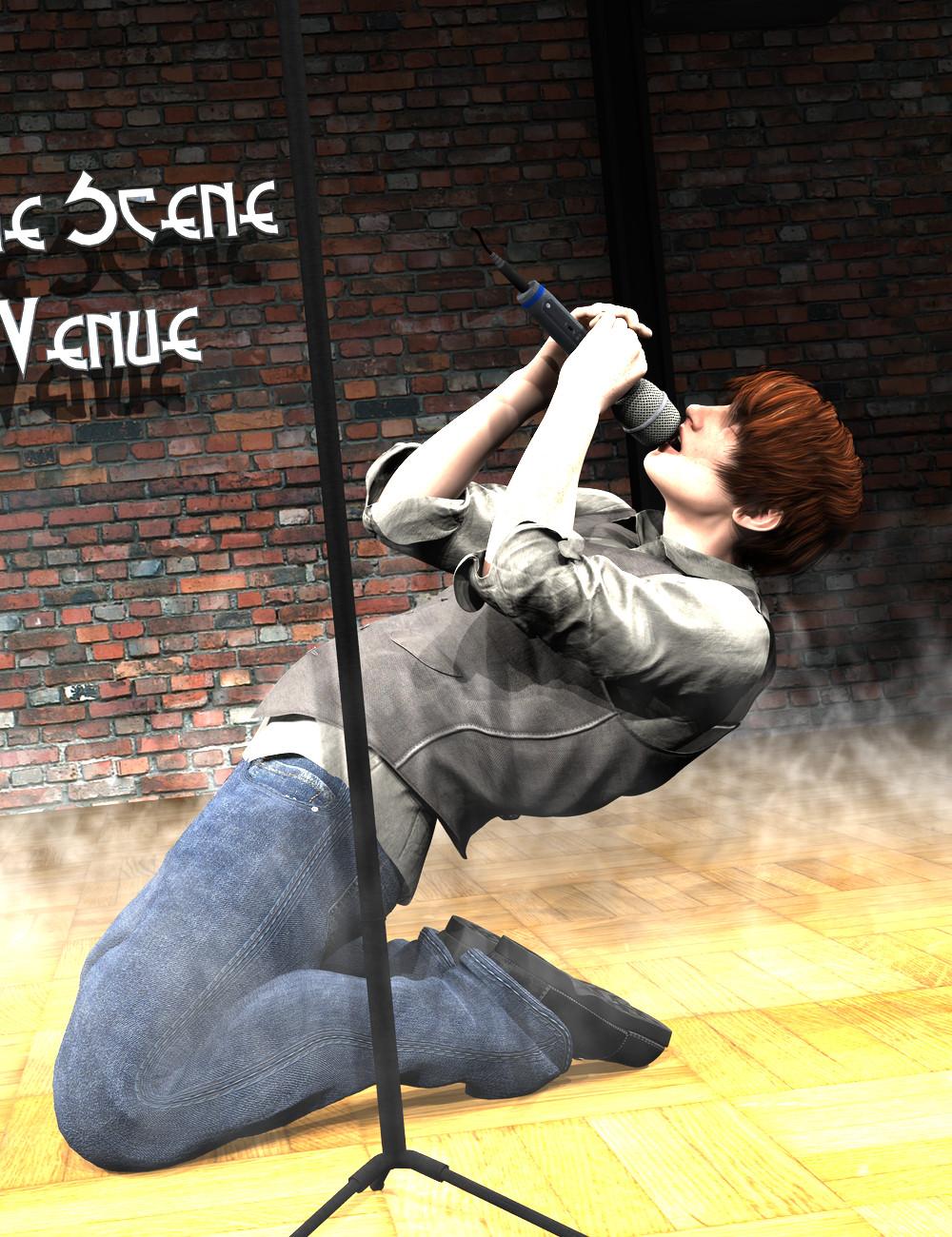
  • I'm not a newbie so I'm not really part of the challenge.  I offer advice where I can, but I'm still learning lots.  I'm posting an image I rendered in 3Delight.  3DL isn't a render engine I'm comfortable in yet.  I'm more of an Iray gal.  However, I'm trying.  And, as I mentioned in a previous post, composition isn't my strong suit. 

    I'm including the two original renders straight out of DS to compare along with the postworked version of the second version, the one with the lights after adjustment.  I like that I can see more of the freckles on the arm, but despite adjusting the lights there still seems to be way too much light on his arms.  However, I love the play of light and shadows on his face and if I adjust so the arms look good, the face has too much shadow and I lose some of the light that makes his face interesting. 

    While I would like some suggestions suggestions on how to fix the blown out lighting on his arms without messing up the nice play of shadows on his face, I would love some tips or suggestions on improving the composition.

    Original render:

    Rendered again after playing with the lights:

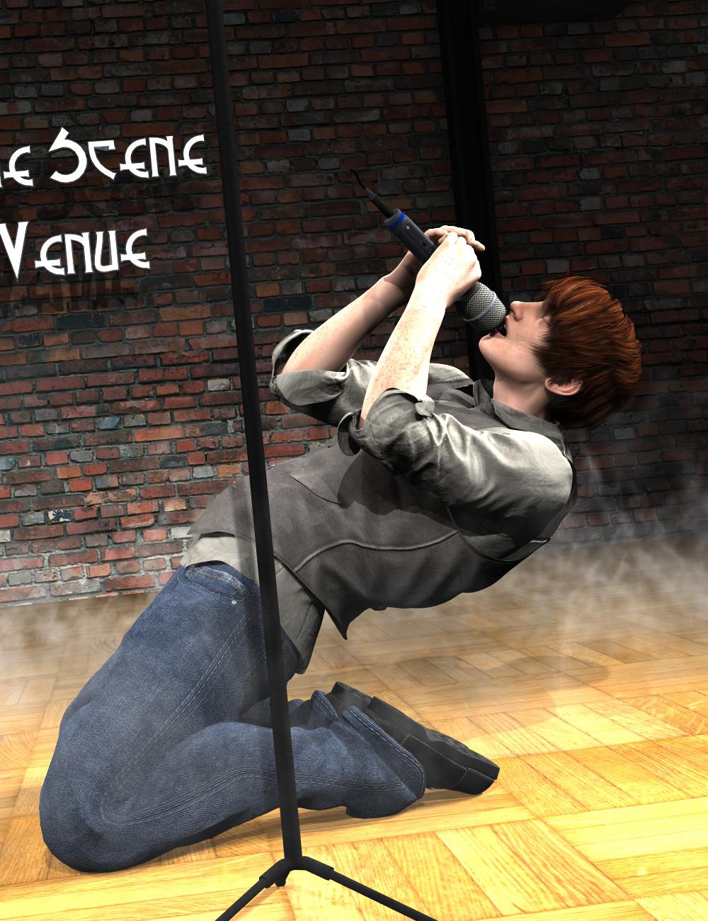
    Postworked version of Singer02:

    I've included an attachment that shows where I have the Rule of Thirds lined up.  I can never figure out the best places to put body parts! :)
     

    RuleofThirds.jpg
    602 x 780 - 136K
  • daybird said:

    Lot of changes since my last post and I hope, I don't have overdone it, but I was in a great creativity mode.
    I'm still not pleased with the light, but think, the camera angle works quite well. Maybe I should adjust the DoF a bit, to bring the fallen guard more in focus, or should I completly erase him from the pic?


    Leave the guard where he is! He adds interest to the foreground and it's good he's not in focus. Your focal point is the action on your main figure. You need some light to help seperate her from the background. Her dark clothes blend with the darkness in the background. Perhaps some lighter clothing? Also you have a huge dark area at the top left which has no detail in it. Perhaps try a similar angle as you have now but featuring your main figure more prominantly. i.e filling the space a bit more, and add some more ambient light, or even put a shadowy figure there waiting to pounce on your main character. The bright area at top right takes the eye away from the action, so perhaps crop that out and work with the light from that globe in the alleyway?  I like the skewed angle of the shot, it suits the action!

  • ShortcutShortcut Posts: 68
    edited January 2017
    While I would like some suggestions suggestions on how to fix the blown out lighting on his arms without messing up the nice play of shadows on his face, I would love some tips or suggestions on improving the composition.


    Hi Knittingmommy,

    Still learning the ropes on lighting myself, so I can’t really comment there, but, with your composition try cropping a bit closer. There’s a lot of empty space above your figure which adds no interest and doesn’t balance with the amount of space below your figure. The diagonal you have running through the background though is good and helps add to the energy and dynamic of the singing figure. I’ve cropped your picture a couple of ways just as example. I think sometimes going in a bit tighter to help isolate the action can help make a composition stronger. Hope that helps! What do you think?


    cropped01 - Copy.jpg
    878 x 1023 - 482K
    cropped02 - Copy.jpg
    856 x 481 - 253K
    Post edited by Shortcut on
  • I actually really like the second cropped version.  It definitely has some promise.  I may have to see what I can to do to inside DS to pull the camera in tighter if I decide to try rendering again should I get some lighting advice.  Thanks.  :)

  • AGnawKneeMooseAGnawKneeMoose Posts: 26
    edited January 2017

    Playing Off the Rails

    I was feeling Star Wars-y.  Tried to hit (or otherwise stumbled into) addressing the "5 fundamenals":

    - Composition: Upper 2/3rd intersections hit on both heads/eyes of the two figures.

    - Perspective: Liked all the rails in this scene to create vanishing points, X axis converges to the left, Z axis angles back and to the right. (not really enough camera angle to make the Y axis converge, but oh well.)

    - Value: Fog with light from below serves to lighten the background and makes the foreground relatively darker and more contrasted.

    - Color: Blue vs. Red with the blue pressing down from the upper left on the red in the lower right, mirroring the action.  Coincidentally, before this contest was annouced I'd ordered "Picture This: How Pictures Work" by Molly Bang, so that influenced me a good bit here on color and geometry.  The blue has a steady base, is grounded, stoic, noble, implacable.  The red is dynamic, wild, precarious, playful, passionate. The blue saber is extended forward but runs parallel to her body, so it's not as threatening - the blow has been parried.  In contrast, the 2nd red sabre and her leg angle directly back.  Feels like a counter attack is coming.

    - Lighting: The sabres and lights cluster around the upper right focal point to lead the eye there.  The height of the perch wasn't quite playing until I put a lit plane at the bottom to better illuminate the drop.  Little bloom added to make the lights flare a bit.  Had a little trouble with the bloom of the blue blade "eating" the overlapping red one - more or less satisfied-ish with it now.


    Those are my thoughts anyway.  Comments, tips and ideas appreciated.


    Products Used:

    Abandoned Factory Floor / Skies of iRadiance - Night Sky HDRIs for Iray / Fast Fog Iray

    DT - Eve for Genesis 3 Female / Vigilante Outfit for Genesis 3 Female (pants) / Buckle Up 3 Outfit for Genesis 3 Female (top) / TreadZ for Genesis 3 (boots) / Jazmine Hair

    Awan HD for Michael 7 / Fantasy Friar Outfit for Genesis 3 Male / Kylan Hair

    Clothing Shaders: DA Iray Fabric Shaders Leather and Cloth

    Sabres: IDG Iray FX - Props and Shaders (3 concentric morphable cylinders per blade, with varying opacity, luminance, emission color - just standard Iray emissive shader) / handles are mine from Hexagon / Mec4d PBS Shaders vol.1 for Iray

    Playing Off the Rails

    PlayingOffTheRails18.png
    1560 x 1080 - 3M
    Post edited by AGnawKneeMoose on
  • mosjeschwartzmanmosjeschwartzman Posts: 29
    edited January 2017

    Playing Off the Rails

    [...]

    Playing Off the Rails

    Pretty cool picture this. I particularly like how you did the background! It's there, but unobstrusive or distracting. Which can't be said from the dominant pressence of the light blue light sabre; it sucks in all the attention but I'm not sure that was your intention.

    The girl must have some pretty strong muscles in her legs and abs and rather strong magnets in her boots to be able to maintain this position with such a smile on her face! She's seemingly  holding it effortlessly ;-)

    I'll try to comment on it:
    I find it hard to find where I should focus on; what are you trying to make me see? Surely you adhered to the "Rules" but rules are to be broken as well.
    In terms of perspective you mention the vanishing points, but way you tilted the camera makes for not one single straight line in the picture – eventhough there's an imaginary straight line on which the characters eyes lie. That makes the picture, imho, "restless" and without a guidance for me on where to focus on.

    Just to give an example: If you'd like me to focus on the girl, maybe tilting the camera in such a way the girls body is more upright would help me, because then she would appear 'normal' and the 'abnormality' of her surroundings would then lead me to see she's actually falling or almost falling if she hadn't clung her right foot under the railing..
    What I'd then be seeing is telling me a story in itself, with a main character, one on which I can focus and relate to.
    Maybe a bit more light on her would then help as well.

    I hope I'm making sense here!! It's rather difficult to explain I noticed.
    But to give you an idea to what I see now is two people – the man appears just focussed on his sabre and her daggers while the girl seems to enjoy the situation she's in greatly – in a light sabre fight but I can't make out where you'd want my sympathy to go to or if the girl's wining or actually about to loose? More helpful expressions on both characters will help, too!

    Post edited by mosjeschwartzman on
  • DeliriousDelirious Posts: 34
    edited January 2017
    Delirious said:


    I kind of like'd the foreground lighting the best, with your main subject standing out.  My biggest issue is the position of the figure in the rear. If you look at the photo, the rear figure is more obscured by the front figure. Right now, the way you have them positioned the front figure is just bumping up against the edges of the rear figure and not obscuring her in any meaningful way.  You want either obscuring or not, don't do it half-way. Oh, and try to get some shine in your main subject's eyes. She's kind of flat.

    Thanks for the feedback. As I was working on it I kept moving the background figure more and more behind the foreground figure. Here I separated them to give each its own third. I have been trying to get light into the foreground figure's eyes but with no success. I tried spot lights with no success. Any suggestions are appreciated. Otherwise I know the foreground figure's skin is not there yet, I think this adds to her appearing flat. Still, I think the composition works.

    This render timed out at 3 hours. I know I can increase render time for better results, just have not done it yet.

    DL_Jan16.jpg
    879 x 856 - 693K
    Post edited by Delirious on
  • rosselianirosseliani Posts: 374
    edited January 2017


    While I would like some suggestions suggestions on how to fix the blown out lighting on his arms without messing up the nice play of shadows on his face, I would love some tips or suggestions on improving the composition.

    Hi Knittingmommy! The strange thing is that one light (or a sum of lights) seems to illuminate your singer's left arm without affecting his face that much. What kind of lights are you using? Are the singer's hands and microphone casting the shadow on his face?  

    Post edited by rosseliani on
  • @AGnawKneeMoose  Playing Off the Rails is such a cool image.  I cringe every time I see the female on the rail but the pose does actually work with her leg hooked under the bottom rail like that.  I keep waiting for her to fall to her death which, since she has the red light sabers, might be the point.  :)  Very nice job.  I'm not sure I could offer anything constructive to improve it.

    @Delirous  Could you perhaps post a screenshot of your lighting for the girl in front?  Also, did you make sure to giver her cornea some bulge?  The default is zero for a lot of figures but giving it some number really helps capture some light to the figure's eyes.

    @lolitojfr  Thanks for the comment.  It got me thinking.  The scene has spotlights in four different locations surrounding the stage in sets of three.  It's a FirstBastion set and he did a great job setting the lights up.  Of course, he can't set the lights for every situation his set is going to be used in.  The default is for all of the spotlights to be on which makes sense because not every stage act is going to need the same type of lighting.  Once I got my character in place, I went through and tried to figure out the best lighting for the scene I was creating.  I had to go through and turn down some of the lights as those blew out his arms.  Changing the lighting for the arms seemed to have more shadow on the face but maybe it is because I need to turn some of the other lights up to compensate for the ones I turned off to add the lighting contrast back in.  It is possible that the shadows are coming from his hands and microphone and I just need to figure out which light is causing that and increase it to compensate for the lights I turned down.  I'm not sure I'll get to it today.  But, I'll look more closely at the other lights when I open it back up.  Maybe turn each one off and see what each light does individually to my figure and go from there. 

  •  

    @lolitojfr  Thanks for the comment.  It got me thinking.  The scene has spotlights in four different locations surrounding the stage in sets of three.  It's a FirstBastion set and he did a great job setting the lights up.  Of course, he can't set the lights for every situation his set is going to be used in.  The default is for all of the spotlights to be on which makes sense because not every stage act is going to need the same type of lighting.  Once I got my character in place, I went through and tried to figure out the best lighting for the scene I was creating.  I had to go through and turn down some of the lights as those blew out his arms.  Changing the lighting for the arms seemed to have more shadow on the face but maybe it is because I need to turn some of the other lights up to compensate for the ones I turned off to add the lighting contrast back in.  It is possible that the shadows are coming from his hands and microphone and I just need to figure out which light is causing that and increase it to compensate for the lights I turned down.  I'm not sure I'll get to it today.  But, I'll look more closely at the other lights when I open it back up.  Maybe turn each one off and see what each light does individually to my figure and go from there. 

    I visited FirstBastion's Indie Scene promo, it seems that you cannot move the lights as you want because they are part of the ceiling, wich allows only restricted lighting creativity. Better bring your own lights and be your own lighting engineer! Create new spotlights from the DAZ menu, move them where you like, give them the colors you like, and of course intensity, spread angles, etc. Try one main spotlight first, then add more lights to fill dark areas or attenuate strong contrasts. I'm sure your singer and audience will appreciate your work!

  • IceDragonArtIceDragonArt Posts: 12,548

    I really like the shadows from the tree and leaves it helps give it depth and interest as well. And I want to know what's up there too!

    lolitojfr said:
    lolitojfr said:


    hehe really cute so far. Great job on the expression..makes me wonder what is over yonder smiley I think the neck on both may need played with a little bit possibly but Posing is something we get more in depth on in later months and it can be tough sometimes to get certain poses. Id try maybe twisting a little less at the neck and a bit more at the head maybe and see if that works. Really cute so far though. The lighting and the colors etc all look really nice so far smiley As far as the spiral...you could make the render a tiny bit wider possible to add to the spiral (IE so a bit more of the background is visible) Nice job so far! smiley

    Thanks DAZ_ann0314!

    I reworked both neck/head posing, and it shows much better, especially for the younger girl's neck. I also moved back my cam, and reduced DOF a bit. Then I changed the older girl's right collar's pose to get her hand closer to the spiral origin.

    I still wonder what scary thing is over there on the trees, in fact it is the main subject of the scene.


  • IceDragonArtIceDragonArt Posts: 12,548
    Shortcut said:

    A black & white portrait of a Woodland Elf


    Hello!

    This is my first post to the DAZ forums, and I’m a beginner to rendering, but not new to photos/digital images. After installing DAZ it sat on my hard drive for more than a year before I properly tried to do anything with it. The last few weeks have been my real start on the learning curve by diving into tutorials and tips online to see what other people are doing and how their work turns out. The more I learn the more I get hooked :-) It’s great software and like having a virtual photo studio or cinema set, which is very cool!

    I’d like to offer this as an entry, a portrait using a golden spiral, black&white, and limited DOF to aid the composition. Postwork in PS at this stage includes adding a vignette, a little dodging and burning, and some softening of the elf’s skin to give it that glow. I welcome and appreciate any comments or tips!

    Title: Woodland Elf

    Software Used: DAZ Studio 4.9, Photoshop CS6

    This is beautiful!

    lolitojfr said:
    lolitojfr said:


    hehe really cute so far. Great job on the expression..makes me wonder what is over yonder smiley I think the neck on both may need played with a little bit possibly but Posing is something we get more in depth on in later months and it can be tough sometimes to get certain poses. Id try maybe twisting a little less at the neck and a bit more at the head maybe and see if that works. Really cute so far though. The lighting and the colors etc all look really nice so far smiley As far as the spiral...you could make the render a tiny bit wider possible to add to the spiral (IE so a bit more of the background is visible) Nice job so far! smiley

    Thanks DAZ_ann0314!

    I reworked both neck/head posing, and it shows much better, especially for the younger girl's neck. I also moved back my cam, and reduced DOF a bit. Then I changed the older girl's right collar's pose to get her hand closer to the spiral origin.

    I still wonder what scary thing is over there on the trees, in fact it is the main subject of the scene.

    Why does the little girls arm look like she has no elbow at all did you maybe pose it a little too hard?

    Does she happen to be a V4 character?  I had some of the same sort of thing happening with one of my V4 characters, the elbow joint was actually clipping into itself.  Might try loosening her grip just a tiny bit and see if that fixes the problem.

  • IceDragonArtIceDragonArt Posts: 12,548
    daybird said:

    Lot of changes since my last post and I hope, I don't have overdone it, but I was in a great creativity mode.
    I'm still not pleased with the light, but think, the camera angle works quite well. Maybe I should adjust the DoF a bit, to bring the fallen guard more in focus, or should I completly erase him from the pic?

    I agree leave the gaurd it makes the scene more interactive.  Have you considered changing t the color of the orb light from bright white to a slightly more subdued color?  Like a really pale yellow or orange (like, almost white with just a hint of color).  It might tie in better with candlelight kind of light coming from the door.

  • IceDragonArtIceDragonArt Posts: 12,548

    Playing Off the Rails

    I was feeling Star Wars-y.  Tried to hit (or otherwise stumbled into) addressing the "5 fundamenals":

    - Composition: Upper 2/3rd intersections hit on both heads/eyes of the two figures.

    - Perspective: Liked all the rails in this scene to create vanishing points, X axis converges to the left, Z axis angles back and to the right. (not really enough camera angle to make the Y axis converge, but oh well.)

    - Value: Fog with light from below serves to lighten the background and makes the foreground relatively darker and more contrasted.

    - Color: Blue vs. Red with the blue pressing down from the upper left on the red in the lower right, mirroring the action.  Coincidentally, before this contest was annouced I'd ordered "Picture This: How Pictures Work" by Molly Bang, so that influenced me a good bit here on color and geometry.  The blue has a steady base, is grounded, stoic, noble, implacable.  The red is dynamic, wild, precarious, playful, passionate. The blue saber is extended forward but runs parallel to her body, so it's not as threatening - the blow has been parried.  In contrast, the 2nd red sabre and her leg angle directly back.  Feels like a counter attack is coming.

    - Lighting: The sabres and lights cluster around the upper right focal point to lead the eye there.  The height of the perch wasn't quite playing until I put a lit plane at the bottom to better illuminate the drop.  Little bloom added to make the lights flare a bit.  Had a little trouble with the bloom of the blue blade "eating" the overlapping red one - more or less satisfied-ish with it now.


    Those are my thoughts anyway.  Comments, tips and ideas appreciated.


    Products Used:

    Abandoned Factory Floor / Skies of iRadiance - Night Sky HDRIs for Iray / Fast Fog Iray

    DT - Eve for Genesis 3 Female / Vigilante Outfit for Genesis 3 Female (pants) / Buckle Up 3 Outfit for Genesis 3 Female (top) / TreadZ for Genesis 3 (boots) / Jazmine Hair

    Awan HD for Michael 7 / Fantasy Friar Outfit for Genesis 3 Male / Kylan Hair

    Clothing Shaders: DA Iray Fabric Shaders Leather and Cloth

    Sabres: IDG Iray FX - Props and Shaders (3 concentric morphable cylinders per blade, with varying opacity, luminance, emission color - just standard Iray emissive shader) / handles are mine from Hexagon / Mec4d PBS Shaders vol.1 for Iray

    Playing Off the Rails

    This is a really great idea, I love that she is hanging on by a leg.  I agree with a previous comment, the expression on her face is too sweet.  If you want her to smile, make it a fierce smile, like she knows she is really going to do some damage. The other think I noticed when I make the render smaller, there isn't enough contrast between background, foreground and middle ground, it all blends together a bit. I'm not sure how to fix that on this one though, lighting is still a struggle for me on many occasions.

  • IceDragonArtIceDragonArt Posts: 12,548
    Delirious said:
    Delirious said:


    I kind of like'd the foreground lighting the best, with your main subject standing out.  My biggest issue is the position of the figure in the rear. If you look at the photo, the rear figure is more obscured by the front figure. Right now, the way you have them positioned the front figure is just bumping up against the edges of the rear figure and not obscuring her in any meaningful way.  You want either obscuring or not, don't do it half-way. Oh, and try to get some shine in your main subject's eyes. She's kind of flat.

    Thanks for the feedback. As I was working on it I kept moving the background figure more and more behind the foreground figure. Here I separated them to give each its own third. I have been trying to get light into the foreground figure's eyes but with no success. I tried spot lights with no success. Any suggestions are appreciated. Otherwise I know the foreground figure's skin is not there yet, I think this adds to her appearing flat. Still, I think the composition works.

    This render timed out at 3 hours. I know I can increase render time for better results, just have not done it yet.

    Worst case scenario you can add a tiny point of light as post work on her eyes. Its coming along very well though.  You might want to let it render through one time as her skin might look better than you think once the grain is gone.

Sign In or Register to comment.