Daz 3D is part of 
Connect
DAZ Productions, Inc.
7533 S Center View Ct #4664
West Jordan, UT 84084
Licensing Agreement | Terms of Service | Privacy Policy | EULA
© 2026 Daz Productions Inc. All Rights Reserved.
Comments
This has been a great month of challenge entries and collaboration on suggestions. I've enjoyed the images I've seen here and the progress of getting to the final result.
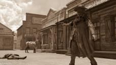
Okay, here is what I hope is the final version of my singer. I redid the postwork and held back to conservative. I hope it's better.
@Shortcut I do all of my post in Gimp using the NIK Collection of filters. I'm in love with them, but sometimes I go a little overboard. I'm trying to learn some control. I actually use several different filters and then composite the layers and play with the opacity until I find something I like. I don't usually just use one filter.
Two thumbs up!
.
@Shortcut Thanks! Gimp has masks and ways to select just parts of an image. Half the time I forget to do that so I sometimes need to go in and do it backwards and just get rid of the parts of the image I didn't want to be affected. There are ways to do that, too, which aren't that difficult. I've been doing a whole series of Gimp tutorials on my thread, but I haven't done a masking tutorial yet. From what I've seen, it does it in much the same way that Photoshop does it. I'm still learning, though, I need to play with masks more and get a better handle on using them.
I've only seriously been doing postwork on my images for the past six months. I still have a lot to learn. Before that, if I couldn't do it all in DS then it didn't get done because I didn't know how to do it. The good part of that was that I learned a lot about tone mapping and doing effects inside DS before I ever started working with postwork in Gimp.
@Barbult I'm happy with the two thumbs up! :)
I'm glad the new version is better.
KM I like it much better now. That sharp shadow is still there but now it fits and doesn't jump out at me. Looks great!
I have to say I think I enjoyed this month more than the months when I actually did a render. Its been most interesting to see how everyone has progressed and I always find it facinating to see the beginning then see all the changes, subtle or not so subtle that wind up in the final image. You guys all did a great job, and I really hope you had fun while doing it. I loved participating in these challenges the last year, not only did I make some good friends I think my learning curve multiplied many times over and it would have taken me a lot longer to learn how to do things without them. Hope to see you all next month!
I agree. You guys did great this month and I think the whole thread has been more relaxed and you guys really helped each other out a lot! I loved seeing all of the helpful hints everyone has been giving this month. My favorite part of this thread is always seeing the progression of each image.
Oh, and thanks, Ice Dragon Art! I'm glad I was able to do it so we both got what we wanted with that shadow! :)
(I'm not quite sure how to best do multiple quotes)
Updated version follows. I think the tips about the skybox and the fence helped a lot. Most of my attention was on trying to send less of a sad, melancholy vibe and more upbeat, if exhausted.
I'm still not sure I got the emotional balance right. At least, now she has a focus, rather than just being slumped.
In the end you have to be the one happy with lol. I think you did a great job with balancing it out.
Now she looks more like she stopped to tie her shoe and rest for a minute. And she looks a bit sweaty too which is helping as well.
This challenge is now closed
As this is now a Challenge (with prizes) and not a "Contest" anymore, the next part of this will be a bit different than before. We will be spotlighting various artists for different reasons (and from month to month what will spotlight and why will vary). Each spotlighted artist will get a $10.00 Gift Certificate to the store as part of that spotlight and one person will get a $5.00 "Welcome" Gift Certificate. It is our intention to spotlight the hard work and dedication of those participating and to use those who did well at attempting to master the topic as an example to try and help others.

We hope that this new format will be encouraging and make this challenge special for those that participate.
With all the changes, please do give us some extra time as it may take a bit longer than usual to look through and pick the artists/images.
Also, as this is all in somewhat of a testing phase, we would love to hear from you. Please feel free to go to this thread: New User Contest Revamp Discussion Thread and let us know what you think. What do you like about the new format? What would you like to see improved? How do you feel about the changes? We would love to hear from you!
Thanks for the suggestions. I'll give them a shot.
.
.
Showcased Participants for the January Composition Challenge
Most Improved Artist - For this Showcase we looked at where the artist started their piece to where it ended up, the number of edits, and how those edits benefited the image as far as the theme of Composition.
For those reasons we have selected dstuffle to showcase
Most Creative/Unique Perspective - For this Showcase we took a look at who we felt applied a unique or creative perspective or added extra creative "oomph" to their image. The person we felt had a perspective that was most "outside the box" and original.
The New User we felt best showed that this month was yhzmurphy
Best Example of the Topic - For this Showcase we took a look at who we felt demonstrated the most growth of knowledge on the topic of Composition. We payed special attention to edits that showed an attempt at applying or experimenting with different rules of composition and who we felt ended the challenge with the most rounded/solid understanding of the topic.
The New User we felt best showcased those things this month was kanegs
New User - Welcome
lolitojfr and delirious
Congratulations to those we spotlighted as well as to all those who participated in the Challenge. Looking, every single person who participated got votes in one of the above topics which shows that as a group you all did such a wonderful job! I am very impressed with each and every one of you, how well you worked together and helped each other, how much each of you worked towards the goals of the competition, and how lovely a group you all were to work with!
To those above who were showcased: Please use the instructions here for how to claim your prize for being showcased: http://www.daz3d.com/forums/discussion/comment/43825/#Comment_43825
There is still a discussion going on here: http://www.daz3d.com/forums/discussion/comment/2070981/#Comment_2070981 where we are still kicking around ideas on how to keep improving the challenge so if you would like to give any feedback on your experience with the contest this month or add any thoughts on any of the ideas (or add additional ideas) we would love to hear from you
Thank-you so much. It was a really fun challenge, and there were so many other great compositions and wonderful comments. Congrats to the others showcased, and the other participants who created wonderful pieces.
.
Congrats to all the winner ( Hey yhzmurphy... you did it ) and my consolation to all those who went empty. Do not be sad, after all, we had an interesting month and learned a lot again, which is the main thing. :)
Yep! And as I mentioned, every single person was pointed out to me by at least one of the people who was reviewing (it's a team of people) to try to sort who to spotlight. So everyone really did an amazing job!
Congrats to the winners! And yes, no one should feel... No one is... Oh dear.
Haha, this is so sweet! It's like in the Jackie Chan films where in the end you see the whole team, bad guys and good guys together.
Thanks for running the contests andproviding feedback. It helps and its fun!
Congratulations everyone!
I thought that there was more of a discussion with the new challenge format.
Thanks for all the feedback and for the recognition!
Thanks to all the team and artists, I really learn a lot about CG on the forums, and it helps me to improve my limited knowledge of the english language as well!
I love that! LOL! I happen to love outtakes from movies and that's exactly what this reminded me of. :)
Congratulations everyone on great images and learning lots! :)
Here is my last works...hope you like!
Images removed because of Nudity Please review the Daz Forum ToS bullet point #1 of the general code of conduct
Very much like this picture, clarity, thanks to share