Non-photorealistic Renders (NPR)
This discussion has been closed.
Daz 3D is part of 
Connect
DAZ Productions, Inc.
7533 S Center View Ct #4664
West Jordan, UT 84084
Licensing Agreement | Terms of Service | Privacy Policy | EULA
© 2026 Daz Productions Inc. All Rights Reserved.
Comments
late to the party again I am - new version looks perfect - doesnt need any more tweaking
well that's pretty much all working - maybe the perfect texture on the blue fabric is too regular and maybe a few lost and found lines would help.
lastly a coloured glaze over the whole would help unify the colours a smidge
one of your best I think - love the texure in the shadows amongst other things
putting a white vignette around it would be interesting
looks like a clip straight out of a movie
Thanks a heap, but I still see a few things that need adjusting. However, I'm glad you like it because that means I'm probably very close to finishing this and will finally be able to move on to the other pages. The challenge with this page was really finding a way to set the scale of the scene without providing human-sized references in the image. I put a lot more work into this, but the mountain only appears in two places (page one, and a smaller panel later, for which I will be reusing this page), so it really needs to be strong and set the stage for the rest of the story.
Created some art for my D&D group again. This is Pencast, a not-so-nice archfey and their antagonist for the evening!
He looks like a jerk. LOL! That's what your going for right?
The "not-so-nice" part definitely comes through. Nice painting job, and good work on the portrait lighting. Hair is suitably soft (although the edges where it meets the background could have used a little blurring to keep it in line with the rest of the image's soft-focus, romance-novel look Good work.
LOL - yes indeed! He's a total jerk.
Thanks very much! Good note on the hair, I might take a second look at that.
Decided to take a quick break and do something fun. Whipped up a quick dragon illustration.
Sorry for the duplicate post, folks. Although I do like the look of this illustration, it looks a little washed out to me. So I adjusted the opacity of one of the layers and really pumped up the blacks to make something more dramatic. Which one do you guys prefer?
The same scene is used for an animated sequence that I compiled.
FYI, if you update Photoshop to the newest version, you have to reinstall the Nix Collection.
Cool looking jerk... I think I either went to school with him or we got into a hockey fight... :-)
They are both excellent but the top one gets my nod...
Just copy the plugins folder
From C:\Program Files\Adobe\Adobe Photoshop CC 2017\Plug-ins
To C:\Program Files\Adobe\Adobe Photoshop CC 2018\Plug-ins
That's all I do, no need to re-install...
See this video...
Since this was just for fun, I decided to add a quick color wash to the dragon.
I do see the places where the color doesn't blend correctly on the legs and wings, but since I did this in 10 minutes, I'm okay with that.
Oooo, very, very nice!
-- Walt Sterdan
I like it, I like it very much...
I'm liking the bottom one but something was bugging me and I realised what it was - the lighting direction.
I used to work in the country and rent a room for a day and it had pretend sandstone wall paper - and it kind of looked odd and one day I realised that tyhey'd hung it upside down and that the light source in the pretend sandstone was coming from the bottom
it's like when you see pictures of clouds and they are upside down or taken from a plain that is above them
:) But I am imagining your dragon is being lit from below by the fires of Smorg. Maybe the colouring could show that ? Heh , dont mind me I have been learning Excel all day, it's like learning blender but worse - now I know why I chose art.....
I created "Christmas Window Shopping" a couple of years ago. I was trying to achieve a paintery look.
A young boy and his sister along with their dog do some Christmas window shopping for gifts they hope Santa will bring them...
Cropped version
I think I much prefer the cropped version.
I modeled the toy shop in Hexagon3D ver 2.5. Other software used was DazStudio, Vue Complete, Photoshop and Corel Painter, UV Mapper Classic.
HAH! S'funny you should mntion the dual light source. I was thinking he was lit from blow by fires he had started! I chose that because it gave me more highlights on his skin to bring out the scales on top and bottom. I wouldn't do this if he were for production, but since it was just a quickie, I let it "fly." HAH! Couldn't help myself. Same thing with the simple color wash I added. Spent about 5 minutes on that.
Of course, fun time's over. I really need to move on and get to the interior pages of my story. I think I've almost fot the first page (with the mountain) finished. Just two more tweaks and then I'm moving on. Wish me luck!
PS: Good luck with Excel. I use i all the time for project tracking, invoices, and things like that. It does have a learning curve, but it's pretty darned powerful (my wife is a bookkepper and she's an expert user; whenever I get in a jam I call her).
Great job modeling and setting up this scene. I definitely prefer the cropped version (in the larger scene the little girl gets lost because of the gree-on-green coloring, and there's soemthing about the angle that makes it look like the building doesn't have a side -- like it's just a storefront flat, the kind used in movies). Nice painterly effect, and good job on the snow and stone floor. And I LOVE the addition of the dog! This is a very classic Christmas scene! Thanks so much for sharing it with us.
I might tweak the mountain shadow a little more, but hopefully not. I think I'm finished with it. Thoughts?
A NPR version of a car I modeled in Groboto3D & Hexagon...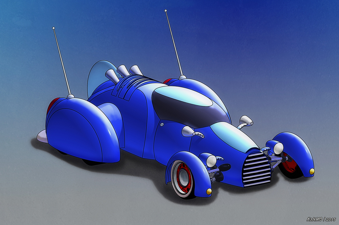
Non NPR renders in Vue can be seen in this thread here at DAZ Forums https://www.daz3d.com/forums/discussion/57610/car-and-bike-lovers-thread-mark-iv#latest
Links to some of my favorite Filter Forge filters that I find useful for NPR...
Crosshatching
https://www.filterforge.com/filters/5531-v3.html
Crosshatch and Stipple
https://www.filterforge.com/filters/4786-v2.html
Crosshatch
https://www.filterforge.com/filters/11261.html
Pen and Ink Crosshatch
https://www.filterforge.com/filters/932.html
Cutline v18
https://www.filterforge.com/filters/9503.html
Artification
https://www.filterforge.com/filters/9049-v8.html
Old Book Illustrator
https://www.filterforge.com/filters/9388-v3.html
Presently at work so when I get a minute I'll add to those that I may have forgotten... Memory is not as sharp when you are in your early to mid 60's...
This is a very nice toon car. The simple shapes give this a clean profile that is very pleasing. I particularly like the details like the inside wheel on the front. Nicely done.
Agreed.
Aahh! I love this!!
A simple pic for the my story, almost done with 34 pages!