Superheroes Rebooted - Ready to Rrrrrender?
This discussion has been closed.
Daz 3D is part of 
Connect
DAZ Productions, Inc.
7533 S Center View Ct #4664
West Jordan, UT 84084
Licensing Agreement | Terms of Service | Privacy Policy | EULA
© 2026 Daz Productions Inc. All Rights Reserved.
Comments
And my Green Lantern......
They’re all pretty good, but this one’s my favourite. Very nicely done, you’ve captured his spirit perfectly.
— Walt Sterdan
Many thanks, Good sir. :)
And now... SPAAAAAAAAAAACE.....GHOOOOOOOOOOOOOOSSSTTTTTT!!!!!!!
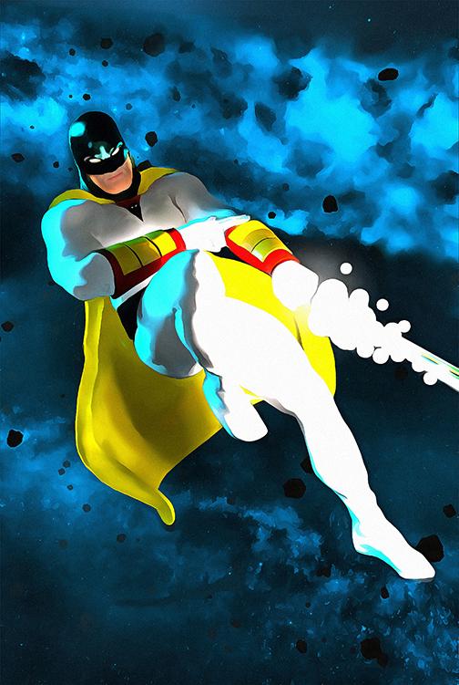
Another paint over render
SPPPAACCCEEE GHHOOSSTT!! Cool.
Very nice! Very, very nice!
Now we need Jan, Jayce and Blip. Some of their foes would be pretty cool, too.
— Walt Sterdan
LOVE your Space Ghost and your Flash is really cool!
Aaawwwwwwww shucks, Rammy. Yer gonna make me blush. :) Thank you, sir. :)
And another great job. You really nailed the old-school look of the Alex Toth design. Definitely one of my favorite versions of theis character that I've seen in a long time.
This is one of the best color-on-color knockouts that I've seen in AGES. You added just the right amount of shadow and subtle muscle lines to define his shape in just the right places. I'm SUPER impressed.
I cruised over to sharecg to see if they had anything that could help, but didn't find anything. I think you're going to have to make it yourself, unfortunately.
This is really nice. Has an anime look to it.
Very cool. I like that the belt has some actual depth to it. Have you considered adding a bump map (or other effect) to give the S Shield a little more depth and body? These days he's typically drawn as though it's a raised decal or separate piece. And have you considered making the trunks the same texture as the cape?
I've been meaning to do a Green Lantern render. Got to get it done.
More Venom from me
Noice! I was thinking of getting Parasite after seeing your stuff just to make Venom. I was thinking of mixing him with Atlas because Venom always distorts himself so much and the chest being huge may work for that look. Love the lighting in this, Spot on! :)
Agreed, the "cloud" backdrop is especciay excellent.
-- Walt Sterdan
Spiderman.... Webdeveloper. :)
Thank You
I tweaked him from the original shape of parasite as well, using my "Biggun" morphs to bulk him up. (and obviously tweaked his textures too)
Digging all your renders too......reminds me of action figures I would have loved as a kid
Not bad.
Thanks! :)
It's always been my dream to be "Not bad". *chuckle*
Any criticisms? (Please be gentle) :)
This is one of the most complex scenes I've EVER set up. Took a long while to render too.
BATMAN ALWAYS WINS...
In hindsight, I should hve added a starfield behind the deathstar and should have put more light on the Terminator as he just blends into the darkness. :(
Well, looks like I will get an opportunity to put my starfield in,. The printer screwed up my order and doesn't have the normal gloss papaer I normally print on. *shrug* more time to perfect my piece :)
If you're going to make some changes, consider adjusting the text a little. I'm having a hard time reading "WINS" as it's written. Maybe make all the text just a little shorter, or increase the width of each letter in that one word so there's not so much space between the letters. All in all, a very amusing and well-crafted piece.
Very nicely done, but I don't love the green background color. Have you considered purple, and maybe making the spider symbol yellow or white/gray?
Just something to think about.
My superman character, DAZ Studio Iray render.
Very nicely done. The textures look good with this style of lighting and realism. Just a question: could you add more yellow to the gold? Just a bit of brightness in that texture would give those details just a bit more pop (if you know what I mean).
fun in Carrara
EXCELLENT feedback. Those are good points ! I will definitely take those into consideration. :)