Daz 3D is part of 
Connect
DAZ Productions, Inc.
7533 S Center View Ct #4664
West Jordan, UT 84084
Licensing Agreement | Terms of Service | Privacy Policy | EULA
© 2026 Daz Productions Inc. All Rights Reserved.
Comments
This is most helpful thank you!
"Yrch..amin can fira sen, Ayr'Dal" (Orcs.. I can smell them, Half Elf) A little snotty comment from the Koada'Dal archer to her un-nocked companion. But.. that's High Elves. They don't think much of anyone BUT high elves, feel distinctly superior to Feir'Dal, (wood elves) and are frankly aghast at the concept of Wood Elves co-mingling with humans. Tainting the Blood. This little Ayr'Dal guide is in for a rough week.
Take 2. I think I will have to change out the Ayr'Dal's hair color.. the right figure. Lighting from the front isnt doing much for her, and I'm hesitant to add another spot. I like darker images. I guess I'll have to fix that foot slipping off the rock eventually.
Like the set rotation much better. I know nothing of IRAY so really can't help much. The fire glow seems oddly intense in spots.
Reposed, some material tweaks
huge, huge improvement! Get some lights on your actors. The ambient light from the fireplace is great, but.. they are in shadow. And now that you have moved the camera, the light from the scones is distracting at the top of the frame.
Arm is much more natural (even for a machine lol) this way.
I think I will get rid of the sconce light entirely and maybe put a soft light of some sort close to them. I can play with the fire a bit more as well.
Objective:
To provide a serene forest scene with pretty flowers, happy butterflies, dappled light, and then you notice that there is a tiger stalking you.
I want to distract the viewer and not make the tiger obvious. Currently there is a spotlight above the tiger, placed there to bring lighting to the foliage and dappled light on the ground, but it is illuminating the tiger's back. Maybe I can move the spotlight forward and perhaps narrow the spread angle?
I haven't given the tiger real fur, but not sure if I need to do that. I also want to add some soft atmosphere, but haven't learned how to do that yet.
Rendered in 3Delight with Advanced Ambient, Distant and Spotlight.
Ok, getting the transparency on the glass to work has been a greater challenge than I expected. I've fixed the pose on the frame and eyes. I'm going to have to correct the ale and add the tear in Photoshop, but since it's on my other computer I didn't want to do it for a test image.
I've also adjusted the angle of his right shoulder, but I'm not sure I like the position of his hand now from a compositional perspective. Feedback is welcome.
Yes I think I will move them to the right wow I should have noticed that the crow was wayyyy too close!!!
Yes I do see what you mean Sonja they are so floating on the snow I guess I am going to have ta get into the mixer to send some shadows down.
I do have a distance light in the scene but I do see that it is still a bit dark, I will work on this tomorrow cause my daughter just had her baby today and I am so exausted right now that I can't even think
The scene seems very busy to me. The colorful foreground does grab the eye, and then lead it near the tiger, but the blue butterfly seems overwhelmingly large, and I couldn't recognize the tiger AS a tiger at first glance. I'd move the tiger a bit closer to the center (almost in front of the tree trunk) and move the foliage so it doesn't split his (her?) face. Also, I might shrink the blue butterfly, probably by moving it closer to the flowers.
I liked the mug better. You say you will modify the ale, I'd be interested to see the result then. This version confuses me. I imagine the tear there, because I know it will be there, but the drink is not what I would expect. My first impression was "orange juice", and judging from the rest of the scene, that's not the reaction you're after.
Nice one. Changes the story completely.
Looking at the previous image, I heard her in my mind, asking "What should I do with all these books? Should I burn them?"
This one tells a totally different story. Although, judging from her expression, burning something or someone is still not completely ruled out. :)))
Indeed, it looks a lot better with some grass and wildflowers:
Click on attachment for full details. The smaller picture does not show the variety of flowers well.
@Ice Dragon Art
Not an entry, but I put this together to let you see what you could achieve, if you wanted to.
60 Watt bulbs in the table lamps. Temperature 3000; Two Sided Light On; Emission Profile SoftDisplay.ies; Luminous Efficacy 5.00
Emission with the fire/flame .jpg in the Colour channel; Luminance 100; units cd/m^2
Linear Point Light as a centre light near the ceiling; Lumen 600; Temperature 3500; Light Profile AreaLight.ies.
Environment Scene Only
Ton Mapping Shutter Speed 4.00; F/Stop 1.6; Film ISO 400.00; White Point 0.96 0.96 0.96 (250); Burn Highlights Per Component Off; Burn Highlights 0.20; Crush Blacks 1.0; Saturation 1.2
I let it run to the end and it took 15 hours, or there about,CPU only but that isn't something I worry about too much :)
Fire Guard
Actually, I happen to like the hand on the beer glass instead of the mug. The mug seemed awkward to me, and the hand position is better, although there is a strange bend in the first joint of the index finger. The left hand pose doesn't look right. Hand posing can be hard, and the best way to do it is to use yourself as a model. Grab a picture frame and head to a mirror. When you have your pose at the angle you like, snap a picture and use that as a guide to posing your hand and it will look much more natural.
Also, the room is dark and gloomy, reminding me of a prison. Is this a tavern? Perhaps the addition of some objects on the wall, such as lamp, clock, etc. The addition of a light fixture will add some interest. If you don't want the items to distract from your figure, then adjust the settings of your camera so that they are out of focus.
Thank you Ati, I am glad that her expression shows exactly what I was trying to convey lol. The vegetation really helps with you picture, I haven't had much time to play with Bryce yet and haven't even attempted to really do ground cover so I am impressed!
Fishtales thank you for the detailed explanation that will help as well. Now I just have to FIND all of that in the tabs and play with it lol. I have been watching Sickleyields tutorials (I really need to remember to pull out a notepad) and am up to page 17 or 18 on the tips and tricks for newbies and am kind of starting to understand.
Fyreheart I think you are on the right path here. I thought he was either in a tavern or a simple hut but a bit of something to distinguish which wouldn't help.
I was spinning around in perspective to fix some little issues and hit this view. I like it. Let the other sit for another time.
"Amin fina Yrch" 4.6 3Delight minor post. Posted to my gallery, to fade into obscurity.
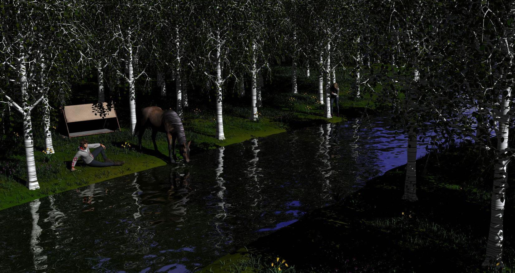
I do not know Bryce. Is there a way to individually rotate some of the Aspen/poplar to get rid of a little of the cloned aspect? Only a few by the horse are really evident.
Does this look more convincing?
(Quality is not the same, this is just a quick 10-minute render. Full quality takes 3 hours.)
This thread certainly has been busy now that everyone seems to be off the holiday hustle and bustle. :)
Not sure I'll go for an entry with this, but this is something I've been tinkering on and off with since the War Dancer outfit was released in december. There's much still to be done, especially with lights, as I haven't even decided on a setting and story yet. If anyone has any opinions to spare I'll gladly take them.
The idea behind the first one is simply the "war dancer" practicing on her own. In the second I thought there would be someone (not yet added) that she kicks off the tower and in the third she is making sure that whoever it is that sits on that throne (not added yet either) gets their behind back on it. The third one is also supposed to be an interior setting but the set is obviously not finished yet. As you might notice, I like using HDRI's ;)
Isidorn, I really like the angle of the third image.
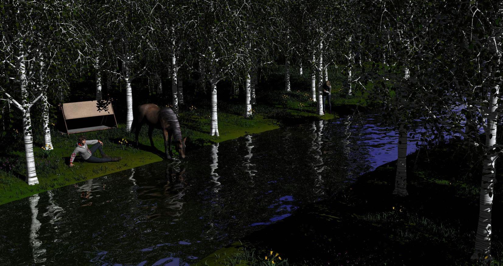
In addition to the tree clones, the straight stream irks me out. It's a really great scene but the very straight shoreline is distracting. On closer inspection I notice it's not that perfectly straight as I first thought, but the stream still runs in an unnaturally straight line. I can imagine it would requite a lot of work to improve that, but perhaps just adding some rocks here and there would be enough to break the straight lines?
Thanks Ati!
Your trees are less obvious clones now. :) Could perhaps need a bit more tweaking. It's one of those things that can't be unseen after have being seen so I still notice some clones.
Unfortunately I cannot save the scene anymore, so this is pretty much it... :D I'll make a different scene later this month. There's so much stuff I learned in the past few days, I need to start a scene completely differently.
I hope my suggestion didn't cause this. I'm so sorry. Yes the trees looked a lot more random.
No, it's the grass that's eating up most of its memory. I now know a better way of doing that, but since this image is only for learning purposes anyway, it's not worth redoing all of that. I'm getting to really like Bryce, but it requires a different kind of planning when it comes to larger scenes.
Composition is really my weak point with my work so some suggestions would be greatly appreciated :)
Thanks for the comments, Fyreheart.
Actually, I want the tiger to be less obvious. The piece will be titled "Distracted Pray," inviting the viewer to look for the pray and discover that the viewer IS the pray. This is why the tiger is to one side and is not the main subject.
I went ahead and shrank the blue butterfly - one of the reasons why it's huge is that the species has something like a 6-inch wingspan. (Yes, I'm putting South American butterflies in the same picture as a tiger, but we won't go there).
As to the business of the picture, I'm thinking I can solve that problem along with the flat appearance by reducing the ambient lighting. That will put the background foliage further into the background and make the dappled lighting more prominent. So I played around with the ambient lighting and the tiger's spotlight. I also moved the foliage out of the tiger's face. The end result is that the background foliage is a little darker so as to make the foreground plants lighter. I also played with adding highlights in the upper right and around the tiger. The tiger is darker, but I want the viewer to look for him.
I'm still thinking about what I want to do with the foreground lighting. If I soften the shadows, then I will loose some interest with the dappled lighting. I wanted a shaft of light effect, but I need to research the documentation for Advanced Spotlight for 3Delight.