July, 2019 - Daz 3D New User Challenge - Portrait Rendering
 Kismet2012
Posts: 4,252
Kismet2012
Posts: 4,252
New User's Challenge - July 2019
Sponsored by DAZ 3D
Are you new to the 3D World? Are you at the beginning stages of learning 3D rendering? Have you been around for a little bit but feel you could benefit from some feedback or instruction? Have you been around awhile and would like to help other members start their creative journey? Well then come and join the fun as we host our newest render challenge!
"Portrait Rendering (Expressions and Lighting)"
This month's focus will be Portrait Rendering, with an emphasis on the character's expression and lighting. Portraits are the way we show off the unique aspects of each individual. Expressions should convey their personality. Good lighting will enhance your portrait and set the mood. Portraits don't have to look like yearbook headshots. Get creative, hone your skills, and have some fun in this months contest.
A portrait is a representation of a person, group of people, or even a pet, that displays the expression, personality, and mood of the subject. The focus of a portrait is usually the subject's face, although the entire body and the background or context may be included. Depth of Field is often used to blur the surrounding environment to draw the eye to the subject.
Inspiration:
Portrait Tips and Examples:
Tips for good portrait photos
Google Search - Portrait Expressions
Lighting:
Lighting Tips from the Masters
Portrait Lighting Patterns
Mastering Lighting in Blender (The first 25 minutes of the video are basic lighting theory and insights.)
Other Helpful Links:
When following tutorials, be cognizant of the different applications (Bryce, Daz Studio, Poser, Carrara, Blender, etc.) and different render engines (3Delight, Iray, Reality, etc). Techniques for one may not apply directly to another. If you have some favorite portrait lighting and composition tips, please share them in this thread.
Composition Golden Ratio helpers:
Bryce
DAZ Studio (Also, DS has a built in Rule of Thirds guide; just select Show Thirds Guide in the Viewport context menu)

Lighting Tutorials:
Tutorials by Szark (Credit is given to Szark for this wonderful thread with links to many tutorials.)
6 Tips for Better Lighting - Blender Guru (Most is general lighting tips, not Blender specific)
Creating And Lighting A Scene With Iray In DAZ Studio
Dreamlight Lighting Video Tutorial (currently free in Daz Store)
Creating Eye Reflections with Reality Poser Edition Part 1
Creating Eye Reflections with Reality Poser Edition Part 2
Carrara Chapter 14: Setting Lights
Bryce Artist’s guide page 123
Great Lighting for Dark Backgrounds
Perfect Lighting for a White Background
High Key Portraits: Take and Make Great Photography with Gavin Hoey
Low Key Portraits: Take and Make Great Photography with Gavin Hoey
Laws of Light: 5 Portrait Lighting Setups
Some good information on useful portrait cropping
https://digital-photography-school.com/good-crop-bad-crop-how-to-crop-portraits/
The Rule of Thirds in 5 minutes | Creating More Dynamic Framing
And of course its always a good idea to check the portraits contests from the last years
For a list of the current challenge rules, please see this thread : Challenge Rules
Closing Date: July 31, 2019
I will be checking in as will the rest of the Community Volunteers to try and help with anything you all may need.
Daz 3D is part of 
Connect
DAZ Productions, Inc.
7533 S Center View Ct #4664
West Jordan, UT 84084
Licensing Agreement | Terms of Service | Privacy Policy | EULA
© 2026 Daz Productions Inc. All Rights Reserved.
Comments
Here's my start. While I know there's open space to both sides of my shadowrunner, I'm planning to add two more runners flanking him to take up said space.
Must admit I have difficulty with portraits in these days of incredible detail on the models. Just end up going through loops of saying: "Look at that" with each new trial render. One of the ones I did in April was as the attached render of Mousso's 'Reese'. It's a sort-of portrait, but it is hard to get past the 'Oh, Wow' stage and turn a render into a proper portrait.
Regards,
Richard.
Decided to try something in black and white, probs need to work on the lighting but for now I'm pretty happy with
I know this is a work in progress, and you probably haven't really started on the lighting yet since you are adding 2 more characters, but I would like to see some shadows to anchor him to the floor.
Nice start.
This is quite a good start. You have some interesting shadows on your figure. The thing I am missing at the moment is some kind of background. If you do not want to take the attention from Reese maybe some kind of blurred background would work.
I really like black and white images. I like the textures in her body suit. With no colour in the image it adds interest. Having said that I would suggest you crop the image a little tighter on her face. With so much suit showing it is drawing my eyes away from her face.
Thanks, may need to work a bit on the width, but hopefully this is zoomed in enough
edit: have played a bit with the width, I prefer it when there's space between the sides and the end of the image
Yusss! I've been looking forward to this, because I love creating portraits, but I almost always hate the results!
Anyway, this is my starting point. Here we have a typical example of how I do portraits: Some random character, vague expression, vague surroundings like a wall or something, sunset-y light, and an overall pervasive flatness reflecting the existential misgivings of society's ineptitude at human excellence, or whatever *real* artists would have to say. So, suggestions, please! Zarinda will be my model for this challenge, because I like her nose.
Here is my first attempt. I call this "Kala with a Hat". Still needs some work. This is actually a three light set up, which are two emissive planes for the key light and fill along with the sun sky environment. The key light is to the left with a very slight fill to the right to try to lessen the shadows under her hat, my guess is there is about an 8:1 ratio (3 stops) between the two based on the light settings. For the sun sky, I created a null and pointed the SS Sun Node parameter under the Environment settings to it. For me, that is easier than adjusting the longitude and latitude along with time of day settings to get that golden hour sun effect. There is something going on with her skin on her neck that I need to sort out still.
So you might want to give it a go and reframe the image. I took the liberty of cropping your scene so Zarinda is more prominent in the scene. Maybe a shallower DOF if you have that set to blur the background a bit more.
For a portrait lighting setup, what I typically do to start a scene with a single light (could be an emissive, spotlight or environment sun sky) and have my character looking at it. I set up the camera with it straight on to the character, so any light source is either behind the camera or in front pointing to at the character. From there I just rotate (Y axis) the character in 15 degree increments to see how the light hits the character and shadows are created. Once I get that sorted, I look to add other lights as needed for the effect I was going for or sometimes serendipity jumps in while I am doing that and creates something interesting.
With all that said, you are off to a good start, maybe see if the hair prop allows for some adjustment and pull the right side (model left) back some to get more light onto that side of her face, which would give it more of a split lighting look with the shadow line falling along the bridge of her nose.
Here's version B with a second character added as well as their ride behind them to try and cast some more light to get some shadows, but not sure how well that is working with them on asphalt. Also included is a screenshot of my set with the characters location indicated so you can get a since of the difficulty that the nighttime HDRI I'm using has to add to the shadows.
My artistic motivation has been a little weak of late, so I decided to try a challenge entry. I've never done this before, so hopefully, I'm on the right track.
This is a portrait of Quincy Morris, from Bram Stoker's Dracula. I'm pretty happy with how it turned out. Hope everyone likes it.
Ok, here is the first version of my portrait of Darwin's Dante
I agree the image needs room to "breath". Once I have a starting point I like to add more cameras, so I do not lose the first shot, and experiment with different angles and zoom lens lengths.
Maybe experiement with the camera down low or up higher.
First question: What is Zarinda doing? Is she camping? Hiking?
Second question: How is she feeling? Is she bored? Happy? Sad?
I like your start ( and your comments ).
You like her nose. Maybe put a little wrinkle into it like she smelled something bad, ie: skunk...or whatever seems appropriate to you and Zarinda.
Work on her pose and expression to convey to the viewer what is happing. Lighting, posing, props and camera angle are all about the message you want to try and convey to the viewer. What is Zarinda saying to you?
Please excuse this, hopefully brief, intermission. I have a little fur face that wants me to go outside and play with her.
This is a really good start. I like the way the hat is framing her face and you were not afraid to crop most of it out of the image.
The hair fringe on the right side of her face needs to hang down and away from her face a bit.
I am looking forward to seeing what adjustments you make to this image.
Evening/night shots are difficult when it comes to shadows.
Wonderful start. I do not know this character so if I make suggestions that are out of character for him please ignore.
I also do not know anything about guns, rifles, etc. The stock on the rifle looks odd to me. Is it supposed to have that grey area?
I really like your posing and light application. Not sure what to suggest to help improve the image.
You have a lot of space to either side of your character. Are you going to put something in there? If not, maybe change to a Portrait setting. It will help to bring the focus to the character.
Hiya everyone, first time I've done this challenge although I've been looking at it for the past 2 months ha. I'm always looking for helpful comments/constructive critisism rather than just the 'thumbs up' with no comments that you get on most social media sites. I'm not sure I can offer much advice at this point but I CAN offer an opinion...however helpful that may be lmao. Anyways (clamps her mouth shut) here is my image named High Impact, made in Daz Studio with some Photoshop postwork thrown in.
Okay... when is a user New? 1 month? 3? 6? 12? Sorry but it is not clear for me...
Here's version C fresh out of IRAY adding my third crew member.
There are two settings, as far as I can tell.
1 The user hasn't entered the competition before
and
2 The user has won the competition
I think
Okay... then i‘am out i think ... Thank you sandy
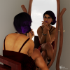
Sasha is my spirit Daz girl. Because I'm too lasy to take a proper self portrait.
It also states at the top of the page "Have you been around for a little bit but feel you could benefit from some feedback or instruction?"
Here is a portrait I felt like doing with a recently aquired character. done in Daz 4.10 with a bit of post prod touch ups and framing.
I really like your monochromatic colour palette. Is it possible to see the image before it was postworked?
We do not apply a specific timeframe. It is really an individual thing. Some people are naturals at lighting but have trouble with posing.
The Challenges cover different areas throughout the year with some months that allow participants to apply what they have learned in a more general way.
If you feel you are a "New User" then please feel free to participate.