Daz 3D is part of 
Connect
DAZ Productions, Inc.
7533 S Center View Ct #4664
West Jordan, UT 84084
Licensing Agreement | Terms of Service | Privacy Policy | EULA
© 2026 Daz Productions Inc. All Rights Reserved.
Comments
Hello,
I've been trying to find a way to create a book cover that looks more hand drawn from 3D renders (without plugins or actions because I find them too limiting). But I'm having a hard time figuring it out. Can some one tell me, in this test image what gives it away that it was done in 3D. What are the details that make you say, "Oh yeah, that's definitely a 3D figure." Thanks.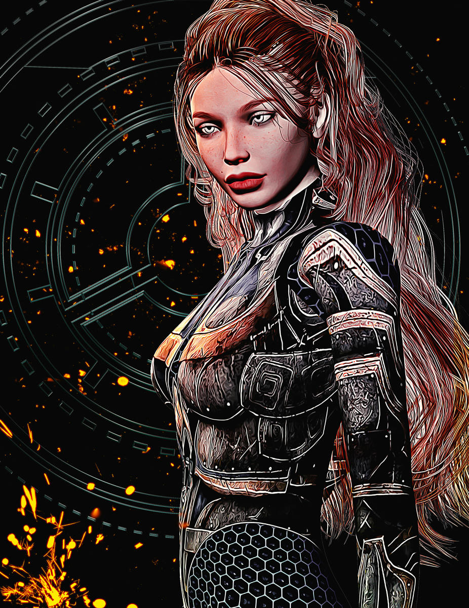
Really good! I would say only the skin on her face is not as flat as an illustration but it is very close.
Thanks for the reply Worlds Edge. Yes, it seems the problem is always around the face. I'll try brushing over the skin a bit and see what happens. Thanks.
I had some free time so I thought I'd try again. Followed my work flow again but focused more on the skin. I may have over did it this time. They are fun to do but I'm not sure these would work for book covers.
Hi,
I would agree with Worlds_Edge on this - skin tends to be a little problematic for a lot of art finishes. I think it can be a combination of the detail along with the shadows that need more contrast and/or colour to sell the effect. Sometimes it is worth trying to combine different techniques on different areas of an image. I usually use Topaz simplify for this but if you use PhotoShop, then you might try a combination of Cutout and Drybrush just on the face. I also like to avoid very detailed textures for clothing as well, partly because they are a devil to overpaint for the finish I aim for, but also because texture distortion from morphs and bends can give the game away - while the textures on your first image work with with the filters, there are a couple of areas on the second figure's outfit that are visual give-aways (in particular, the front of the right thigh, and between the breasts - you should be able to tweak them though using a warp brush).
Yes, I see what you mean. Detailed patterns on the clothes can be a sure give away too. Thanks.
I've been MIA for a while recharging and focusing on my writing. However, I recently tried my hand at book covers again and came up with these:
Rendered the girl and the dog and added a background I found on Pixabay. I know, not a great idea. Because now, I really like that background and it's not really safe to use for a cover if I want to sell it at some point.

Tried a different background with a softer look. This background is safe as I got it from DepositPhotos.

In both cases, I don't like the typography. I wanted something fun and whimsical but I can't find the right fonts to use. I would love some suggestions and critiques on either image.
edit: fixed typo
Those are fun covers. I think Pixabay Creative Common images are OK as long as it doesn't show pictures of people. And if you want a fun font, you can try Henny Penny. It is a Google font, so it should be safe to use. https://fonts.google.com/specimen/Henny+Penny
@Lyam Thanks! That font looks interesting. I'll play around with it and see how I like it on the covers. While the images on Pixabay say CC licenses, it's always risky using images from there for covers you might want to sell to someone else. Unless I can contact the person who uploaded the image and find out where it came from, it's difficult to know where the person uploading it got it from. Using stock from a stock image site is always a better idea. However, I really liked that image so I'm thinking of contacting to uploader and seeing if he actually created it or not.
At long last, I'm about 95% finished with the book cover for a science fiction anthology. Now, when you read the text on the back cover, keep in mind that this book is not targeting the general Amazon marketplace, but that this is a product tie-in to an existing role-playing game. So the usual rules for text intended to "grab them" are a little different. In this case, name dropping the specific races and plots (and stating that this stuff is 100% true) serves the purpose of attracting the players who whow want more info about how to play these races and it also lets them know that this material is "canon" for the game universe.
I'm attaching both the "virgin" artwork (which was purposfully created MUCH larger so it could be used for a poster or banner) and the almost-finished cover design. I still need to add the company logo, bar code and price at the bottom of the back cover.
WORKFLOW: Set up in Poser 11 Pro. Renders edited in Photoshop and Topaz Studio. Final version layout and text in Adobe InDesign.
NOTE: I'm aware that the "J" of the author's name on the front cover is not clear. Tonight I will experiment with adding a stroke to the text or editing the artwork to "dim" the white highlight on the space debris behind it. CLICK ON ATTACHMENTS for a higher-resolution view.
This is a very nice illustration, but I would know at a glance that it was based on a 3D image, and I would almost immediately discern that it was done in Daz Studio (as opposed to Carrera or Poser). The gieaways for me are numerous (and I'm hesitant to list them all because I don't want to "dump" on a great illustration), but here goes:
Again, this is a NICE illustration, but to address your question, no, it does not pass as being hand drawn.
At least not YET! Keep at it and I'm confident you'll get there!
Yee-Haw! The book for which I created a cover is finally live on Amazon. I should have my contributor copies by Saturday. I'm very anxious to see how it looks. Typically, for my own work that is, I print a sample so that I can tweak things regarding UPC box placement and colors (I would go back to the original art and make it lighter/darker as needed). Since I'm "just" the artist I do not get to make those finer adjustments.
If anyone is interested, the book can be found at Amazon by searching for The Epic Anthology of Galaxy Prime.
(I won't post a link because of the forums TOS).
Found it, its looking great! I hope you will have good sales with it!
Thanks, I appreciate that! I'm not the seller, though. That would be my friend (and the editor) James Shade. But here's hoping for the best. I'm really looking forward to seeing my copies on Saturday. :
make a photo and post it here, it's a great thing to see some of your own work printed
Congrats, MM. It's great seeing your work in print. I agree with@Linwelly. Take a pic of you hard copies and post it here when you get them.
Will do! (And thanks to you both.)
Congrats it looks great,
Thanks. It will be here tomorrow so I'll post photos then. I'm really hoping it prints well. I've got to admit to having some anxiety about that.
That is a really fun cover! I'm sure it will catch the eyes of readers and game players. Congratulations! What size did you use and how many pages is your book? Just curious. Anyway, BEST OF LUCK!
Here they are! Two of the comp copies of the 240-page book published by my friend, James Shade. Cover (art, logo and typography) by me.
Whereas I am happy with the results, I am going to ask him if I coulod send an updated JPEG that is a little brighter. I'm not happy with the yellow explosion and how dark the blue tones came out. But if this is it, I can definitely live with it.
Looks very good! Its always a bit tricky with how the colours turn out in the print
They look great! I have heard that images always look darker in print. So far, I've found that to be true with the books I've had printed.
I love that this thread exists, as book covers are one of the primary reasons I got into Daz. I'll be launching new covers for my entire line of novels and story collections this month, all of them done in Daz and Photoshop. And this thread is making me feel like that's far less nuts a proposition than I sometimes fear it is.
Thought I would post this one here as it is perhaps a better fit. As I posted in the NPR thread, I'm looking to use some classic public domain novels to practice my typesetting on, which, of course, means book covers. I based this layout on a couple of 1960s paperbacks. Used as branding, is could work very well, and everything looks nice and clear on a thumbnail. Different colour tops and spines will differentiate between genres: purple for sci-fi and fantasy, yellow for horror, blue for mystery and detective, red for thrillers, and green for anything literary.
Not being a commercial project, I've allowed myself to design the book according to what pleases me and so I've chosen the pocketbook size offered by Lulu. Sadly, because the safe area doesn't scale with the trim size, the boarder is a little on the large size but I don't think that's too great a problem.
The fonts used are League Gothic (easily one of my favourites) and ADF Libris (another favourite which was designed as an alternative to Lydian and fills the role very well indeed)
This thread's been dormant for a while - but then, so have I.
Here's the preliminary work on at attempt to ape Giallo book covers - please forgive the puns. The cover design template was created to match the old covers as closely as I could, sampling colours, adding a little uneveness, faintly soiled, and some registration that's a little off on the blue.
I'm trying to compose something to postwork into a faux painting to fill and (which was usual) somewhat overlap the ring, I'll post the finished thing once it's ready (I'm a bit tied up with other things, so that might be a while).
I really like your work on the old-looking bookcovers. This really catches the flavor of the glassic look, and I like that you threw off the registration just a bit. That's the sort of detail that we don't usually get in digital art, but was rampant on the cheap paperback covers from the 40s thru 60s (more common inside the book than on covers, to be honest, but it still happened).
I'm working on a book cover for a sci-fi paperback (it supports the Role-Playing Game, Galaxy Prime). The editor likes the brighter background but I think the darker one would be easier to place text against. I'm going to take another pass at it this week and see what I can do to fix some of the issues I'm not happy with (like that rod/antennae sticking out of the wrecked ship).
BTW: I achieved the difference in color on the sky by simply taking the lighter one (which is the one I started with) and inverting the colors in Photoshop.
I'm going to side with your editor on this one. While I understand that better contrast makes the text easier, I feel the lighter sky has more of a painterly feel to it that reminds me of the paperbacks I used to read. Also, because the rest of the scene is quite dark, it provides a little contrast against wich the other elements can pop out a little.
I guess I'm with the editor on this one @mmitchell_houston, I prefer the brighter one, though I can see the text contrast thing. In that case I think you can darken the upper third a bit in postpork, kind of extending the darker blotch in the sky from the upper right.