December 2018 New User 3D Art Challenge - Free Render Month: Wrap it up!
 Linwelly
Posts: 6,070
Linwelly
Posts: 6,070
New User's Challenge - December 2018
Sponsored by Daz 3D
Are you new to the 3D World? Are you at the beginning stages of learning 3D rendering? Have you been around for a little bit but feel you could benefit from some feedback or instruction? Have you been around awhile and would like to help other members start their creative journey? Well then come and join the fun as we host our newest render challenge!
___________________________________________________________
Wrap it up!

This contest is a general render challenge. Try putting to use all the things you've learned over the last year and create an image showing off mad skills.
I will be checking in as will the rest of the Community Volunteers to try and help with anything you all may need.
You may want to have a look into the challenges of this year covering different topics from composition in January, Light in February, to materials in November, there are lots of valuable tools, tips and tutorials hidden, that will help you to wrap it up nicely.
So far this year we have covered the following topics:
This forum place has all the past challenges and you can go even further back in the years to find good information https://www.daz3d.com/forums/categories/new-user-contests-and-events
For a list of the current contest rules, please see this thread : Challenge Rules
Closing Date: Dezember 31th 2018
Daz 3D is part of 
Connect
DAZ Productions, Inc.
7533 S Center View Ct #4664
West Jordan, UT 84084
Licensing Agreement | Terms of Service | Privacy Policy | EULA
© 2026 Daz Productions Inc. All Rights Reserved.
Comments
Not exactly something which shows everything I have learned these past few months, but since this is free month, I decided to try to finally use some of the stuff I can get in a daz render.
Personally I like how it came out
The only thing I can think of is maybe adding some DoF to focus on the ship. Other then that you've got a nice start here.
Alright here we go on another run in the shadows. I'm guessing that he's in a base/office building of some sort from the setting.
The light looks nice, but you should look at his pose. I think it would look more realistic, if he will lean on the railing.
It could also be a good help, if you move the camera angle a little bit, to bring the man an the space ship in the rule of third lines. (you can activate the grid, when you click in the perspective panel on the small icon with the arrow and the lines and there on the Show third lines.)
Same here, Shinji, we have two main character, so it would be good, to bring them in the rule of third lines.
Two other things.
I think, the man who at the entrance should be look at the other. What, if the guy inside was shoot down, point a weapon at him, or try a ambush? A shadowrunner must be always expect such things. ;)
On the other hand, I would give the guard a magazine in the hand, so every viewer knows immediately that he is not on his post. *gg*
The runner in the elevator is a close quarters fighter, and doesn't have any ranged weapons. He does however have his blades (shaped plasma types) out and activated.
I'm in the process of making changes for version b as I take a moment to type this, so thanks for the feedback.
If things went through then version B is up. I turned the head of the shadowrunner in the elevator to look at the goul on the ground, gave the goul some more clothing and hair and changed the camera angle.
@Shinji Ikari 9th
Love, love, LOVE the blood! It's the right color, it looks like the consistency of blood, and the shine to it dead on! I love it!
As others have mentioned, there's something "off" about the layout that makes it look a little forced. Doing two characters of very different sizes AND putting them in a narrow area is a bit tricky. You don't have a lot of room to change angles in! Also, you have a bit of dead space in the foreground, soooo....just an idea to consider....perhaps change the aspect ratio to something more widescreen/landscape instead of the more square aspect ratio you are using now? That would widen the area you have to play with angles in and it would crop out some of the dead space in the foreground. Maybe something like the golden ratio - landscape or something similar? Or change the area the viewer sees to focus in more on the guy at the door, leaving only a puddle of blood and part of the leg visible on the other guy. we don't actually need to see ALL of him to know it's a big guy laying dead or wounded on the floor. 8D.
Just don't mess with the blood! It's perfect!
~ Novbre
So, I had an idea of shoving 5 characters in a car and seeing what sort of scene I could get from that. I figured I'd start simply, and just try to have them all sitting neat and tidy (makes it easier to copy paste from one to the next). But, then comes the question of where does the camera go? It seemed like the most straightforward spot is right on the middle of the dash, but it seems to be reacting weirdly with the windshield.
Options:
1. Ignore the hazing. It doesn't cover that much of the image...
2. Embrace the hazing. Move the camera totally outside the car, so I don't have to deal with FoV issues, and then try to shade the windshield. Maybe some trees.
3. Try to find somewhere else to shove the camera that doesn't do this. I don't know how many of the occupants I'll be able to get in frame. Faces are more interesting then the backs of a bunch of heads, so this probably means either looking sideways at someone or moving the camera into one of the windshield corners.
4. Abandon the car for something with a bit more room, where clipping won't be a problem and I can get everyone in frame without turning the FoV to fisheye. Like maybe an open field. Can't run into clipping problems in an open field, right?
Not sure if this is the best solution, but if the windshield has it's own surface group you could try setting the cutout or opacity to 0 (depending on the type of shader), which should effectively remove it from the scene.
Unfortunately, turning the cutout to 0 had no effect. I'm starting to doubt that it's a clipping issue. The downside of that is I have no idea what else could be doing this.
In an arrangement like this, the camera position has another important effect - being inside the car it adds intimacy, while being outside it adds realism (reflections - as you said, trees, or lights, clouds, the sun...). So I personally would not make a decision from a technical point of view, but from what you want to achieve - if you like your idea and you want to create a scene in a car, make it happen :) If the glass is a problem when the camera is inside, I would try to remove the windshield as its effect on the scene may be negligible when it is behind the camera.
Here we go, version C up. I brought the camera in closer so that there wasn't as much dead space, changed the size of the render to a fixed 4:3 ratio, added DoF to try and focus on the guy in the elevator, and added a little bloom with a setting of .01. Other then that I increased the render time and max samples to minimize artifacts that can show up.
There still is the option that beside the cutout you have to turn glossiness/ refectivity top coat (depending on the renderer) to zero.
If you mode the camera furterh inside probably a bit to the left you can adjust framewidth and focal length to still get everyone one, there might be a bit distortion but maybe the would look interesting.
I like the concept of having them in a car and still get everyone on.
That fixed a lot of what was weird to me, AND now you don't have to fuss over posing the big guy, just his leg lol! I did have a question for you. When you were trying out different angles, did you try one from the angle/light of sight of the dead guy? I was trying to think of ways i would try to frame the little fellow so he really stood out (more so than he does now lol) and I thought looking at him from the dead guys perspective might do the trick AND you could still have the leg and blood in the image (did I mention I really like the blood?)
@ Linwelly
Two ideas that might help....
1) if you can change the colour of the haze to a golden colour, it would be a perfect accent to a late afternoon southwest/desert scene, in which case you could keep it and not worry about how to get rid of it.
2) The other idea was to hide or delete the car while you did the posing and and then add it back in at the end when you are ready to render. That would save you some head aches during the posing part of the process.
~ Novbre
I suspect that it might be some sort of SSS, as part of the camera could be inside the glass. When I was positioning the camera, I swapped the glass material for something in the default IRAY shader folder. The main purpose was turning it opaque, so any part of the camera aperture outside the windshield would have a very obvious grey block. I think that might have only affected the outside faces, as inside faces are generally left invisible to cut down on polys to render.
1) I could probably get that through either switching to a more sunset-y skysphere or possibly mucking with the SSS of the glass. Experimentation time!
2) Personally I prefer not to do that as I find posing in a vacuum difficult. Much more straight-forward to balance a bunch of constraints of varying hardness than just plopping a figure in space and trying to eyeball everything.
I like your concept a lot and prefer the camera outside the car.
Maybe you are right with the clippink issue. A had a similare problem a while ago. Look if you camera (the whole camera, not only the lense) intersect with some part (not only the window) of the car.
When yes, move it outside the car and look if the problem is solved. Even when not, please go ahead with your idea, i like the composition a lot. :)
I think, the main focus is the person in the middle. Give her something in the hand, to show it the others. So, you have a reason , to let all others look at her and lead the viewer's eyes to her, as main point of interest.
The driver has nearly the exact pose to look at her over the back mirror in the car, but you could improvise and create him with primitives.
After months of lack of inspiration, I saw yesterday a Tomb Raider intro and finally I got what I need to start a new picture.
My first intention was, to only use the flames as light source, but the result was not so exhilarating.
Now I have put two spotlights at each side of her, but still there are areas who are a little to dark for my taste.
A great challenge, was to create the feeling of movement in the water. I used a couple of props and deformers to create the effect, but I'm not sure if it works.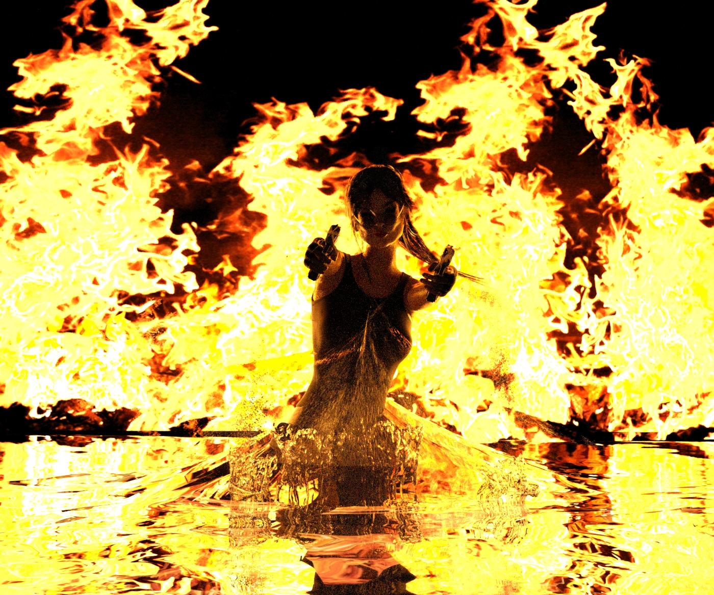
@daybird
I love the waster splashes just in front of her!
Are the flames an object or a photo background?
~ Novbre
Thx Novbre, the flames are a wonderful prop from adamthwaits
https://www.renderosity.com/mod/freestuff/hell-fire-site-link-/56489
, it's a few years old and freestuff, but still my favorite when I need flames.
Maybe I need a little correction in the lumen setting, to make it look more natural, because I use it with iray now.
There was a side, where they explain the best lumen for different effects, but I can't find it anymore. :(
Ment to post this after I got home from work, but here's version D. I changed the pose of the guy in the elevator, tweeked the positioning of his backpack so that his ear wasn't poking into it, and gave him a pair of droids as backup.
I am pretty new to daz as I am trying to learn it fully. This was my second render and I kind of know already after some great tips and help from people on my Newb post what is wrong with it. I have another one that goes with it and the first one I ever did but figured I would just post this one. I have only been doing this for a few weeks. I used Daz along time ago but it was very brief and not knowing a thing about it so that time really did not count lol. Any more tips would be welcomed:).
Here's mine. The first 2 pics are titled "All That's Left: Just a Broken Shell of What Was Before" (2 versions of same idea)
The second one (3rd picture) is titled "Can No Longer Find the Words".
I'm new on here and new to 3D/digital art in general. Just here to learn, and whatever critiques and pointers someone can offer I do appreciate. I just looked through some of the previous months to try to gain a better understanding of concepts along with putting as much time as possible into learning Daz Studio.
I created the characters, morphing, configured poses and scene arrangements, added props along with the lighting (Mesh lighting along with the warm spot&point lights from "physical sources" inside the therapist's office), developed the backgrounds and overall composition. I adjusted and introduced new materials and shader presets to better suit the narrative, mood and tone, and implemented new textures particularly with the clothing. I know there's plenty lacking and again I'm new and so all too much room to grow and that's why I'm here too.
Hi VR 42
I think that look pretty fine to me. I like the character and the setting. So fare I can give only a few standard tips.
What is your main focus point in the scene? The Woman, the sword, both of them or the column in the background? (joke *gg*)
I think it's both of them, so try to bring them both in the rule of third points and it could also help to blur the background a little. I'm not sure about the cut through her feets, maybe you should change this too.
Regarding my renders from my previous post (just above): The colorful background, though it may seem the opposite of the intended target of dark mood, is intended to provoke an eery sense from the sunset...like blood and fire in the skies of what had happened leading up to the moment. The broken shell, which is all that remains, represents the broken crumbling image of what was humanity which is now just a shell of what it was before...and also the broken shell of the individual which is all that is left of him after what he has experienced...the humanity that he has lost.
Uhh, I think I spam this months contest with my comments, but nevermind.^^
First welcome to you TT35 (yes I know, I'm lacy with the names)
Now to your pics.
First thing that strikes me, was the fine pose and emotion you put in the figures.
That tells more than all other things in the scene.
The setting is well done and fits fine with his emotions.
I prefer the first pic more, than the second, because I like how the light works on him.
I think in the second pic the guy needs more space above his head.
Well thanks daybird and lol yea it was both of them. Actually all I did was move the camera from the original one I did which I will put here I guess. Also what do you mean with cut through feets? like seperation?
Yes, Imean the crop, but the link will explain it better.
https://digital-photography-school.com/good-crop-bad-crop-how-to-crop-portraits/
another link to show you the rules of third.
https://www.digitaltrends.com/photography/what-is-the-rule-of-thirds/
Well the more comments the better...your critiques are helpful and much appreciated. I couldn't decide why I also preferred the first pic over the 2nd and I think you narrowed it down, that the headspace and crop is awkward in my 2nd pic. And you are right, I spent more time trying to convey the emotion with his expression and gesture than on anything else to capture what I was feeling.
day bird,Whoohoo thanks:) I just watched a tutorial on this but these links put everything into a persepctive view. These will help greatly and I am also learning lighting as well because I think my lighting is not so good in the ones posted. But it is better then my first one I made as you can see.