Daz 3D is part of 
Connect
DAZ Productions, Inc.
7533 S Center View Ct #4664
West Jordan, UT 84084
Licensing Agreement | Terms of Service | Privacy Policy | EULA
© 2026 Daz Productions Inc. All Rights Reserved.
Comments
@testingtesterson35
The background doesn't strike me as strange at all, it feels highly accurate.
In Afghanistan the enviroment was usually very beautiful, in stark contrast to what the humans there were doing to each other.
Hello Everyone,
I've been distracted by the PCA and Holiday sales/contests, work, and trying out a bunch of different new things with Daz...
But now I'm back to (probably over)contribute in the new user area with you wonderful people!
(You must be so thrilled) :p
So for the free render I wanted to setup something with a party and balloons, but early on when I was experimenting with poses while trying to build a shirt in Marvelous Designer I noticed that the sad expressions carried a lot more weight than the happy ones...
So I got the idea to make a sad girl with balloons at an otherwise happy-looking party, or an angry girl popping balloons at the party.
Now I needed some balloons, so I made an individual one, a column, and an arch. Played around a bit with getting them to look decently beliveable, and then tried to make some poses and one being popped.
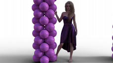
It was moderately effective until the balloons started looking like disco-balls, probably from too many material changes and random tweaking. Eventually I got that sorted and setup the party scene. I was going to have a sad girl taking a smoke break from the party, holding a bunch of helium balloons with some of them popped and/or deflated, but it turns out a mausoleum just wasn't the setting I was looking for:
Certainly a festive looking mausoleum, but not quite right.
So I set to work creating my own setting. I wanted a balcony, not sure why, but leaning against a railing is just what I was picturing in my head.
So here's the latest render along the way. Many changes planned: I'm still going to give her the balloon bunch in her off-hand, drooping off the balcony rail, I'm going to swap out the balloon arch for a column, or possibly move the decor entirely inside. There's rooms inside the glass, but no lights yet, so you just get the city reflection off the windows. And then her pose needs tweaking, and she needs an actual party outfit (and a cigarette). I'm also hoping to show the party going on inside the apartment, if i can get the lighting right to still keep some of the reflection.
So far I like the direction it's headed, we'll see how it turns out.
Any suggestions or advice is welcome.
Thanks for looking!
Inspired by Vargas.
Lots of cool freebies and some very useful assets at big discount really open up the possibilities.
There are a lot of good images taking shape this month.
I hope the woman will pass the ToS.
For the technical aspect, I must say you are far above my skills. The foam on her skin and on the floor looks great and I love how the light is shining in the dark hallway.
Can you give us a little insight in your workflow and how you created this imagination of a walking track?
Same here. You have a lot more skill in 3D than I.
The reflection in the last picture is nice to look, but creates a lot of empty space in the picture.
I think, it would be better to show the viewer a party through the window, with many happy people. That would increase the sad mood from her immense.
Please can I have some feedback on my image which I posted last week.
Tried to do a little tweeking on my 2nd idea that I had this month on the guys pose so that his one blade wouldn't be going off camera. Would have posted sooner, but the system had to restart while rendering due to updates that had been downloaded during the render.
Hi Sueya,
I'm pretty new here but my 2 cents for what it's worth.
I love the composition although the tree is a little off of the third so it might help to scoot the camera to the right just a touch to get that nice rule of thirds.
There's a lot of white in the scene so if you turned down the exposure and/or used a tighter depth of field it would give a richer contrast (maybe...lighting is my bane)
And the shadow of the tree on the floor is a really really nice play on light. You could make it softer by changing the spotlight into a mesh light and giving it a larger surface area. It would soften those. I'm afraid I can't gues what size you'd want to set the light to because (points to the parenthetical statement above).
I really like the earnest expression on the girl on the left but I think a tighter shot would lose some of the shadows on the floor which would be a shame.
Hope that helps a little. I think it's a very nice start.
I'm gonna echo Daybird on this. I'd love to know how you put this together. It should pass TOS because everything is covered by opaque but I have an image that apparently is getting deleted even though she wearing a bra and undies. So I don't know how that's always interpreted.
I know the idea is to give some ideas for people to improve the render but I can't think of much to do different. The little detail of the soap bubbles on the door handle kinda blew me away.
sueya, I think ariochsnowpaw has some insightful comments.
It seems to me that the lighting in your scene is, for lack of a better word, too cold for the subject. Perhaps try a slightly tinted rim light in orange or yellow, play with the angles, brightness, and height? I wonder what the morning sunlight coming in through the windows would look like in that scene?
Have you experimented with the lighting presets that comes with DAZ? I found those to be very helpful.
I think your image has a lot of potential.
LOL I wondered if anyone would notice! You just made my day.
@daybird & @ariochsnowpaw by insight, workflow, and how all this came together are we talking about scandalous pasts, being seduced and betrayed by a wealthy scoundrel, ninja fights in exotic and remote locations, promises both kept and broken that lead to complicated, forbidden rituals designed to bring forth the shadows that sow madness and death, or just the process of how this render came together? I'm going with the second one.
Inspiration for this struck me the first time I loaded Delaney by Mousso. The figure reminded me strongly of a particular work by Alberto Vargas, "Maid With Phone". I did a figure study of his work a long time ago. Much of his art are nudes and NSFW but if you are interested in the origins do an unrestricted image search for it.
Coming from the 2D art world I tend to do my 3D work in a similar way, I started with the background and layered up to the foreground. I have few assets so much of that scene is primitives with added shader. 6 planes (floors and walls), 7 cubes ( door, door frame, tub sides, smart phone and screen), 5 or 6 cylinders (candles), 1 sphere (door knob), and 1 torus (top of tub). The purse is the freebie The Body Pillow from OziChick repurposed. Everything else is a freebie or less than $5, except the character Delaney, the candle flames, the suds, and towel.
I would have liked to use some of the rigged 3D water I have seen but I’m already skipping meals this month to afford the towel, lol.
I tried several different ideas to add some water drops to the floor surface but could not get the effect I wanted.
Posing and expression are simply observation and imitation.
I did a fair bit of trial and error with the lighting. I ended up using the dome as primary and bouncing 1 white spotlight off the wall (screen left) and another orange spotlight off the side of the tub so it shined out the door, I think it is augmented by an additional point light in the bathroom. Everything else kept throwing ugly shadows. I now suspect I could have adjusted the glossy setting on some of the surfaces but this is the first time I used several of them. I am still coming to terms with what you see on screen is not necessarily what you get in the render. The phone screen light is just a cube set as an emissive.
I forgot to add a cylinder for the door knob shaft so I did it in post. I free handed the door hinges, purse strap, and cloned in a 5th layer of suds (the other 4 layers were done in DAZ) in a strategic place to make sure nothing could be mis-construed as something else. All the other suds in the image are included in the purchased asset, "Soap Suds Iray for Genesis 8 & 3". I used both the figure applied and the plane applied suds on the figure to get the effect I wanted. I ended up adding a water layer to the floor in post for a little extra realism. It does not stand out on the tile floor surface as much as I would like.
To date this is the longest render I have done, over 18 hours. I’m assuming because of the candle flames, suds or both. On the technical side that’s about it.
Thank you both for your comments.
Shinji Ikari 9th, I like this version better. That toe touch pose is awesome!
Please don't take this wrong, but the light/shadows don't make sense. It appears to be deep shadow behind the tree and yet the tree is throwing light and shadows forward
@sueya
What lighting are you using for your image? Did you use a pre-set lighting option? Did you create a spotlight yourself and manually adjust the settings? Are you using just the default working light (Camera or environment headlamp? I agree with the others, the primary issue I would give feedback on would be the lighting. It's too bright (overexposed) for an indoor setting. There are a number of ways you can tweak this. These are just some suggestions....
First, if you just want something easy there are a couple of good iray lighting pre-sets under Uber+ or Uber environment that come with DAZ. You can try those or install and use in your scene that have more of an indoor feeling like this free one: https://www.facebook.com/DESIGN-ANVIL-427676333955561/app/212097992149339/ which is pretty good.
Second, if you created your own lights, try adjusting the INTENSITY setting. That will dim the light and make it so it's not so bright/overexposed. Also, you can adjust the TEMPERATURE (K) setting down. The smaller the value on this setting the more yellow the light becomes. Evening indoor light is more yellow where outdoor lighting generally speaking is more white/blue which is what the higher TEMPERATURE (K) simulates. You can also use the COLOR setting on the light to get the look you like.
Also, if you created your own light, check the SPREAD ANGLE. The more spread out your light is the softer your shadows will be. (This is not the only or even the best way to soften shadows, but since we are in the light settings, may as well mention it here!). If you look at your shadows inside a house, you will see that they are usually very soft, no hard edges, more like blob on the ground rather than a defined shape. The shadows in your image are VERY defined, so softening them would go a long way towards making it feel like your indoors.
Your image is overexposed which leads me to think that you aren't using the default Daz working light. At least in my experience, the default working lights tend to be too dark, not too bright, but if you are using just the default working lights in Daz look around and try some indoor preset lights or create your own light.
Like others have said, lighting is my weak spot too, so I'm not really sure how to give you any really useful feedback on it. ><
~ Novbre
Another option is adjusting the exposure level/value (I can’t remember if it’s EL or EV) at the top of the tone mapping options under the render tab. It affects all lighting in a scene as if adjusting it on a RL camera. I find myself messing with it pretty frequently when I have lighting issues.
It's EV, and I find myself using it sometime myself. Just be careful that you don't adjust too much and lose the effect that you were going for. That's the problem that I have when I'm doing darker sceens.
Version F of my main idea here. I added some shell casings and empty magazines in the dead space to give the feel that the fallen guy had gone down fighting. I also added his rifle where it settled as he dropped it. (Also used what looked to me like a light as one by adding a spotlight that is positioned just behind the lens.)
Many Thanks for the sharp eye Daybird. Turns out at some point I had apparently dropped the whole house about 6 inches so mother and child were floating.
I decided to stick with the warm lights...might have been over thinking it and got rid of the misty feel. The lighting gave me a lot of grain so I did postwork it a bit.
Here's the second try at...
The Gift
I like the idea of the shell casings, but (at least to me) less is more. 3-5 casings would be good in that location. The way they are laying there on the floor looks like kids were playing with them on the floor, if that makes sense. I mean they wouldn't have fallen like that with the magazines if they were fired from a gun. At least I wouldn't think they would. I still really love the image, I just think THAT many casings and magazines adds clutter more than detail.
@ ariochsnowpaw
The mom's eyes don't seem right to me. I think her eyes would be more open if she were surprised like that. Also, here eyes seem to be looking at something just off tot he side, rather then at the package. I have to say though the girls pose and expression are beautiful!
~ Novbre
The casings are a prop that is a group of about 18 I think that I created 2 instances of, same way with the magazines. So it should be a case of simply removing the instances to remove some of the clutter as you say. (It was way late at night when I was making the changes so who knows what I was thinking when I should have been asleep.)
I have had similar situations where there is a group of features (though in my case they weren't instances) but I only wanted one or two of the items. The hexagon bridge was really neat to use in those cases. You can export the whole lot to hexagon, select and delete those features you don't want to keep, and then send the altered version back to daz. There is a way to do it using just the geometry editor as well, but I wanted to get more into using hexagon so that's the route I took.
@ sueya
*** Added note to my previous post about lighting....if you are using a lighting preset, go into you RENDER settings and under GENERAL (I think) there is an option at the bottom for head lamp. If you are using a lighitng pre-set, try switching the head lamp option to never. I have had renders that were over exposed because this head lamp setting was on and all the extra light cause the final renders to be over exposed. I just thought of this this morning when I looked at a render I did over night and saw I had forgotten to turn off this head lamp and my image was a little over exposed. lol!
~ Novbre
I've got version G here, having removed the instances and moving what was left a bit to try and have it feel natural. The prop is actualy from a different weapon I got over at Renderocity a while back, but works in a pinch for this kind of thing.
Thank you for all the advice. I have changed all my lights to pale yellow and increased the spread angle of the spotlight. I softened the shadows slightly as I didn't want to lose the patterns on the floor. I have used 3Delight to render this because my PC is not good enough to use IRay for a more complex scene like this.
I am still playing with a snow shader.....
"Soon"
~ Novbre
Nice one that you've got here Novbre
Thanks for your feedback, it's great to have input from someone familiar with the real-life environment.
Regarding your renders, I also really like the last one. Will be great to see some of the party going on inside in contrast to her calm spot of solitude. If there is a way to keep some of the cityscape reflection, I imagine it could look awesome. It will be tricky to balance the 2 elements I imagine (the inside lighting and angle of the outdoor lighting), good luck.
I'm hesitent to offer suggestions being as new as I am, but just wanted to mention something because I dealt with something similar trying to create a scene not long ago. I was trying to do the same thing with showing an indoor background while capturing a cityscape reflection on the glass. It didn't turn out as I'd hoped, as I wanted the city structures and lights to be much more prominent. I guess I overlit the indoor environment (with point lights and white interior) and didn't really know how to get the hdri/backdrop to reflect properly on the glass. The reflective portion of yours is looking strong though so I imagine it will come together nicely if the indoor lighting doesn't drown it out entirely.
I had a thought of what might be causing the issue with the shadows - have you switched to side or front view to see if the characters and tree and items are all resting on the floor surface? ctrl-D (the keyboard shortcut to drop object to the "ground") sometimes doesn't work perfectly when you have multi-level architecture like this, so you have to go to alternate views and make sure each object or person is properly placed on the ground, or the shadows will be disconnected, and can sometimes even do some pretty crazy funhouse tricks. (Which could be useful, I suppose, for acertain kinds of illusion image...)
This needs to be a thing. I'm newish, so I don't know if it is, but I'm gonna look in the Hex forum, and if I can't find one I'm seriously considering starting one. :D