Daz 3D is part of 
Connect
DAZ Productions, Inc.
7533 S Center View Ct #4664
West Jordan, UT 84084
Licensing Agreement | Terms of Service | Privacy Policy | EULA
© 2026 Daz Productions Inc. All Rights Reserved.
Comments
Granted, it is obviously up to the artist. For me, however, the sniper is the focal point of the image but my eye is drawn to the soldier in the back. And I drew my comparisons with the reference photo that was provided.
Anything stated is my opinion and is not intended to be be offensive, derogatory or otherwise demeaning to the artist.
Thank-you for your kind words of encouragement...this one is taking a life of it's own, I'm afraid. My biggest lesson to re-learn through repeated mistakes: always save before leaving it to render so you don't come back to a crash and loss of work :-) I'm also struggling with simple things like these comments...
I can't tell you how many times I've crashed and burned and forgotten to save! In fact, you reminded me to save the one I am working on now lol.
Ditto. I still do that myself.
The resources for this contest were wonderful, thank you for including them! I think this composition is within the realm of the rule of thirds, and I also used leading lines (the wings/ feathers, and the arch leading to the head), framing (again with the arch), and light and color on the subject to pull him out from the background and draw the eye.
I hope you like him. :)
When I said it was taking a life of it's own, I was serious. I made a few changes, but changed everything it seems. I'd love to say I did this as a study in constraining composition by changing dressing (or some such fancy sounding stuff) but I really just thought "ooh, I should try this".
And a really quick test render of where this started to head last night (and I had to wake up early to try). Lot's of work to do - is this interesting to bother continuing down this rat-hole?
Nice, very nice but... it's a bit out of context like this. I mean, I know the context because I've seen the other renders. So, I like this one because I know this ship is actually in a bottle on the table and the man is kinda... sad, I'd think. But, stand-alone it doesn't tell the story so it's rather odd like this..
Hope I make sense!
Good points! Also from DAZ_ann0314 by the way.
So, I tried to come closer to the original and adjusted the lighting to include a bit more blue as Ann suggested. Turns out it really works better.
Thanks!! And keep 'em coming ;-)
Still it's not exactly Bradley Cooper... lol.
PS. Also included the first version; for reference. Otherwise everyone has to go back 1 or 2 pages to find it ;-)
Very good point - there is a lot to do, and your input not only makes sense, but is very helpful. The expression will change (this was just a quick test of if this would work) but you're spot on that it's missing the connection between the two, and the challenge to convey in the single image the context of the other image. I guess that's where the composition bit comes in :-)
No worries...I wasn't inferring that you were. I was just saying Id not pointed out those things because I wasn't sure where they wanted their focus. One, the other, or both. (Was more stating it as a question to the artist so we could give better feedback
Really nicely done taking in all the feedback. I will agree with with evilded that you may want to adjust you DOF a smidge to lighten the effect on the barrel just a little so its not quite as blurred. Honestly though that is a small thing...I think everything looks really great!
Ah, that's a good lesson to learn and I think most of us learned it the hard way!
It looked a little too dark in the thumbnail but, when I looked at it full size, it has some nice lighting. The hard part to an image like this is keeping that nice lighting and trying to enhance it while still keeping the dark mood. I think you've done a nice job with it. If I had any suggestions, I would put a little more light on his face but I can see good artistic reasons to keep the light as you have it. He looks really good. I like the almost painted look to the image. It's a nice non-photorealistic effect and done quite well.
Thank you Knittingmommy. When I was working on my window's computer on photoshop it didn't look quite so dark. And on my Mac it is somewhat darker. I am not sure why that is, except maybe their calibrations or something. Sorry for the thumbnail size on the first upload. I'm still learning the forum, and I guess attaching a file doesn't put the image into the massage. I will try and upload again and figure out the trick. LOL.
Trying to post this again. I think I figured out it now. :D
Ok, more progess on the alternate path. The sound track for my renders seems to have shifted from "I Drink Alone" to "Shipbuilding"...among other things, I wanted to try some instancing (I used it for bits of wood shavings) and also mess more with the camera. I went with Golden Ratio more than rule of thirds on this one...
Oh, not a big deal about the thumbnail and not putting it in the body of the message. I tend to look at thumbnails a lot as I do research on book sites because I'm working on book covers so thumbnails are an important part of book covers. It is important to that thumbnails look just as viewable as the full sized version. So, I mentioned it. It isn't a requirement for thumbnails here.
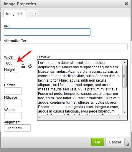
It is great that you figured out how to add the image to the post, though. In the forums, the images posted need to be 800 px or smaller so if you could right click on your image and edit the size to 800 that would be awesome. Watch the Height because for some reason it doesn't always scale down when editing. I'm not sure if that is just me, though. :) So, sometimes I get weird stretching until I get the proportions right again.
Hi All
I'm brand new to Daz, 3D art and art in general. I've been using Daz for about a week, so this is all new to me. I thought I'd give this challenge a try.
Any feedback is appreciated.
as long as that padlock is there the image ratio should stay constant.
BTW the reason that we like to keep forum images to a width of 800 pixels is because of the range of different devices that people use to browse the forums. Widht does not display correctly on some of them once it is above a certain size.
When you are using the insert image tool and get that screem KM shows in her screen shot, if you click on the 2nd tab you will find you can then specify for the image to automatically display (when clicked) in a new window at full size. There are other options on that tab as well.
And just as a reminder. Here is how to upload an image and then use it as an in line image as well. The CVs do need the thumbnail of the image in order to be able to make up a judging thread for them to vote.
SO
Step 1 Load the attachment to make a thumbnail Post the comment
Step 2 Click on the attachment thumb to bring the image up to full size. This is just a normal click at this point
Step 3 Right Click on the full size image and then click on "Copy Image Location" from the drop down
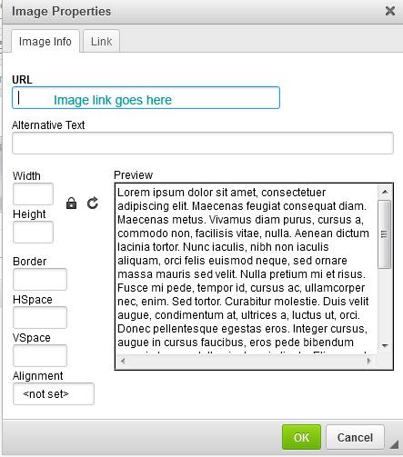
Now click on the gear icon at the top right of your post and click the drop down to edit the post. Once you are on the edit screen, click to insert image
This is where you should now get this screen.
At this point remember to size your image
Then if you click on that 2nd tab, where it says link you will see this screen
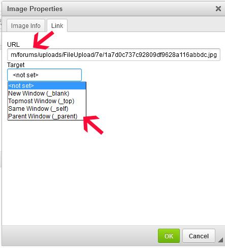
So add the image link again in where it says URL and select how you want your image to display I tend to always use the New Window option.
A test render with the new light setting. I'm not sure if it is still a little too dark.
Hi all, I added a few more elements to this and here is my next render on the project; This is all done in Daz studio and IRay rendering engine.
Winter Fox
This looks really nice! You're definitely on the right track.
There's a thing or two that spring to mind when looking at the picture. Maybe it helps!
First of all, the fox looks realy big in relation to the bridge.
Its tail seems to touch the onramp of the bridge, so it's not as if the camera distance tricks the eye and there's actually quite the distance between the fox and the bridge.
I.e. the fox is big. Also in relation to the trees left and right from it.
Now, this could be a fairy-tale fox and it is supposed to be big, but somehow it doesn't feel that way.
I think I would scale down the fox a bit (33% ?), place it a bit further from the bridge and then have a camera at a greater distance and zoom in more. That would give roughly the same picture but it would make more sense to the eye, I think.
I would also place the fox a bit more to the left so its head would be at or slightly left of the most left pole of the bridge cover. That way the composition would be better balanced (Golden Rules). I also think it then would look more like the fox is guarding the bridge as it appears it is supposed to be doing now; although now it is merely blocking the bridge from anything instead of guarding it.
I would definitely add a Depth Of Field (DOF) to the camera up to about halfway of the bridge so the whole picture gains depth, drama and credibility.
Maybe add a (not too harsh) light from the right onto the fox as well, as now the background is really light, the foreground isn't and the fox tends to wash out. By putting another light on it, it separates itself from the foreground. Could add more drama to the picture with a bit more pronounced shadow from the fox then it has now, too.
Hope this helps!!
Thanks Chohole for the "how to upload an image" tutorial, I learn a lot on forums!
My composition, I tried to use golden ratio and spiral, please tell me what you think...
Ah, thanks, @Chohole. I did not know that. I admit I don't always pay attention to things like that. I'll have to remember that the next time I need to go in adjust the size of an image. :)
I like the additions. I agree that your fox might be a little large when compaired to the bridge. Although, foxes can get quite large depending on the breed. I would definitely look at offsetting the camera so the fox isn't dead center. If you like where the fox is in relation to everything else, try rotating the camera and play with different angles with the rule of thirds grid on your camera. You may be surprised at how much different and interesting things can look with just some slightly different camera angles. Play with it and have fun. :)
You've got some good lights and shadows. Which rendering engine are you using? Composition looks good at first glance. I'll let others comment more about composition, though, as it isn't my strong suit.
Really nice...I really love the mood and the positioning etc. The only thing I would say to add extra punch would be to possibly play with lighting a bit. I think the dimmer light really adds something so don't want to see the "scene" to be brighter but I think it might add something potentially to add a point light or a soft spot light shining towards/ at the face just to make that pop a little and pull him out of the dark just a touch more. You could potentially try brightening the light you have there (I can see some pronounced light all ready so there is a change you have a light in there...maybe try a blue tinge to that light and then make it a bit brighter. Whether you do it or not though really nice so far!
hehe really cute so far. Great job on the expression..makes me wonder what is over yonder I think the neck on both may need played with a little bit possibly but Posing is something we get more in depth on in later months and it can be tough sometimes to get certain poses. Id try maybe twisting a little less at the neck and a bit more at the head maybe and see if that works. Really cute so far though. The lighting and the colors etc all look really nice so far
  As far as the spiral...you could make the render a tiny bit wider possible to add to the spiral (IE so a bit more of the background is visible) Nice job so far!
I really like how the light is bouncing and the shapes etc it is picking up and the shadows those create. As for the darkness it's maybe a little dark. Personally I tend towards brighter blue lights for anything that is "night lit" Obviously the light on the wall wouldn't be that but if she is outdoors there would be some moonlight so a touch of blue lighting tends to add that it is night/dark but still brighten the image. Granted there are lots of ways to accomplish a bit more brightness. You could try turning up the emission on the outside light or even add a spotlight right by that light to direct the light a bit more towards her. Really nice job though. The shadow play especially is very cool
Like where you're going with this. I couldn't help but think of my late father when I saw the ships in a bottle, because he had made one once that the nearest one reminded me of. It was so well done that the local hobby shop had it on display for awhile. (Sorry of this is jumbled, its 0227 hours where I am typing this, and I should be getting some sleep for work in the morning. Night.)