Daz 3D is part of 
Connect
DAZ Productions, Inc.
7533 S Center View Ct #4664
West Jordan, UT 84084
Licensing Agreement | Terms of Service | Privacy Policy | EULA
© 2026 Daz Productions Inc. All Rights Reserved.
Comments
OMG! Thank you for describing the camera lock. In my limited experience I already can't count the number of times I have accidently moved what I thought was an ideal camera set up. Still working on the lighting, but the camera lock made my day.
There's a good script for this here.
The composition is somewhat limited by the HDRI I used, but I'm not sure if I hit it within those limits.
DAZ Studio has a built in Rule of Thirds Guide. Click on the lines with a sideways arrow beside the Perspective View drop down.
You're welcome. It has happened to me more times than I care to admit. :)
Ah, it figures Richard has something to do with that. I'll have to see about adding that script to my scripts. I haven't done that yet. Love the cute little icons that mjc put up on the post for it. :)
I've wanted to know how to lock my darn rendering camera for months now. THANK YOU! I use a bunch of cameras to move around the scene but try to keep my rendering camera in place. Can't tell you how often I've forgotten and moved it out of place.
Ah, well I can't take complete credit for brilliance. That handy little image came from a thread that I found where @Szark provided the info and the picture. I found the thread when I was at wit's end of frustration myself after have accidentally moved the camera myself at least five times in one render session a while back. Locking just a few of those transforms just doesn't do the job. You have to get all of those nodes.
-=-
Here's versions c and d respectively on this.
ooooooo...nice Shinji. I really liked the changes you made when I saw the first image then I scroll down further and I see the second with all the different lighting.
The slight adjustment to Cheetah's head makes a difference. It always amazes me the difference a subtle change in pose or expression can make.
You have done a great job with all the different lighting levels in the 2nd image to draw the eye around your image and the googles on the soldiers stand out more and draw your eye to their faces.
The only suggestion I have is dependent on whether or not you want Cheetah to be the main focus. I am drawn to the soldier exiting the hallway at the back. If you want Cheetah to be the focus you may need a subtle light on her to help her stand out just a bit.
Final Render
I like this Marvel composition. The Hall was a realistic place for this catfight.
For me, the first pic is much more dramatic and better balanced, than the second. Not just because of your neon tubes and the reflections (cool work btw. )
Here's what I got for this month:
THX from me too. I have destroyed my camera setting so often, but with this advice, you have give me a lovely new year present.
I have changed the surface settings from her wardrobe and given her new hair. Not perfect the Underworld style but I think it works out well. Now I should go and put her in a appropriate environment.
That is an awesome render with a good sense for action and movement. What I would like to point you to is that colour is a very powerful tool for composition as well, with those bright spots in the background and the colours overlapping eg at her hair and the background colour I think you can play around with that a bit, and use it with intention
First test render done enough to share. Clearly still a work in progress, not only in composition and lighting, but still working on the props (candle sticks, candles and glassware all made in Carrara - I'm still figuring out how best to make a flame for the candle wick). Any and all input welcome.
Thanks for your feedback Kismet, however I'm going to have to wait until this evening after I get home from work to see what I can do about things. (Maybe I could give her a companion just outside of the frame with a light or something? I don't know right now.)
Has this been there all along??? (face palms)
Here is the latest version of my composition. Any and all suggestions are welcome. I know I have a lot to learn about doing this. Thanks!
Same pose and camera setup. LOTS of lighting changes.
I have another image with some camera changes rendering right now.
I really like the changes you've made in the lighting here. You have some nice highlights and shadows happening on the figure in the foreground. Do you have any lighting on the figure in the background yet? If not, I'm not sure you'll need too much because the lighting you have is having a nice effect on her too.
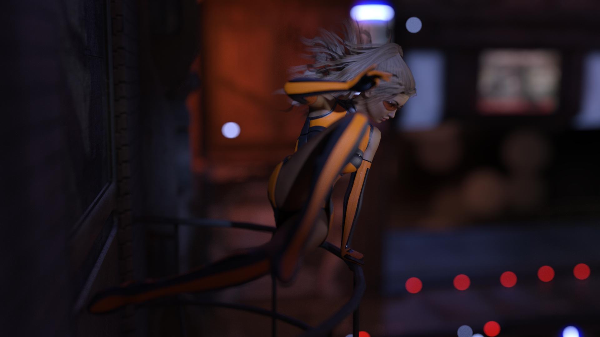
I like the changes in lighting here. Her skin looks a little more natural and you have some night contrast and highlights. I'm not sure what the red dots comes from but those add a nice depth to the image.
I'm embarrassed to say that the first image still had the camera's light turned on. The red dots are part of the background set (Urban Future 2) that I hadn't made emissive yet. I think it's some kind of landing zone. The bigger blurs part of one of the HDRIs from UltraGenesis Bokeh 2: Into the Night.
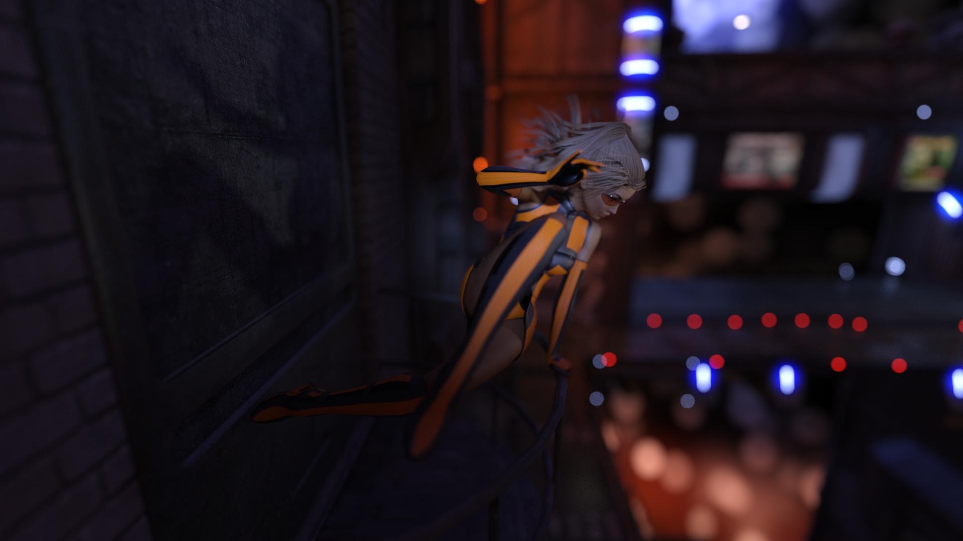
Here's the same scene but with a wider field of view. The camera is closer to the subject, so she's more or less the same size in the frame. Nothing else has changed.
I've got one more image with an even wider field of view rendering.
This is coming along so well - I really like the divide of dark on the left and the lights of the city on the right.
Should she be a little bit more to the left? I'm the worlds slowest learner at this...and these challenges are how I learn. The only trick I've developed on my own (which is probably well known to everyone else) is to look at the thumbnail - both in the file view of your PC/Mac and here - to get a sense of balance/layout without being able to see the details.
Do not be embarrassed by forgetting to turn off the camera light. I did that myself yesterday on a render.
I like the wide angle shot. Your figure's shadow on the wall is easier to see and a nice touch. And as mentioned by yhzmurphy the contrast between the dark on one side and the lights on the other is quite nice.
I like the bigger frame because it gives me more of a sense of the open space she is jumping into. Very cool.
Nice of you to say, thanks. I want to highlight the background figure's face without bringing her entire body out of the shadows. Also playing with making the background figure more in the light and the foreground figure more in shadows. At this point trying to use the image to work on different lighting since that is my kryptonite.
Oh, this composition thread is perfect. I have to admit that although I'm a newbie at DS, I am not a newbie to art, digital art or Poser art... So originally all my questions were about my confusion using DS software. But now I jave a new quandary. I did this art piece that I want to post on my site as a sample of children's art but something is wrong, is missing, something I don't like, and I can't figure out what it is... Yeah, I know it's oversaturated and too yellow, which I personally kind of like but there's something else wrong and I can't figure out what it is...
Anyway, I wrote this in the Toon Generation 2 thread so I hope it's OK to post here too, I'm thinking it may be a different group.
This is what I wrote there:
So this took about 10 hours to render then I ended up doing a ton of postwork on it.... The render was perfectly fine, but just didn't pop. I like to go a little crazy with postwork LOL... I always HAVE to do postwork even with good renders because I like to go more extreme. This was Toon Gen 2 mixed with a bunch of other morphs...
Yeah, I know it's too yellow and oversaturated, but it's a toon and I like them to really pop!!! I'm still not thrilled with it, don't like the top left corner so blank, might add more foliage? I will probably work on it more, but it's time to watch the Golden Globes!
I'd be interested in any suggestions on how to improve it (through postwork, not going to do a whole new render.) Something is off (besides the oversaturation) but I can't figure out what it is. Does the saturation hurt people's eyes? Is it too much? What can make it better, my brain has frozen. Also I was on the phone with a friend for like two hours while I was working on it so not as focused as I could be. Suggestions welcome! I'd like to keep it as a sample of children's/toon art on my site so hoping to get it to its best. Thanks.
And I'd REALLY prefer to fix it with postwork although that is technically out of the scope of this part of the forum but rendering on my CPU capable only Mac just drives me crazy. 10 hours for toons! 10 HOURS! Aaaaaaaaaaaah! :) :) :)
OK, NOW I'm going to watch the Golden Globes...
Wait, edited to add... Is it the background? Too busy and haphazard? That may be it... Which is why I usually like to render characters separately from scenes. I may try to remove the background through postwork, I actually like the pose of the girl and dog at least. Those two lighter color leaves on both right and the left are especially bothering me... Still interested in any and all opinions and suggestions. Thanks.
Since I'm asking for help, I thought I'd try to give a little back. For me, there is wayyyy too much dark space on the left. I would chop most of it off and then just have her looking off to the right and not centered in the middle. As I'm much more of a postwork person than DS savvy, I would then brighten up some of the left side in postwork and bring out all the details and shadows in nooks and crannies and fix the brightness/contrast on the whole scene and using dodge to bump up areas like her face you want to highlight and burn to gve it contrast where needed. Maybe give a little glow to the colored lights on the right. Maybe give the darker left part of the scene a bit more of a bluer tone and the right a bit more yellow to make it pop. Of course I'm giving postwork advice and very little advice about DS itself, because I am way too much of a newbie to help correcting the lighting in DS itself.
Oh, and maybe move her back leg in closer so you can lop off more of the dark empty space on the left without chopping her leg off! :)
Save