October, 2023 - Daz 3D New User Challenge - Atmosphere, Ghosts and Special Effects

2

Comments

  • dreamcatcherphoto said:

    f.boschanski said:

    dreamcatcherphoto said:

    Ok there that seemed to work on my end ...are you seeing it now in the original post?

    yes.

    btw.: nice picture, well done.

    EDIT: you probably need to add info on what category you wish it to enter..

    I edited the info on the submission ...hopefully thats correct as to what i was entering ...I have never posted and i started using 3d rendering about 2 weeks ago  by getting the daz 3d program then some add ons. If you think there is a better category I sure could use some direction as I am clueless on entering challenges here. Thank you so much for the kind words and thank you so much for showing me how to set up my posts better.


    While i am using DAZ for about a year now, i only started to learn about rendering last month myself. Usually i was/am using DAZ to create my own 3D printables.
    Yeah. You decide your tasks. Don`t worry. Its just, that this particular thread does host two challenges. And we were asked to specify which one we would like to enter with a particular submission.

    If you are interested in more challenges, you could have a look in the general forum. under artists there is the rrrr-challenge, which asks you to randomly pull 4 items of your library and work with those along a given theme.
    However, as you are quite new, i would assume, that there are probably not a lot of items to pull from.
    The other one i decided to join, is the freebie challenge under freebies category.  a good place to find some free items too.

  • f.boschanski said:

    dreamcatcherphoto said:

    f.boschanski said:

    dreamcatcherphoto said:

    Ok there that seemed to work on my end ...are you seeing it now in the original post?

    yes.

    btw.: nice picture, well done.

    EDIT: you probably need to add info on what category you wish it to enter..

    I edited the info on the submission ...hopefully thats correct as to what i was entering ...I have never posted and i started using 3d rendering about 2 weeks ago  by getting the daz 3d program then some add ons. If you think there is a better category I sure could use some direction as I am clueless on entering challenges here. Thank you so much for the kind words and thank you so much for showing me how to set up my posts better.


    While i am using DAZ for about a year now, i only started to learn about rendering last month myself. Usually i was/am using DAZ to create my own 3D printables.
    Yeah. You decide your tasks. Don`t worry. Its just, that this particular thread does host two challenges. And we were asked to specify which one we would like to enter with a particular submission.

    If you are interested in more challenges, you could have a look in the general forum. under artists there is the rrrr-challenge, which asks you to randomly pull 4 items of your library and work with those along a given theme.
    However, as you are quite new, i would assume, that there are probably not a lot of items to pull from.
    The other one i decided to join, is the freebie challenge under freebies category.  a good place to find some free items too.

    Thank you so much for all the information and the assistance...I will eventually have a library to pull from but yes I am just starting out so that might be out for now. I love getting free stuff...don't we all ...every little bit helps it seems to compose a themed image. I will certainly be checking out those areas as well once i can even get a hang of how to submit at all lol. All that said i cannot reiterate how helpful you have been and it is much appreciated :) 

  • f.boschanski said:

    marconft6 said:

    ...

    Nice entry!

    Very interesting with the stacking idea. However, i do not understand the need for smoothing.
    Did you parent the figures to each other and then set collisions amongst them?

    This is exactly what I did. The reason I did this was so that the two faces melded together slightly. I didn't deform the inner model, just the outer. Adding the smoothing modifier caused the outer skin to bulge around the eyebrows, nose, chin, and cheeks while fitting better near the lips and mouth. I didn't just want the interior bones to stick out, I wanted the feel of them being pushed through the skin while the skin molds around them.

    Maybe it isn't perfect, but I'm headed out of town and won't get a chance to fix it before the end of the month.

  • dreamcatcherphoto said:

    This is my Submission for the Beginner challenge ..In attempts to create an overall atmosphere using lighting and posing and enviromental as well as compsition 

    Title: Succubus Chained

    I have to set up my gallery I will try to edit this post with the link to my gallery and a larger version when completed but here is the submission for beginner. I think i covered the concept or concepts you were looking for ..if not i can always make adjustments or submit another..fingers crossed. I made this charachter to go with my original charachter which is my version of a warlock in the game World of Warcraft...this is her minion "Minx" a succubus. I am trying to attach a version big enough to see clearer so bear with me. 

    This is a great first image. I'm quite impressed and looking forward to see what else you can do.

  •     Thank you so much my friends told me to submit to the challenge I was hesitant at first as I really am just grasping the program ..this image was one i was actually practicing from tutorials on Primative lighting and Camera set up as well as enviromental fog. I have an extensive history in photography specifically fashion photography so understanding the entire concept of framing composition and lighting came fairly easy even as it was a different platform. The rest I have had my head down into the tutorials and non stop practice for the last two weeks..i am very impressed with the program as it allows me to do anything especially with ghosting the primatives. I am in love with this platform and it's vast array of tools and abilities...i'm merely a kid in a candy shop..learning as I go. Now if i could figure out how to post things better and build my gallery lol. 

  • marconft6 said:

    f.boschanski said:

    marconft6 said:

    ...

    Nice entry!

    Very interesting with the stacking idea. However, i do not understand the need for smoothing.
    Did you parent the figures to each other and then set collisions amongst them?

    This is exactly what I did. The reason I did this was so that the two faces melded together slightly. I didn't deform the inner model, just the outer. Adding the smoothing modifier caused the outer skin to bulge around the eyebrows, nose, chin, and cheeks while fitting better near the lips and mouth. I didn't just want the interior bones to stick out, I wanted the feel of them being pushed through the skin while the skin molds around them.

    Maybe it isn't perfect, but I'm headed out of town and won't get a chance to fix it before the end of the month.

    thank you for the explanation. i am always eager to learn how others approach a certain task.

  • LeanaLeana Posts: 11,304

    Shinji Ikari 9th said:

    Here's version B giving a shot at tweeking the flames some.  At least the one on the right is different, though I can't say clearly on the one closer to the monster even though I did tweek it as well.

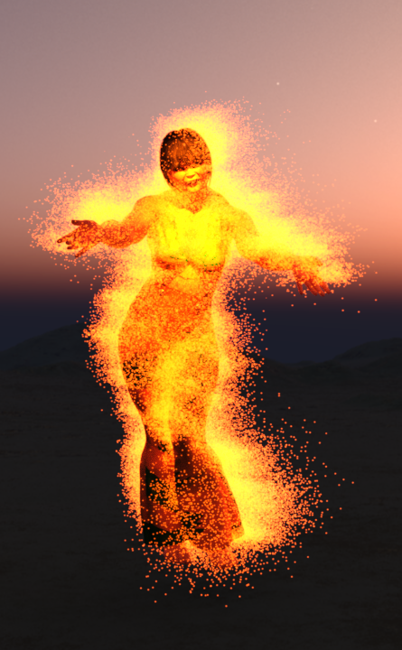
    The flames look better

    Shinji Ikari 9th said:

    Got an idea for a potential second project for this month.  We've found a Shadowrunner and are getting a fireball right in the face for our trubbles.

    Good start. There should probably be a bit more light on the figure since there's a huge fureball nearby.

  • LeanaLeana Posts: 11,304

    f.boschanski said:

    Get Out Of My Head (wip)
    inspired by Elle Kings - Can`t Be Loved


    This is my current project. Thought i should post some wip-pictures.
    While i am not anywhere close to finish, i feel pretty good about the progress made.
    In particular regarding the lighting.
    If you have a look ar rhe first quick render to the actual one, you might get an idea, what i am aiming for.
    Still got to figure out how ro create a decent ghosting effect. The first texperiments, as seen in the first iteration,
    were done with "mesh to volume" and "volume to mesh", then experimenting with different surface settings.
    However, it is still to dense and looks more like marshmellow men standing behind the figure.
    I need to figure out, how to gradually change opacity to zero towards the outer rims. might work with a gradient opacity texture mask?
    Gotta try it out, but first i will try to experiment, if i can`t get a less dense ghost mesh with the current method. Probably need to increase turbulence and allow expansion beyond the borders.
    While the final scene is kinda set now, i had to split it up for these experiments. Otherwise my outdated gfx card doesn`t handle the workload too well.
    Better to do those experiments on smaller scale settings.

    (EDIT: regarding the ghosting... ofc i could try and render layers, then adjust the ghosting layer in photoshop.. However, my goal is to achieve a better effect without postwork. Its all about trying to improve the base render. Not having to fix that much afterwards.)
     

    Interesting effect on the glow. I agree it's a bit too thick, and maybe too uniform.

    There are a few products with aura / halo effects, that might give you a few ideas on how to modify the effect:

    https://www.daz3d.com/halo-effects

    https://www.daz3d.com/fsl-flexible-auras-and-halos

    https://www.daz3d.com/sf-auras-genesis-8-male

    https://www.daz3d.com/sf-auras-genesis-8-female

  • LeanaLeana Posts: 11,304

    sueya said:


    This is my next version of my image

    I have changed the floor texture and altered the light in his hand

    Nice one, the shadows are quite interesting here.

  • LeanaLeana Posts: 11,304

    marconft6 said:

    Intermediate Challenge

    Title:  Phantom Express

    About:  In a desolate, overgrown railway station, the villainous conductor relentlessly drives his spectral train through the night, collecting lost souls bound for an eerie destination. Passengers aboard his ghostly locomotive are condemned to an eternal journey on the cursed track, their agonized screams echoing through the dark, twisted, tunnels as they become part of the conductor's sinister spectral orchestra.

    Great picture, I really like the effect

  • LeanaLeana Posts: 11,304

    dreamcatcherphoto said:

    This is my Submission for the Beginner challenge ..In attempts to create an overall atmosphere using lighting and posing and enviromental as well as compsition 

    Title: Succubus Chained

    Really nice pic! I like the atmosphere.

    There's something a bit weird with her hip, but I suppose it's due to the pose...

  • f.boschanskif.boschanski Posts: 188
    edited October 2023

    Leana said:

    ...

    Interesting effect on the glow. I agree it's a bit too thick, and maybe too uniform.

    There are a few products with aura / halo effects, that might give you a few ideas on how to modify the effect:

    https://www.daz3d.com/halo-effects

    https://www.daz3d.com/fsl-flexible-auras-and-halos

    https://www.daz3d.com/sf-auras-genesis-8-male

    https://www.daz3d.com/sf-auras-genesis-8-female

    Thank you for your feedback! Very much appreciated and i will have a look into these products.

    However, i already purchased quite a lot of products for atmospheric and special effect tasks this month and there won`t be any more additions for now. I am way over my budget already.
    (My library wasn`t really build for this before, because there is no use for these things when you mainly aim to create 3D.objects)

    Also, after spending some time on other projects to learn a bit about the ropes regarding this months topics, i fell ill and lost the connection to my first project.
    I think i had already achieved the effect i was aiming for

    But to be honest, i would have had to spend a lot of time to get back into it and another truth is, it is quite plentyful regarding the polygons.
    Just imagine the above but times eight or nine...
    While i could prepare them one by one and then merging it later, my system does have a hard time handling such heavy scenes. navigation and doing changes is quite a pita.

    Therefore i put the project aside. Not to be forgotton, but to be taken up again on another day, when there is more patience, time and motivation to be found to bear with these issues.

    I already am close to finish my new project. But it crashed last night during rendering and i had not saved before. Had to go back and re-do the last hour of work and now it was rendering for about - i don`t know - a lot of hours.
    I might do some post-work or do another render.. because i am dumb and after re-doing the pre-crash work, i forgot to auto-focus the camera again and enable depth of field....
    also, there is a slight misalignment for the torches effect and its opacity is probably a bit more heavy than i would like it to be...
    but thats where i am atm..

    Surprise, surprise...


    I really can`t figure out the proper brightness. while it does look too bright on my secondary (glass panel ips 1440p) screen, it looks quite right on my working monitor (matte ips screen 1440p).
    If i go darker, it would be too dark on some screens, if i let it be, it will loose some atmosphere on screens, calibrated like my secondary.

    Discovery_01.png
    890 x 1441 - 1M
    Post edited by f.boschanski on
  • LeanaLeana Posts: 11,304

    f.boschanski said:

    Leana said:

    ...

    Interesting effect on the glow. I agree it's a bit too thick, and maybe too uniform.

    There are a few products with aura / halo effects, that might give you a few ideas on how to modify the effect:

    https://www.daz3d.com/halo-effects

    https://www.daz3d.com/fsl-flexible-auras-and-halos

    https://www.daz3d.com/sf-auras-genesis-8-male

    https://www.daz3d.com/sf-auras-genesis-8-female

    Thank you for your feedback! Very much appreciated and i will have a look into these products.

    However, i already purchased quite a lot of products for atmospheric and special effect tasks this month and there won`t be any more additions for now. I am way over my budget already.
    (My library wasn`t really build for this before, because there is no use for these things when you mainly aim to create 3D.objects)

    I was mainly suggesting using the promo pics as inspiration, though of course using the product themselves can help.

    Also, after spending some time on other projects to learn a bit about the ropes regarding this months topics, i fell ill and lost the connection to my first project.
    I think i had already achieved the effect i was aiming for

    That one is indeed pretty nice!

    But to be honest, i would have had to spend a lot of time to get back into it and another truth is, it is quite plentyful regarding the polygons.
    Just imagine the above but times eight or nine...
    While i could prepare them one by one and then merging it later, my system does have a hard time handling such heavy scenes. navigation and doing changes is quite a pita.

    Therefore i put the project aside. Not to be forgotton, but to be taken up again on another day, when there is more patience, time and motivation to be found to bear with these issues.

    Perfectly understandable :)

    I already am close to finish my new project. But it crashed last night during rendering and i had not saved before. Had to go back and re-do the last hour of work and now it was rendering for about - i don`t know - a lot of hours.
    I might do some post-work or do another render.. because i am dumb and after re-doing the pre-crash work, i forgot to auto-focus the camera again and enable depth of field....
    also, there is a slight misalignment for the torches effect and its opacity is probably a bit more heavy than i would like it to be...
    but thats where i am atm..

    Surprise, surprise...


    I really can`t figure out the proper brightness. while it does look too bright on my secondary (glass panel ips 1440p) screen, it looks quite right on my working monitor (matte ips screen 1440p).
    If i go darker, it would be too dark on some screens, if i let it be, it will loose some atmosphere on screens, calibrated like my secondary.

    That one is really nice! I love her expression, it really fits the moment.

    Overall brightness seems fine on my monitor.

  • csaacsaa Posts: 815

    f.boschanski said:


    Surprise, surprise...


    I really can`t figure out the proper brightness. while it does look too bright on my secondary (glass panel ips 1440p) screen, it looks quite right on my working monitor (matte ips screen 1440p).
    If i go darker, it would be too dark on some screens, if i let it be, it will loose some atmosphere on screens, calibrated like my secondary.

    f.boschanski,

    It's always intersting to infuse our images with stories, and your "Surprise, Surprise" invites the viewer into the one you've created. Very creative! Hope to see more.

    As to brightness and color hues, it comes out vividly in my display. Have you considered callibrating your monitors using a colorimeter, such as the one from Spyder? Basically it test various aspects of the monitor against industry standards, (Adobe RGB for example) and guides us in adjusting the monitor settings until we callibrate the monitor within accepted ranges. But even with that, two monitors may have different color depth and brightness range. In that case, the same image will look subtly different, regardless of the callibration.

    Cheers!

  • csaa said:

    ...

    f.boschanski,

    It's always intersting to infuse our images with stories, and your "Surprise, Surprise" invites the viewer into the one you've created. Very creative! Hope to see more.

    As to brightness and color hues, it comes out vividly in my display. Have you considered callibrating your monitors using a colorimeter, such as the one from Spyder? Basically it test various aspects of the monitor against industry standards, (Adobe RGB for example) and guides us in adjusting the monitor settings until we callibrate the monitor within accepted ranges. But even with that, two monitors may have different color depth and brightness range. In that case, the same image will look subtly different, regardless of the callibration.

    Cheers!

    Thank you for your feedback! Very much appreciated!

    i have tried several calibration tools, though it has been some years since.
    Never could get the hang of it. Never thought it was something that was too helpful.

    But i will have a look into the one you spoke about. Gotta do some research to find it, as i can`t remember hearing this name ever before.
    As far as i remember, professional calibration is done by instruments that are able to measure the wavelengths. Which does not come cheap to have it done.
    In the end its just a hobby and one needs to decide where to put the money.


  • f.boschanskif.boschanski Posts: 188
    edited October 2023

    This will be my entry for the beginners challenge this month:

    Surprise, surprise...


    a bit of postwork done in photoshop CS4: frame and colour corrections, took away some of the "pow" from the torches effect (mostly desaturate). i had it rendered at only 5% opacity, but it is/was still punching through.

    Surprise.png
    1879 x 2980 - 8M
    Post edited by f.boschanski on
  • csaa said:

    ... a colorimeter, such as the one from Spyder...

    oh, ic....
    it is in fact a hardware solution.
    Sadly, i am pretty broke right now and it will be a while until i can spare that amount of money.
    I got 2 months of DAZ+ left. Want to make the most out of it, as it is unlikely that i will be able to allow myself to re-subscribe.

  • Leana said:

    dreamcatcherphoto said:

    This is my Submission for the Beginner challenge ..In attempts to create an overall atmosphere using lighting and posing and enviromental as well as compsition 

    Title: Succubus Chained

    Yes I have also had that in my thoughts and i was going to see what morphing her size down a little would do as well and possible creating a slight position change. I will be looking more into that this evening...and will see what i can do to final out that project. I appreciate you pointing that out and I concur completely.

    Really nice pic! I like the atmosphere.

    There's something a bit weird with her hip, but I suppose it's due to the pose...

  • Hellkitty742Hellkitty742 Posts: 47
    edited October 2023

    f.boschanski said:

    This will be my entry for the beginners challenge this month:

    Surprise, surprise...


    a bit of postwork done in photoshop CS4: frame and colour corrections, took away some of the "pow" from the torches effect (mostly desaturate). i had it rendered at only 5% opacity, but it is/was still punching through.

    I really love the feel of this work...great render!


    Post edited by Hellkitty742 on
  • dreamcatcherphoto said:

    ...

    I really love the feel of this work...great render!


    Thank you!

  • aprilshowers2065aprilshowers2065 Posts: 715
    edited October 2023

    Whatever the Cost

    Intermediate Contest

    Whatever the Cost5.jpg
    1667 x 2000 - 3M
    Post edited by aprilshowers2065 on
  • csaacsaa Posts: 815

    f.boschanski said:

    This will be my entry for the beginners challenge this month:

    Surprise, surprise...


    a bit of postwork done in photoshop CS4: frame and colour corrections, took away some of the "pow" from the torches effect (mostly desaturate). i had it rendered at only 5% opacity, but it is/was still punching through.

     f.boschanski,

    This is a great improvement from the earlier version. The troll/monster now stands out from the gloomy background. Glad you found a way to adjust the brightness levels and that it came out well. laugh

    I know we fuss a lot about the techniques, and that these parts of the Daz Forums are a wonderful ways to experiment and get feedback. But from a viewer's perspective our mind-eye seems to work in Gestalt fashion,  meaning that we distill the details of the scene and strive to arrive at the "story" behind it all. My philosphy: the image is the handmaiden to the story. I just want to point out again that your scene has story, something all the effort you put into the techniques delivers with a good punch.

    Hope you extend or find a way to get back to Daz+ soon. Life -- real life -- has its ups and downs; there's always a need for creativity. To that end, Daz is a great tool. Hope too to see your handiwork in other portions of the Daz Forum.

    Cheers!

  • LeanaLeana Posts: 11,304

    f.boschanski said:

    This will be my entry for the beginners challenge this month:

    Surprise, surprise...


    a bit of postwork done in photoshop CS4: frame and colour corrections, took away some of the "pow" from the torches effect (mostly desaturate). i had it rendered at only 5% opacity, but it is/was still punching through.

    Really nice! The color correction gives a very interesting overall effect. 

  • csaa said:

    ...

     f.boschanski,

    This is a great improvement from the earlier version. The troll/monster now stands out from the gloomy background. Glad you found a way to adjust the brightness levels and that it came out well. laugh

    I know we fuss a lot about the techniques, and that these parts of the Daz Forums are a wonderful ways to experiment and get feedback. But from a viewer's perspective our mind-eye seems to work in Gestalt fashion,  meaning that we distill the details of the scene and strive to arrive at the "story" behind it all. My philosphy: the image is the handmaiden to the story. I just want to point out again that your scene has story, something all the effort you put into the techniques delivers with a good punch.

    Hope you extend or find a way to get back to Daz+ soon. Life -- real life -- has its ups and downs; there's always a need for creativity. To that end, Daz is a great tool. Hope too to see your handiwork in other portions of the Daz Forum.

    Cheers!

    Thank you for your kind words and your "almost poetic" feedback. It means a lot to me and i had to take a step back, let it sink in to reply in proper fashion on another day.
    I agree, its the story behind that needs to be found within the chosen setting, posing, expressins and atmosphere. And these challenges i participate in, are mere or foremost lessons to find the proper language and techniques to improve on that task.
    Its even more important for my creation of 3d printables, because the options are more limited. One has (to try) to achieve it without colour, fx, atmosphere and most of the scenery.
    If there is no story to be found, its hardly more than a show-off of technical skill. (which doesn`t have to be bad, but feels as if one does miss out on opportunities)

    Again: "Thanks for caring!". Very much appreciated.

  • f.boschanskif.boschanski Posts: 188
    edited October 2023

    Leana said:

    ...

    Really nice! The color correction gives a very interesting overall effect. 

    Thank you!
    Yes, i like it much better now. Its closer to what i had in mind, when i set up the scene.
    In fact, i had a blue moon with a white backlighting, the ground fog asf..  to give the impression of a cold, nightly environment. only wanted the torch to emit some warmth. (paired with a warm spotlight to aid the torches light, as i could not crank the torches light up too much - i already had to manipulate the scenerys reflection properties to remove some undesired reflection effects.)
    However, i still do struggle to achieve the desired result within the render itself. Balancing the lights, the atmosphere to give the proper feedback within the camera frame and upon the protagonists and scenery...
    its not (yet) something that does come with ease. With the vast amount of control options and needs, there is a balance to be found, between "not enough" and "too much".
    thats why i still had to balance the colours in postwork. It was there, but not yet visible.

    For the final iteration i had the lights moved by 15° backward rotation and the ground fog increase by about a third opacity compared to where it had been before. And some minor tewaks here and there.


    In hindsight, i feel that i could have been more careful with my torch effect manipulation. Zoomed in at a 100% one can clearly spot some overpainting and poor blending of the effects colour with the surroundings.
    But i had to let go and i feel, it does look "ok" at the 1440p background size, that it is intended to be used at.
    There are other matters i need to attend to right now.

    Post edited by f.boschanski on
  • Hellkitty742Hellkitty742 Posts: 47
    edited October 2023

    So I made some changes to "Succubus in Chains" The leg section  was looking odd but while I did that i decided to use creative angle and some red backlighting using a ghosted primative between the model and the back wall to create a more red hue off the back ground versus the plain stone look..as well as i opened it to two sided so it would backlight the model creating a more dramatic effect off the wings and flooring. I am also wanting to see if i can create a halo under her to give a firery circle to represent a summoning portal being activated...perhaps a very light ring of fire.


    Succubus in Chains Final ce rz2.jpg
    2500 x 1875 - 7M
    Post edited by Richard Haseltine on
  • Hellkitty742Hellkitty742 Posts: 47
    edited October 2023

    This Is one with a portal created under her as if being summoned versus the fog with a little different lighting 


    Succubus in Chains 7 final with portal rz 2500.jpg
    2500 x 1875 - 7M
    Post edited by Hellkitty742 on
  • f.boschanskif.boschanski Posts: 188
    edited October 2023

    dreamcatcherphoto said:


    This Is one with a portal created under her as if being summoned versus the fog with a little different lighting 


    I like the flying red pentagram/runes a lot. But, tbh, not a big fan of the blue one. Maybe if the floor beneath would be darker(you know.. some dark reflecting marmor or even reflecting glass maybe?), or maybe just the ring needs another value?
    as it is, i feel it doesn`t really fit the colour palette of its surroundings. The removal of the fog made the floor texture more prominent and therefore "a thing". Its resolution does seem to be too low once it gets attention. (did not seem to matter with the fog above.) The broken corner bottom right, that had been hidden before, does look somewhat weird and out of place to me.
    Take all this with a grain of salt. Its just "one" perception from a rookie. It is personal taste and you should foremost trust your own instincts.
    Its just that, while i try to not be disheartening or rude, i do believe its most helpful to be honest. For me these challenges are not about competition, but about helping each other to grow as an artist.
    And i wish others to do the same when they do give feedback to my work.

    EDIT: and while i am at it.... i would try to scale down the chain about 20% or 30%. It does look out of scale to me and as if she could just slip her head out of it without any issue. Again, that is personal taste and nothing i wrote here is guaranteed to be any improvement. its just what i would try if it was mine.
    Please forgive me, if i have gone too far. My only intention is trying to be helpful.

    EDIT2: regarding the the one with the fog..  i think you lost some important darks. (if you compare the wings colours within the two pics you posted last. the latter one looks much better imho)
    but its nothing, that some value correction in postwork could not solve.

    Post edited by f.boschanski on
  • Hellkitty742Hellkitty742 Posts: 47
    edited October 2023

    f.boschanski said:

    dreamcatcherphoto said:


    This Is one with a portal created under her as if being summoned versus the fog with a little different lighting 


    I like the flying red pentagram/runes a lot. But, tbh, not a big fan of the blue one. Maybe if the floor beneath would be darker(you know.. some dark reflecting marmor or even reflecting glass maybe?), or maybe just the ring needs another value?
    as it is, i feel it doesn`t really fit the colour palette of its surroundings. The removal of the fog made the floor texture more prominent and therefore "a thing". Its resolution does seem to be too low once it gets attention. (did not seem to matter with the fog above.) The broken corner bottom right, that had been hidden before, does look somewhat weird and out of place to me.
    Take all this with a grain of salt. Its just "one" perception from a rookie. It is personal taste and you should foremost trust your own instincts.
    Its just that, while i try to not be disheartening or rude, i do believe its most helpful to be honest. For me these challenges are not about competition, but about helping each other to grow as an artist.
    And i wish others to do the same when they do give feedback to my work.

    EDIT: and while i am at it.... i would try to scale down the chain about 20% or 30%. It does look out of scale to me and as if she could just slip her head out of it without any issue. Again, that is personal taste and nothing i wrote here is guaranteed to be any improvement. its just what i would try if it was mine.
    Please forgive me, if i have gone too far. My only intention is trying to be helpful.

    EDIT2: regarding the the one with the fog..  i think you lost some important darks. (if you compare the wings colours within the two pics you posted last. the latter one looks much better imho)
    but its nothing, that some value correction in postwork could not solve.

    Yeah i wasn't so sold on the blue circle either...some valid observations thank you

    Post edited by Richard Haseltine on
  • csaacsaa Posts: 815

    dreamcatcherphoto said:

    So I made some changes to "Succubus in Chains" The leg section  was looking odd but while I did that i decided to use creative angle and some red backlighting using a ghosted primative between the model and the back wall to create a more red hue off the back ground versus the plain stone look..as well as i opened it to two sided so it would backlight the model creating a more dramatic effect off the wings and flooring. I am also wanting to see if i can create a halo under her to give a firery circle to represent a summoning portal being activated...perhaps a very light ring of fire.


    dreamcatcherphoto

    Hi, this is the version I like! The myst, the red backlighting and the low camera angle dials up the intensity of the gloom and horror in the scene.

    In a visual medium such as this, there's a temptation to show-it-all -- that is, have sharp details from foreground to background. We rach a point though when too many details become overwhelming to the viewer. As the saying goes: less is more. To this end, I'd like to offer a few suggestions.

    (1) Depth of Field. The Daz camera system is quite good a mimicking real world lenses. You can play around with it and get surprising results, just as with a digital camera. Looking at your render, we could say that you have an f/16 of f/22 aperture. Very crisp details from end to end. Have you consdered a shallow DOF, say f4 or even f2.8, focused on the face? The narrow field of sharpness guides the eye to the figure, the heart of the scene.

    (2) Noir Lighting. Film noir from the 1940s is all about moody lighting, often using a key light on the face and a rim light to outline the subject. To heighten the sense of mystery and horror, perhaps you can dial down the intensity of the  foreground light, leaving only the red highlights to define the outline of the figure (particularly the horns and the bat wings) and of the architecture in the background. Then shine a focused lamp on her face. If you set the angle right, that catchlight should set off reflections on her fangs and eyes, upping the drama.

    (3) Lense Angle. Try to get closer to the subject and tilt the upward camera further while still capturing the architectural details in the background. Then switch to a wide angle lens, say 33mm or even 28mm. You'll likely see a more dramatic, more sinister scene.

    Daz is a great tool for exploring visual effects. I really enjoy the creativity you bring to this image and wish you well.

    Cheers!

Sign In or Register to comment.