Star Trek Builders Unite 7: The Continuing Mission
This discussion has been closed.
Daz 3D is part of 
Connect
DAZ Productions, Inc.
7533 S Center View Ct #4664
West Jordan, UT 84084
Licensing Agreement | Terms of Service | Privacy Policy | EULA
© 2026 Daz Productions Inc. All Rights Reserved.
Comments
Unfortunately I am kind of terrible at matching up poser people to real people. :(
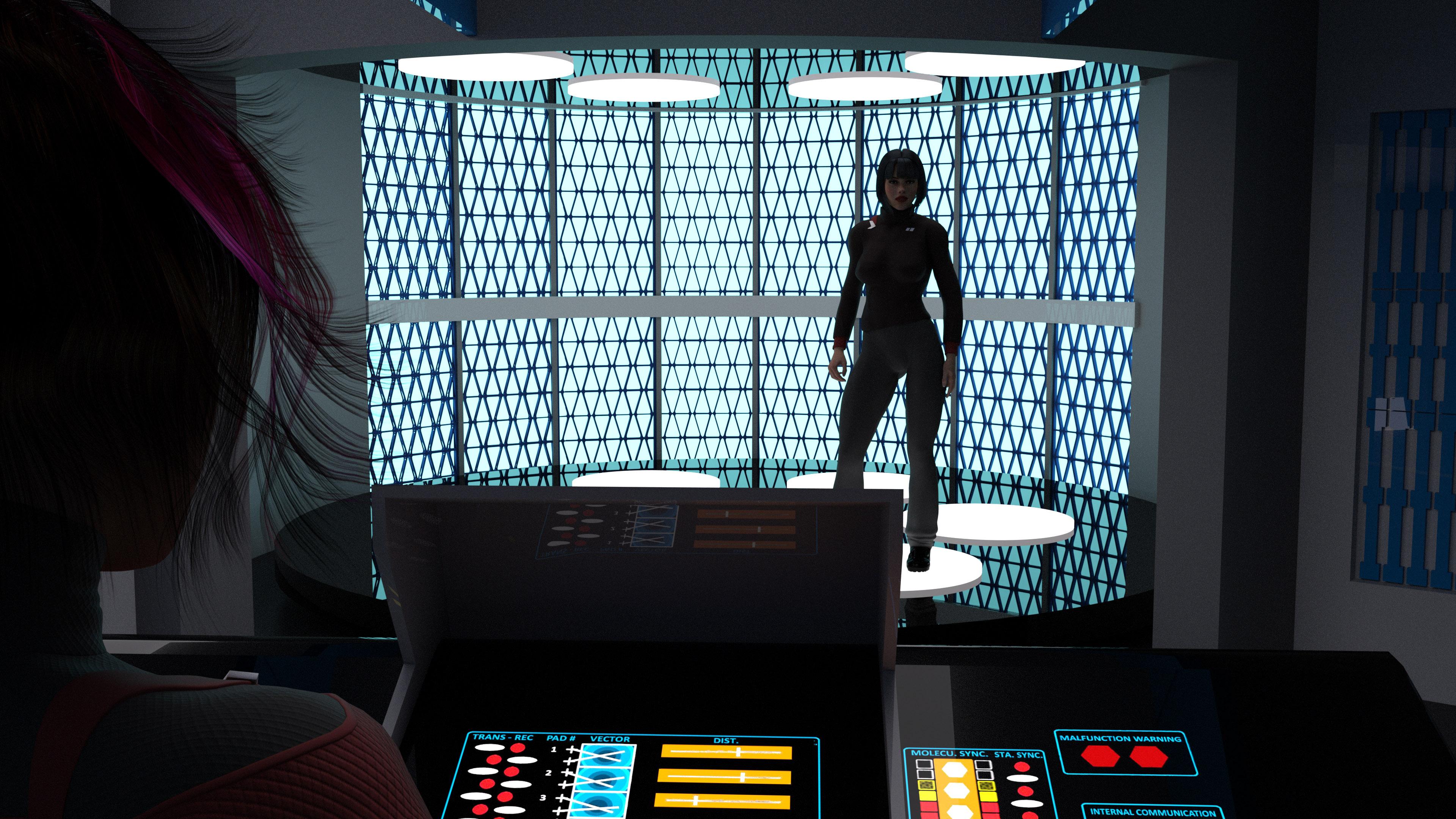
Re-renders of the Destroyer Transporter Room. Made some changes. Added in a new console to replace the TMP style one with something in between. Added floor textures to the raised floor and a safety thing so visiting Admirals don't trip, changed out the outside corridor to the Destroyer Radial Corridor, and now I'm ready to work on the other side of the room. ;)
New render with spherical camera. This time at 8k x 2k (took forever) with the chairs in place.
@Night-Forager : Was it the set of renders showing how it interacts with the light that convinced you, or do you just like that texture better?
The one on the right; the background should help the main object stand out, but the background on the left's badge (a very cool texture) is too "busy" and distracts from the main element rather than focusing attention on it.
-- Wal Sterdan
Lets try this again from scratch. The new insignia first. Illustrating how it reacts to light from different angles
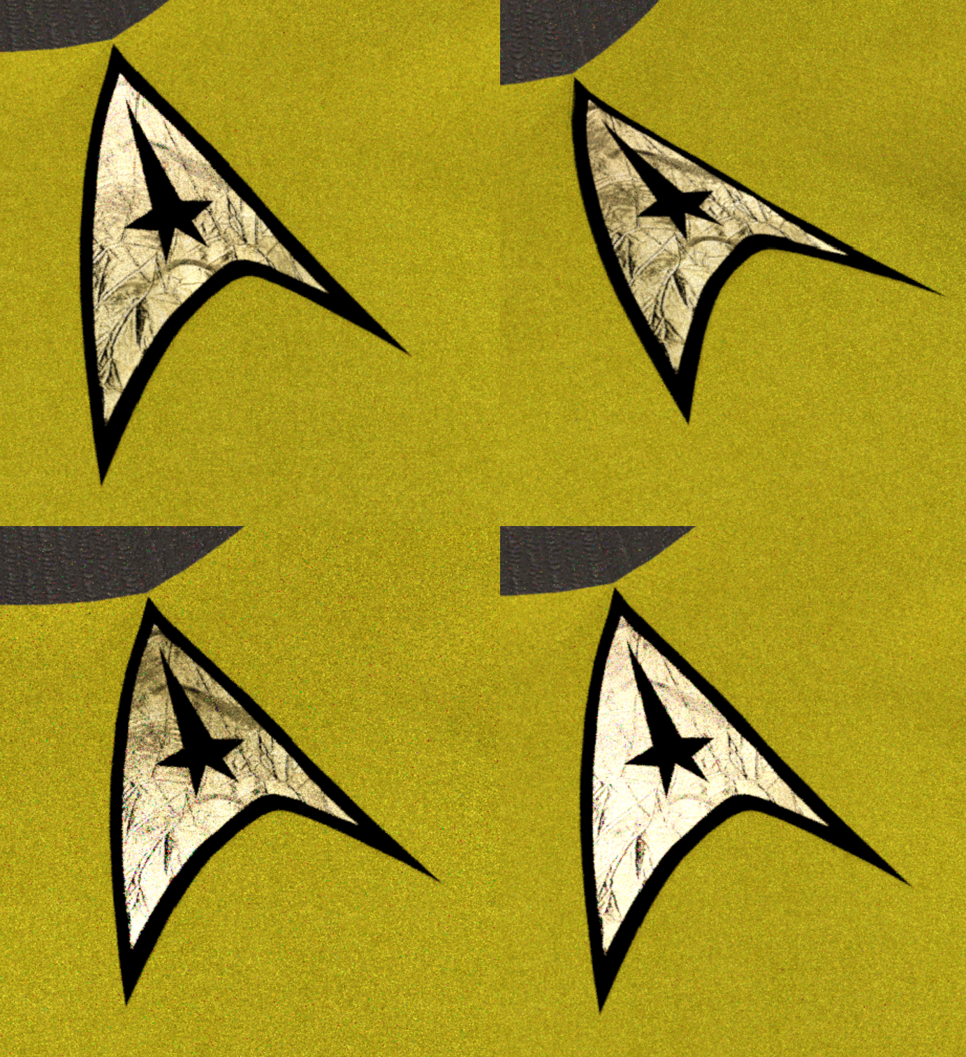
The first comparison I did not have the shader set correctly, so it was just flat.
And here is the old one again for comparison, both an up close and a distance render.
JamesJAB, now I'm liking both of them for different reasons. >_< Go with the one you like the most. We'll deal. This is your baby. ;)
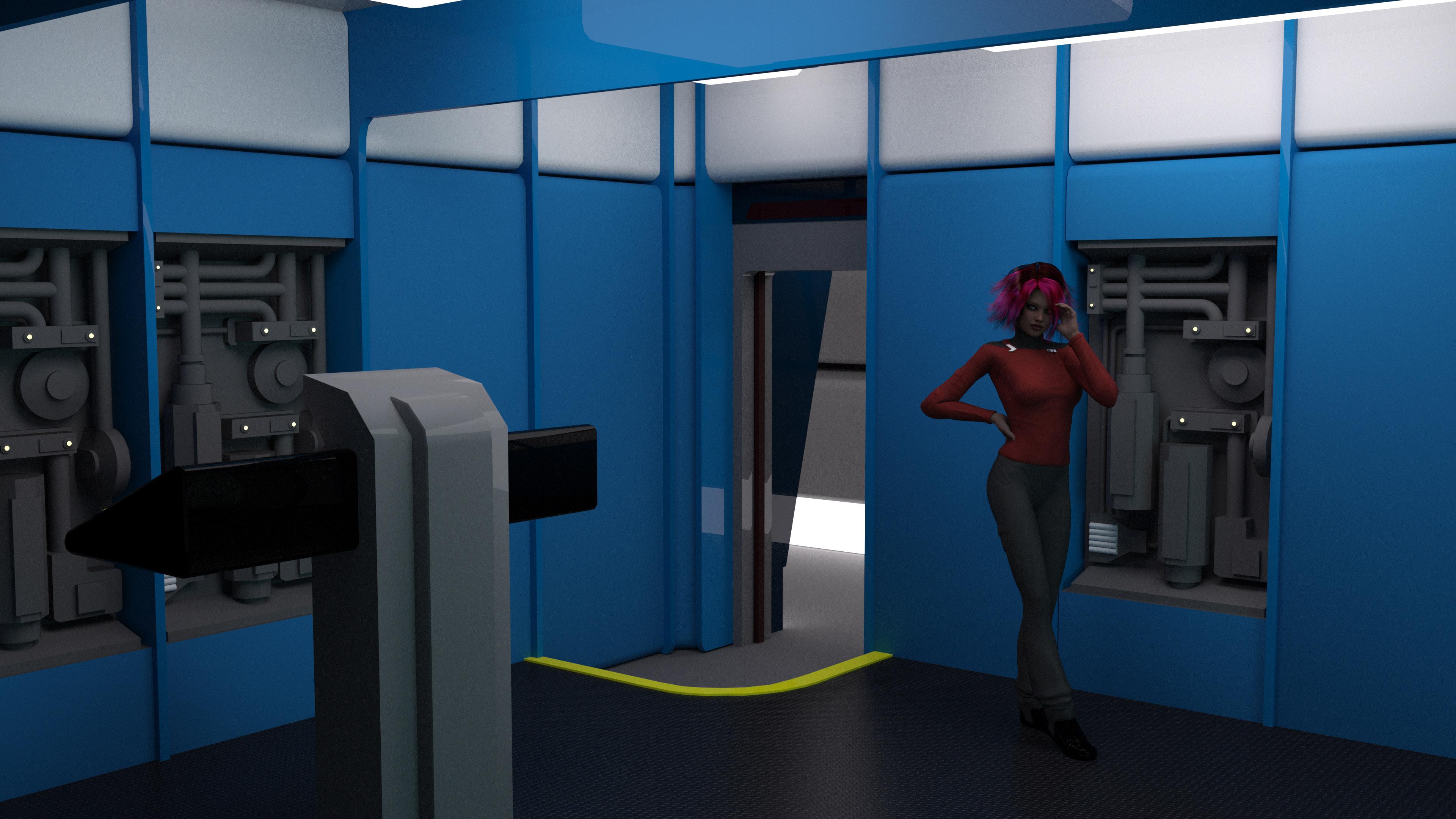
Speaking of, two more renders of the Destoryer Transporter Room. I need to make up some signage for the corridor and maybe the instructions for the tranporter and then she's all done.
Does no one pay any attentinon to those Transporter Malfunction warning lights on the console? No wonder the Star Trek universe is full of transporter accidents. This is why we can't have nice things! :P
Your transporter room looks great by the way.
LOL Yeah I should probably do up a texture set where those AREN'T lit up. ;) I'm pretty sure the only two who ever looked at those were Scotty and O'Brien which explains a lot ;)
And thanks very much! :)
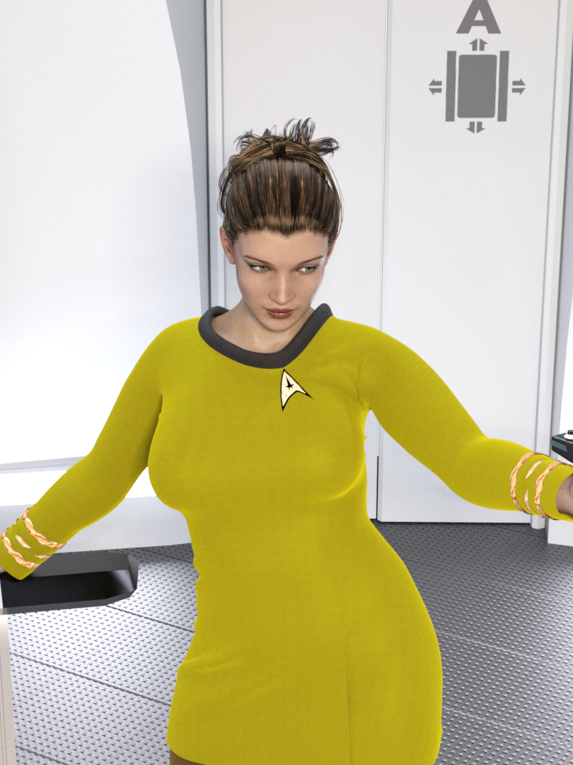
Here's another render of Lt Uhura.
Looking pretty good
Since I got the destroyer's transporter room done I've been working slowly on its engine room. Located in the saucer since it doesn't have a secondary hull, it has to contain both the access to the main warp drive and impulse engines. I've got a small list of thigns yet to do for it but she's coming together. :)
Also inculded a current look at my workspace for this in Truespace.
I love that blend of styles you have going on, with the TMP/TNG style panels on the walls and the TOS style elements in the colors scheme and the celing and the overall layout. Great ideas for a preciously unseen ship class! Those round engine things look like something I saw in some shots of the aborted Start Trek Phase II sets from the 70s Was that the inspiration?
I wondered about those too.
Thanks! Yeah this particular destroyer was launch in the late 2260s so I wanted it to look kind of inbetween in design style from TOS to TMP so I'm trying to blend the two a bit. Adding in the TOS color scheme helps it alot with that ;) Those are what I assumed were some kind of power chamber or dilithium chamber on the Phase II designs. There's precious little information about that design but I didn't want the standard dilithium floor chamber we saw on the TOS Enterprise either, so I melded the two designs a bit to get what I've dubbed Dilithium Pumpkins. They are absolutely inspired from the test footage though. No real great shots of them there but enough to work off from to build something similar.
Yeah definitely based off of parts of the Phase II Engineering test shots.
It's been awhile since I came here. Lots of new and cool artwork! :)
The forum is getting harder and harder to find this page, for some weird reason.
It has been a while since I have posted anything, but I decided to try to finish the earlier version of JamesJAB's TMP 1-3 Bridge. Started adding the screens to the stations. I am up to the challenge :)
Nice work on decking these out further. I'd been tempted to do the same but got distracted by the destroyer sets lol.
Just an update of my work in progress
nice work
wow, that's magnificent.
Very nice!
That looks nice, good job on the screens and consoles. Are you planning on building the physical controls (buttons and switches)?
I'm thinking about making the interfaces with the physical controls. I am still working on trying to get the rest of the stations together and the viewscreen. I added a little more detail to add some lights similar to the bridge on ST III (at least on the ceiling.)
Finished the Saladin class (destroyer) Engineering set. So I did some shots with people actually in them :P I have red alert versions of these I'll post later.
In order though, we have the exterior corridor, then the corridor leading into the section with a radiation airlock, a view from the balcony at the imulse engines and dilithium chambers and last but not least a view from the rafters looking back at the bulk of engineering. :)
Hi guys! Sorry I haven't been around. It's not by choice. I didn't drop the page- the page dropped me! Took a look around and it all looks great! :-)
Hey, welcome back mdbruffy! :)
Here's the red alert versions of what I posted before. Not as dramatic as we've seen on later Trek shows but there wasn't a dramatic lighting shift generally between standard and red alert on TOS and that was more the feel I was going for. That and I got to show off the red alert symbol I did up in Photoshop as a texture :P
These are looking awesome!
Interesting thing to note on the Star Trek I - III version of the bridge set. on some of the scenes you can see directional spotlights installed in some of the outer rim light fixtures. (they where probably used for the character up close beauty shots.)
This is good work being done up in here
You are definitely getting closer. I think subtle tweaks to the proportion of her eyes and nose will help.
Moved Zoe/Uhura over to G3F and tweaked the skin color a bit. In my opinion she was coming off too light skin. Comments/Thoughts?