Daz 3D is part of 
Connect
DAZ Productions, Inc.
7533 S Center View Ct #4664
West Jordan, UT 84084
Licensing Agreement | Terms of Service | Privacy Policy | EULA
© 2026 Daz Productions Inc. All Rights Reserved.
Comments
The 1st guy that hired me sent me a very detailed description of what he wanted on his book cover, as well as a general idea of what the main character should look like. We used a real model and just sent him the headshots that were sent to me though the casting call to choose the girl. I actually just did the photo shoot and artwork for his, he did all the typography himself.
The 2nd guy that I worked for, and he has since hired me to do several other book covers, was specifically looking for a cover with a dragon when he found me. He would totally put his main character on the cover. I know because sometimes to practice I will do characters of the books I'm reading. I really liked his main character so I sent him a portrait I did of him, and he nearly put it on one of the older book covers (from before he hired me) I'm the one that suggested we not do that, as we were already into book four and readers probably had their own idea of what the characters look like by now, Also it didn't go well with the other covers already existing, as none had characters on them.
This last guy that hired me was looking for one with a girl on it, and he has already asked me to do the next cover also just so we have the same girl.
Personally I think it's a better idea to NOT have a persons face on a cover, because it allows the reader to develop their own idea of the character. As a designer I think its easier to sell a cover that does not have a persons face on the cover, because like you said the author already has their own idea of what the character looks like. However I think if the author could afford it many would have their main characters on custom covers. lol Also in those design articles I linked to they talk about how the design of a face is so ingrained in us that we seek it out, and it makes for a powerful design element. I personally think not having the face is just as strong, in photography and art they say that turning the face away, or in someway hiding the face allows the viewer to place themselves or people they know within the image and to better identify with a piece.
Anyway interesting things to think about.
Personally when I do my pre made covers I'm not actually designing covers. I'm just creating what I want to create. Then on my down time, when I'm in a creative slump, I turn those pieces into book covers. My goal isn't really to sell a lot of book covers though the book cover website. My goal is to create what I enjoy. To that end, my book cover design goals are to turn every author that buys a premade from me into MY client. If they bought something from me it's probably fantasy fiction as that's what I like to create. Usually these are a series, and I know they already like what I'm doing - because they just bought my work - so my goal is to get them to stay with me so that they pay me to keep doing what I like to do. lol
As a portrait photographer/ business owner they tell you that the photos you take get the people in the door, they already like what your doing or they wouldn't be there, but it's the experience they have with you that keeps them coming back. I really enjoy working with my authors, and I want them to enjoy working with me. I do a lot of little extra courtesies. I read their books, I give reviews on good reads and amazon. I promote their books on my social media. If I find mistakes and typos as I'm reading I let them know. I now pre read for one of my authors so I can get the book cover designs going, but I also ask questions about things that are going on in the book and it's so fun to read the book after publication and find a change in it that was because of a conversation between myself and the author.
So anyway my business plan isn't to sell tons of premade covers, my plan is to collect a bunch of authors who like my artwork. lol
The "super close up eyes shot" with silhouettes or scenery is a thing in science fiction/dystopian novels too.
How's the covers coming everyone? Here's a new one from me.
After I posted this on my Facebook page, my friends tell me have to write a bodice ripper to go along with it, hahaha.
Would a human man in muscle maps be considered nudity for these forums? The figure has no 'bits and bobs' but I'm not sure if that makes a difference (I've posted to my DA gallery).
I've decided to finally make a start on pooling what I've learned so far into some tutorials and will put them up on a blog focussed on publishing modern pulp (so later I'll be posting about formatting and typesetting as well). While getting some notes on paper I thought it might be nice to make the title images faux book covers as well. I'm starting to realise that the project will take a little longer than I realised but I'll post updates here if there is any interest.
They're only considered nude if they have skin or visible genitals. DAZ shows nude muscle maps in their promos so I don't think they have a problem with it.
Definately no skin on this chap! I'll post and see :)
Another stunning pulp cover. I recently bought a book that has a lot of covers from "naughty" books from the 1950s-70s. It also includes some essays about the artists and writers of that material.
I really enjoyed the covers of books back then -- these days, all the photos just leave me bored. Paintings like the one above really brought more imagination to the cover -- at least in my opinion.
Thank you for that insightful glimpse into your world and workflow.
Awesome design. I could definitely see this being a "house style" for a publisher back in the day. Funny you should be reading Conan right now -- I recently picked up a cheap stack of the b&w comic, Savage Sword of Conan, and am really enjoying reading them. There are a fair number of story adaptations in these issues, but most are original tales written by the comic writers. Still, a lot of fun stuff, nonetheless.
Looks like it could be a useful tutroial if you put it together,
+1 on everytrhing Mike said. Very creative cover. Plilebus, you know I love your pulp stuff, so I'm definitely looking forward to your tutorials!
Here is my idea of a sci-fi cover from the 1980's.
I definitely get an 80s vibe from this. Especially from the type choices and vivid cyberpunk colors.
Absolutely! The colours and type are just spot on. Love it - exactly the sort of thing I pick up at the second hand book shops.
Now I'm really jealous! I'm trying to cast my mind back - I believe that Savage Sword was when Marvel switched the format to magazine to get around the restrictions faced by comics (I remember reading how the writers found ways to push the limits with the preceeding comic though). Both series had some amazing covers but for a long time weren't easily available in the UK. I've seen that some of the Robert Jordan novels are being republished now in eBook format, so I'll probably be reading plenty more Conan in the coming months.
Saying that, I've never ready any of Howard's other heroes, so I should probably turn to them next. It turns out he was a very versatile writer, turning his hand to westerns, sports, detectives, horror, Mythos, and he even did some writing for the Spicy pulps.
The art is very 80s in a good way, but the title font looks more 60s mod to me, FWIW.
Mike, Philebus, Odaa - many thanks!
Odaa, yes, the title font is Twilight-Zone-ish, so it could be associated with the 60's.
I'm not really happy with how this turned out but I had set myself the task of starting to learn Affinity Photo. Photoshop Elements is not all that stable on my system and I'm a little tired of switching between that and GiMP, so I really wanted to be able to do everything in one place (well, almost - I still need to switch to ArtRage). At £39, I figured it would be worth the try. I was right but at version 1, it still has a ways to go. It doesn't automatically align items in the way that PSE does so well, it doesn't run all photoshop plugins, it lacks artistic filters (which means no Cutout filter), and I don't seem to be able to paste an image into a layer mask.
I started with building a fresh cover template for a tutorial and that went very well - it does handle text very nicely indeed, so I'm completely on board with that.
When it came to preparing the render to take into ArtRage, I realised just how good the Cutout filter is in PSE and I will certainly find myself going back to it but this time a least, I had commited to sticking with Affinity. One of the plugins that does work is sadly one that I've not really touched since buying it - Topaz Simplify. It really is very good and it can approximate Cutout but not quite and it's preview is not really preresentative of what you are going to get, so that can also slow things down a bit and a system as sluggish as mine.
Also, I couldn't paste the depth render pass into a layer mask in the way I can using GiMP - so I resorted to just doing it by hand, which worked fine.
I have to say that it does do well for fixing colours.
Like I said, I'm not too happy with it and there's more wrong than with just learning the software (she really doesn't look very frightened) but I'll try putting in some practice with Topaz Simplify tomorrow and then try something else.
I think if you want to use an image as a mask you bring it in as a layer, then right-click on the layer and select Mask Below but I haven't explored in depth.
Thanks - I'll give that a try in the morning. I've got this week off work, so I'm going to try and have a proper explore of it over the next few days in between some 80's British horror novels and some 60's Doctor Who (now that I've completed my collections for the first three, I'm going to start from the beginning with the novels to fill the gaps).
I love this idea, and would definitely be interested in checking it out. Not only do I love the artwork on this cover but the title is with it is fantastic! Very punny. :)
I wanted to try something out for the background - not sure how well it worked out though. Anywho, I then tried turning it into a pastiche of the Carson Brown books as published in the Signet editions. Unfortunately, I didn't have quite the right font for the job so had to make do with the closest I had.
Philebus, looks awesome as usual, very authentic. I'm assuming that you are continuing to use Artrage for the painted look (because you are really overpainting the image, correct?). I wanted to favorably comment on your previous efforts in the NPR thread, but it is so crowded there recently. Can you recommend any video tutorials on the technique you are using? I have never hand-painted anything, and I am eager to learn.
Hey guys! Haven't been around in what feels like forever. Soooooo...I am going to be working on a graphic novel project. It's not strictly speaking a book cover, but I'd still like to post progress, questions, and whateves here. What do you all think? Okay with you guys?
And just for fun...here's what I've been working on lately
Some fun with Carrara and PSE 2018.
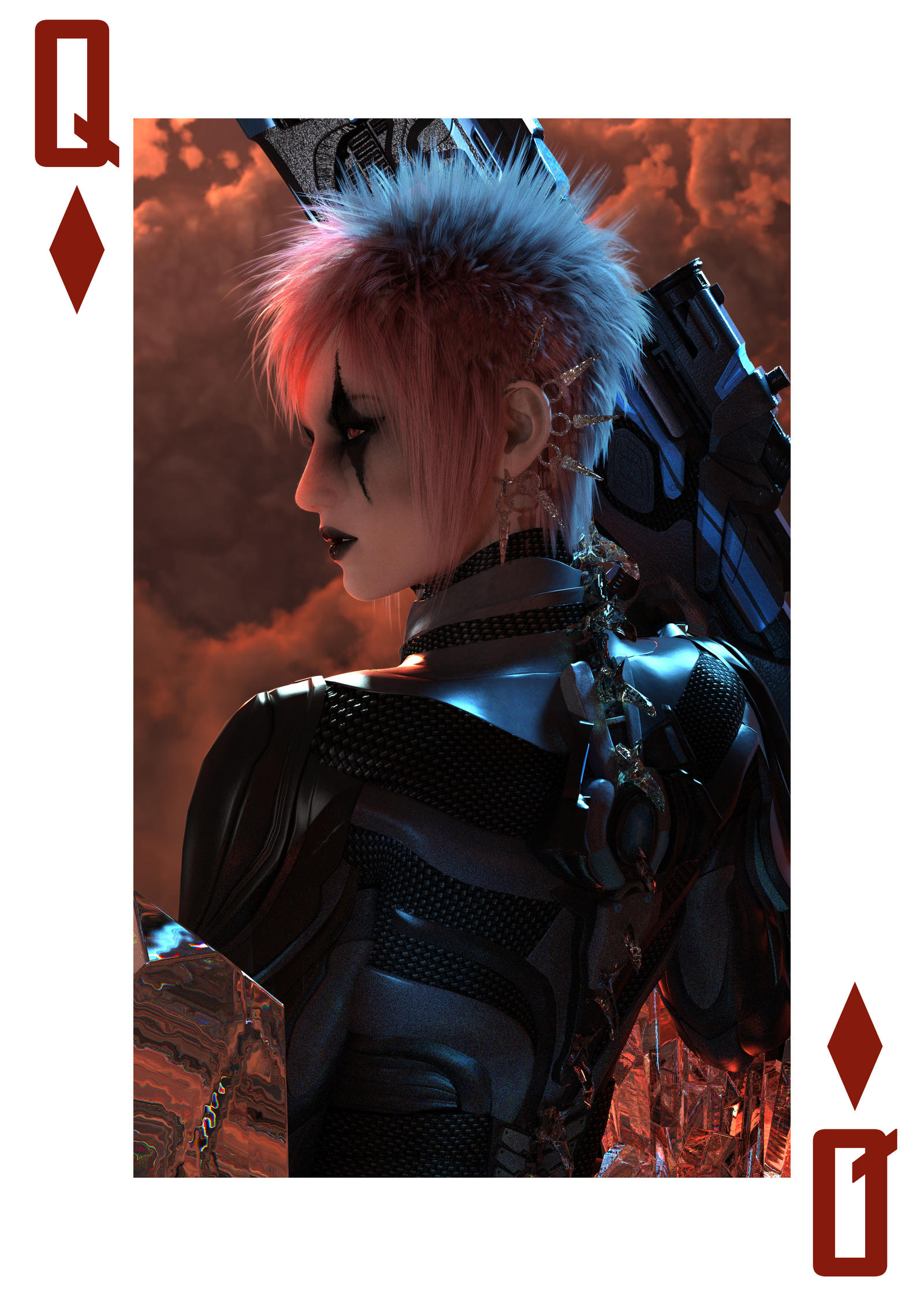
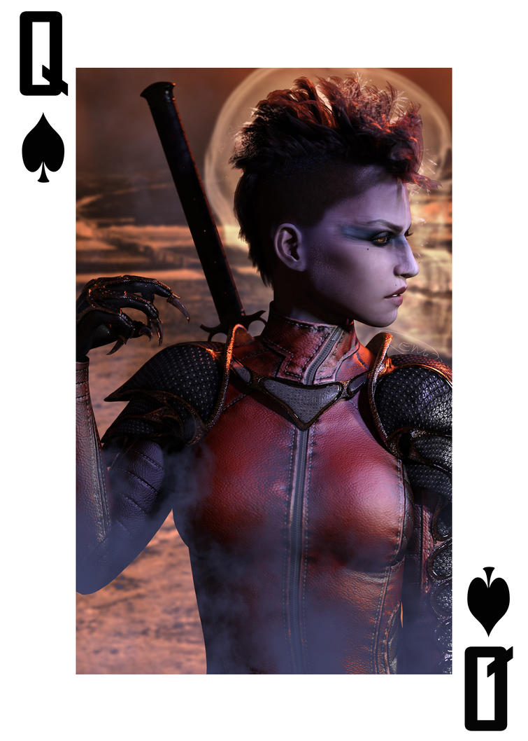
I don't have a problem with it. Not sure what others think. I love the playing cards. Those look great! :)
I'm not sure if those sunflowers work or not. I like the touch of brown it adds. I love the tagline, though. That's really inspired. Nice painted effect on the overall cover. I really like that.
That looks very striking. I like your color choices. It really pops out at you.
Thanks Knittingmommy!
A whole month without a book cover comment? Too long I tell you, too long!
These are awesome!