Show Us Your Bryce Renders! Part 7
 David Brinnen
Posts: 3,136
David Brinnen
Posts: 3,136
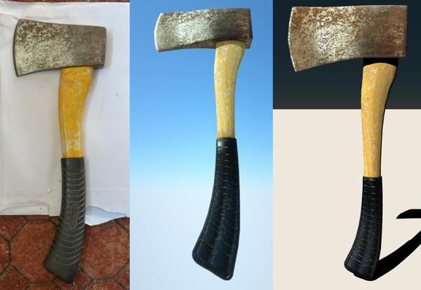
OK in the interests of teaching myself UV mapping. Here's a little project I've undertaken. On the left, my subject, my ,model, my muse...? In the midst, an octane render and on the right, Bryce.
If you would like this object for your collection, here's a dropbox link.
https://www.dropbox.com/s/9ocklc9tsd44rzt/Hatchet1.obp Object is 14mb in size.
If you don't know what you should do with this file...
Please read Horo's excellent pdf on the topic of Bryce Content http://horo.ch/docs/mine/pdf/BryceContent_v4.pdf
Daz 3D is part of 
Connect
DAZ Productions, Inc.
7533 S Center View Ct #4664
West Jordan, UT 84084
Licensing Agreement | Terms of Service | Privacy Policy | EULA
© 2026 Daz Productions Inc. All Rights Reserved.
Comments
Wow we are moving fast.
David – cool renders. Thanks for the Hatchet, downloading it now.
Spent the last few days doodling with Bryce and abstracts, very additive – a few renders
David : cool what can I say you always have such great ideas.....Did you ever take on the hosting of the Bryce files for the website deal??? just wondered you never said......
mermaid: WOW these are super... the colors are wonderful...nice job.....Trish
Been away a while learning Hexagon.
I noticed someone asked what the Alphabet image in Wings' UV Editor was for.
It's just so that you can tell if a part of the map is flipped over (letters read backwards) or if there is any stretching in the map:
To demonstrate this in one image you can see some stretching where I've scaled up one edge of the model, the alphabet image shows the stretching that results. Some models may arrive with stretching on them (depending on the unwrapping method you've used) and such scaling of edges or faces or just moving a vert in the UV Editor window may help to relieve this stretching.
You want as little such stretching as possible since this will distort your texture otherwise.
The other image shows a face that has alphabet letters displaying as backwards, sometimes this happens, and this indicates that you need to flip the face over.
But you can map with some faces flipped over (if that enables you to fit the pieces onto the map more easily - you want pieces to be as large as you can manage, so you aren't wasting any space and so you can use as small an image texture as possible) and such flipped faces are no problem if it's just a texture with random rust or similar.
But if you are using text or have something (like a painted row of buttons on a dress, or a number pad on a scifi door that needs to be in a specific place) - then you need to know which way round such faces are.
That's what the alphabet image is for.
~~~~~~~~~~~~~~~~~~~~~~
My Hexagon modelling has enabled me to do this:
(see image 3)
Fran: really cool thanks for explaining that......Trish
@David: Both hatchet renders turned out well, and are very convincing. Yet the Bryce render gives the hatchet a more weathered look, an older look. And thanks for this object.
@mermaid: Whoa! Beautiful abstracts, lovely complimentary colors.
@fran: Yeah, I asked about the letters in the uv mapping window. I watch a Wings UV Mapping tutorial just the other day, and it should have dawned on me what they were for, but didn't. Thanks for your explanation.
hello everyone, great renders as always, and congrats to the contest winners!
I am back with the latest version of my water wall.
the animation can be found here:
http://youtu.be/6TGp7gZci_0
it is close to what I wanted. the water material is rotated on x axis, so that it can be looped for how ever long the scene is. although this is good for looping, there is some speed and shape variations on the 90 degree positions but I am happy with the variation. for a more constant flow you can use position on y axis for making motion but this is not easily looped because I run out of texture after a handful of seconds of animation, but does look the best. and depending on the scene timing would be the better choice.
now I am ready to try a terrain with a water feature of some kind perhaps a horizontal flow dropping down to other layers
many thanks for the tips provided!
@dana: Now that looks like falling water. Great improvement. If you could get that on the terrain you're talking about it would look great.
I've neglected Bryce for a while because I've been trying to make something for Bryce using Sketchup, which has become a re-learning adventure. But I did follow David's Wings tutorial creating the Mobius from a rod, before starting my Sketchup adventures. Actually, the image below is from two tutorials, the Mobius loop and the leatherette tutorials. For this image I increased the bump setting a bit more and played around with the color a tiny bit. Also added an HDRI just for reflections and rendered it using premium settings for the soft shadows only.
Hi all, I'm back (for a while, at least).
There is so much going on in this forum; no way to react to everything. The strange circular human figures of David are great, for example. Many other things too.
I'll now drop a question to you. Which version of this Bryce abstract do you prefer:
Version a. Only a very limited postwork in Photoshop Elements (bit lighter and a bit more contrast) or
Version b. Via export as HDR saved and tonemapping in Picturenaut (not even very extreme).
I have my preference too, which I will indicate later.
dana365...yes, that's quite nice....look forward to futher versions, which I can see from your expertise you are quite capable of (editing, is an art in itself).
Jay
GussNemo:
Jamahoney:
Thanks for the kind words! building these scenes is rewarding, and even more so having some one to share them with. on ward and forward!
@hansmar: I personally like the first image. The intenser light allows the variegated coloring on the brown pointy things to be seen better.
Thanks Trish and Guss. Abstracts are so cool too do.
Dana- well done on the water-wall. The animation is awesome.
Fran – thanks for the explanation on UV mapping
Guss-the render is very nice. I like what you did with the leather material. I tried Sketchup but gave up after a while, I only use it now to convert the Sketchup freebies to .obj.
Hansmar- I prefer the 1st one, the colors are more alive.
Here’s another abstract, still having fun with them.
@David - the Bryce render looks way better, the Octane one looks a bit fuzzy as if there were mal-adjusted DOF. Thanks for the model.
@mermaid010 - yes, addictive indeed, and almost limitless possibilities. All three are nice but I like the first one best. EDIT - and the newest blue one looks great, too.
@dana365 - the water curtain in the static image looks like some glass that lets the light through but hides what's behind. The animation, however, shows that it really looks like water. Good job!
@GussNemo - looking nice on the red leather.
@hansmar - good to see you back. Definitely the first, on the second it appears that the reflections lost a bit of power.
Horo:
thank you, couldn't have got there with out your help, many thanks!
Mermaid010:
those shapes are great, it makes me want to fly a camera thru the space and watch all the light and reflections.
GussNemo:
Hansmar:
Mermaid 010:
the use of HDRI is amazing, cant wait till I get there
Franontheedge:
thanks for showing how the mapping works, that totally makes sense.and the couch you did in Hex is perfect
David:
really nailed the mapping and textures.
everyone:
its hard to stay focused on my direction, everyone's work makes me want to drop everything and start learning their techniques and tools, as I have said before, no shortage of inspiration and talent, awesome!
Love that blue one, Mermaid...gorgeous. Dana365 got in before me, as I, too, initially thought of a fly-through sequence. Have it as a wallpaper right now on the comp,..
Jay
Thanks (modelled on a sofa we once had).
By the way, did I tell you about the tutorial on waterfalls that I'm hosting on my website? I can't remember if I did or not.
It's here:
http://www.franontheedge.com/waterfall_tut_vanlippe.html
But you're probably past that point anyway. (but just in case it helps)
@mermaid010: Very nice abstract. I like those colours.
All others: I see your point. I made yet another, even more coloured, version and put it on Deviantart. That one really doesn't look like the original anymore.
I'll keep experimenting with these abstracts.
Franontheedge:
thank you, you never told me but I did find it a couple a months ago when I was first starting to work with water, I did post the link in the Bryce forum,and gave you and Richard credit for making it available.I am still going to reference it in order to learn to do exactly what you have done there, I really like the way it turned out and is my next challenge to do something like that, thanks again it has been very inspirational and educational , and very east to follow, love it!
@mermaid/Horo: Thank you very much.
@mermaid: Latest abstract is really nice looking.
Dana: I am liking the look of your waterfall....
Guss: Using Sketchup is a neat idea...one I would not have though of....I haven't played with that program for awhile...how are you going to get the models into Bryce??
Hansmar: both of those are nice ...I just like the brighter colors in the first one better...
Mermaid: you are having a lot of fun with the abstract pictures ...The blue one is great...
I didn't do very much but host it. I did try the procedure again just before posting it, to make sure it worked with the current version of Bryce, and added a few pics that had become lost since VanLippe's site failed (Luckily, I'd saved a copy when I first did it.) and finally added my resultant animation of a waterfall - since his was lost completely. But VanLippe did all the hard work, figuring it out to start with, such a shame he's no longer around to thank.
Your current wall of water is looking pretty good now, flows beautifully, and looks great. You could try it under different lighting... I wonder if it would be possible over different shapes? Like say... a pyramid? Garden designers do stuff like that.
I'm sorry I didn't mention it before, but I'm glad you found it.
I made use of David's Tutorial on the Importance of Lighting (part 1) to make some adjustments. I also moved the front trees back a little bit. The animals come next.
Trish:
thank you I really like Escape1, the very first thought i had was labyrinth and danger, than I saw that you named it escape, very cool.
Looking good, Sandy...let's see how you fit in the animals. The trees, btw, are working a 'tree-eet' (sorry, couldn't avoid it ;) ).
Jay
Hey everyone just wanted you to know that Horo's stuff is on sale.... http://www.daz3d.com/horo
@SandySims - you're making progress. I don't know what you're after. Light and sky look right for an overcast day without sun, and under such a sky there are no shadows and no bump.
@Trish - thank you for mentioning it. I feared that DAZ forgot to put my store up for March Madness.
By the way, we also have a new product that came up today http://www.daz3d.com/new-releases/bryce-7-1-pro-seamless-texture-mix-and-hdr-lighting-set-1.
Thanks to everyone who commented on the abstracts. As Horo stated the limitless possibilities make abstracts addictive and fun to do.
Dana and Jay – animation, that’s something I still need to learn. Thanks Jay for using the blue one as a wallpaper. :)
SandySims – the landscape is looking good.
WOW Thank you Horo and David.....The new product is in my cart and ready for check out.....edit...got it.....glad you said something did not notice it right away...just saw the car rims and did not read on....now I have something new to play with....Be warned this is a large file and takes about 7min. to download it....comes with a lot of stuff....Trish
@Trish - thank you again!
Yup this is certainly a great product with tons to play around with.
I haven't even scratched the surface of it all yet, but I just had to do this render.