WIP - Golden Age Superheroes
 mmitchell_houston
Posts: 2,535
mmitchell_houston
Posts: 2,535
Here's another illustration for the upcoming superhero RPG, Powers Beyond. This is was something created for another project, and I've repurposed it (slightly) for inclusion in the book. I added the halftone effects just to be consistent with the other illustrations. I know it needs to have the outlines inked and worked on a little more, but I'm out of time. So, if the editor wants this one (and he might now), then it's going to go as is. Nevertheless, I would like some feedback on it regarding composition and how you think it fits in with the other illustrations you've seen in this series.
EDIT: Added the attachment again.
Daz 3D is part of 
Connect
DAZ Productions, Inc.
7533 S Center View Ct #4664
West Jordan, UT 84084
Licensing Agreement | Terms of Service | Privacy Policy | EULA
© 2026 Daz Productions Inc. All Rights Reserved.
Comments
Hi Mitchell, there is no render attached to you post, and it probably makes more sense making one art thread with your stuff that starting a new one for every project. Its easier to keep tack on what you are doing.
Linwelly: You're probably right about a single thread.
You don't see an inline image? Weird. I see it.
Hey, MM, yeah, all I see is a broken image icon instead of your image.
mmitchell, it doesn't look like you had an attachment from which to reference. Did you delete it?
And if you find the Attachment thumb distracting, our dear McGyver started a thread here which is solely for the purpose of loading attachments, so they can be linked elsewhere.
http://www.daz3d.com/forums/discussion/59113/an-ot-thread-for-images/p1
I tried McGyver's suggestion, but it obviously didn't work for me. The weird thing is, I could see it on my computer at work and at home (and the image is not on my work computer). Weird.
OK, now you can use the link, and it will show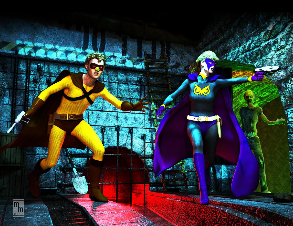
Oh, I remember this. One of my favorite pieces of yours. I like the new look. I think it will fit in with the other images fine. Although, as we all know, not my field. :) I did go back through the Book Covers thread to take a look to compare and see exactly what the texture differences were. I think I like how the cross hatching textures add a little something to tie in with the new progject.
KM: Thanks! I liked this piece, too. It was a lot of fun to create. And it was a good learning experience for using Iray emission surfaces for lighting. Also, good experience with tone mapping. Like you, I like the hatching effect (particularly on the kid's uniform). If I get another few minutes, I may go back and try to enhance the hatching on her cape and uniform. The background really didn't benfit from this treatment, but I doubt there's time to do much more than I have.