Daz 3D is part of 
Connect
DAZ Productions, Inc.
7533 S Center View Ct #4664
West Jordan, UT 84084
Licensing Agreement | Terms of Service | Privacy Policy | EULA
© 2026 Daz Productions Inc. All Rights Reserved.
Comments
I decided to create a new image using Victoria 4 for this mini tutorial.
There's loads of images, sorry to be taking up a lot of space
This technique comes from Blue Lightning TV on photoshop and is part of my workflow: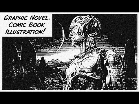
This is the image I have created
Steps 1-3
Create your character and pose in Daz and render out using Iray, interactive at 4K resolution: 3840 x 2160
Then take that into Photoshop and add a black background layer
Convert both layers into a smart object
Steps 5-8
Go to filters, sharpen and smart sharpen. Set the amount to 500 and radius to 6 and reduce noise to 0 and remove type to gaussian blur
Apply this to the image to sharpen it
Go to filter gallery and add a half tone pattern. Change pattern to line and set size to 1 and contrast to 0
Click add a new effect layer at the bottom and choose torn edges.
Image balance makes the image lighter or darker, sharpen sharpens or softens the lines and contrast makes everything lighter or darker. Apply this to the image
Steps 9-12
You can double click on the filter gallery option to reopen it
As you drag the smoothness to the left it makes it more like a pencil sketch
Go back to halftone pattern, change type to circle and change size to 2 and contrast to 5
Notice how you now get more distinct comic lines, play with the sliders to vary the effects
Step 13
Double click on the smart object to reopen it and change the background to white. This changes how this technique affects the image, it now works in reverse. If the image got lighter when you increased contrast, now it gets darker. It can give you some good effects
Save the smart object and close it.
Get this style of image as shown below
Steps 14-16
Add a gradient map from the adjustments button and choose the purple to orange gradient
Change its blend mode to vivid light
Reduce its opacity to 9%
Steps 17-20
Now choose a light blue colour, create a new layer and fill
Change its blend mode to difference
Reduce its opacity to about 21% (This softens out the lines and makes it look like a pencil sketch)
Finally click on image and image size and reduce it to about 1280 x 720, or whatever size you want. Choose either automatic or bilinear as the resample type.
(This effect works best when you anti alias, by working at a larger size and shrinking it down. Just check your work for any flickering of lines or banding due to high res rescaling. (Moire effect) Sometimes I get this when working on an 8K image and resizing)
I hope you enjoyed this. If there is anyway you can improve it please let me know.
That was ...Whao. I'm shaking. So disturbing, but an important part of history that we should never forget.
That was a VERY cool video. I'm not sure how well it would work for print-quality graphics, but it's worth exploring as a possible approach for some backgrounds I do in my Western work. Thanks again!
After viewing the video and looking at your image, I think you need more shadows on the figure to make the most of this effect. Maybe you could try some stronger lighting that leaves deeper shadows along her arms, legs and body? And, by the way, I think the base character has a very strong comic book look.
OFF TOPIC (but close): I just watched a documentary on Starz called Sex Fashion & Disco about iconic 1970s artist Antonio Lopez. It was a facinating look into a powerful artist who, although he did not draw comics, had a strong comics sensibility. It can also be seen on other streaming services. It was really interesting and worth a look. If nothing else, you guys ought to do a google search for his artwork. It might give you some inspiration.
Your reaction is a strong testament to the creator's skill. Bernie Krigstein is considered a master storyteller for good reason.
Hello guys. I'm just trying to get started into comics but I need some advice first. Stuff that I need advice about is:
A good printer, good ink, good paper, good binding machine and where is a good place to get them. If I missed something please let me know! Thanks in advance for any help!
So are you planning to print your comic at home? How many copies are your aiming for and which quality do you head for?
Usually I would advice to find a print company, either through the internet, better in your actual neighbourhood. Buying into all these things with a decent quality will be quite costly and printing at home will give you tons of shenanigans, But before judgeing I would like to know more what you really have in mind to do
I'm not sure but I think a good guess will be like 500 copies a month, magazine quality. I'm also considering print on demand through the internet but I would like to include nudity in my comics and I'm not sure if any company is willing to work with that. Do you know of any? I don't know of any local company that prints comics but I can find out. I would like to achieve magazine like quality.
printing nudity is mostly no problem here in Germany, but that might be different depending on where you are. For the quality part I would recommend a company that offers print quality control, as often the colours come out different in print and that actually changes from printer to printer.
With the numbers you name I really don't think printing at home will be an option as being busy with printing there will be no time for anything else. So my recommendation is to call up some companies and just ask them about offers, if they don't do nudity they go off the list, get an example printed and then make a contract. Investing this time now will give you much more freedom of mind later
I don't want to open a can of worms, but I'd rather have you start with the most important question.
What are you goung to do with these comics, once they are made - and even more importantly, HOW?
Before investing in any equipment, I suggest you simply send some samples of your work to the various companies:
Be up-front and tell them what you are printing. ALSO, tell them you don't want to list your product in their stores and that you don't want to include a house-ad. Tell them you only want a printer and that you won't tell anybody who is doing the printing.
------------------
I'm also going to be frank (so frank that it really will border on rude), but do you really think you can move 500 copies a month? Unless you already have a distribution network (or have a big name talent) and stores lined up to take your product,t that is a very optimistic. I have friends who run comic stores and most of them only carry 1 to 3 copies of a new, indie comic. And, again I'm being frank, that's mostly out of the kindness of their hearts because they like supporting new artists and local talent. I don't want to dampen your enthusiasm, but you should talk to people in the indie comic / self-publish field and see what they say about print runs and expectations on sales.
By the way, do you have any samples of your work that you would like to share with us (if it has nudity, you could send it to me via Private Message).
dang, you both are thinking too practical ;)
no, honestly vaid points
The laws here in the US can be problematic for anyone who self-publishes. While it's not against the law to print nudity (or even things like intercourse), the simple reality is that most of the Print On Demand (POD) companies here are small- to medium-sized businesses and all it takes is one over-zealous prosecutor in some small town ANYWHERE that you have sold your book, and that prosector can come after you and cripple you with legal action (particularly if a young child got the comic and was "corrupted" by it). And, if the prosecutor is so-inclined, it's possible to pull the printer into the legal issues, as well. Honestly, it's just easier to avoid the issue and not print anything dealing with nudity, sex or anything controversial.
Your advice on seeking a "contract" leads me to another point. Anyone planning to print controversial material (or something that the printer might balk at) is well served by getting the printer to put forth written guidelines that detail very specific lists of what they will and will not print. This could save you from arbitrary decisions down the road, such as "You printed issues #1-3, but now you won't print #4?" So there you are with 75% of your 4-issue mini-series complete and no way to get the conclusion out there to the clamouring public.
Again, my advice is to just talk to the POD printers and send them some samples. Get a dialogue going.
ALSO: Go visit their websites and see if there are any books in their catalogs that are similar to yours. If you see a few "naughty" books on their list then you know they are a business that would likely be open to your material.
I think I'll drop the idea about nudity because I want to stay away from trouble. As for the material, I'm thinking about zombies in the old west. I have nothing yet but I think I can learn relatively fast. As soon as I have something nice I'll post some pics.
So far I like Ka-Blam because is the most affordable. They also fulfill IndyPlanet.com orders which I plan to give a try. I mentioned 500 copies but not because I'm an experienced indie. That's before speaking with nobody with experience. Let's wait until I have something selling at IndyPlanet.com to see how it goes but now I think I'll be lucky if I sell about 50 copies.
Thanks for your help.
I have redone my warrior girl image using V4. I tried to keep the line work a little more crisp.
Wowza! This is really coming along! Good, strong lines. Nice job with the shading. I'm very, very impressed with what you're achieving here.
I would suggest that if you add a little more touch-up to the hair and hair line you could elevate this into something you could use to make comics. I took a quick stab at it to show you what I'm talking about.
Thanks for the feedback. The post work you did on the hair does improve the image. Did you use a custom brush in Photoshop, or some other method?
So far I have been trying to create comic images using software, without any drawing at all. I think maybe it's time I see what happens if I try combining different methods with some drawing work in Photoshop as well.
I have found that I can pretty much get all the layers I need out of Daz, (colour, mask, flats, shading, ambient occlusion, etc.) so it saves me having to export into Unity. Although I do miss the Unity MKToon materials that do give some great comic book effects as well as toon outlines.
I really like the Victoria 4 and Michael 4 character results, they seem more suited for comic book images. I just wish the clothing system was as easy to use as genesis figures.
I think I may try an image with M4 and V4 together in some sort of fantasy image, with some sort of fantasy creature, complete with a background.
I took a look at TopazStudio. The base software is free, which is cool. Which plugins would you recommend for achieving the best artistic results?
Thanks for the feedback. I'm going to quote professional comic book artist Brian Haberlin (he also uses Poser in comics that he creates and that have been published by Image Comics): When using Poser, "there's ALWAYS hand work!" In other words, once you get your renders, you will ALWAYS need to do a little touch-up. As for her, I didn't use any brush at all. I just used the selection tool and drew a quick squiggle across her hairline and then filled it with white. I did this because her hairline in the original was so straight that I thought she was wearing a headband. Just a few imperfections made it look more realistic. Ditto for those loose strands: I just used the selection tool and "drew" random hair strands and filled them with black. Or I used the selection tool to "cut" white areas out of the hair near the bottom. I really only spent a tiny amount of time on it. I spent more time downloading/saving and then uploading the file.
If you'll forgive me using my "teacher voice" for a moment (I feel self-conscious doing it because I'm certainly not an expert or qualified to teach anything in this subject), but if you can accept the fact that you'll always need to do just a little bit of hand work / touch-ups on your art, then I think you're ready to focus on things like panel composition and storytelling (and yeah, I should have those thumbnails I promised you soon).
Back to "normal voice," I totally agree that both V4 and M4 really have shapes that lend themselves well to comic books. But if you want to see a "classic" superhero, check out the really old Michael 3 body! There is something VERY comic bookish about his dimensions and shape. In other words, his body is very "heroic." However, there are a lot of limitations regarding expressions and movement, so I don't recommend using him as a principle character in a comic. A background figure or secondary character, though? Yeah, M3 is still pretty darn good.
TOPAZ STUDIO: I bought both Impression and Simplify and seem to be using Impression the most. However, these aren't cheap: They are about $140 (I might have also picked up "edges" for $15). So far Impression is the one I use most, but it's $99. You would definitely need to decide it's worth the investment.
Talk more later, bud!
I've set up the pose for a new image. I'm going to try and do a lot more after work in Photoshop, possibly some drawing, editing and effects after sorting the technique for the comic effect.
Before I get into all that, what do you think of this initial pose. It's better to get this right before doing loads of work on the final image.
By the way, you really set me off with the Conan thing. I think the character just looks cool and this time I'm including a fantasy creature :)
Pete
Conan is a BLAST to work with and I can't wait to see what you do with it. Truthfully? This pose doesn't do him justice. I thought he was standing on something because of the angle of his feet. Although it might not be "realistic" to tilt both feet way back, it would give more of a sense of motion and make it clear he's leaping and not standing. Also, someone about to attack would probably arch his back more so he could get more power behind his swing. Here's three quick examples of what I'm talking about regarding the arc of the back or the fluidity of motion you should strive for if he's in mid air.
BTW: I think te poses of the other two figures are great. They have that classic Frazetta look to them.
Thanks for the feedback. I agree the warrior pose was quite lame. I've changed it around a bit, I think it's a bit more dynamic.
I also did a real quick test of a comic technique with the images to see how it looks in black and white. This is very, very rough, just a quick test. I will go through it in a lot more detail for the final piece and I'm looking forward to the post work in Photoshop.
Pete
Much better. How about extending his right leg a bit so we see more of it (kinda looks "stumpy" right now). Also, the girl's hand is not touching the ground (lower hand or add a rock?). LOOKING GOOD and can't wait to see more!
EDIT; Now that I've looked at it again, how about adding a little "body language" to the creature, too? Like changing his hand to be either more claw-like )fingers bent and curled) to make him more menacing, or to flatten his palm toward Conan so it looks like he's warding him off? Just a thought. I'm really looking forward to seeing more.
Just wanted to share this - it's a WIP from the upcomin page of Demon Division. I usually leave the rendered images "As they are", but the image below is for a flashback scene. It's edited in Photoshop, and makes use of the glowing outline filter and various blending modes.
Before:
I really like the effect (I thought the original render was a bit dark). A question about your flashback – are you consciously heading more into the yellows and brighter colors? I'm asking because these colors – to me – seem warm and inviting, like a picnic on a summer day. But I beloieve that the scene itself is dark and filled with pain? I'm wondering if you could use different colors to convey emotions? Maybe more red/orange for anger? Or blue for saddness? Just a thought. I definitely like the different technique used in the flashbacks. It's a nice visual cue.