February 2019 - DAZ3D New User Challenge - Lighting
 Kismet2012
Posts: 4,252
Kismet2012
Posts: 4,252
New User's Challenge - February 2019
Sponsored by Daz 3D
Are you new to the 3D World? Are you at the beginning stages of learning 3D rendering? Have you been around for a little bit but feel you could benefit from some feedback or instruction? Have you been around awhile and would like to help other members start their creative journey? Well then come and join the fun as we host our newest render challenge!
"Lighting"
This month's focus will be on how you light your image. Lighting is what defines and enhances the viewer's experience when looking at an image. Lighting helps a viewer to "see" the story. The presence of light, or the lack thereof, provides us with the ability to believe the world we are looking at. It can tell us if an object is round, whether it is close or far away, what colors were used and even if the surface is reflective. As an artist, it will be your ability to master the use of light, that will set you apart from the others. Below is a source list of lighting tutorials, articles and videos that will help you understand how to use your software, the different techniques used to light a scene, and the theory behind why lighting is needed. This list is not comprehensive; it is just a starting point.
In the past year, some exciting new lighting tools have become available in the Daz Store. They are listed below in red to grab your attention. It is NOT necessary to purchase these tools to participate in this challenge or to create great lighting for your image. They are simply new tools that offer new options.
Also, keep in mind the topics we've covered during previous challenges. Build upon what you have learned to create a compelling image to light this month.
This year of New User challenges is just getting started. So far this year we have covered :
Inspiration:
Check out the amazing entries and discussion in last year's Lighting Challenge.
Other Helpful Links:
When following tutorials, be cognizant of the different applications (Bryce, Daz Studio, Poser, Carrara Blender, etc.) and different render engines (3Delight, Iray, Reality, etc). Techniques for one may not apply directly to another. If you have some favorite Materials, Surfaces, and Shader tips, please share them in this thread.
How to Use Your Software:
DAZ Studio
VII - Lights
Daz 101: Lighting (video)
Point Lights, the Basics
http://www.daz3d.com/forums/discussion/25899/ (ideal for those who have purchased Gia 6, but the lighting tips can be used even if you haven't)
http://www.daz3d.com/great-art-now-step-5-lights
3Delight IBL or HDR type lighting environments
IBL Master (store link) IBL Master Discussion (forum discussion)
UberEnvironment2 - Made Easy
UberEnvironment2 Basics
Learning UberEnvironment 2 Return to Topic
Uber Area Lighting: The Basics
Iray
IBL Master (store link) IBL Master Discussion (forum discussion)
Ghost Lights (store link to one of several sets) Ghost Light Discussion (forum discussion)
Emission Profile Master (store link) Emission Profile Master Discussion (forum discussion)
Creating and Lighting a Scene with Iray in DAZ Studio by SickleYield
Lighting and Tone Mapping in Iray by SickleYield
Ghost Lights: Interior lighting Tutorial
Poser
Poser – Lighting 101 https://www.youtube.com/watch?v=9QWWXZ64ZiM
Poser Lighting 102 (Attenuation) https://www.youtube.com/watch?v=ofj-vOgbwsQ
Poser Lighting 103 (Shadows) https://www.youtube.com/watch?v=CbHQTXiGrx0
Poser Lighting 201 (Ambient Occlusion) https://www.youtube.com/watch?v=7GZbHV7MJD4
Carrara
Chapter 14: Setting Lights
Bryce
Artist’s guide page 125
Thoughts on Lighting in Bryce 7.1 by Rashad
Bryce: http://www.youtube.com/watch?v=C772CuZ6RgI
Bryce: http://www.bryce-tutorials.info/bryce-tutorials/lighting-and-skies.html#
Bryce: http://www.youtube.com/watch?v=s_mzhnLRx0s
Bryce: https://www.youtube.com/watch?v=e-Pe-IVp_dY
Theory:
Mastering Lighting in Blender the first 25 minutes of the video.
Lighting Basics:
http://www.amaanakram.com/lightingT/part1.htm
https://software.intel.com/en-us/articles/the-basics-of-the-art-of-lighting-part-1-simple-principles-of-and-techniques-for-creating-artful-lighting
http://www.3drender.com/light/3point.html
http://bensimonds.com/2010/06/03/lighting-tips-from-the-masters/
Examples of Lighting:
Some Examples
I will be checking in as will the rest of the Community Volunteers to try and help with anything you all may need.
For a list of the current contest rules, please see this thread: Challenge Rules
Closing Date: February 28, 2019
Daz 3D is part of 
Connect
DAZ Productions, Inc.
7533 S Center View Ct #4664
West Jordan, UT 84084
Licensing Agreement | Terms of Service | Privacy Policy | EULA
© 2026 Daz Productions Inc. All Rights Reserved.
Comments
while this render was more about hand posing rather then lighting practice, I feel like the lighting I did really adds to it.
Funny, but that scene has a feeling for me, like we see a underwater scene.
I like this effect an would like to know ,what setting did you use to create that atmosphere?
All I did was put a spotlight (with 90000 luminox flux) above the hand, and put a plane in front of the camera with opacity strength at 25%. There's no headlamp as well, and the enviorment map is at 0.
It's close enough to what I wanted to do, so i'm happy with it
Lighting a single object is a challenge. There is no where to hide.
The highlights on the back of the arm and hand really help it stand out from the background. If you do not have one already a soft light coming from the left to help soften some of the shadows will help. Not a super bright spotlight. Just something soft.
Nice posing. It looks natural to me.
@no nose I'm with @Kismet2012 on this...the simplest scenes depend the most on lighting and you definitely got some great light there. I would also say a really soft light at the bottom left to soften shadows and complete the contour of the bottom of the thumb might increase the dramatic effect some.
I was going to upload my first disastrous attempt but getting no love from the upload so I'll have to wait until my net or the forum stops hiccuping (whichever it is).
Oh so now it uploads when I post this. FML.
ok so.....
I had an idea for this image in my head for a long time and the idea of the lighting challenge motivated me to see if I could put it together. I was going after the type of lighting you see in the paintings of the old Dutch Masters. Sadly, a 13 hour render and still at 0% means I may not be able to do much more with it unless I can find a way to reduce my render time. I may have to avail myself of that second image we're allowed or take a mortgage on the house for a render beast. In any case this is my first serious attempt at a godray and I don't think I have it quite down yet. The candle flame doesn't glow quite like I wanted it. I rendered it at almost 4K and reduced it in PS to clean up the fireflies but that's the only postwork.
Lonely Dawn
Rendered in DS with iRay
@no nose Your image has a very nice "feel" and mood to it. Very organic pose. Hands are an interesting subject for art IMHO, so much emotion can be conveyed with just the hands. I encourage you to play around with what you have and try some of the suggestions already posted, also with some colors, shadows, and even volumetrics and see if you can create something you like even better.
@ariochsnowpaw I think you have done a great job with capturing the qualities you are after. Needs some refinement. (I know WIP ).
).
I suspect the render times could be reduced by breaking the scene up into layers. I don't know what set/environment that is but whatever you can take out and render separate should help.
Here's my start for this month, turned out a little darker then I expected so I'm more then likely going to have to go back and make some changes in the render settings.
thanks for all the feedback, I tried to get the two fingers to get closer, but haven't had much luck, though I was able to add a fairly subtle soft light.
@ariochsnowpaw If you haven't already you can try to hide/delete anything that is not visible in the render. This is a great start. The whole image has a very meloncholy feel to it.
It is a good start Shinji. A soft light that brings out the character without washing out the scene (easier said than done, I know) could be quite effective. The character just needs to stand out a little bit.
Nice posing.
Posing hands and having them look realistic is a challenge. I find the thumb especially hard to get to bend correctly. I cannot tell you how many times I have looked at my own hand in the pose I want and then tried to recreate that in the image.
The soft light is very effective. It is bringing out details in the hand and arm that was hidden in shadow in the first image.
Version B here with some changes to the render settings, and some texture work done.
Subtle changes can make such a big difference. I really like all the reflections on the coat but I wish his hair/head stood out just a little bit from the console behind him.
@Shinji_Ikari_9th Very cool image, complex with all those light sources. I like where you are going with it. Agree with Kismet2012 about having the character stand out more.
@no_nose I like the changes.
I started this image with an array of primitives set to cast a pattern of shadows but couldn't get the lighting I wanted without the image becoming very noisy. I ended up removing the shadows and re-lighting the image. I went pretty crazy with the lights. (Lighting challenge right? ) and ended up with something I liked better.
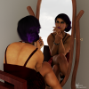
My first post. I rendered two versions of a portrait scene. The “moonlight” scene uses emission planes as the light source and the daylight version has two point lights with fill lighting provided by emission planes. I haven't done any post work on either render, I am not sure what is going on with the model's blouse in the daylight scene as the color is not uniform throughout.
@sisyphus1977xx Welcome to the new user challenge! (You are the third person I have done this with in the last week. LOL )
)
Those are some solid images, I especially like the "moon" render, very good pose and expression.
Could the qwerk/artifact on the first image be a shadow cast by one of the emission planes that is lit by another source? I have also had something similar happen where one light is overpowering another.
I think the second image is good as is but wonder if it could be even better. Perhaps a fade to black, colored rim light, back light or lit background to silhouette the models screen left might be something to try. Lots of potential there.
I really like this image. The pose and expression are saying volumes. All that light but none are overpowering any of the others or the figure.
Not sure how to improve this one. Hopefully someone else will have some suggestions for you.
@sisyphus1977xx I agree with @dtrscbrutal's comments. The shadows in the Moonlight version are much more interesting but they do need slight softening.
If you want to work on the daylight version I would suggest giving her something to "lean" on. A simple square primitive shaped into a column will work if you do not have much in your runtime yet.
I like your idea and the image very much.
Render time is an issue when using volumetric effects :-\ But 13 hours and 0% percent sounds a bit extreme. What are the specs of your machine (cpu / graphics card)?
As a natural consequence of the composition, there is a darker area on the left (the unlit side of the wall that has the window). Perhaps you can move the bed and the girl away from this dark area, more to the right (so that the girl is on the right third-line?) to give more space to the light that enters the window, to emphasize the light and the girl more? I am sure you do not want to lose the lit bed and the girls shadow... a difficult setup. Using additional indirect light to lighten up certain areas is difficult when you want god rays, because the rays need a bright light in a rather dark environment and volumetric fog. In my opinion, getting rid of the candle would not be an issue, it feels as if it doesn't add to the color scheme or lighting setup, it is rather distracting there in the corner.
There is also great potential to make the materials pop out and generate some nice shadow details (very rough wood, the plaster on the wall...). Normal maps need light to work, so this is also difficult with rather dark environments.
You have a great start already. Challenging but very promising! I am curious what you will do with it (if you manage to tame render times). This can be an epic render!
Dance practice version 1
Here is the first version of my image
Here is round 2 of both my images. I added simple backrounds in both and took the color temperature down on the daylight scene to make it more warm. Most of my problem with the render of her shirt has been resovled, but there are still some issues with it. Thank you and I appreaciate the comments.
Version C here, with some shading done to his hair, and decided to use the lift behind the camera for a light source to try and light him a little better.
@Kismet2012 You just made my day!
@sueya That is an awesome start! Love the way you are using the reflections and pose So much potential there. Those windows are just begging to have some light put through them. If your hardware limitations allow, you might consider some volumetric light.
@sisyphus1977xx Much improved on your daylight image.
@Shinji Ikari 9th Definitely think you are going in the right direction. Another super cool set/environment too.
dtrscbrutal
answered those questions quite accurate, thanks, the link to 2018 showcase is this one though: https://www.daz3d.com/forums/discussion/231556/2018-new-user-showcase-year-in-review#latest
2019 will follow
Thanks for the feedback. I'm using City Sewer by Predatron as my setting this month.
I see a lot of great ideas from everybody so far. For my scene "Narrow Escape" I did some rearranging/geometry editing of environmental parts to get this cramped corridor that she's trying to escape through. Re=surfaced with a different texture adding emissive lighting on several specific areas of the surface. Then tiled the pattern by a pretty huge factor to create all these individual lights that surround the interior 360 degrees. Any suggestions please let me know.
You've got a nice start here. The only thing I might mention is that her chest armor looks like it's poking into the 'floor' of the corridor. You might want to take another look at that to make sure.
@testingtesterson35 That is an awesome render, great idea, use of textures, light, pose, and camera work. Very nice character (assuming morph?).
I find the lack of gravity acting on her hair very unrealistic, a real knock on an otherwise stellar image. I agree with Shinji but, also where the smooth armor ends at her chest, check if it's clipping into the undergarment.
This might be trouble depending on how you built your set/environment, but if you are wanting to play up the cramped feel, you might consider bringing the screen right wall into frame more. I suspect you could fill the space vertically by grounding the elbow and displacing some hair on top. The hair could get tricky. Really interested to see how this one ends up.