Brad Carsten - Books and Tutorials.
 BradCarsten
Posts: 856
BradCarsten
Posts: 856
Hi everyone. I've been using DS to create book covers and promotional images for a while now, and I decided it was time to stop lurking and to carve away a small space to put up some of my musings and artwork. I also thought it may be fun to show you how I create some of them. I've learned so much from everyone, and that's my way of paying it forward.
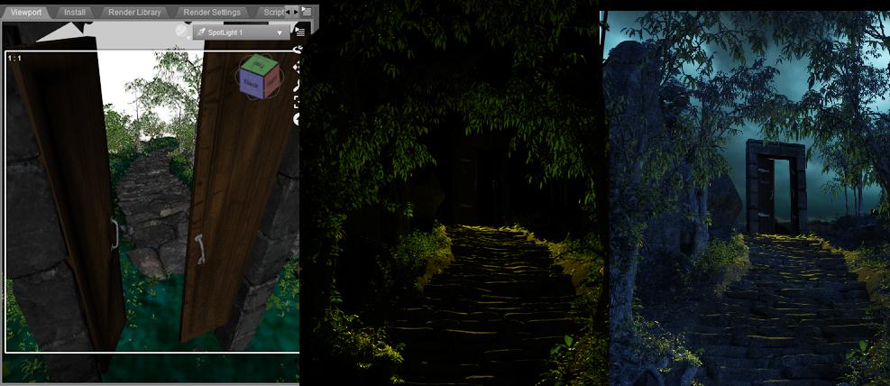
The first is the original cover for Riftwalkers: The King and Guardian. It's a Portal fantasy novel (People finding a doorway from our world into a fantasy world) I wanted to emphasise the Portal on the cover, so that people know what it is just by looking at it, and I also wanted it to have that painted look of those books from the 90's, because that's what inspired the novel.
Unfortunately, this image is a little dark when you look at it alongside some of the other images on Amazon, so I'm in the process of redoing it. I have however already created the tutorial, so I'll post it, and then show you the changes once I'm done with them.
First up is the finished image.
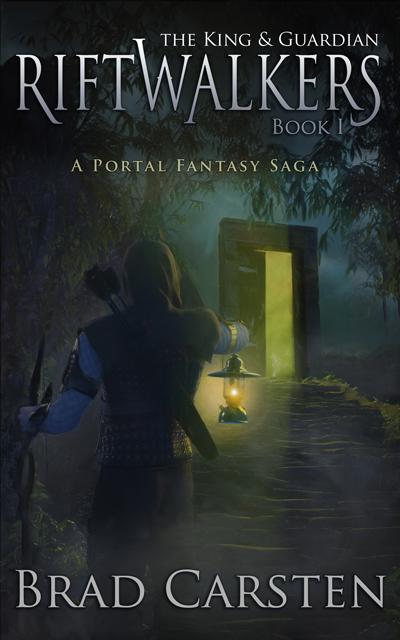
I wanted the doorway to have depth, so that you can see that there isn't anything behind it.
To do that, I exported StoneMasons's gothic ruins into Blender and cut away the highlighted pieces. I realised the undersides of the lintel are hollow, so I simply duplicated it, turned it on its side and popped it into place. Crude, but it doesn't matter because it's going to be in the distance.
Those amazing doors were taken from Jack Tomlin's A Curious Pub.
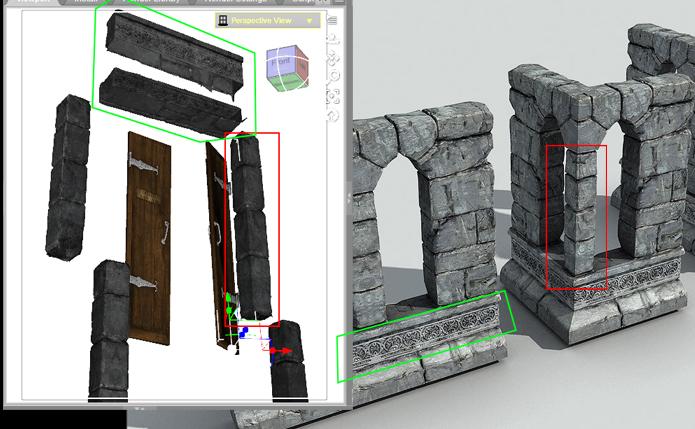
The scene is Andrey Pestryakov's Stairs and Rocks. I took out the default trees and replaced them with Stonemason's Jungle construction kit so that they would hang over the doorway, creating a tunnel.
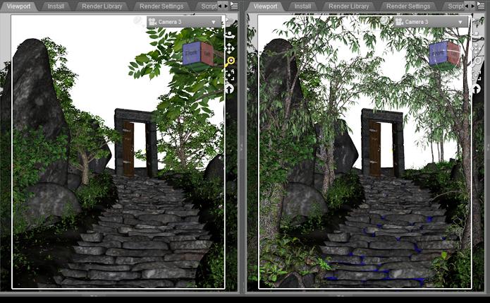
Next up was a pic of some stormy clouds for the background. Clouds are so good at creating drama in a scene.
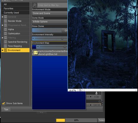
I then created a blue HDRI and used that as the environment light to render out a blue layer. This will be the night base that we'll build everything else on.
Next, I positioned a yellow spotlight behind the doors and rendered out a layer with nothing but the yellow light.
In PS I dropped that on top of the blue layer, and changed the opacity to 70% and the blending mode to "screen." This combines the two layers, giving you the flexibility to adjust either layer without having to render the scene over and over again. It wasn't bright enough so I duplicated the layer, doubling the strength and that gave the blue a rich yellow tint.
Daz 3D is part of 
Connect
DAZ Productions, Inc.
7533 S Center View Ct #4664
West Jordan, UT 84084
Licensing Agreement | Terms of Service | Privacy Policy | EULA
© 2026 Daz Productions Inc. All Rights Reserved.
Comments
In order to create the light in the door, I just grabbed an image off my computer, colourized it yellow, and then turned up the saturation quite high. I slid it behind the door until I found a spot that looked good. The rest I just erased.
I wanted to add a bit of fog, so I dug out an old smoke simulation that I had created in Blender, and dropped that onto the scene a few times, using the exclusion blending mode and then shaped it very roughly with a soft eraser. I will add another thicker later once the character is in place to give it a bit of depth.
There are plenty of tutorials on youtube if you would like to create your own smoke. It looks great if you use it to add some chimney smoke to your medieval city scenes.
Speaking of characters, I used midnight rogue (yes, I know, I'm still stuck onGenesis 2), but I found it was a little too dark for a night scene, so I changed the textures using Uber+ Iray Medieval Armor Shaders. you can't see it in the viewport, but I used a lighter cloth for the hood. For lighting, I used the same blue HDRI that I used for the original scene as a base, along with two emissive planes on either side to create a rim. white for the moonlight, and yellow so that some of the lantern light would reflect back onto him.
To give the lantern a nice glow I dabbed a big splotch of orange using a soft brush. I then rendered a lens flare onto a black layer. That went on top of the orange splotch using the "screen" blending mode. The character went on top of that, and finally another orange dot and a smaller white dot to finish it off.
Now I wanted to create that painted look. Instead of painting it by hand, because I'm too lazy for that, I just ran it through Coral painter express using the oil paints filter. It doesn't give the greatest results, but you can drop it back onto your original image, choose lighten, and it adds a few nice looking brush strokes to the image.
We're almost there.
I wanted a yellow glow coming through the door, so I used the old volumetric lights for 3Delight. For that layer I used a screen blending mode with 70% opacity. Afterwards I lowered the saturation a bit to make it look more like a painting and less like an advert for Jake and the neverland pirates.
I like to drop a clear layer on top of my images to make sure that everything blends in properly. It just adds the same blue hue to the entire picture. Old paintings also tend to have that blue tint to them. I added a Luminosity blending mode with a very low 8% opacity.
In the final block, I dropped the saturation a bit more and darkened the sky. I also played around with the red colour channel, by upping the greens and dropping the blues. There isn't really a formula, you should just become familiar with the tools and then go with what feels right to you.
The text has a simple gradient applied. For the final step, I made a copy of the entire image, dragged up the curves to make it very light, and set saturation blending mode to 29. That brought out a bit more of the colour.
That's it. Thanks for sticking around. I will post the new changes a little later.
Okay, phew I finally finished the lighter cover. I say finish, but it'll no doubt go through 100 more revisions and tweaks. All I did on this is add the 3delight rim light rig behind the trees, and a blue point light near the bottom left-hand corner to illuminate the background a little more
reserved 4
Very cool! Thanks for sharing your process. I am always interested in how other people do things
Wonderful explanation of your process. Thank you for posting this. I love seeing how people approach their artwork.
This looks impressive, nicely done!
Nice kitbashing! I love your cover. :)
Thanks. I love ripping these kits to pieces lol. It's so much fun. I've got a really big one coming up.
Thanks for the comments. Now we just need to get Deviney to give up some of those secrets
Thanks you.
Love your avatar btw. Her face is so expressive.
Thank you so much for sharing your steps. Great cover!
Your covers are excellent. Thank you for sharing some of your workflow. I really appreciate it.
Thanks! and no problem. I hope someone finds it useful.
Deleted - I'll redo it later.
I got the cover for my new book done and dusted. it's an early YA, late Middle-grade fantasy.
This is some of the promotional material I was working on. Unfortunately, my computer crashed, so I don't have access to the original files for the next few weeks.
This was an extremely challenging scene to pull off.
This scene takes place in a magical city called Atlas. It's surrounded by a huge bubble that keeps the water out, but because of that, there is no gravity in the city either. Huge pillars rise up from the bottom of the city with old medieval-type buildings wrapping around them. People ride on dragon-like creatures called serpents. In this scene, my characters are fleeing from a group of magicians that are hunting them down.
This is what the structure looked like. I used 1971's Hall smugglers as the base. Took it into Blender and extended the tower up and down. I then got hold of every medieval building I could find and stuck them on. Once I had the basic structure, I simply created clones, and stacked and roated them, creating endless combinations. This is the same stack from each side:
Deleted: There is something seriously wrong here. I keep getting errors while uploading images, and now it's posted the same thing 3x
deleted: strange repeated post.
I created a few different renders, mixing blue and orange lights. I move the lights around until I have a nice collection of images that I can then play around with afterwards
This was the image that I decide to use as the base. I then added all the other blue and orange layers to it:
I went back in and changed every surface to plain black. And then made every window surface an emmissive light to create the window lights. Because I'm using clones it didn't take as long as you would think.
Combined it all in photoshop, and added some light streaks.
After that I added the creatures, for the smoke trails, I used blender smoke simulator for that.
Wow I love that idea with the house stacks! Thanks for sharing the process as well, very creative, now I wnat to think where I could use this strategy to make an original environment
awesome thread man, top stuff
Excellent work, @BradCarsten! Thanks for taking the time to document your work and share a bit about your process. The overall color palette and your work with the fonts really work well - cheers.
- Greg
Enjoying this thread a lot. Great work.
Wow, fantastic tips and superb art! Thank you for sharing!
Thanks everyone for taking the time to comment. It's much appreciated.
That would have made my life so much easier haha. I see stacks were also used in Ready Player one with trailers stacked ontop of each other. It makes quite a striking image.
I think this is probably my favourite image.
As I said, I don't have access to the original files at the moment, but when I get my new pc I will see if I can break it down.
I used the 3delight rim light rig for the sails. I absolutely love that product. I also used it for Dalia's dress in my Fableman cover.
Great thread. I enjoy a lot, what are you posting here.