July 2018 - Daz 3D New User Challenge - Portrait Rendering
 Linwelly
Posts: 6,070
Linwelly
Posts: 6,070
New User's Challenge - July 2018
Sponsored by DAZ 3D
Are you new to the 3D World? Are you at the beginning stages of learning 3D rendering? Have you been around for a little bit but feel you could benefit from some feedback or instruction? Have you been around awhile and would like to help other members start their creative journey? Well then come and join the fun as we host our newest render challenge!
"Portrait Rendering (Expressions and Lighting)"
This month's focus will be Portrait Rendering, with an emphasis on the character's expression and lighting. Portraits are the way we show off the unique aspects of each individual. Expressions should convey their personality. Good lighting will enhance your portrait and set the mood. Portraits don't have to look like yearbook headshots. Get creative, hone your skills, and have some fun in this months contest.
A portrait is a representation of a person, group of people, or even a pet, that displays the expression, personality, and mood of the subject. The focus of a portrait is usually the subject's face, although the entire body and the background or context may be included. Depth of Field is often used to blur the surrounding environment to draw the eye to the subject.
Inspiration:
Portrait Tips and Examples:
Tips for good portrait photos
Google Search - Portrait Expressions
Lighting:
Lighting Tips from the Masters
Portrait Lighting Patterns
Mastering Lighting in Blender (The first 25 minutes of the video are basic lighting theory and insights.)
Other Helpful Links:
When following tutorials, be cognizant of the different applications (Bryce, Daz Studio, Poser, Carrara Blender, etc.) and different render engines (3Delight, Iray, Reality, etc). Techniques for one may not apply directly to another. If you have some favorite portrait lighting and composition tips, please share them in this thread.
Composition Golden Ratio helpers:
Bryce
DAZ Studio (Also, DS has a built in Rule of Thirds guide; just select Show Thirds Guide in the Viewport context menu)

Lighting Tutorials:
Tutorials by Szark (Credit is given to Szark for this wonderful thread with links to many tutorials.)
6 Tips for Better Lighting - Blender Guru (Most is general lighting tips, not Blender specific)
Daz Studio Gia Character Promo Render Tutorial
Creating And Lighting A Scene With Iray In DAZ Studio
Dreamlight Lighting Video Tutorial (currently free in Daz Store)
Creating Eye Reflections with Reality Poser Edition Part 1
Creating Eye Reflections with Reality Poser Edition Part 2
Carrara Chapter 14: Setting Lights
Bryce Artist’s guide page 123
Some good information on useful portrait cropping
https://digital-photography-school.com/good-crop-bad-crop-how-to-crop-portraits/
And of course its always a good idea to check the portraits contests from the last years
For a list of the current challenge rules, please see this thread : Challenge Rules
Closing Date: July 31, 2018
I will be checking in as will the rest of the Community Volunteers to try and help with anything you all may need.
Daz 3D is part of 
Connect
DAZ Productions, Inc.
7533 S Center View Ct #4664
West Jordan, UT 84084
Licensing Agreement | Terms of Service | Privacy Policy | EULA
© 2026 Daz Productions Inc. All Rights Reserved.
Comments
Here we go with my start for this month. Figured that I'd try and bring my kahjiit in ESO into the world of shadowrun.
(Funny story. when I created him, my friend that I play with created a kahjiit as well shortly after I had created mine. Long story short, when we met in-game with the two of them, I swear that he had channeled my character when I first saw his.)
Here's version B of this one. Swapped his guns out for a pair that came with silencers, (he's finished the Dark Brotherhood's main storyline and unlocked the silencer costume. So silencers to represent that.)
Also did a little more texture work, and added a spotlight in the tunnel in the background to simulate a train coming in but still out of sight around the corner.
Finally before anyone comments that the silencer on the gun in his right hand is intersecting with his leg, it isn't. I checked it at the silencer is falling behind the leg.
Nice start that you have here. She's a cutie that's for sure.
Can I enter a portrait that I have already submitted to my deviantart account?? Only submittetted it 8 hrs ago.
This is right out of iRay/Daz with only small sharpening in PS.
Welcome to the New User Challenge @doctorrealgood
Generally there is no problem to work with a scene you already had before, but you should be aware that the idea of this challenge is to experiment and improve your skills. For most people it is easier to work on something new rather than something you already though finished.
Welcome to the new user challenge @vpaintersue that is a really nice start there!
Here are some thoughts: She wears a really interesting head piece, so it would be nice to have something in the backgeound and/ or her clothing that tells us a bit more about her and how she comes to wear that piece. I like that you chose a grey tone as the fits to the headpiece but the image in total gives little to the eye to keep watching.
Considering compositional aspects for portraits its is often a good starting point to have one of the eyes at one of the third grit intersections, especially in scenes where the character looks to the side. That will move the character sideways.
Hi Shinji, I would suggest to either make a full body Portrait or concentrate on the upper body part, in the moment you cut off the legs (not on a forbidden place) but rather unnecessary as there is more than enough space above his head. If you don't want to loose the red part you could twist the camera to a slightly upwarts angle. As well I suggest to draw in on your character, give it more light and contrast. Its hard to even make out the interesting details you got for him.
This already is a very beautiful work, but something is irritating the heck out of me with it and I can't put my finger on it, The only thing that comes to mind is that I don't know if she is looking at the camera or somewhere slightly off. It would probably help to make her either look really point on at the camera or make it decidedtly off the camera, just my though.
Camera angles can make things look different from how they really are. I fight with that all the time. Something does not look "right" through the camera but when you check it is correct from other angles.
The addition of the light in the tunnel is a subtle but significant difference and I like the choice of guns with the silencers. They have more presence and give a stronger sense of his deadliness.
I would like to see his face a little more clearly. It is in a little too much shadow.
Good start.
She is lovely.
I really like her pose and expression.
If you can try to adjust the top so that the strap sits on her neck and collar bones. Right now it is floating a bit.
I agree with Linwelly that something isn't quite right but I am not sure what it is either. Our subconscious can pick up on details that we are not consciously aware of.
A really nice start.
I'll have to see what I can do about the face this evening, but it does not help that I went with the closest texture to what I used on the character that he represents. (The actual character is getting up there in the years and it shows in the facial fur. I guess that this take on him could be a younger version of the guy?)
Thanks for your feedback, and have a safe 4th of July.
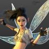
Here is my entry, it's called "At One" The models name is Mishti, I created her using Genesis 8 Female as a base with Daz Studio 4.10, the Photoshop Bridge, Zbrush and a fair bit of luck, she was never meant to look like this, but I am so happy that she does. The picture itself has three Photometric lights, side, back and rim and the background is a simple plane with an Uber gold surface applied. This render was created especially for this thread and absolutely no post processing was involved, it's a straight up render! I really, really hope you like it and all feedback is more than welcome beit good or bad, I still have so much left to learn.
Wow that's very cool!
Here we are with version c. I changed the camera angle so we could see his feet, and started a fire outside of the frame to try and cast some more light on his face. Also gave him some dogtags to give him some back story. (Though what kind of back story it is I leave up to you.)
Thank you :)
Very nice and interesting start! I love the idea of the golden reflective plane. I like the kingfisher there as well very much but in the moment I have the impression that its drawing attention away from your main player. My suggestion would be to switch the bird to her right hand and give the bluish sidelight you already have a bit more intensity, that would balance the blue from the light on her left side with the blue bird on the right. As well I hve the feeling that a bit more light on her face in general would give her even more presence. I hope these ideas help you and I#m looking forwar to what you come up with.
Hmmm interseting, the original idea was "At one with man and nature." which definately puts man on the left as you look at it, we read from left to right, but I think you may be right, I'll give it a go and see where we go from there. Thank you for the feedback, I really do appreciate it
Ok here is the "B" version. To be honest, I don't really like it. I chose the name Mishti because the meaning means:- sweet girl that may seem mysterious to some. When I rendered her for the first time I was amazed and t really was a mystery to me how I managed to creat such a beautiful model that looked nothing, and I mean nothing like I had hoped and yet I couldn't be more proud.
Lighting the face takes away a lot of the 'Mystique' element and although she looks, in my opinion, no less pretty, I do think it detracts from the original, I also do not like the new reflections so apart from starting over I don't know what else to do! I know exactly the thought behind reversing it, but I just don't think it works, so again, any suggestions would be more than welcome.
yes, I can see what you mean, the subtle light from the side was more gentle and supported her better. And the flow of reading the image was better in the original. I'm sorry, sometimes the suggestions are not leading in the right direction, I hope you kept a copy of your original scene? Something, that I learned the hard way, is very helpful when one starts experimenting and is not sure if the outcome will be better.
I will have to do more thinking before I give other suggestions (which then I hope will be more helpful).
This improved really nice! I like all the changes you made from the rim light to the staff and her dress and the little touch of bokhe in the background.
The only thing you might try to work a bit on is the hair, there seems to be some sort of artifact from the hair at her temple and I believe that this is an older hair you used which originally is not made for Iray rendering. You could try to adjust some of the shader settings to make it work a bit better with Iray. That is a lot of trial and error so better do the experiementing in a separate copy of your scene so you don't lose this. If you can give me the product link of the hair I can see if I have that or somthing similar to give you some ideas of what to adjust.
I used Wynter hair with one of the headdresses that came with it. Thanks for any advice you can give me and for your comments.
This looks amazing, well done.
Thank you
Oh I kept it alright, that's never getting deleted lol
Well done so far, very nice job.
I tend to agree with you. I prefer the first image as well.
I have made changes to an image on more than 1 occassion thinking it would be an improvement only to prefer the way it was. But if we do not try something you will never know.
That is why we suggest when making a change save it as a new version of the project, ie Misthi A, Mishti B or Mishti, Mishti Alt, etc.
Mishti is a wonderful character. Congrats and I am sure you will create many wonderful renders with her as your Muse.