Bee's Breakroom - Comics, WIPs and other Ruminations
 BeeMKay
Posts: 7,019
BeeMKay
Posts: 7,019
Hi!
I finally bit the bullet and started an art thread of my own. (yay!) In here, I hope to show some WIP, and the occasional page of the webcomics I'm working on.
I do understand that I'm still very much a beginner when it comes to 3D rendering, and a complete novice when it comes to comics (at least the creation part)
Any type of feedback is highly appreciated and welcome. And yes, that also means "your art sucks", but in that case, please let me know what exactly is suck-some, so I can improve. And no, "everything" does not count as a valid answer. 
I'd like to start out with two recent pages from my comics, "Demon Division" and "The 4th Wall".
"Demon Division" and it's prequel "Demon Division: Dwellers" have been projects for over a decade now. However, the comic thing is a new developement - so far, both stories just existed in shape of a novel (Dwellers) and a concept (Division) my co-author and I were working on.
I always wanted to draw comics, but my artwork with pen and paper is pretty abysmal. A couple of years ago, I stumbled across DAZ Studio, and was hooked. After frying my laptop, I spent some savings to buy myself a proper rendering PC (and a new laptop). I began to think - hey, that could be a way to get a glimpse at your dream - make something visual out of the stories. You know, the next best thing to an actual TV series with real actors and stuff...  Hey, don't laugh, a girl has to have dreams!
Then came along Iray, and some webinars over at Digital Arts, and I finally got over my fears, and posted the cover art for Dwellers. Which, if I may say so, turned out pretty good (at least, for my level of expertise and skill with the programs involved). Fast forward a couple of pages, and Dwellers (which had started out in the present day Division part of the story) got its own comic. because the initial concept didn't work out. Fast forward again, and it turns out that two comics are a bit too much to handle, and Dwellers will go on a temporary hiatus once the current scene has completed.
Then, you might ask, if two comics is too much, why did you start another one?
Simple. First of all, the 4th Wall is a Behind the Scenes. It will be a lot of screenshots, with single figure renders of characters from the comic plus my author-avatar narrating the bit. It also doesn't have a schedule, updating irregularly. I hope that the readers will enjoy it as much as I do creating it, and ask the questions they want to know. If anything, it is something I can point people to when they ask me about "How's this and that done", with visuals rather than dry words.
Talking about words, I've babbled enough, so I'll share the two pages now. Like I said, feedback is welcome. The current workflow is DAZ Studio 4.8/4.10 BETA (for renders), Comic Clip Studio Paint Ex 1.7.2 (composition and lettering), Photoshop (QS and resizing).
EDIT: I mistakenly wrote Comic Studio, but I am using Clip Studio Paint Ex, formerly Manga Studio 5 Ex. The stuff is on sale regularly (Right now, at $69), and worth the investment, i.e. if you are also doing drawings.
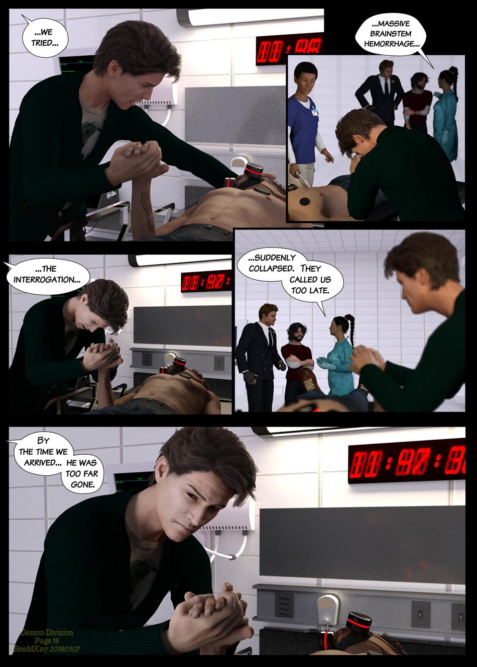
Demon Division -- Page 18
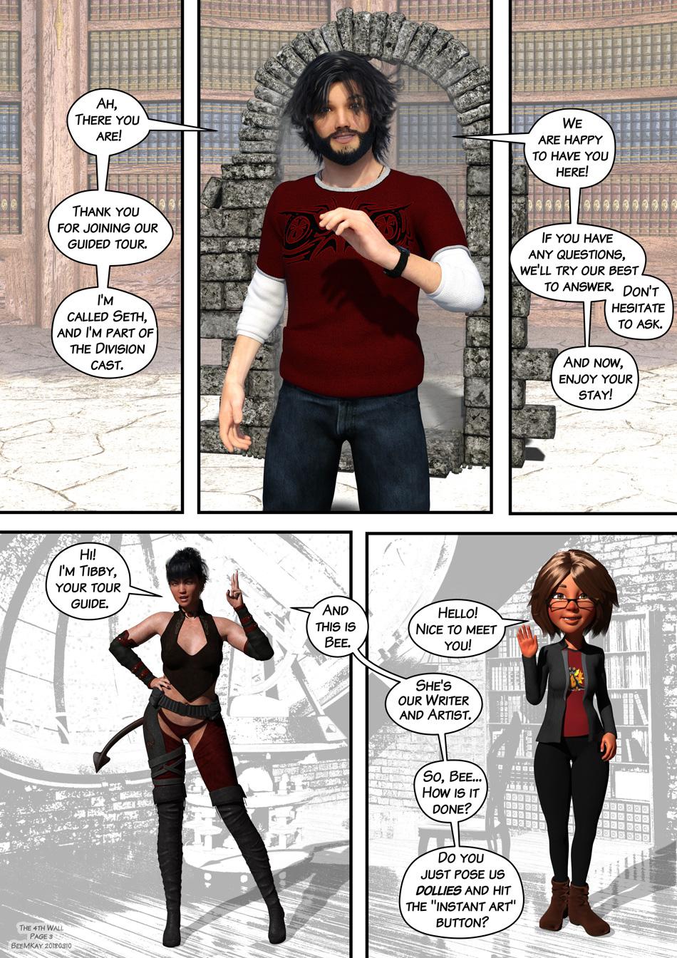
The 4th Wall -- Page 3
Daz 3D is part of 
Connect
DAZ Productions, Inc.
7533 S Center View Ct #4664
West Jordan, UT 84084
Licensing Agreement | Terms of Service | Privacy Policy | EULA
© 2026 Daz Productions Inc. All Rights Reserved.
Comments
Glad you started a dedicated thread. Wonderfully fun beginning. I like your style very much. Looking forward to more. I'm still looking for the "make art" button myself. I don't have Comic Studio, but I like your results. Will have to look into it.
What a wonderful start! To be specific, I really think you did a great job of portraying emotion in the first renders, and my eye went to where it should. A nice balance of lighting, posing, and dialogue. One tip/suggestion- in your second frame, that man in the back with his shoulders elevated rather draws the eye, and I wouldn't put a dark suit person behind someone with dark hair. You had "open" gray wall space that you can use, aka, move your camera so the person with the head bowed would be more noticed.
Not saying to have the bowed head completely against gray wall, but that background man's hand also unfortunately comes down right where the bowed head starts. So that man back in the background is just distracting to me and makes your main focal point (bowed head) harder to pay attention to. I like the orderly in the blue shirt who is paying attention to your main character, he looks confused or uncertain and really adds to the emotion of the scene.
The gripping of the hand has such a powerful message, well done. Not wanting to let go, to be there to comfort even when the other person can't feel it.
For the talking bubbles- easy to read and follow along, nice style!
@diomede , thank you for the warm words!

Yes, we all would love that button, wouldn't we? But, as they say, no pain, no gain.
In regard to the software, I am sorry I lead you astray. I'm lousy with names when it has similar components (drives my colleagues at work nuts). I'm not using Comic Studio, but Clip Studio Paint EX (formely Manga Studio 5 EX, which is probably what caused the snafu in my brain). I got cheaply about a year ago. It's currently on sale at $69 if you are in the US. The main page is at http://www.clipstudio.net/en/
@novica Thank you for such a positive feedback!
 I got a lot of great advice from the Comic thread here in the art section, but still lack the experience and skill to fully understand/utilize it.
I think you have a point about the suit guy and him taking away focus. The idea was to slowly move from the mourning guy and his deceased brother over to the group in the background, with the mourning brother overhearing their talk and getting really angry about what happened. I also thought this would be the best angle to establish the position of the nurse, who will need to be behind the mourning guy in the next few panels. Maybe if I move together the group in the backgroud so that suit dude is standing closer to the other two, maybe behind Seth (in the red shirt)?
Fortunately, I rendered that image in layers, and so it's not too difficult to replace the background group.
Oh, Manga Studio. I have an old version (4) of that. Wonder if I could get even more of a discount for an upgrade. Thanks for the link.
Possibly... That's also how I got mine - starting from a cheaply discounted older version of MS, upgraded to the (then heavily discounted) newest version of MS pro, and then from there to Clip Studio Paint EX. And it is a good software - they even use it in Pro mangas and animations.
Here's one of the reasons (outside of speed and an overflowing graphic card's memory) why rendering in layers is useful...
I replaced the layer in question with the newly rendered one. Render time for the background characters was a good eight minutes on my GTX980Ti. The full scene is too large for the card, and would have needed ages in CPU-mode.
I will be watching with great interest! I know nothing about comics other than the fact that I enjoy reading them but I am already wanting to know what happened and what happened next so I would say you are off to a great start. Great sense of humor as well. Also still looking for the make art button.
@IceDragonArt Thank you for the positive feedback!
What's happening next is always a bit of a problem. Not in as much as that I don't know what will happen (we have the scenes scripted out), but in that I haven't developed a good feeling yet as to how much should go onto a page. There's that sudden realization that you will only get a few lines worked off from your script, and it feels like there should be so many more lines covered, because of "story progress". But then, what I've learned here is that you shouldn't skimp on the emotional parts of the story telling (choose wisely!).
And then, you havbe something like this week's scene, where I was originally having 5 planned images, but realized that I need three more reaction images. And then I am at the bottom of the page with 5 images, and need to get the rest covered on the next page...
Below is my "putting the images together on the page" before I go into the layouting for this week's page.
Great that you have your script so well organized. The emotion is coming through. Out of curiousity, have you looked into issues and tutorials for storytelling in smaller formats? I saw that DAL has an upcoming event related to targeting phones and similar devices as display formats. I'm not sure that I am interested in such small venues for comics, but you are much further along in your storytelling than I am. Seems like the small screenswould take too much away. What do you think of the topic in general?
Thanks! I need the script to plan my time table... at least, somewhat. Everything is much more time consuming than it should be. Part of that is because I want the image to look good. Setting up takes time, i.e. with the poses. But then, getting the emotions acros will not work without proper poses...
I've signed up for that webinar, as the presenter Mr von Stackleberg does a pretty good job getting things explained and pointing you in the right direction.
As for small screen story telling... well over 60% of people going online with a small screen, as in, mobile phone. If you want to reach that crowd, you'll have to adapt to their screen size and viewing habits. But I don't plan to go one venue exclusively. I'm a "classic comic/manga" type of person, and I am used to reading a comic "the old fashioned way". That is what I'm comfortable with.
But when I started out with Division, my speech bubbles were a lot larger than they are now, because I also looked at the comic on my tablet, which is a lot smaller in screen size. It was hard to read it there, and I tried to counter measure that by the larger bubbles. In addition, the comics are bi-lingual, and I initially had just one bubble for both.
It didn't look pretty. On the large screen, the speech bubbles dominated everything. On the small screen, the print was barely readable. It was neither fish nor flesh.
Here's a comparision between two pages. The left side is before the edit, the other is after the edit. I now have a smaller font size, smaller bubbles, and don't try to dance on two parties at the same time. There will be a dedicated version for mobile, at some point, but it will then play by the rules of a mobile comic. I hope that the webinar will help me understand those rules. Putting them into practice... that's a different story altogether.
Great information - thanks
So... here's the final version of the Page 19 WIP that went online... I decided to change the order of the images slightly, and did some last minute fixes to the text.
There's also a new page of The 4th Wall... That one's a lot of ad-libbing rather than real scripting. I roughly know what I want to show on each page... I might change that in the future, though, as fixing the text right now needs a lot more time than doing the renders. Now... I need an Instant-Script-Button!
Hehe I like you comic avatar and how you went along with the explanation. and the comic page is coming very good with the emotions.
Actually the comic avatar inspired me a little to try my cyberfaery avatar :D
Thank you Linwelly! The Avatar is mostly 3D Universe Toon Generation 2 and some clothing/accesssories for G3. I first wanted to go for a faceless blue figure, but that didn't really work out. And 3D Universe's set is quite versatile.
You avatar looks really good!
Love the instant art button. I want one of those too!
the rework flows nicely on the comic page. Definitely want to know what happens next!
Thank you, IceDragonArt! Yeah, that button wasn't cheap to come by, but it's so handy!
As for the next page... let's just say... posing it is no fun, and its FX even less!
So... here's the next page of Division. I used quite a bit of postwork this time, though I didn't use Howler, as I first intended. I had to redo the images a few times, as it turned out that the fx became overwhelming. So I decided to go as minimalistic as possible.
On other news, I am begining to wonder if it really was a good idea to jump right into the fray with little brother's death, or if it would've been better to add a bit more of the brothers regular life... I mean, there's going to be more of that in retrospective as they work on the case, but still...
Then again, while this is a turning point in Simon's plot, the main plot is still with the students, and focussing on their daily lives as they have to make up their mind about whether or not they want to stay in the Division, or get a magic inhibitor...
The frame where he says "My Brother!" looks weird.
It almost looks like he's throwing a punch...and hitting someone....
And the arm looks awfully small.
----------------
I like how the doctor is laid out in one scene and looks fully prone in the next.
I bet he fainted. I would have too.
lol
The throat grab is great and so is the pause with the dramatic line broken into frames.
I'd also suggest more post work on all the effects.
Thanks for the feedback.
Yes, the arm gave me quite a headache. He pulls back, ready to punch the guy he's holding in his strangle. At the same time, the magic fx is forming from the lights into a flame.
However, the arm is really as it looks from that angle; outside of giving it a different posistion, I don't see a way to fix that.
As for the fx/postwork, yeah... if I get the time. I'm still learning photoshop, and I'm glad I managed to get this out of the rendered image/layers at all. The wings is three different images/layers merged to get the effect. It still doesn't come out as it should. There's still so much to learn! *sigh*
EDIT: You wrote it looks like he hit someone... is it that it looks like he hit the guy he's holding, or the nurse in the background?
The guy he's holding. Looks like his hand swipes across his face.
Ah, I see! This was supposed to be a "flame sword forming FX", but I see how this can also be read as a movement FX. The fist is aiming at the face, because he's in the process of striking the guy he's holding. He has no real control over the deadly magic he's creating at that point, other that he's at this point "willing to kill". The original concept from way back when had them materializing "energy swords" of sorts, that looked like swords or knives. The current concept was more to the point of transient effects and the flame.
The problem is how to get these ideas and the intended action across to the reader, methinks. The current method obviously is not quite as effective as I had hoped. I'll have to figure out what would work better. Makes me really worried about this week's images, which contain the combat between suit-guy and big brother.
Maybe take a regular sword or mystical sword prop and use a different shader to make it composed of light, fire, energy, etc.....
There's a lot of weirdly shaped swords in the shop. some for real cheap.
Scale it huge....maybe double it and make it shaped like a star, anything that's different, really....
Like some Green Lantern stuff where the magic makes incredible constructs of....mystical energy lol....
You can probably execute that better than I can describe.
I'll have to think about that. The reason why the concept is different from the original was to show the unrestrained, instictive use of magic here. There's no intricate spell weaving like they usually do (which allows suit guy to come up with a shield) but this is something beyong control, and as such, a most "primitive" shape... For example, when suit guy fights back, he could actually create a sword shape, because he's not run over by his feelings. Simon (big brother) is, and hence has no control at all.
I'll have to look into this a bit more and consider the consequences.
Thanks again for the feedback.
Oh shoot, never mind then, I got it wrong.
Having effects that cast light naturally, make a big difference.
The fireball-dagger affecting his face = great!
The white energy ball casting off her blouse = great!
A lot of us struggle with that or skip it, but you went right for it.
Ah, no, it's quite okay. Because it shows that I need to work on letting my images communicate these things I mentioned better. Of course, there will be some more scenes of training of the student mages that will explore how the magic works, but the reader, at this point here, should be able to tell that Simon's feelings are a problem.
Thanks for the kind words about the light effects. It takes longer to render, but looks more natural, as my co-author likes to say. So I always have the light in the scene, even if I do composition render (I then ghostlight it). If you have eyes or other reflection zones, it's a lot more difficult, because they have to mirror something to look natural.
Here's what I've been doing the past few days after work... the first two images of the new page. I've tuned down the FX, though I've kept the wings in the first image. Flattening the flame along the x-axis, and spreading it along the y and z axis worked surprisingly well (it helped that the flame is actual mesh and not a billboard!).
And here, the character learns the hard way that a shield that protects from magic doesn't neccessarily protect from a fist to the face...
a shield that protects from magic doesn't neccessarily protect from a fist to the face.
Ajhhhh hhah great stuff. I almost wish that was a caption.
Classic.
Damn, you're learning quick.
Thanks. :-) Yes, too bad that I don't have a narrator. That would be a perfect place to snark for him or her!
It will still be a long time before I'm anywhere near a decent level, but it's good to now that I'm going in the right direction. :-)
Here's the latest page of the 4Th Wall. The transition between the Intro and actual explaining stuff is very hard to do.
I find it interesting that we all see things differently. To me, it did look like he was pulling his fist back to punch him and I understood that his magic was starting to explode, although it did not occur to me that it was not on purpose. But that would be very difficult to show until the backstory is completely in place. Who knew storytelling was so hard! I think you are doing a great job though and am looking forward to seeing more.
Thank you, @IceDragonArt ! I just posted this week's installment of the comic over at Comicfury... just one more action page after that, and then the "calmer" part of the plot can advance, and we'll also return to the students...
I really likee how the third panel came out. I hope it brings across the relationship between Seth and Duon properly, and not leading people astray. Ya know.
It's official: I hate FX. The light effects are rendered in Iray, but I really need to get the postwork stuff going to make the effect look a bit better.
Here's Simon nailed to the glass window of the examination area.