Worlds Edge's Trials And Errors
 Worlds_Edge
Posts: 2,153
Worlds_Edge
Posts: 2,153
I'm a newbie at Daz/3D in general. I've been gleaning a lot of great information from tutorials and the generous posters on the forums. I've probably rendered less than 10 things so far as most of my time has been spent reading/trying to learn things, and yeah, buying assets. My renders are pretty hit and miss. If and when the lighting comes out good, it is a fluke, not talent or knowledge, LOL. I am having a lot of fun though, and I plan to get better with time and practice.
All comments, crits and tips are appreciated.
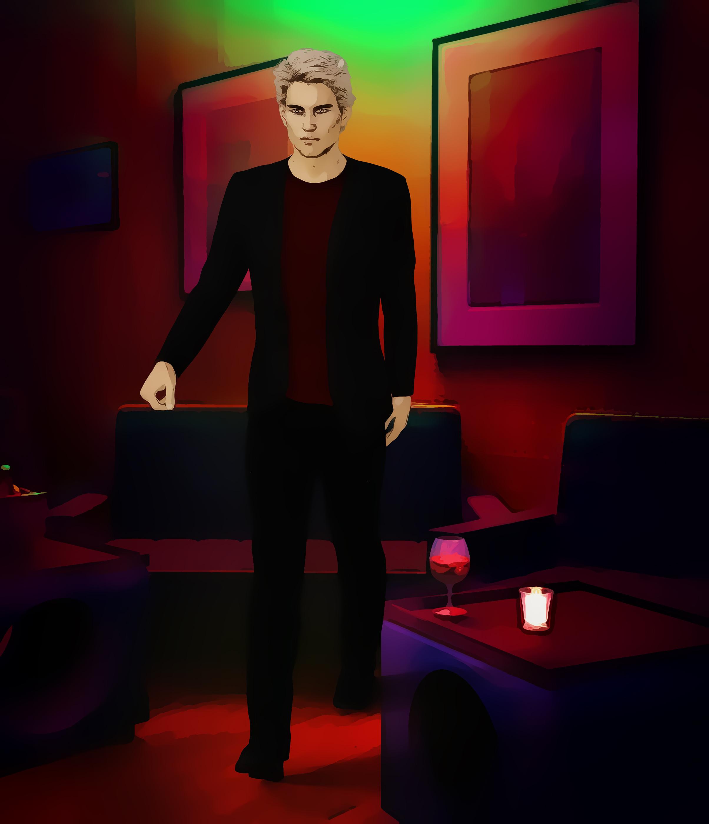
This first one is non-photorealistic. I made it a while back. It is a simple Robert render with a Sveva background, postorked to give it a comic book look.
Daz 3D is part of 
Connect
DAZ Productions, Inc.
7533 S Center View Ct #4664
West Jordan, UT 84084
Licensing Agreement | Terms of Service | Privacy Policy | EULA
© 2026 Daz Productions Inc. All Rights Reserved.
Comments
Angel v. Monster render pre and post work. I made so many mistakes that I later corrected in photoshop. Here are the ones I remember:
I'll put the post-worked version in a separate post - I was unable to add it here.
Here is the post-worked version. I tried to fix the errors above (some with more success than others), and added some details such as blood, scuffed up sand, and footprints.
Belatedly notice hand on sword is wonky - too late to fix.
Ah the joys and frustrations of learning daz lol. One of my very first renders ever was with the same background. And I had the same issues with the floating as well, so don't feel bad! You will get lots of help and encouragement around here as well. You did a good job on the post work as well!
Thank you @Ice Dragon. Funny we used the same background - I was tryng to make it as easy on myself as possible! I already see that everyone here is welcoming and brimming with good advice. I've learned a lot just by reading a lot of the posting threads. I'm learning to look at renders with a critical eye to notice errors or things that can be improved upon. Even that is a skill, it seems.
I need to make an avatar in the near future because I'm tired of staring at the smiley, lol
You are certainly off to a good start with your renders!!!!
I really like your angel vs. monster render (The 2nd one) it is like he walking away form battle for sure and I do see the issues with floating.
Thank you @saphirewild. I kept it simple because I goof up lighting, have not learned yet to do anything much with surfaces, and indoor attempts are frustrating so far. All I can say is thank God for photoshop, lol. I'll need to nail down my characters' feet in the future. With the creature, I just couldn't push it to the ground any better (one side insisted on floating, and I couldn't bend its body the way I'd need to to make it flat). As for the angel, I just didn't notice his feet were skimming the sand.
I'm buying the KA lighting - maybe that will help my lighting issues for indoor scenes!
I promise you that KindredArts lights will make your indoor lighting much much much easier lol. Lighting is the bane of my existence, I know how to do it, I just don't want to. Takes me too long. So I have a lot of light sets of which KindredArts Ghost Lights 1 & 2 and and the Boss Portrait Lights by PA Philosipher are my favorites. I have others that I use fairly regularly as well but these are the ones I use in almost every render.
@ice dragon art Apparently I have the first set of ghost lights already, but I don't think I've tried them. If it is something other than a preset, that's probably why I haven't tried it yet. I used a set that has "time of day" options, but those don't work inside. I'll read up on the ghost lights and see what I can do with them. Thanks for the encouragement, much appreciated.
Oh the ghost lights are super easy you have to try them! They are perfect for indoors.
Here are some test renders of Brenna but without the Ophelia base. I really like her look, not to mention the killer abs lol. If anyone has a tip on how to make the renders less grainy, especially around the hair/forehead, I'd love to hear it. I don't know what render settings to tweak. Iterations show around 219 - if that has anything to do with the grainyness.
And here is the non photo-realistic version after using filter forge and photoshop.
There are still some "smudge marks" around the characters that need to be erased.
For future reference, use the ones from the "Poses" folders, not the "Wearables," to avoid having darts in your scene.
@Sickleyield - Thank you for letting me know, it's very kind of you! I love the pose set and I'm sure I will get much use out of it as I have lots of characters that need to be, erm, will be, knocked out at some point, lol The darts thing was completely user-error. I'd use the poses even if they always came with the darts (I don't mind post work), but I'm thrilled to hear there is another option.
Do you have a screen grab of your render settings under Progressive Render?
@fishtales - here is a screengrab of the progressive render settings. Thanks in advance for taking a look.
Crank up the Max Time as high as it will go, 7200 is only 2 hours, I have mine at 7200000 which is 60 hours, it has never been near that :) Take the Max Samples up to 15000, I have mine set at that and it has never been close to that :) The rest is fine although I have Min Update Samples at 5 and Min Samples at 20, no idea why I did that but I came across something about it somewhere :)
See how that goes and get back to me.
Thanks for the advice @Fishtales I raised those settings and also matched your samples settings, but I'm still getting grainy pics. The attached (full body but I cropped for attachment) rendered in under less than 2 mins. It looks like there is dirt or soot all over her face/skin. Maybe it is because I'm a failure at lighting, lol
I'm not quite sure what the problem is then. I set this model up with Sun and Sky only which took about 20 minutes, I have CPU only and no graphics card, then the next one I added a free HDRI which came free with the DAZ Creative Magazine when it was being published, which took just under two hours.
Sun and Sky Only
HDRI
Thank you for the tests @Fishtales. I don't see any graininess in yours, and like the second one's lighting a lot.
I did a couple more, and with higher settings, it looks like my renders got better. However, if I zoom in, even my maxed render settings results still have a bit of graininess (or really, it looks like there is a screen glare protector over the picture). Am I imagining it or do you see it as well? I haven't added any lights whatsoever.
Lets try optomization, Filtering and Tone Mapping then. Screen shot your setings and post them.
Also, you have your Rendering Converged Ratio (in the Progressive Rendering section of the Render tab) at 95%. I put mine up to 99%.
A key thing to remember when you do the sliders in Tone Mapping, is Film ISO moves the Exposure Value, and they do opposite things so far as what direction the sliders go. Exposure Value LIGHTENS as you go to the left, Film ISO darkens. Even though Film ISO slider moves Exposure Value, it's not the case in reverse. The Exposure Value slider moves the second one, Shutter Speed. So first, I move the Film ISO to about 135-135 which moves the Exposure Value, so then second, I put that at 13.50, and then if it's too dark I move EXPOSURE VALUE to 13.25.
That's the basics to start with- just remember when you increase ISO, you are increasing the Exposure Value which DARKENS. It offsets the glare of more light, so to speak. So Film ISO goes UP to lighten, Exposure Value goes DOWN, but if you're going to tweak after that, stay with Exposure Value so you aren't changing the ISO again. If you're just starting out on Iray lighting this will give a great result, very easily. (You've seen the portraits in my thread, these are usually tweaking those two things.
Next- In Tone Mapping, Crush Blacks should be lowered if you have dark subjects, it makes the shadows even darker. You'd turn up Burn Highlights. And the reverse is true for light colored objects.
Last tip- if you have light objects, select them with the Surface Tool (the three sheets of paper icon) and in Scene, then go in Surfaces and for Diffuse, make that a darker color (white would go to light or medium gray.) That prevents wash-out if you have a sunny scene.
Have fun!
@Fishtales and @Novica. Thank you both for helping me clear up my issue. I have attached a pic showing my renders using my original settings (grainy forehead etc); then fixing the progressive render settings per Fishtales' advice (came out oh so much better), and then also fixing the tone mapping per Novica's advice (came out great). I'm very pleased and I don't think I have a graininess problem anymore!
Fishtales, because you asked, I'm posting a pic of my other render settings as well.
I can't believe it, without adding lights, I'm getting good renders. Thank you both again!
I'm glad you got it fixed.
Your other settings look fine.
In Optimization I have path length at 10 which helps speed up render times as the light doesn't have to bounce round the scene as much. The only time I put it up is when there are a lot of transparent surfaces and if set too low they will come out black because there aren't enough light bounces for the render engine to know they are see through.
In Filtering my Nominal Luminance is set at 100 as at that setting most fireflies seem to go and it also speeds up rendering. The only time it gets changed is with the Bloom Filter enabled as if if it set too high or low it affects the Bloom because it thinks the pixels are fireflies and corrects them :)
Pixel Filtering I have set for Mitchell at (0.07 this should have been) 0.7 because that suits the 1500 pixel wide images I tend to render. For larger renders I will raise it as high as 2.3 but that is rarely and only on really big renders.
It works for me but I am sure others will have different ideas and settings that work for them.
@Fishtales - I will play around with those settings as well and see what I get. You've made me brave enough to try the sliders etc. I've been worried I'd mess things up so I hadn't really made changes to them until you gave me the above suggestions. I think it helps when i render 3 different versions with different settings so I can actually see/record the the difference, at least until I gain a more solid understanding of what these settings actually do. Thank you again, you have been a tremendous help.
Your welcome.
Always try things out on non critical renders first and remember the Ctrl Z combination, on windows, to go back to the original setting before trying more settings. You shouldn't break anything just by moving sliders to experiment the different settings. Remember too that some things don't show up right away until rendered, especially the Bloom filter, and they can look different when rendered through a Camera rather than the Perspective View.
And write down your original settings! lol.
I really like FWSA Chastity Here she is postworked to make it less photorealistic. I'm also trying to render a dragon fight scene but nothing I can show in public as yet, lol. Getting the figures to to where I want them is quite the struggle! Add a desert? Now everything is buried. Everyone is out of the sand now, and I'll give it another go.
Lovely!
Forgot to add, I hate when that happens lol. Or they are buried somewhere in the basement of the building lol. (could actually make a good render with that idea, now that I though about it). I started leaving my characters where they load and move the environment around them as much as possible. Obviously this will not work with multiple characters but its a good starting point.
Thank you @IceDragonArt. It is simple, but I like it. I also got myself an avatar finally and lost that smilie thingie, lol. Thanks to all the nice people on the forum, I am now able to render images that are not grainy. Still a lot to learn, but it is a fun journey to be sure.