How do you deal with overexposed elements close to the main subject in the frame?
 Jumbotron
Posts: 272
Jumbotron
Posts: 272
Hello,
Say, for example, this scene I've been playing with.
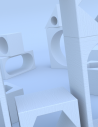
Initially, I loaded this old set. Just with some global illumination it looks like you can see in the first screenshot.
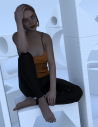
Then, if I make the character visible, one can see that she needs more light directed to her. (You can safely ignore the pokethrough, I know. This is just for discussing lighting and overexposed elements close to the main subject).
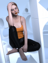
All right, let's make the main light visible. Now she looks better, but at the cost of the overexposed architectural elements close to her.
This is a very common scenario. How do you deal with this type of challenges?
Daz 3D is part of 
Connect
DAZ Productions, Inc.
7533 S Center View Ct #4664
West Jordan, UT 84084
Licensing Agreement | Terms of Service | Privacy Policy | EULA
© 2026 Daz Productions Inc. All Rights Reserved.
Comments
My first suggestion, study real world photography and lighting techniques.
While we can do many things in 3d that we can't do in reality, it's a good starting point
In the case of your image, you can do a few different things, but will be dependent on what type of light( point, spot, distant,) you use.
It appears you're using a spot light with defalut spread angle(60 degrees), and it's relatively close to your subject.
If that's the case, the first thing is to determine where exactly the light is pointing. You can do this by switching your view to that particular light via the drop down in Viewport.
Depending on what look you're going for, you'll probably want the center point to be aligned with the person.
With that out of the way, you'll then want to reduce the spread angle so that it doesn't shine on the walls.
This will necessitate a reduction in luminance, as the light will be more intense the narrower the focus gets.
Another option would be to switch the spot light from "Point" to "rectangle", with settings of 100hx50w, and align the light with the center mass of the figure.
This functions much like a "Light box" in the real world by softening the light, and reducing the area it lights up.
Another option, use "barn doors" to reduce the coverage area of the light.
A simple plane, or 4, positioned on the sides of the light, will give you more control over what is and isn't lit.
You could also just put a plane inbetween the light and the figure(s) you don't want lit, though this may produce unwanted shadows, or sharp shadows, and you need to make sure it won't appear in the render by keeping it off camera.
In Render Setting > Tone Mapping what is the Burn Highlight value?
If 1 try to lower it to 0.25.
DrunkMonkeyProductions
Hi. Back when I first got interested in Daz I read and watched many, many basic and not so basic tutorials and courses. I also read about complementary subjects like photography and cinematography. I am not very knowledgeable now by any means (I started knowing nothing), but I think I know decently enough about the most crucial elements of photography applied to the use of Daz Studio. Of course, if you have specific suggestions for me to read/watch, don't hesitate to mention them.
This is the main light view and its parameters (first screenshot). As you can see, the light is pointed directly to her head. I already tried reducing the spread angle and playing with different options, but nothing seems to get a good compromise between her light level and that of the surrounding elements (that these are white definitely does not help).
In the second screenshot, you can see what happens if I reduce the light spread from the default 60 to 28 and reduce the lumen by half. It's probably better now, but that the light has geometry added to soften the shadows makes reducing the light spread angle less effective.
I'll try the idea of the "barn doors" and see what I can do with that. Thank you. :)
felis
Hi. I am using 0.4 for the burn highlights as I've found that this valor together with 2.00 for the gamma tends to produce renders with highlights that match closely those of the beauty canvas. But thanks for mentioning it all the same. Often times I forget about things that I always add to my renders. So I can always reduce the burn highlights to help with the issue. :)
create new camera . . . lock it
render scene without the character with lighting you want
turn off the set
render character with lighting you want
save the renders in tif or ping
stack in photoshop
you can even play with each layer separately
then save master file as tif and save a jpg of you mixture.
image below
sky layer
trees and land
a real bright dragon to geneate the light with girl
a normal dragon to layer over the bright one
It could be that you're also fighting the materials/shaders here - maybe in the iray simulation the set material/shader just ends up bouncinbg more light back than the ones used by the character. It would be hard to make up for that using real-world photographic techniques ("hey, my fluorescent mylar set is blowing out my portrait photo"). It looks like the set may use a single set of surface parameters, so you could just try tweaking some of those to dull it down.