
Daz 3D is part of 
Connect
DAZ Productions, Inc.
7533 S Center View Ct #4664
West Jordan, UT 84084
Licensing Agreement | Terms of Service | Privacy Policy | EULA
© 2026 Daz Productions Inc. All Rights Reserved.
Comments
Thanks @Kismet2012! Those aren't actually the edges of the plane but the edges of the doorway in the back wall and the well in the centre of the room that are mostly invisible; I've added more light in the background so they're a bit clearer. Also tried a bit of rim light on her, although I may have made it a bit bright at the edges. Will try toning that back a bit.
Reversed your suggestion a bit to make sure she remains the one in focus....attacked sucker it is :D
Might be a bit dark now though, not sure.
One Man And His Dog
Intermediate
So, after a nearby lightning strike rendered me internetless, I found it a struggle to get into the challenge this month. I have had a little play so far with the LIE to get the character his tattoo. I think he could take a little more ink or effects without overpowering him, but not thought what yet.
@katywhite. Of the two newest version I like the top one. Intesifying the red light and DOF is really adding drama to this image the 2nd one lacks. The intensity of the light near her head really draws the eye upward.
@aki3d This is a great image.
I can feel the desperation in this character. Bloodied, dirty and fighting for his life. He looks like he is at the end of his rope but won't give up.
I do not have any suggestions for you.
You are welcome @Tynkere
I think everyone probably has a preferred size depending on what they are rendering and why. My personal preference for most images is 1500 on the longest edge. But I have had images that I have had to reduce the overall size in order to get it to fit on my nVidia card. It is really about personal preference. For the forums it needs to be resized to 800.
When it comes to expressions I personally tend to keep them subtle. I personally find they start to look off when taken to an extreme. I do a lot of mixing and matching of expressions and then go in to individual features, ie: eyes, mouth, etc and tweak from there.
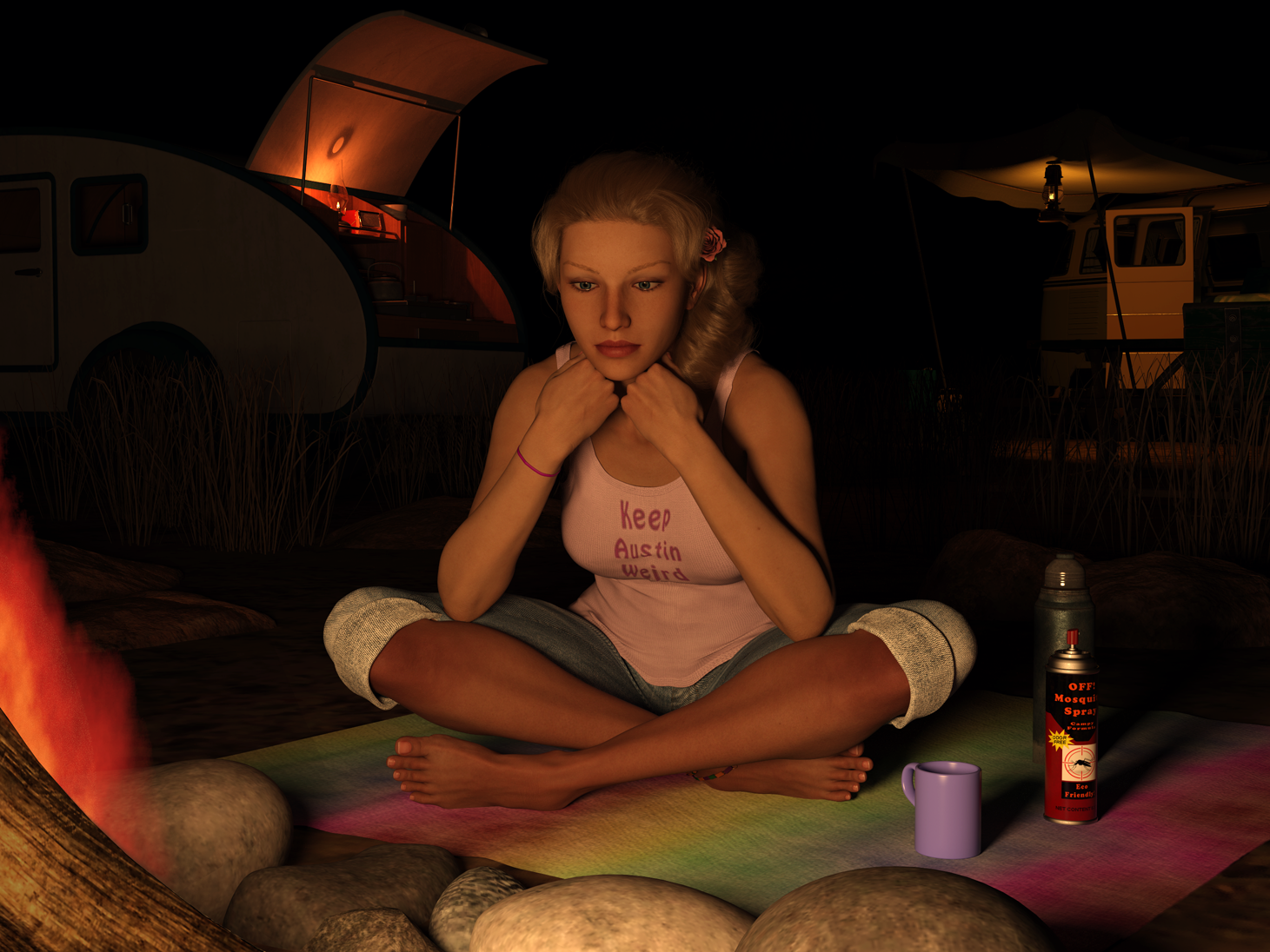
This is a very realistic scene. I am right there with her. I can just imagine the mosquitos.
The camper and vehicle in the background really add to the scene. Love the colourful blanket. Her clothes look good. The lights on the vehicles help to draw the eye around the image.
Well done.
Dark shadows in am image certainly add mystery but can also cause confusion. At least for me.
Lighting up the background a bit has helped her to stand out.
Lots of dynamism in this image now. But it does need some light to help separate the figures. Maybe something coming in from the side of the corridor she is ambushing the guard from? Our left perhaps? That might help to separate both figures with 1 light?
I am sorry to hear about the lightening strike but glad you are okay. I have been struggling with an internet connection with my rendering computer. It doesn't want to stay connected which is irritating.
If you want to add another tattoo to your character an arm band of some kind might work on his right bicep. I have seen tattoos on the underarm of the bicep as well. Googling shows some quite elaborate and intricate tattoos.
This is the final version of my entry for the Intermediate challenge
Thank you! Glad you liked it.
I made two attempts to adjust as you suggested. It wasn't actually really glossy so the first take here I turned up the roughness. The second version I also added a slight lilac tint to the muumuu.
One Man And His Dog (2)
Intermediate
Have added a second tattoo sleeve. Also, turned the Direwolf's head to make it cleared it had blue eyes (like the tattoos!) Changed the sword and armour around and added some extra spider types. Bit of fun. More to come.
Something went wrong again. Very specific!
Thanks for the kind words. Am trying low settings on HD morphs then tweaking with facial ones. Good point about mosquitoes too. Was needing some props to fill that corner.
Final version then.
Enjoyed reading through topic and seeing everyones work. Best wishes
---
Title “Pensive”
Contest: L.I.E. (face and shirt)
App(s): Design Studio 4.10 | Photoshop CS-3
---
Changes & work done:
Tweak pose-- chin on hands, elbows on legs.
Change shirt design so all of slogan is visible.
Finish rock & grass instances.
Move camper so hatch isn’t cropped out at top.
Make a mosquito repellent label for prop. The template is from a can of roach spray.
---
Looking at the lilac version it might have been the yellow in the shirt that was giving me the impression of it being shiney.
I do enjoy the cocky, self-assured smirk he has on this face. The additional tattoo looks great.
Mosquito spray is a must have item.
Really well done.
I find I get this usually when trying to attach an image or quote a comment that has images in it - navigating back and trying again it usually saves part of the post and publishes that part and I'm able to edit and fix as needed.
I'm glad those changes helped :)
Okay...tried adding the light. Easier to tell them apart now I think :)
Title: The Smuggler
Software: Daz 3D
Challenge: Intermediate
Version B of my second Idea here.
I retextured my characters shirt, gave him a holstered sidearm as a backup weapon, added some smoke wafting from a nearby vent, and added some DoF to focus on him.
Very nice! The lighting is working very well here and the DOF is certainly helping bring focus to him.
A subtle change that works. I hadn't thought of red but now I immediately think a warning light...which seems to have come a bit late for this guard.
That is an interesting character with an equally interesting story to tell I am sure.
Nice additions.
Game Over
Intermediate Entry #2 Rendered in Daz. No postwork.
My goal for this one was to stick some nose art on a warplane. I still don't own the beautiful B-17 so I had to work with something a little "newer". I started by trying to find a royalty-free pinup girl which was a complete waste of time. Then it donned on me...I can make my own pinup art! So I rendered up a pinup girl and used the LIE editor to stick her onto my aircraft along with a star, aircraft id #, and the scribbled text "Get Some!". Unfortunately, the text got covered by the laser fire. The hardest part was identifying the correct surfaces on this vehicle. It has so many parts on its maps!
Love it! Great idea to create the pin up girl! The L.I.E. editor is simple to use but a pig to get precise positioning!
I agree, figuring out the positioning can be a real bugger. Here is a trick I figured out. Open the file you plan to edit with the L.I.E. Editor in your photo editing software. Make a new layer. Create/modify/adjust your "decal" and then position it exactly where you will want to place it on the model. Hide the base layer and save your decal layer as a png without resizing it.
In the L.I.E. editor create the new layer and browse to the decal layer you made. When you import it, it will be prepositioned (assuming you have ticked scale to fit) because you saved it on a canvas the same size as the original :-) Now bake that thing in and call it a day!
I am sure the file is a little bigger, but the convenience more than makes up for it.
Thanks for the comment.
Love the idea and the pin-up girl.