Feedback wanted: Killbill/Snowblood like scene
 archgeo
Posts: 36
archgeo
Posts: 36
As this seems to be the thread for discussions about ideas, concepts and further inspiration.
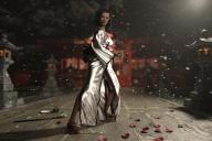
I had the idea to work on another kenjutsu scene and I really liked the aesthetic of some of the japan-sword movies, like Kill Bill or Lady Snowblood. Still, I not wanted to create a blood massacre. So I went for other symbols. Important was for me still to show a certain dynamic, like the counter twist in the body (the cut ends, the body is twisted, while the head looks in the other direction).
By now I really like the composition as such, but I am not fully satisfied yet. I tried different angles of the camera or lights. I am also not fully happy with the model of the Saya (the guard of the japanese sword or ken).
What kind of ideas for further improvement or things which would make sense in this setting would there be? What kind of post-work would you apply? Any advice you could give me?
Thanks a lot in advance! :-)
Edit: I added another try. There I went for a camera angle of 40mm (before was 35mm), changed the leafs to snowflakes and added some volume into the air. The scattering density was clearly to much for the rim light in the right upper corner. Still happy about ideas or feedback! :-)

Daz 3D is part of 
Connect
DAZ Productions, Inc.
7533 S Center View Ct #4664
West Jordan, UT 84084
Licensing Agreement | Terms of Service | Privacy Policy | EULA
© 2026 Daz Productions Inc. All Rights Reserved.
Comments
And yet another version with black kimono and another rim left coming from the left
I'm not sure what kind of feedback you're looking for. Of the images, I prefer the black Kimono, and I feel there is decent drama with the image.
In My Opinion, I feel that the character's skin is just too dark\brown, and I feel its blending in. It could be the lighting, or the skin. The expression might be improved with a some tweaking, less symetric? Mouth closed, and told with the eyes?
From the original scene, the lighting was decidedly cold. I think Oren's skin is 'grey', but it contrasts with the darker background. Since you're using warmer lighting, you might want lighter skin?
Lastly, one tip I picked up from Reality\Paolo, was that enhancing the character's presence can really help sell an image. Try something from the rear\high to highlight the fact that she's there, a sheen off the hair, outline her side. Also, try to get a glint off the sword. This is what you'd do in phtography.
Maybe add some blood on the ground or carnage in the background? Not much, but does drinking tea in the wind make sense?
1. move your subject to the left or right in the image, ie move the camera so the subject is in the left or right third of the image. that adds drama. Unbalancing the viewer is what makes a picture interesting or not. Reference UHF's video. pause the video and see where the point of interest is, Directors tend to use the Rule of Thirds when they shoot their movies.
2. Your light focus is on the dress and not on her face. To much specularity on the dress and not on the face. There needs to be spots pointing on your focal point in the image, one front right, one front left and one back center. All of them should behigher then your subject and pointing down. Rims are good for adding drama they are not good for establishing the focal point of the image. As UHF says you need sheen or specularity to occur on lips, eyes, hair and sword adding the spots will allow you to get that look. Dresses are not as interesting to humans as faces are and they diffiently don't add drama. Go to the 2:18 point in the video. There in that scene Lucy Lu has her sword in her hands.
3. My take of your image is she is walking enjoying her tea and a wind comes and she senses something bad is about to happen. The pose you picked is one that has her to have already assessed the danger and she is ready to act. The story that I think you are trying to tell and her pose are not in harmony. You have two choices either 1) reflect recognition in the face, (fear, surprise) or 2) change her pose to be in the motion of pulling her blade that is reacting to the wind and the unseen. You can use both to add more drama but you must do one to make the image believable.
As artists we are all about telling a story. So anything that helps convey the story is what we need to do. I sometimes stand in front of the mirror and play act out the story and see what my face and body do. It helps me maybe it will you too.
Thanks to the two of you for the very interesting points! I am still a beginner and I am fascinated by the possibilities. So therefore I was really interested in feedback and views.
I have to see how what I can further do in regards of skin tone, the lights and the points of interest. I might change the scene a bit and not have it ready yet. The rule of three is interesting. As amateur photographer I am of course aware of it, but in the render I tend to ignore it because I am so much in love with my figure. ;-)
The story is that we was surprised, dropped the tea and (don't asked me where she got it from draw the ken. The actual position supposed to be the moment after the horizontal cut, when you you build up tension, observe the opponent and wait for the next move. It is a moment of tension or freeze between two fast movements. In the story the opponent got cut by the sword and it is not clear if he manages to get up or simply bleeds out. The roses should symbolize blood, as I not wanted to use it directly. So far the story ..
Before I was reading your comments I was playing around with different colour and light settings .. but they go towards more red as you can see. The red dress takes the focus from the face and dominates too much, I will go back to the black. But together with the red kimono I tried to put more rim light on the hairs.
Thanks again for the ideas! I will get back once I got something worth sharing in this regard. :-)
Ciao from Bern (CH)
I tried to incorporate your suggestions. I went for the black kimono because I doesn't take so much attention from the face. I also went for a bit more lighter setting instead. I agree, that I ignored the rule of three so I now took more care. Only with tilting the camera I was not so convinced. But maybe you could give me more advice.
Also I tried the suggestion with the lights but somehow it still got too dark on the hair as on the face. I will try with more light for the respective lights ..
Getting to be a more interesting image archgeo. I see more emotion in your lady and her new postion has added more drama. all of this leads to a better sense of tension which adds more interest to the image. Attached I have shown you where your sweet spots are. A sweet spot is the intersection of the horizontal and vertical lines of the rule of thirds. They are sweet because putting your point of focus in one of these areas sets up the image. So from what you have said you want her face to be the point of focus. Her face needs to drop down to a lower point closer to the upper left sweet spot. Make the camera position higher and tilt it down if you want her legs to be in the image. Your lighting is to low as well. The strongest light source runs along the foot path. This pulls the focus away from the face and into the lower left sweet spot and therefore the flowers on the robe become a focus and take away from what you really are trying to say. I would suggest that you add a spot to the right of the lady, above her head and pointing down at her left side of her face. I would leave your scene lighting alone and see if you can bump up that small area of her face. It might be that all you need to do is make the spot a specular light source. The name of the game is to play. Always asking yourself am I keeping my story in focus.
Thanks a lot!
I will try it out, but take the current scene as a milestone. I like it very much right now, but I am also curious were your suggestions will lead me to. I am still experimenting a lot and sometimes I had a good idea but I lose it on the way, while playing with all the wonderful details. ;-)
I will get back once I have something new!
Thanks again and have a nice weekend all together!
Your welcome. Yes each project is truely a milestone. Good to learn new things. Good luck on your journey. This is a very fun hobby.
I gave it another try and yes, I think it got better for the perspective and the image composition. I went for a square format as in the beginning as else the figure would be a bit lost in the picture.
As for the lights, there I am not fully happy yet. Not that I expect step by step instructions, don't worry. Just saying I think this is not the end of the journey for this scene yet. I was carefully with the lights, but without rim and meshlights for filling it would have been rather darkish. I not wanted to loose the leafes on the floor so I added a bit light to them as well.
I added two versions, the first a bit darker and the second with more lights on floor and chest. I have to admit, while I first though it needs more light, now I see that I am not so far away from where I started as it regards the lights. Of course, I haven't done post edits yet.
Thanks again. Don't worry, I don't expect an tutorial, but I am very happy for feedback and suggestions :-)
So far it really made a difference in this scene :-)
A few opinions, please use or disregard as you like!
- I like the low camera of the earlier versions much better than these last two renders.
- The Katana tends to visually get lost a little.
- Adding a lens flare to the blade could be cool!
- Making the lower half of the Kimono flare would make the scene more dramatic. But that can be hard to achieve, dForce wind nodes can be such a headache!
- Love your use of DOF and the flying petals!
- ... und tue nid z'wüud!
Many thanks! :-) Yeah, the worry is justified, because we tend to play so much with the scenes which makes them worse sometimes.
- Fully agree on the katana, I planned to fix that in post edit. I also tried from within the scene, but as the blade is curved it was impossible to get a nice glowy reflection over the whole back of the blade.
- The lens flare on the blade is something I will try in post edits :-)
- As it comes to the kimono .. I had endless tries with dforce including wind nodes, which didn't turned out well (to say the least). Now I had dforce just by the movements and turns (timeline) which turned out much easier to control. But yes I agree, with a bit more flare in the fabric the movement would be more real
Will try it out ..
Here we are .. thanks a lot for the help!
https://www.daz3d.com/gallery/#images/1013896/