Skin tones - why isn't there a baseline?
This discussion has been closed.
Daz 3D is part of 
Connect
DAZ Productions, Inc.
7533 S Center View Ct #4664
West Jordan, UT 84084
Licensing Agreement | Terms of Service | Privacy Policy | EULA
© 2026 Daz Productions Inc. All Rights Reserved.
Comments
Renders are not photographs so let's stop pretending they are. One is a simulation that doesn't have the limits of a physical camera or a physical human eye for that matter and so can be technically more accurate, although human eyes might not recognize that added accuracy being physically limited.
The purpose of PBR is realistic renders based on the materials' physics according to the natural materials' physical properties and also the simulated light obeying physics as well. There really is no room in that for artistic input or opinion, it's all cut & dried formulaic physics.
I think that we are all talking past each other here. We can all agree that it is theoretically possible to create a scene with lighting conditions that make each product look uniformly bad (The PBR theory) so that dark features are not visible or pleasing and really pale skins would have their details washed out thus leaving a sweet spot for those tones in between. That is the physics part. Unfortunately, this sort of setup would only be usefule for products that are neither dark or pale and puts anyone who makes a product that is either darker or lighter than the tight median at a disadvantage. It doesn't provide any more information because its bias to the middle tones is baked in. Having worked in scientific laboratories for over 35 years, the method to get past this to use more diverse styles of lighting. The promos already show you that that skin that you consider too orange can be lit with the appropriate settings to look good enough that one would buy the product. Moreover, the user can customize the textures to remove whatever color cast they want. It is still not clear to me what an arbitrary and artificial "standard" would tell a buyer.
What I see here is more an issue of lack of access to controls at the user level than anything being particularly wrong with the skin files themselves. You just need to be able to change up color hues, should be easy as pie.
As to why the need to make edits, its probably due to a lack of appropriateness for the task. Its imporant to know the "intent" of the skin texture you are loading, and use them as they were more or less intended. For example with most PBR type skins you want a very desaturated diffuse/albedo color map because your SSS will provide at least 50% boost to the total final saturation of the skin. Thus, if you take a full saturation diffuse/albedo map and apply SSS to it the skin will render with far too much saturation. I will bet that many of those dead looking skins you've run into would look much much much better once they have their SSS compliments.
On the other side I personally I wish the tools in DS were layed out a little differently, so I can see more things at once instead of having to scroll around so much to find sliders. All this faffling around makes the idea of editing more daunting. But anyhow that's just me.
My mistake, I should have said realistic instead of well. But now, back to the topic...
Here's a little example: Let's say we have 3 PAs, who all use their own favoured lighting setup when they are creating skin shaders for their models. I have no idea what PAs really use, but let's say that PA1 uses studio lighting setup, PA2 uses some random HDRI and PA3 uses Sun/Sky environment. They all use different light intensity, and all have their own favourite gamma, saturation and white point corrections, because they know their own setup and know that they get good promo shots with that setup. Now there's the customer, who browses Daz shop, and sees 3 great characters from those vendors, and buys them all. Then he decides to create his next masterpiece and uses all characters in the same scene.
Now in worst case scenario one character looks blue, second orange and third is super tanned in customer's lighting setup. There really is no intensity/tonemapping combo that would correct the situation. If the customer increases gamma/saturation, one character gets better and others worse. If he decreases saturation, same thing. If he increases light intensity, one looks better, but others looks worse. Should customers just scratch the original shaders, and build their own for every character they buy, because there is no lighting setup/ tone mapping combo where all characters look good? Of course that is just the worst case scenario, where it's not possible to find the correct tonemapping setup. Even if the customer uses just one character, and it looks orange or something, it's still really hard to find the "correct" setup to make the character look how PA intended. And it's not just one lighting setup we have to figure out, we have figure out every PAs favourite lighting setup.
If you try even a little, I'm sure you can see the problem here.
Perhaps, a turorial on using the surfaces would in order to teach people how to adjust the characters to their own idea of what the various tones should be?
@mendoman : The problem you mentioned is because your example PAS work with different lighting setups, that’s exactly how to overcome it.
If they work with the default hdri, you are working to warm / cold. It has a sun which is to warm in colour and a shadow which is too cold in colour. If they would work with all light colours the same at neutral, the problem would be non existent. That’s exactly what neutral light does; you get a neutral playing field, overcoming the original complaint.
There also is no problem concerning the skin tones (shirley card) because that was for a photographic medium with a different response , aka dynamic range. Now The distance / intensity of the light is still important for a good effect, see the last shirley card of that example, with the different skintones of the models and it actually defeats the argument that its not possible, as its totally possible to arrive at the right exposure as can be seen.
Unfortunately, the last shirley card didn't solve the problem unfortunately in real life and standard photography.... It continues to be an issue especially with celebrities; any magazine cover with Meghan Markle, Beyonce, or Kerry Washington can be crazily variable in the skin tones.... Granted, it is better than the days of Sidney Poitier movies where he was in a constant sweat from the bright lights. The real secret is for users to adjust the character skins to suit their own tastes so that if they want a narrow range of skin colors and tones, they can desaturate, use complementary colors, and color grade to their heart's content.
This is the folly the PBR purist mindset.
In abstract theory, you are correct.
However in reality there is no lighting & material PBR physics "formula"
that will work as a universal "baseline" for all human skin colors
for all users.
Not without some means to rigidly enforce some universal standards
on everyone regarding their Monitors,calibration, and the lighting conditions of the rooms
in which they are ALL working.
I worked in the print industry for 19 years.
We tried this notion of using ICC profiles and linear workflows
even the supposedly 'Universal" Pantone matching system as a means to get consistant color
of a major client brands/logos across a wide variety of mediums,substrates.
However as soon as the print client hires a new design firm that is not
"On board" with our linear workflow, all of our "cut & dried" formulas
are sundered moot and we are back to Manually adjusting colors in photoshop
printing test prints on the actual paper or vinyl or foam board etc.
and sending these samples to the client for their "artistic input or opinion"
The OP may as well be asking for a "baseline attractive female shape"
...we all know how those conversations go.
@Paintbox My post's idea was to describe what the problem in current situation is, and I'm strongly favouring some neutral/standardized lighting environment if that was not clear
.
@nemesis10 This has nothing to do with people wanting to narrow range of skin tones or desaturating images. It also has nothing to do with how our monitors are calibrated. If my monitor was too yellow or something, all my characters should look too yellow, but it's not the case here, is it?
@wolf359 What you describe there is actually what is happening here in Dazland too. PAs are different companies, and they all have different linear workflows....except in this world, PAs do not change their product for the new design firm ( Daz customers ), but instead those customers have to magically try to figure what each PAs linear workflow really is that they get the "correct" colors. I assume what we see in promo images is, what PA wanted the skin look like, so that should be the "correct" color.
To others who still argue that PAs are somehow unable create a black/pink/brown/pale/reddish whatever type of skin for some default environment ( I don't really care if it's a HDRI, 3-point lighting with given intensity/warmth or what, just that it's same for all ), are you really serious? The PAs who create those skin shaders actually have full control over diffuse, SSS, bump, roughness/glossy and whatever map and colors they need to make it look good, and you are seriously saying that PAs are unable to make a skin shader for Emission temperature 5500K light, but they can do it for 6000K and 6300K or something? Also they really really have to use 500k lumens instead 200k lumens, because somehow it's impossible to adjust their shader to work in given light intensity? If they are able to create something beatiful with their current own lighting setup, surely they could do the same with given default environment. It's only of matter of adjusting maps and values to get the wanted result. Now if all characters were built for that same kind of environment, it would be so much easier for customers to adjust their own lighting setups, and have all the skin shaders look how they want in it.
Isn't the whole idea behind a new character is that it is different from the base character because it has a different skin so they shouldn't look the same?
Well if they ever mathematically model code that generates PBR reference materials for humans correctly using actual physics and not just eyeballing photos then they'll have a sets of materials that serve as a baseline and a utility to adjust the baseline according to all the natural physical properties of whatever natural human skin from where ever on earth. That's going to have to come from some University research, Disney Labs, Unity, UE4, or some organization with lots of money and the profit motive to make creating physically accurate character likenesses easy for their customer base, so OK in that case, maybe only Unity or UE4 would embark on such a task.
All the layers of skin, fat, blood vessels, types and amount melanin, hair, and other factors that are painted on once and once only would be generated dynamically instead. That's a ways off to create the math and code to do such simulations very accurately but I'm confident it will get mathematically modeled, at least good enough for 'entertainment purposes' for 3D movies & games and such. It should be reflected in the PBR material descriptions when they do that.
maybe we need a Passport shot /mugshot of every character
in that harsh flouresent tube lighting with dead pan faces
can add the height chart too
Something like this?
http://gl.ict.usc.edu/Research/DigitalEmily2/
http://www.imageskill.com/tmp/skintones/skintones.html
http://www.collectionscanada.gc.ca/obj/s4/f2/dsk3/OWTU/TC-OWTU-317.pdf
No. that's the entire point of discussing using 5600k as the light against a neutral background. You're acting like we're demanding all promo's be rendered this way. We want one or two shots this way so potential buyers can actually see the details and colors of what they're buying. That is what rendering with white light will get you. No, every model won't look good under white light, if I modeled myself as I am right now, very very pale, I'd look horrible under white light. I don't care. The buyers should know what they're getting.
I've said it before and I'll say it again this is a truith in advertising thing for me. I've bought too many products that were tonemapped or otherwise manipulated, lighting or postworked, to look decent and when I bought it and tried to start working with it it was so completely outside a usable range of skin tones that I had to get a refund. I don't need the hassle.Just give buyers a render under white light against a neutral background so we know what we're buying. Sure some models will look bad. Anyone who knows anything will know that.
+1
Well said!
For me the issue is not a particular skin tone on a single character, but placing more than one figure in a shot and having too stark of a difference in their appearance standing next to each other, when the goal was to make them look similar enough.
And to the argument that you just have to fiddle with the surface settings until they match - I don't have time for that. Simple enough.
Google will tell you how to do this and how to do that. If you are inclined to do so, fine. Personally, I'm not spending resources on that.
I am creating hundreds of shots in DAZ to visualize a VN, writing the second draft of my script and are updating the game engine.
There is already enough on my plate.
It's just out of my comprehension how people seem to think that if PAs would design their skin shaders against some standard/default lighting set, suddently skins all look the same or passport/mug shots. If the skin shader was designed for that neutral lighting setup, it would look just as good in that new setup as it now looks in their promo images....but anyways, I give up since this is hopeless. When people deliberately refuse to understand, there's very little one can do...
I guess part of the problem is that 100 users will use DS in 100 different ways.
Some render just for fun,some render commercial promos, some render animations and others use it to visualize a script.
If, for example, there was an issue in Maya with getting an animation going on a comercial asset because of it's poor bone rigging - you bet they'll be all up in arms about that! :)
That is great results. nice work :)
But, that is exactly what 1 or 2 pictures in neutral light will circumvent! 100 users using the DS in 100 different ways doesn't make any difference for a baseline lighting / exposure set up! It allows you, by inference, know how the character will render.
It doesn't matter that user A does an apocalypse scene in Red / Orange light.
It doesn't matter if user B uses a stark flood light thats blueish in color.
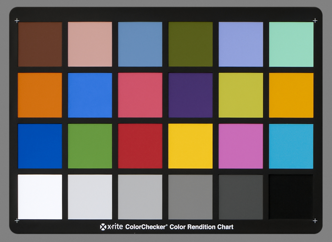
It's the equivalent of having a board such as this in photography :
And that is why it would be super helpful :)
I did some tests using Genesis 8 and 4 characters that I have under various lighting settings,
This one is at the default settings by clicking on the Default button at the top using the default HDRI but with Draw Dome turned off.
2019-02-18 22:43:31.745 Total Rendering Time: 55 minutes 47.51 seconds
Genesis 8 Base
Akira
Hailey
Victoria 8
Teen Kaylee 8
This one is an HDRI with a black background and various light spots.
2019-02-19 08:11:14.822 Total Rendering Time: 1 hours 11 minutes 51.65 seconds
HDR Black
Genesis 8 Base
Akira
Hailey
Victoria 8
Teen Kaylee 8
This one has the same lights but is a White background HDRI
2019-02-19 10:03:07.761 Total Rendering Time: 1 hours 35 minutes 22.47 seconds
HDR White
Genesis 8 Base
Akira
Hailey
Victoria 8
Teen Kaylee 8
This one is using my default settings using Sun and Sky set to 21/06/2018 14:30 with the dome turned to 300.
2019-02-19 11:09:33.302 Total Rendering Time: 56 minutes 12.28 seconds
My Render Settings Sun and Sky 21/06/2018 14:30
Genesis 8 Base
Akira
Hailey
Victoria 8
Teen Kaylee 8
Yes, I think there should be some kind of standart...
It is a concern that a product is already needed to make the skin color match different characters in a scene.
https://www.daz3d.com/idg-iray-essentials-for-genesis-8
I don't have that product, but it's on my wishlist, because I see the different skins as a problem, too.
A problem which should be fixed by DAZ.
Having different skin tones is basically ok, but I think the problem is that the skins looks different in a way that it's look very quickly articatially.
Hard to express what I mean... But I think the "famous" organge G8 skin could be one reason.
That's a bit simplistic. I don't think anyone has been asking for identical skin tones here.
Just 2 characters similar enough to not look funky rendered side by side.
That is not what is being suggested.
I definitely agree in principle that there should be a standard lighting scene that is used for character development/base promo rendering. Knowing what a character looks like under a standard lighting environment could be quite helpful.
However, I also think that DS users need to have/learn some basic skills so they are able to easily "take control" and make the character fit what they want. I'm continually amazed at the constant griping about the "orange" skin tone of the base G8F characters. Once you know how to do it, the fix takes less than 5 seconds, that's much less time than it takes to write the post complaining about it. I realize that many people don't want to learn things. It's a proven fact that critical thinking/learning hurts, so people tend to avoid it (don't have the citation handy, but it's been scientifically proven that it causes pain recptors to fire .... much like exercising, so the more you do it, the less "painful" it is at moderate levels). But in this case, a bit of work/learning can expand your capabilities in DS a great deal, and make you much less reliant on the work of others. So here we go, how you can easily fix the orange problem.
I don't have many of the official DAZ 8 Series characters, but it looks like Teen Kaylee 8 does have the much talked about orange tint (see reference default settings render below). For my sample renders, I have used the default Iray HDRI as the only source of light (rotated 25 degrees) - with the camera headlamp turned off - as noted by others in this thread, different light settings will give different results (as can be see in the great examples posted by Fishtales above - note how the last example in the sunlight does make some of the figures much more orange than in previous examples).
First, the main source of the problem does not seem to be the texture map, so modifying it is not necessary. The texture map is slightly orange-ish, but the very slight orange can is easily neutralized by changing other settings. It appears, at least with Teen Kaylee 8, that the real culprit for the overly orange tint is the transmitted color setting, which is quite orange (note: as the intensity of the light increases, so does the orange tint, which supports the idea that the transmitted color is the problem), as you can see here:
To easily modify this, make sure you have "Skin-Lips-Nails" selected for your character in the surfaces tab (see first image above). Scroll down to where you see the "Transmitted Color" setting and click inside the color bar to bring up the "Select Color" window, and select a color that is a bit less orange. and more like the color you want (keep in mind, this will be the color that is transmitted by the light reflected back to the surface from beneath the skin), the examples below will give you an idea regarding what changing the color will do to the skin color.
Color selector moved to red with lower color saturation (right and down more to light pink)
As you can see in the second example, the figure has lost the spray tan look, and it took less than 5 seconds (sometimes it might take me 30 seconds to a minute to get "just the right color"). If this doesn't quite get what you want/need, you can easily modify the colors even more by slightly changing "Base Color" color, and/or the "Translucency Color" color. Changing the base color will add that color the the base texture, and changing the translucency color will change the subsurface color (i.e. in areas where there the light does not penetrate the surface much (low light) this color will not be as intense).
This method will not work well for making large tonal differences in your figures. For example making a light skin overly dark will also darken areas that are normally a bit lighter (like the palms of the hands, and the bottoms of the feet). But for instances where a figure is a bit too blue/white, orange, green, etc. this works extremely well.
Also, if your really "serious" about your work, getting a monitor color calibration system like a Spyder Colorimeter can be very beneficial. True, you can't control the color calibration on any other devices used to view your images, but you can at least be confident that your working in a standard color/light space (and maybe the G8F figures might not look so overly orange now .... though I'm sure they will still be just a bit orange). My screen is calibrated, and while I see a slightly orange tint on G8F figures, it's not a slap you in the face orange. However, when looking at them with uncallibrated monitors, I have noticed a very obvious orange tint. So color calibration of your monitor can be a very important part of creating digital art.
Hope this helps a bit, and your now able to easily control the minor color differences of your characters.
What is being requested is a standard way of prsenting the skins so that they can be compared, to see the differences. This is not, of course, without issues (hence many of the posts here) but it has nothing to do with standardising the materials themselves (though there has been some discussion of whether a PBR model coulr capture the way real skin works, which would represent a form of standardisation if it were actually possible with the tools available).