Comics - A connected universe in look and feel
 will2power
Posts: 270
will2power
Posts: 270
This is just something that I happened to come up with that I'd like to share. Most of us have an interest in comics and graphic novels. I've seen many great examples of both, but something has always bothered me with using 3D to achieve it. I have never felt that 3D was capable of giving you a feeling of a "connected universe". What I mean to say is that when you start collecting textures and morphs and applying them to figures, what results is a disjointed feeling that won't go away. The eye notices too much and therefore something looks off when you look at the page. Well that may be my OCD acting up, but it does. I've struggled quite a bit with it and had a recent breakthrough that I wanted to share. I didn't believe it until I put it to the test.
I'll start off by showing one of my older renders:
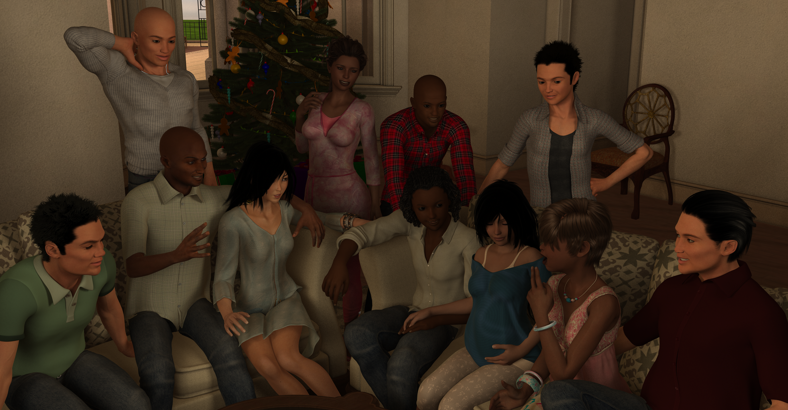
This is a good example of what I'm talking about. Keep in mind it's an older render --Genesis with 3Delight Render. When you look at it it looks okay but to the eye the difference in textures is inescapable. This is something that it took me a while to nail down. For a single character in frame it looks fine but when you put them together the differences in texture quality from figure to figure becomes noticeable. Now some of it is the render engine, but mostly it's the difference in quality and shader from figure to figure. The difference in shaders from skin to skin and figure to figure make a huge difference in believing you're in a connected universe.
A part of me was resistent to the idea of using one texture set and shader configuration with my characters but occasionally a happy accident or two can change your mind about this.
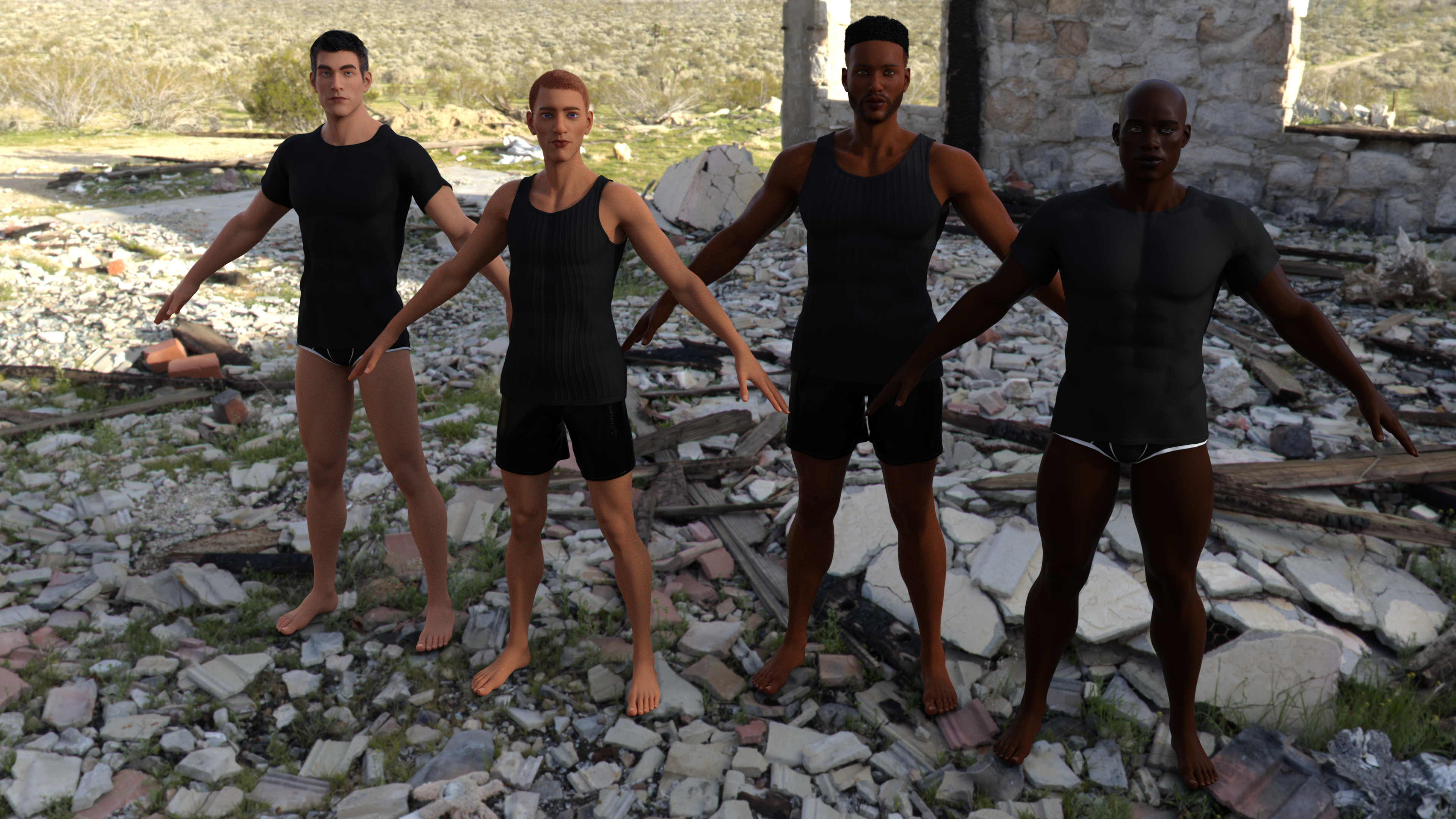
This is what started me on the trail to where I am now. This is an old Poser Render for an updated version of Terai Yuki I'd been working with. The texture and shader from each figure is the same --I just adjusted the colors in Paint.net (I do have Photoshop, but I find Paint.net to actually be more efficient for simple color adjustments like this.) I dropped the eyebrows and made a few different versions of the face and the result was very encouraging. I won't take you through the whole process, but I have found that in developing a comic book look it is better to start off with a generic texture and shader set that you can adjust to get unique looks. But the real breakthrough was when Eyebrow products started to appear. This allowed me to developing different eyebrown faces and develop a few products that I can combine to give me a much better feel for a connected universe like this:
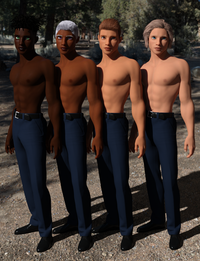
I developed a methodology of collecting a few products and combining them to make more options available when I create a character for a comic page. In this image, I combined a set of eye textures, fibermesh eyebrows and voila! you can make a large number of combinations that have a look that's consistent.You see, the thing about a regular comic page is that the inker and colorist are dedicated to developing a consistent look for the characters. I feel like this is something that 3D lacked because there were so many different texture sets that it was impossible to nail down a consistent look and feel from character to character on the page. The proof is in the pudding because when I applied different morphs, the coloring and shading helped keep my eye thinking that these characters are in the same connected universe.
Later on, I'll take this to the next step and develop a comic page and see how it turns out. I have every confidence that I will be satisfied with the result.
Daz 3D is part of 
Connect
DAZ Productions, Inc.
7533 S Center View Ct #4664
West Jordan, UT 84084
Licensing Agreement | Terms of Service | Privacy Policy | EULA
© 2026 Daz Productions Inc. All Rights Reserved.
Comments
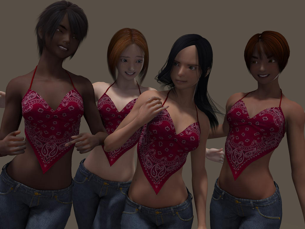
I wanted to continue by using the same procedure with the ladies this time.
It was quite an interesting learning experience which yielded unexpectedly pleasing results. I was able to get the looks to change just enough from iteration to iteration to make the feel of their looks uniform.
Here's a demonstration of what I mean in practice. The same model with my methodology applied and you can see that you can make different looks for your comic book characters with just a few tweaks and still have them look like they are in the same Universe.
I have never felt that 3D was capable of giving you a feeling of a "connected universe". What I mean to say is that when you start collecting textures and morphs and applying them to figures, what results is a disjointed feeling that won't go away.
I never commented on this thread because I don't see what you see. I don't even see it in the image you present as being inescapable.
When you mix characters across generational lines, One might see the difference in detail. But even V4 has some photo-real skin (samples) in the textures. Some characters have it, some don't.
What I see more is a cohesive STYLE, where you have certain features that you accent. Like the sizes of eyes and noses or how exaggerated the proportions are.
Long as that's consistent, I think any reader will see an overall style to the figures and environment.
And since you're already going for a Doll Look, I don't see the heavy need to differentiate that precisely.
Like a toy line, they use the same MOLD but with different hair and make up. That's essentially what I see here.
But good luck with your mission. Looks good so far - at any rate.
This is why Daz's stylized male drought makes me crazy. I can't have characters that look like they belong in the same universe with pretty much anything released for Genesis 8. Because the men just aren't there.
I can somewhat with Genesis 3, more-so with Genesis 2.
But if I want true parity, I gotta go all the way back to Genesis 1 and that mesh is really showing its age, in terms of what can be done with it. Even with the G2 to G1 / G3 to G1 clothing and hair autofits. Its just a step above using Unimesh 4.
Someone else needs to fill in the gap of my memory.
I have a slider in my list of Parameter settings that slides between male and female.
I've turned creatures that were missing a male/female character into the opposite gender.
I can't remember what I bought or how it got there and I don't remember it always being there.
Which is why I think it's attached to an actual item in the store.
Someone clued me in before, but damn, I'm blank.
Oh man, someone has to know about that, but that's my suggestion -> turn the females into males.
That should do it.
----------
And there's a UV Swap product(s) that lets you transfer the "skins" or textures.
That should get you a consistent material(s) look for your characters.
Someone should chime in shortly with the exact stuff cause my brain is fogged right now and I can't recall.
Interesting idea, and your demonstration images show you can do a difference with just this. The other advantage of using the same texture and tweaking the surfaces tab a bit is that they look different, but you get to squeeze more into that graphics card memory instead of sending multiple textures at it.
Your observation is very valid, and something I have noticed in numerous 3D comics. Personally, I address the issue by working in black and white and then (maybe) adding color later. This allows me to focus on using the same lighting techniques in my work, and that goes a long way to establishing a unified look and feel for each panel and character.
It was something I really struggled with. I started these experiments because I wanted to used 3D to get the look I wanted because my drawing skills just aren't up to it. 3D allowed me to go further, but the final results were elusive. I think it was one of my older works that really hit me with how important having a consistent style base texture is. I think the breakthrough came when I worked with DG Iray Toon Styles for Genesis 2 I could see that there was a difference when I started doing the post work experiments to get a black and white graphic style.
This early attempt convinced me that I was onto something because of how consistent their looks were maintained even when I started messing around with the image. I've learned a few things here and there but it really boiled down to establishing a look and feel that I coould consistently maintain. In the end, there wasn't any one product that did it, but collecting several different products in the right proportions that gave me the results that I found desireable.
Now with this image, the only thing I have left to really do is to tend to the outlining. It cuts down on the postwork when you have consistency like this. It's a thing where I have learned to plan for it and it becomes a part of my work flow.