Wanderer's Oasis
 Wanderer
Posts: 957
Wanderer
Posts: 957
I'm trying to get better, and I'm finally ready for (gentle) constructive criticism and feedback. Please feel free to say something, anything, about my work. If you want to engage me in conversation, that might be nice, too. Only be nice. I really don't think I'll ever get better at this if someone isn't willing to nudge me in the right directions.
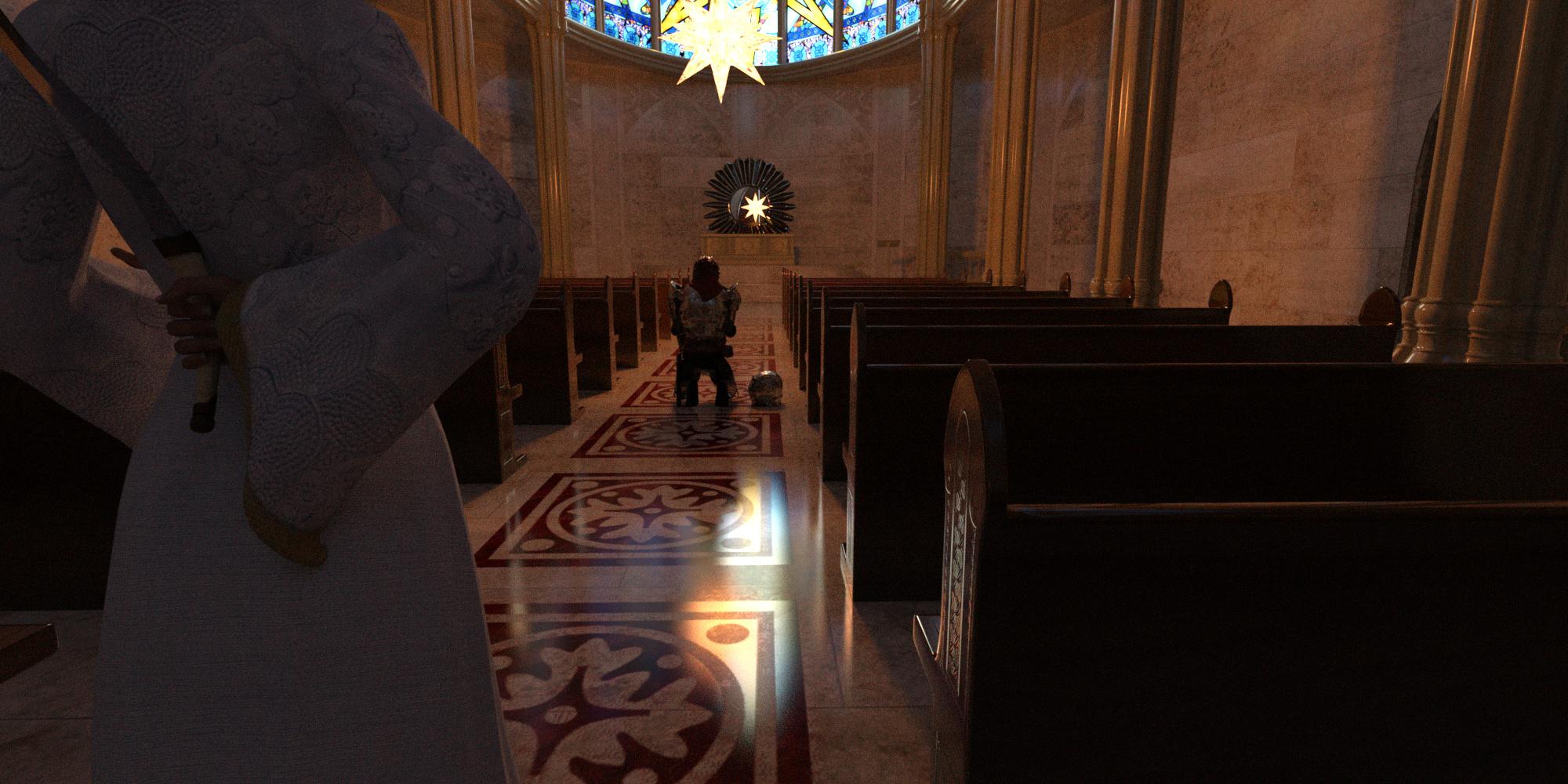
BetrayalFinal.jpg
2000 x 1000 - 1M
Post edited by Wanderer on
Daz 3D is part of 
Connect
DAZ Productions, Inc.
7533 S Center View Ct #4664
West Jordan, UT 84084
Licensing Agreement | Terms of Service | Privacy Policy | EULA
© 2026 Daz Productions Inc. All Rights Reserved.
Comments
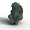
I call this one Termination Imminent:
welcome Wanderer and nice start there! I like that your renders are telling a story, and you are trying to stay withing a colour scheme.
Overall both renders could use a bit more contrast to pinpoint the relavant bits in your image. for example the light reflecting on the floor in the church would be nice to have where the knelleing person is. LIght is always a method to lead the eye to where the interesting part is. Similar you could try to create a glinting reflection on the blade she hides, so we can notice the hidden danger.
In the Termination image I like that the red light of the goggles are in row with the city lights, but the city lights right now are stealing the show.
I would like to point you to our New User challenge where a lot of the how and why are tackled theough the year and you can post renders for discussion. Our current challenge is here https://www.daz3d.com/forums/discussion/228681/february-2018-daz-3d-new-user-challenge-lighting#latest
Thanks for the input. I will definitely look more closely at those suggestions. In the first one, I was working so hard on getting the reflections to show that I missed the point. The second one, I see what you mean, and I'm going to see how I can make it better. I'll check that thread out and maybe get more wonderful feedback like yours. Thank you so much.
Really nice renders. Great job with reflections and light auras.
Looks like you are off to a great start. Really like both stories you are trying to tell and I do agree with Linwelly on drawing the eye to relevent points in the first one.
And I highly enourage the suggestion on the Newbie Render threads, I spent my first year with Daz in that forum and it totally cut my learning curve probably by more than half. And please don't hesitate to ask questions, there aren't any wrong questions (you should see some of the things that I had to ask lol) and if one person can't help another one can. We are all still learning new stuff everyday, its a huge program with a ton of stuff to learn
Welcome to the Art Studio!
Thanks you each very much. I appreciate you taking the time to look at my work and comment. It's very kind of you.
Here's my effort at improving the second one:
Very nice improvement! If you now increase the light intensity of the red eye light you are spot on.
Welcome to the Art Forum Wanderer!!
What a great start to your Art Thread!!!
I think you did a great job on the first render the only thing I would suggest to you would be to maybe add some "DOF-Depth Of Feild" to the background a bit.
The second one I agree with Linwelly, you did a good job with fixing it as well.
Thank you, Linwelly! You are so kind to help me.
I've worked a bit on the first one, so I thought I'd bring it out. I struggled with some of the decisions, but I think this version works a little better. I found as I tinkered with one aspect, another issue would become apparent. Guess that's just how it goes. Anyway, I've also included a bit of text to relate the story to the world around it.
Caldoran Proverb: Even when golden sun beams dance across rolling green meadows and dapple the cool forest floor, the fiercest vole should remember that the kestrel's shadow is seldom seen until doom comes to him.
Thanks, Saphirewiki! I appreciate it. The DOF thing is something I'm still learning actually. It scares me a bit to be honest. I'm worried about placing the focus on the wrong thing(s), but I'm doing this so I can learn. Let me think on it.
Okay, after much effort, thanks to a tutorial by Sickleyield, some information gleened from this thread (thank you, Connatic), a LOT of trial and error, and the suggestions from those who visited this thread and took the time to comment, here is my next iteration of the first one I posted above. I think it's much improved.
Okay, after taking to heart some suggestions, I've come up with this modification for the second image. I'm going back and forth on it. I tend to go for subtle whenever I can, and so a lot of times it takes me a few tries to hit the mark. I'm not sure how I feel about my changes. Is it too much, or is it just right?
Wow the first one looks amazing now! It think the mood you were going for is showing really well now.
As for the second one, the red light on his eyepiece looks much better and really helps draw the eye to the figure instead of the background.
It can be a bit of a juggling act, figuring out how to draw the eye where you want it to go without just putting a huge arrow in the render saying look HERE lol,
Thanks so much IceDragonArt, I appreciate you taking time to look and comment and help me improve. I really struggled with a lot of things here. heh... maybe I should try the arrow thing... jk.
Haha while that may work I don't think its the the look you are going for lol. And you are most welcome, the people in the forums here have shortened my learning curve by quite a bit, so I'm always happy to be able to pay it forward. There is really a huge amount of stuff in this program and there are lots of areas I haven't even begun to figure out. So I think we are all still learning
I promise to shorten my signature up soon. I just can't help being annoyed by certain things that I think would be easily solved if people were motivated to solve them.
I wanted to use Ultraman in an image for the new user challenge in posing for this month, so I downloaded this awesome model shared by Candy and posted on ShareCG. There was a problem with the right thigh, and after some suggestions in the forums and advice from @Knittingmommy, I somehow managed to fix it. I discovered it was missing what I think is called an active sphere matrix. When I first loaded the character up vanilla fresh, I noticed that the legs were not zeroed and that the right leg was already loading in with the lower leg separating from the thigh. I zeroed out the legs, then went back into the joint editor tool, and looked in bending under the matrices tab. Somehow the active sphere was there, but its parameters were zeroed out. Go figure. So I copied the settings from the left thigh where I could, and the rest I eyed to ensure accuracy. It may not be perfect, but it seems to work fine now. (Let this post serve as a note to anyone who comes after that wants to use this figure in Daz - if it doesn't get fixed in the interim.) Woohoo! So I made this image to celebrate. And nobody liked it. 8p Anyway, I thought I'd post it on this thread in hopes of getting feedback. After doing it, it reminded me of an ad photo for dancers on a stage, so I decided it was promotional material for Ultraman the Musical. And nobody laughed. 8p Oh well. If anyone would be kind enough to make a suggestion about it, I'm all eyes and ears.
Also, I modified the proportions of the limbs, uber-translated all the shaders, changed the metal skin shader to one more to my liking, altered the lights to be iray emissives, and changed the lens cover of the chest light. Just making notes in case anyone who comes after wants to follow my lead on use of this character in Daz. I then converted the figure to Triax, saved the figure support assets, and saved the figure as a character preset. Woohoo! Exporting the figure as Poser figure did not work well for me because of the shader changes I had made. Also, I applied a smoothing modifier (set to 5, any higher and the thing that runs down his spine warps in strange ways). Anyone curious is welcome to read more of my exploits in fixing this figure over in the new user posing challenge thread for March 2018.
Glad you got Ultraman fixed. And hey, I like your posing Ultramen image. I had something similar happen to a figure from the Daz store. It turns out there were two versions, one for Daz Studio and one or Poser. The Daz version worked fine, but some body parts of the version rigged for Poser were not appearing at all. Very strange because the Poser rigged should have worked - it was fom an early enough version.. Victoria 4 an Michael 4 have the same type of rigging. In any case, looking forward to seeing Ultraman defeat some monsters.
@Diomede - thanks man... and thanks for linking me in to that other challenge.
I like the poses I think you did very well. And I would never have figured out what to do with whatever you did with the spherical something or other....
@IceDragonArt - haha... yeah, that thing... I just kind of stumbled over it. Some folks posted ideas, and @Knittingmommy gave me some ideas, and I started exploring the joint editor tool settings to try to figure things out on my own. Thank you for the kind comment.
Hey I saw your question about postwork onAlicia's Wonderland thread and wanted to second what she said about playing around. I also wanted to give you a link to one of my favorite YouTube guys who does tutorials about photoshop. His tutorials are some of the absolute best at making what each thing in photoshop does understandable.
Thanks so much! I am definitely going to get some use out of that link. I started doing more in Photoshop last night in an effort to get some better looking fire in my scenes. So you can bet I'll be checking that out.
Okay, so here is the project I'm trying to improve for the new user's posing challenge thread. The reference photo then what I've done:
The reference image is approved for use without attribution, but I did give the source url over on the challenge.
Now my steps, more or less:
Attempt to align the hips, as @Knittingmommy pointed out.
After posing the figure, I made the firedancer props in Anim8or (my first ever prop that wasn't just a primitive--even though really it is), and the fire I made in Curvy 3D, then applied Real Lights for Iray Campfire shader. After doing that, it fairly matched the photo reference. I was quite proud of it.
But then I went and put her into a scene, which I like, but the fire no longer looks right as you can see from the final image. So... yeah, this is where my lack of understanding and skill shows plainly. Several people have pointed this out to me, but I lack in this area. However, I'm working on it. I still have a little time before the end of the challenge.
Anyway, I've been runniing through testing various options, which I'll post here, in the hopes that maybe someone can give me some idea of what to do/where to go next to get a better scene result for lighting. Would love to hear from anyone who can give a suggestion that will help me solve the lighting issue with more realistic fire for this scene.
One of the problems I've noticed is that emmissive lighting in Iray can be very tricky. If you crank up the lumens so you have enough light in the scene, it goes white and loses all the detail you need for it to look like fire. What I would do in post is create blank layer on top and use a flame brush that is similar in form to your fire. Start with a small one for the center of the fire and the lightest color of flame and work your way bigger and oranger as you go. turn the brushes a bit each time to get a more flamey look.Then play with modes like screen, overlay, soft light, etc and the opacity to see what happens. You can get free brushes on Deviant Art. Make sure you read the terms of use. I would link some but I won't use any that requre me to give credit or link or whatever. Not because I don't think they deserve it, they do, but I can use 20 brushes and 40 layers and there is no way I have time to link to every texture and brush I use for one picture. so I only use ones I've paid for are have no restrictions. Ron's brushes here are fantastic and worth every penny, and frequently go on good sales. Orestes brushes here are also good.
@IceDragonArt - I so get that about having to keep track of it all. Very few resources like that I will use for that reason. With the huge array of resources we need to keep, the last thing I want is to have to worry about wronging someone unintentionally because I had too many things and couldn't keep up with it all. I mean, even if I did keep track faithfully, you're right, a huge huge investment in time and such. Thank you for the tips. I'm always so quick to try to find a solution in program that I almost never force myself into post work, and there you go... stunted growth. I told @daybird that I would follow his example and trade fear for progress more often, and I will. I'd love to get your opinion (and anyone else who cares to chime in for that matter) on what I've come up with so far. So... after talking to a very helpful PA that I don't want to put out there, I started looking around for another solution that might work better than what I did (I am going to experiment with the post work suggestions you made here, I promise). This is what I've actually been spending my time on. Squarepeg3d over at Renderosity has a free Morphing Flame for Iray Prop. I had been working on making flames with the pen tool in Photoshop when I stumbled across that prop, and I was experimenting with my brushwork combined with another shader already. So... here's my current series of test renders: (the ground is a simple primitive plane with uber iray shader applied)
First Test: Left to Right First flame is the morphing prop with some morphs applied but no other changes. Second flame is basically the same, but with altered temp and luminance settings. Third flame is same thing but with displacement pumped, too much. Fourth flame is basically the same as the first flame again, but this time I replaced the texture maps with the ones I created in Photoshop last night.
Second Test: I kept the second flame from the first test with no other changes, and also the fourth flame from the first test and changed the temp and luminance settings to match the other flame in the image.
Third Test: I combined the two flames form the second test.
Fourth Test: I dropped the second flame altogether, and duplicated the fourth flame, which had the altered temp and luminance, and also my maps/textures. On the two copies I replaced the maps with other maps I made, changed the size of the props and rotation along y-axis.
Fifth Test: I duplicated the 3 combined props 2x, spread them around into a campfire configuration, and reduced the luminance by half for each prop.
Any thoughts? Suggestions?
After halving the luminance 2 more times, I got this:
And then, hiding all but two of the props at that reduced luminance, I get this: