Daz 3D is part of 
Connect
DAZ Productions, Inc.
7533 S Center View Ct #4664
West Jordan, UT 84084
Licensing Agreement | Terms of Service | Privacy Policy | EULA
© 2026 Daz Productions Inc. All Rights Reserved.
Comments
Are you suggesting I should give him a spear and shield and put him on an opera stage?
Another idea I've been working on:
It's not yet right. I need to make some kind of decision about the fence and the nature of feet on the ground and maybe play with angles and the fog some. Bleah. Oh. And fix an expression.
Decided against using the screaming skull, and in its place use the Infernal Behemoth. Why settle for a skull when you can conjure up the entire beast? At least that is what my Summoner always says!
I changed this beast's material to a rock shader in Shades of Life by DimensionTheory ($7.49 on FastGrab!), so it would give the impression that it is coming from the stone platform. I also decreased its opacity at different levels, so it would look more like a summoned spirit.
While I can tweak this to infinity, I think this is a good place to stop with this render.
Thanks @unLight865. I did that on purpose so that it would appear more like a fading trail. And I must say if there was a prize for most feedback in a single post, it should surely go to you!
Thanks again. He's an elemental summoner so he likes to show off with multiple elements involved. My initial thought was that the tornado was the end result, so I took it further and made the fires into mini-tornados.
I like the feeling of mystery this is invoking. The fog is so thick anything could come out of it.
I am looking forward to your tweaks.
Summoning demons is not for the faint of heart. Your guy needs to be careful. I hope he has a plan for dealing with the big guy.
When I first saw this image scrolling across my screen all I saw of the demon at first with his raised arm and fist menacing your Summoner. I think this was a good choice on your part. It really tells a clear story.
Thank you @Kismet2012!
Here's my other idea. I usually don't do toony renders, but I picked up both Little Mummy on Runtime and Skully on Daz from Runtime - both free. There is no postwork yet in this render. I don't plan on much - fixing a couple of things I don't like and adding a face to the moon. I used RDNA Fog - which isn't bad once you figure out how to orientate it. I select the surfaces with the Surface Selection tool so it's outlined, then I can move it around. It left some lines at the edges of the "billboards" that I have to clean up though.
Dividing Candy - The story goes like this:
Skully hasn't been able to trick or treat since the prank with Wolfie and Drac went terribly wrong. So Mummy makes sure that Skully gets a share. Drac and Wolfie will be out all night again.
do you render with default settings and your renders usually takes longer then 2 hours ?
Dark scenes in iray can be a challenge. Have you tired playing with the Film ISO settings under Tone Mapping? Increasing the Render Quality under Progressive Rendering can help but will increase render times.
This is so cute. Nice job with the RDNA Fog planes.
My render is cooking away here at 5% so got aways to get yet being done in IRay, so it could be a while :D
I will post just as soon as it is done rendering.
I added in something I learned just recently about glow affect in IRay using Geo Shells (Still used the Dust in it) it is going to interesting to see how it turns out!!
Hi, after a long time i try again to make some pics with Daz.
Iray is a big improvement, but i have also some problems.
As you can see, the picture has still some grain after 2h rendertime and i don't know, how i can slightly lighten up, the cave behind her.
Welcome back Daybird! You can increase the render time under the Iray render settings and that will help get rid of the grain. I'm downloading stuff at the moment but if no one else pitches in I will post exactly where under your setting you can find it as soon as my download is done. You could put a small linear point light with low illumination a bit further back from the entrance to the cave to help lighten the dark up just a bit.
I love this and really like the way the moon and brighter clouds are framed with the dark trees.
So awesome! Wonderful fun and spooky feeling looking at this!
This is cool. Nice work on the fog, and Skully's expression says it all: "Candy for Skully!!"
Haven't done any toon renders in DS yet. Did you use the Cartoon render style built into DS?
After 2 weeks of messing with my earlier render and making no progress (can't figure out Cararra) I decided to give up on it and try again. Sticking with a dragon theme, plus an autumn atmosphere for this one.
Revised. I don't know how I feel about it. I wanted to show the atmosphere through the thickness of the light. This is brighter, maybe too bright. But everything I render ends up darker here, so... Previous version buried in replies above.
This was my first toon render. I didn't use any toon setting, in fact, I wasn't aware of one built into D/S.
I had received both Skully and Little Mummy free from Runtime DNA, which is what prompted this pic.
All the candy was done from one model which is morphable and I tweaked the surfaces and reflection settings. It came with Community Candy Bag, which is also free on Daz. You will need to go to Runtime to get Little Mummy. All three are free.
http://www.daz3d.com/community-candy-bag
https://www.daz3d.com/downloader/customer/files#prod_28295
Here's the final render which I have already posted. I didn't like the glaring white moon so I replaced it. Looks much better.
I love the autumn colors here. And the golden clouds in the background! I kind of wonder if you could do more to indicate a brisk wind. There's a hint of it in her hair already.
That's the thing about lighting. I would often do a dozen or more test renders to get the lighting right. I agree that the golden glow around the ghost is just a little too bright. You don't have to remove it, just tone it down a little.
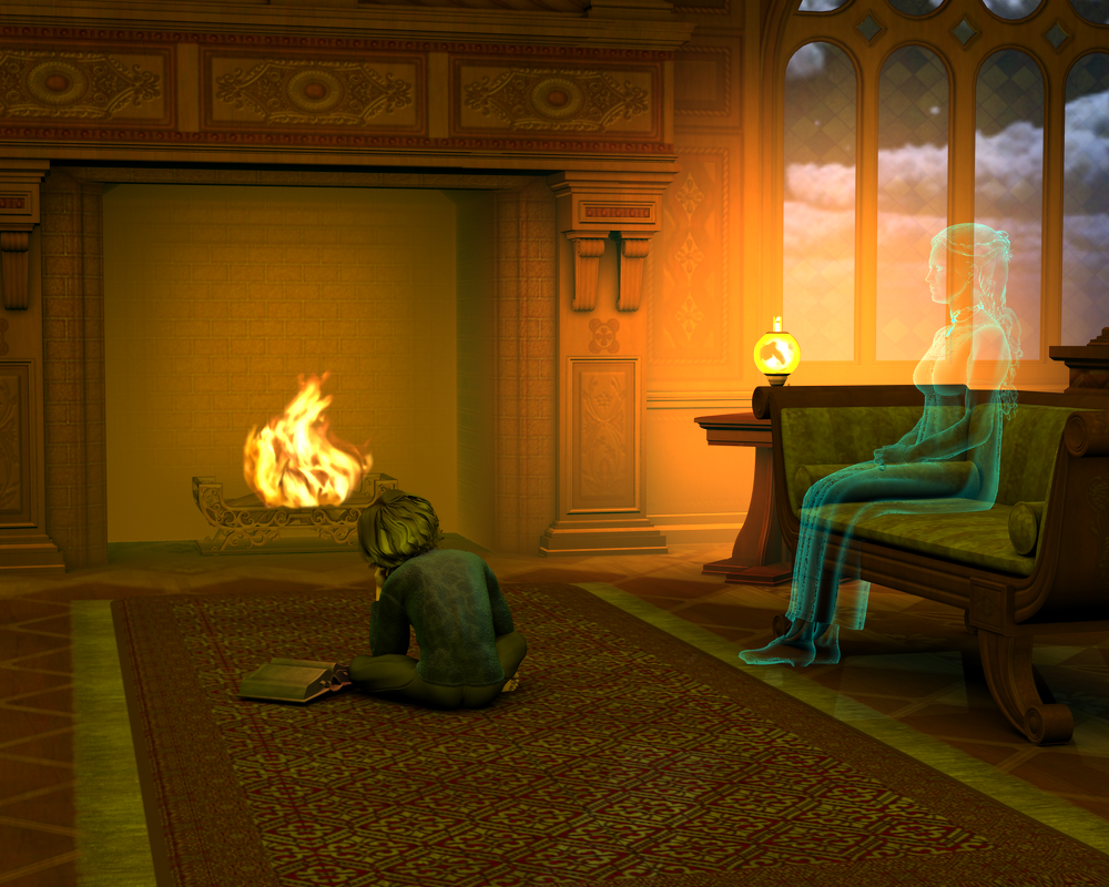
The entire image is washed in a little too much gold. Consider contrasting the gold with blue. Try experimenting with blue ambient light as blue is a complimentary color to orange/gold. This way the gold light from both the lamp and the fire will stand out much more and you can tone them down a little. Also complementary colors will really make your image pop. There's also symbolism in those colors: blue for the emotions of the child compared to the warm memory of his mother.
Heh. A dozen or more test renders.... These are just the ones I saved for comparison purposes!
Anyhow, blue light is an interesting idea. I like the symbolism aspect; I'm always thinking about that with my pictures, when I can work it in. And hey, I realized I can use blue light to make a scene look dark while still lighting it!
Thanks for the links, and it does look better with the new moon.
The Cartoon style is hidden in render settings, so click on the menu icon (shown circled in red) and select Show Hidden Properties.
Then the Render Style dropdown appears, with Cartoon as an option. And...that's all I know. Hopefully someone can chime in who has actually tried it out.
I think PWToon is used more, but here's a forum post on Cartoon Rendering if you're interested.
I had 33 test renders once!
Anyway, I like the blue - nice contrast. Since the boy is now really blue, maybe add a soft white light on him to neutralize it a little. I work in 3Delight, but I believe maybe bouncing light off a plane in Iray may give you the effect you want.
Getting lighting right can be difficult no matter which render engine you are using. I am currently working on a image using Iray and I am up to 35 test renders (that I was willing to save...there were even more that I simply deleted).
Going back my record appears to be about 73 test renders...twice. But I average around 30.
It can be frustrating but when you find that magically combination that works for your image all the hard work is worth it.
Sadly didn't get to make much of a render yet. Well, maybe tomorrow - or maybe next month...
Seems so - didn't yet get a lighting I really liked for any render - and long render times don't exactly make testing it easier...
... make that "when" a capital "IF" for me, thanks.
 But am still working on some older scenes... and not counting the test-renders there anymore
  .
.
Which reminds me (or would that read "Witch" today?
 ) - I still wanted to post the darker version of last months' render - would it be appropriate to put into last months' WIP-thread, or would that be considered "necromancing"?
Depends... Do you like the audience or not?

I see - so the Borg are visiting for Helloween, too ? *shiver* ...
Hm... is he supposed to be summoning the golem or defending himself from it? - For the latter case ( which was my first assumption ) , the angle between them is somewhat strange... I'd think the golem should come from the right side, should that be the case.
Or maybe his magic is auto-tracking?
Personally I preferred the black skull-ghost, and for your question "why that when..." - Well, ghosts usually can't be attacked as easily as a golem - but ofcourse it's your pic, so you can choose a lore that says differently...
Thanks... I was just trying to catch up on the topic, plus anyway have a tendency to write long posts... ( as witnessed here again...
 )
)
Oh, so the others are just prerequisites. - And there I was imagining some weird mixed monstrosity at the end...
 ( some fire-electro-something-tornado maybe
  , or some complicated elemental... )
Not exactly default... but likely I didn't change what was necessary, and yes, usually more than 2 hours - You do sound like you have a likely cause in mind??
( Wait... wasn't there something about not letting rays escape to infinity? D*mn, had forgotten that one... though, how does it relate to the pixeled sideeffect ? )
Thanks.
...right, just what anybody needed. *ouch*
Still, thanks .
.
Exacty my problem. Hope you get a grip on it ( and I too... ) .
Thanks again ( since I basically am experiencing the same problem ) .
Nice!
 ... and very well-lit, too.
So you finally added a glow-/ghost-effect to the neclace, too. - Good. Forgot to mention I was wondering about it last time...
I guess this is with 3Delight ? ( atleast looks like pwGhost to me ) - For that the atmospheric effect looks great.
Oh, and... - is there a small axe hidden in that table-lamp? Nearly seems so. ( Well, today that might be appropriate, huh?
  )
)
Hi unLight865 -
It was easier for me to copy out your comments that I wanted to respond to rather than delete all the previous comments in so many layers. If I want to make comments on multiple renders, I will do a separate post for each - makes it easier for people to reply (just a suggestion).
unLight865 ... Seems so - didn't yet get a lighting I really liked for any render sad - and long render times don't exactly make testing it easier...
... make that "when" a capital "IF" for me, thanks. But am still working on some older scenes... and not counting the test-renders there anymore frown.
Dracorn: Ever consider trying 3Delight instead? It may be a viable alternative if your computer takes such a long time rendering Iray. Secondly, I recommend investing in a lighting tutorial - Dreamlight tutorials are high quality and offer great information. I've gotten some for 75% or more off when they go on sale.
unLight865 Which reminds me (or would that read "Witch" today?) - I still wanted to post the darker version of last months' render - would it be appropriate to put into last months' WIP-thread, or would that be considered "necromancing"?
Dracorn: Your Halloween wit is cracking me up. Go ahead and post it in this WIP thread, as long as you don't post it in the Entry thread. You can let people know that it is from last month's contest and why you are posting it here. In fact, people who are not eligible to enter the New User's contests can also post in the WIP's just for feedback - they comment "not entering" on their post. You will get more feedback in this current WIP (or even next month's WIP) because people won't be looking at the old WIP once the contest is finished.
Good idea, but I thought double-posting was discouraged?
Anyhow, I should at least have deleted the older references inside, I think...
Thanks for the tip, but I actually started with 3Delight quite a while ago (explained here) ... And while switching back to it would certainly improve render-speeds, it wouldn't really improve the images, I think.
Actually I got one or the other, but yet have to get to watch them... But likely a good hint to do so soon, thanks
  .
.
Ok, ok - not the most creative joke, I admit...
Ok,then:
The following is not intended for this months contest, but just a slight improvement to my entries from last month!
First a only slightly darker version without DoF, because the figures were blurred far too much in the DoF-renders:
Then the same view, but with even more reduced environment lighting ( it is supposed to be a night-scene, after all ) :
And lastly the darkened version of the boat-view:
So, any comments, please?
( Just to double-check: This is NOT for entering this months' contest. )