Daz 3D is part of 
Connect
DAZ Productions, Inc.
7533 S Center View Ct #4664
West Jordan, UT 84084
Licensing Agreement | Terms of Service | Privacy Policy | EULA
© 2026 Daz Productions Inc. All Rights Reserved.
Comments
Okay thank you! You totally made my day.
Thank you Kismet. The characters are instances, thats why they all have the same pose. I want to make them all individual characters for the final render though I'm not sure how many I will be able to get in the scene before I run out of Vram.
@ewcarman
I agree that this turned out great. Thanks for taking my feedback into consideration. It was mostly just ideas, but I agree that it would be hard to improve upon what you have as this is a solid image. Good luck!
edit: Oh, and thanks for pointing me to Epic Godrays. I actually tried Sickleyield's atmosphere tutorial a couple of times now, and I had the same issue as you, but I have seen this style of godrays in the Galleries and was wondering how people achieved them. Thanks!
I REALLY like this image. I feel like you have already done so much on this to make it a great image. My final critique would just be that there could be a little more atmosphere in the foreground. I feel like after all the work you've already put into composition, maybe that should have come out earlier :-/ ... However, it does HAVE atmosphere. At the end of the day, I am not really sure if the judges judge the best picture that HAS the required theme, or the image that best epitomizes the theme. Does that make sense?
That said, The image in and of itself is great. I wouldn't even suggest the forground atmosphere if it wasn't for the competition. If I look at this image for too long, I start to get the feeling that I only have a few short seconds, if even that, to run, like it's my only hope. But deep down, I know it's not going to make a difference. So instead I stare in horror, thinking that my best chance is in the hope of just waking up and discovering I'm having a nightmare... hopefully
I think this looks great! Is this an initial draft, or is this completed? It looks good enough to be completed...
Changing his hand is not an improvement. It becomes subtle, and that tones down the atmosphere of danger and menace. The hand before was WONDERFUL. Now it's just a subtle touch. Seriously. I also liked the higher bloom because it added more unworldliness but it's not as important as the hand, personally.
This is a mistake, not what I planned, some kind of error I have to chase down. Or do I?

Sonja, remember that time I mentioned that I had seen your images in the galleries, and had seen enough of them that I just decided to peruse your whole gallery? And after that I was very excited to be in the same competitions as you? As someone who has perused your gallery, I can say you have grown a lot. I hope that doesn't come off condescending, I mean that as in you obviously have an artistic ability, but I feel like your submissions that last couple of months have shown improved artistic ability. I think this is one of your best.
Now... as I was writing that, I did notice that her... dress?... thing is going through her right leg. I would chalk that up to a technical issue. I love the colors, the pose, the lighting... just the overall drama of this image.
Ditto to this, word for word.
It took me a while to understand the cone of light at the top of the scene. I think you put it there to show that there is a lighthouse so you don't have so much empty space in the top left of the image? It's just that without seeing the source of the light very well, the cone of light doesn't make so much sense.
Thank you. It is still a wip, at the moment I am working on poses for the skeletons so they don't all look the same.
Instances...of course.
If your system cannot handle all those individual skeletons the image is still wonderful.
You can have two poses, then rotate the instances a little different and creativily make the illusion that they are all different. I did this one a long time ago using five different base figures that were instantiated ;-)
It is supposed to be a lighthouse.
Right now it feels to me like I'm trying too hard with the second image as it currently stands.. I should probably just back off with the cone of light and focus more on the ship itself.
Wow, thank you very much! Not condescending in the least, I take that as a huge compliment. A lot of the growth is due to these contests they really made me move outside my comfort zone.
I don't know that I would call it a dress exactly lol...It does look like its going through her right leg but I have looked at it from all angles and its not really and I'm not sure if I could change it now anyway. I will have another look though and see if I can get it changed enough that it looks right.
I have to agree on that - Great artistic talent, and now when the tools starts to feel comfortable great are comes out!
Wow thank you so much! I'm feeling a bit overwhelmed by all the nice comments. I took a long break from really working on my art to raise my kids (I still sketched, and did other things, but serious art went by the wayside, between work and raising a family, there just wasn't time). My youngest is in her last year of college now and I have been slowly getting back into it and learning all the cool digital tools that weren't readily available when I was younger lol.
That is a really nice image Totte.
I was able to load and pose individual figures but my PC was very slow.
Can someone please explain how I can place an image in the post.
Click on your attachment, then copy the url. come back to your post and click on edit. Use the picture box (the mountain and sun looking thing) and paste the url into it. Change the dimensions so the highest number is 800 then hit save.
Thank you for the help.
Any time. I hope it was clear lol.
Was hit by this just now. Hot out of IRAY.
I was just experamenting with the geometry editer in DAZ, and found that if you select and create a new surface from a textured object, then apply the same texture to your new surface as the surface it was part of, it will be seemless. If you have a phone or something like that you can use this trick to make the screen emissive.
Yes, the UV map and the surfaces are separated entities in the obj. You can assign polygons to new or other surfaces which only defines which material they will have, but the UV map (which defines from where at the texture map the polygons sits) is constant. The only issue you can, and will fall into is if a polygon is on the UV map at a location where the texturemap you point it to doesn't have any texture data.
I don't know if I should use this as an entry or not.
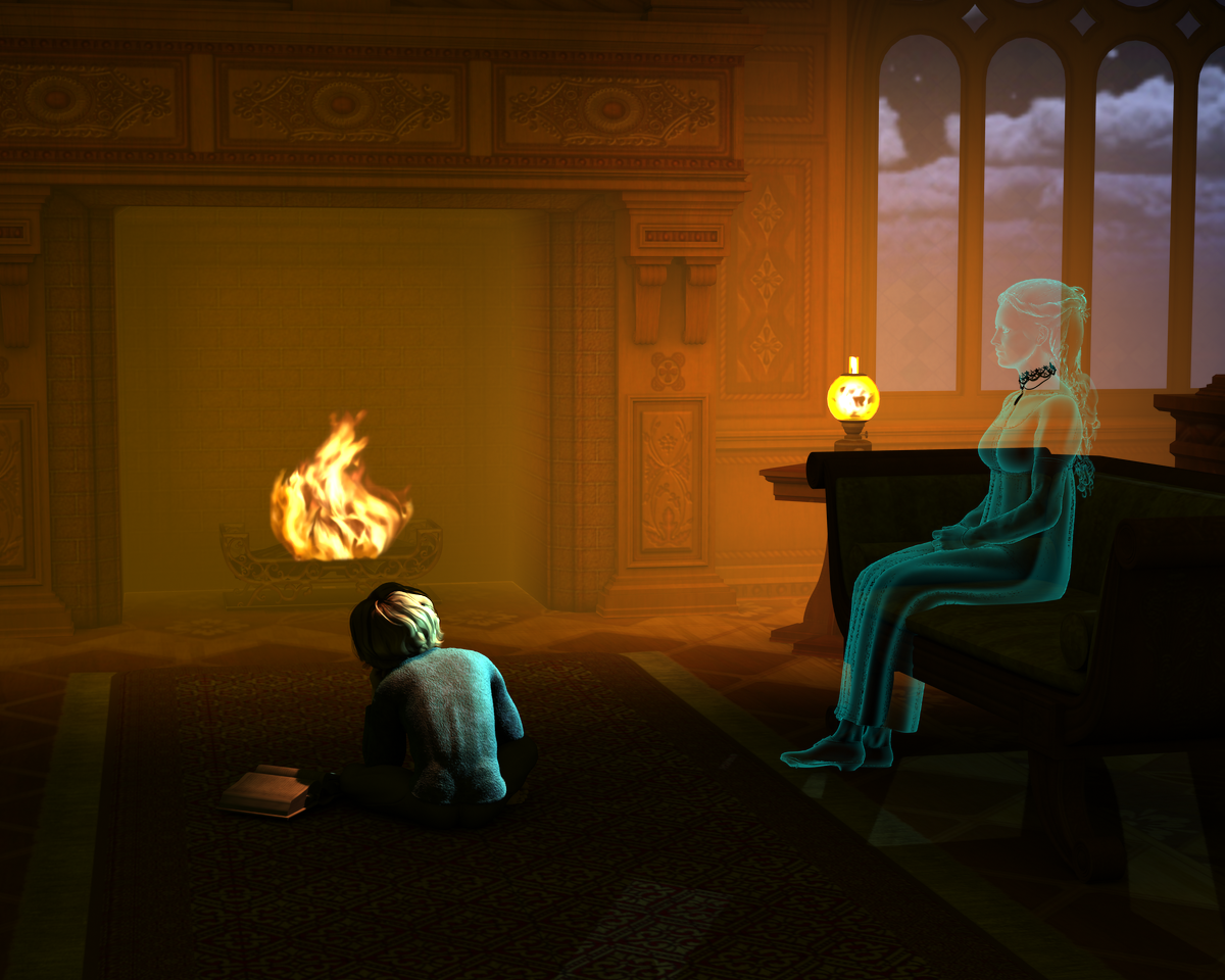
"Awaiting Mama's Return"
Much better!
Suggestion, try to make the light from the fire light up around the room a little more, and you have a very strong light hitting the back of the kids head, try to make that less focused, which might make the fire light look even better.
Added some light coming from your top left, and a bit of fog/haze.
Here's a link to my first and only video that I rendered in DAZ almost 2 years ago.
https://dl.dropboxusercontent.com/u/22879643/thriller.avi
(Warning it's 300+ MB in size.)
Can anyone guess the dance he's doing?
Here's a new idea in the spirit of the month. Might call it "Cyber Thriller" if I go with it.
There is a lot going on in here. I hope he doesn't lose control of all of those elements.