-
November 2015 New User Contest "Materials" (WIP-THREAD)
First time entering :)
Welcome to the New User's Contest ebonartgallery.
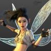
I have added some guide marks to your image. These are the 4 intersecting points of interest in an image when using the Rule of Thirds.
You might want to try moving the camera slightly so your main figure's head is located closer to the upper left point and perhaps back a bit so his leg is not cut off at the ankle.
You have a great action sequence image. I have no experience in martial arts but the pose of the main figure looks natural to me...nothing feels off about it. I am looking forward to seeing what you do with this image.
I rotated it and also repositioned some figures so they didn't interfere overmuch with his body lines. I'm thinking that a slight blurring on the back wall by manipulating depth of focus might also be good - the back wall is detailed and might distract from the central scene in some ways.
I think this format works much better the motion lines are much clearer. the blurring of the background would be usefull but ther is a second option that is motion blurr. You can add that option in yorur advanced render setting (tricky part is about what gets moved will be blurred, so if your guy shoulb be the clear focus of action you need to group verything else and move that, well not the camera, best thing to do with the camera is to parent it to the guy in this case...) I guess I would remove those wooden boxes and put some other junk in there, it look to clean, as well the floor, you could use the griminizer on that or work along the suggestions earlier in this thread. I would mess up those zombies as well they look a bit to washed ;-)
50% don't appear on Iray ItemsI had two and it still doesn't do squat- and it's now 7:41 a.m.Central Time. If they don't fix it until they come into work, that will still be another hour from now. (They're on a different time zone)
November 2015 New User Contest "Materials" (WIP-THREAD)First time entering :)
Welcome to the New User's Contest ebonartgallery.
I have added some guide marks to your image. These are the 4 intersecting points of interest in an image when using the Rule of Thirds.
You might want to try moving the camera slightly so your main figure's head is located closer to the upper left point and perhaps back a bit so his leg is not cut off at the ankle.
You have a great action sequence image. I have no experience in martial arts but the pose of the main figure looks natural to me...nothing feels off about it. I am looking forward to seeing what you do with this image.
I rotated it and also repositioned some figures so they didn't interfere overmuch with his body lines. I'm thinking that a slight blurring on the back wall by manipulating depth of focus might also be good - the back wall is detailed and might distract from the central scene in some ways.
Carrara Challenge #21: “Video Game - Main Scene” - WIP Thread - ClosedCarrara Challenge #21: “Video Game - Main Scene”
The new video game you made is finished!
Now, you must promote it with an original and spectacular "main scene".
Do you like video games? The theme for this contest is this: “invent the main scene for a video game” with, title, story characters (humans, droids, monsters, animals, or whatever you want), environment or place that you like and show it!
Every subject is allowed, fantasy, spy story, sci-fi, noir, animation, etc.
Basic Rules
-
Each participant may submit up to 2 images into the Challenge.
-
Images must be new (previously unpublished).
-
Images must be primarily set up in Carrara.
-
Images must be rendered in Carrara or in an external renderer for which there is a Carrara plug-in (e.g. LuxRenderer, Octane).
-
At least one WIP (work in progress) image must be posted to the WIP thread (this can be as simple as the scene setup, a pre/post post-work comparison or just a final image with a brief description of the process you used or as complex as modeling rooms shots, shader setups or partial scene setups or test renders).
-
Little plot summary of the videogame you made is not required but it could be helpful to better understand the final work.
-
At least one object in the scene has to be modeled in Carrara.
Sponsors
Thanks to our generous sponsor DAZ 3D for offering once again the following awards to the winners:
1st Place: $100.00 towards DAZ 3D owned item(s)
2nd Place: $50.00 towards DAZ 3D owned item(s)
3rd Place: $25.00 towards DAZ 3D owned item(s)
Honorable Mention: $10.00 towards DAZ 3D owned item(s)Thank you to our generous PA sponsor MAGAREMOTO for offering the following awards to the challenge winners:
1st Place: 3 Items from Magaremoto's store
2nd Place: 2 Items from Magaremoto's store
3rd Place: 1 Item from Magaremoto's store
Honorable Mention: 1 Item from Magaremoto's storeThanks to Magaremoto for his support..
His DAZ store is here:http://www.daz3d.com/magaremoto
Please support our PA
Dates to Remember:
WIP Thread Opens: Saturday, November 14, 2015
Entry Thread Opens: Sunday, Decembar 13, 2015
Entry Thread Closes/Voting Begins: Sunday Decembar 20, 2015 23:59:59 (US Mountain Time)
Voting Ends: Monday Decembar 28, 2015 23:59:59 (US Mountain Time)I live in the CET – Central European Time zone, but will keep the reference time DAZ 3D time, which is US Mountain Time. http://www.timeanddate.com/time/zones/mst
how do I make a tiered gathered skirtWendy - interesting comparison of the two models - does iClone use a partial conforming, partial dynamic approach? In both cases, the central panel looks unnatural like a conforming skirt, but there are clearly dynamics going on there too.
Yes its conformed and a dynamic weightmap based on UV mapping ( a gradient) added
can do entirely as a loose dress but tend to get a lot of pokethrough, so its a choice between stretching from limb movement or pokethrough, I did not have to rig the thigh handles to the thigh turn bones but then would have to pose them along timeline for ani to avoid pokethrough or if a prop skirt have track helpers like I would in Carrara adjusting as needed.
i tried resizing on a cylinder first but that just drapes back to shape, I need a skirt that can be dynamic otherwise I would have just textured the pleats with displacement.
Extruding or creating extra mesh as suggested may work though
how do I make a tiered gathered skirtWendy - interesting comparison of the two models - does iClone use a partial conforming, partial dynamic approach? In both cases, the central panel looks unnatural like a conforming skirt, but there are clearly dynamics going on there too.
Has anybody else submitted this Depth Canvas bug?I think you need to re-evaluate just what a 'depth' buffer render is. It is traditionally used to determine what order (from camera perspective) objects appear in...i.e., how far from the camera the objects are. In old scanline renderers, this let them draw from back to front, and just overwrite further objects, thus generating correct object visibility.
A transparent object is STILL a solid object. If you use the above example images, the red plane is STILL in front of the green ball. Even if part of it is transparent. This is the difference in using a plane, and using a mesh that actually has the center section cut out. As far as the depth buffer is concerned, transparency doesn't exist. ALL objects are treated as opaque.
What would it do if your concept was correct and the central part of the red plane was partially transparent? Translucent? Depth is a question of distance from the camera along the view direction. The plane is still a solid object, regardless. Raycasting techniques use the depth buffer to determine WHAT needs to be tested against first. Your way would have it test against the ball BEFORE it tested against the (potentially partially) transparent plane. This would render the ball 'in front of' the plane, since the green ball isn't transparent, and no further rays would be spawned. This is what a depth buffer is used for. Not sure what you are hoping to use it for.....
Tobor, LPE is about light paths, not depth. See http://blog.irayrender.com/post/76948894710/compositing-with-light-path-expressions
Book CoversActually I suggested moving him further left, not flipping (eye gaze going toward the right), and then placing either the title or author name off-centered in the space that's created on the right. The balance can come from the elements, not just the central image. Because everything else in the original image is centered, the odd weighting of the main art is more obvious. Her bubble head isn't a key point, I wouldn't think, so it's okay to partially cover it up with text. Anyway, it's something to play with.
The main problem with the decorative elments top and bottom is that because they compete with the text, all the more so because they are delicate, and are the same color as the text. So instead of adding to the motif or implied story points, IMO they become a distraction.
Book CoversIf I might make a suggestion ... I think the composition of Remember When is a bit heavy to the left. It looks off-balance to me. While the focal point of the image -- their kiss -- is more or less in the center, the bulk of the "weight" of the image is the man, and he's severely creating negative space to the right. IMO it ends up pulling the eyes (of the reader) away from where it should be. The imbalance of the composition is further intensified because the other elements are perfectly centered.
I think you've got a good point. In fact, I liked him better on the right which is how the initial design of the piece which, as you can see, was better balanced. That's what happens when I cram a good idea into an itty bitty space and then add words.
 Disappointing isn't it.
 To be daring, I think I'd experiment by pushing the image further left, and move the author's name so it's more vertically aligned to the right. (Or reverse, and put the title there, and the author's name on the top.)
Also, while I get the ornamental treatment top and bottom (and I like the juxtaposition of the delicate Art Nouveau filigree with the steampunk gear tattoo), I wonder if the ornaments aren't wasting space. Is this part of a series that you might do a sales burst or crest of the series name there instead?
They are kinda a waste of space and I was playing with the idea of making them smaller to give a little more room on the upper portion of the picture and move the text away from the figures a bit as I think that's adding to the crowding on the left. Her hand that close to the type is honestly driving me crazy. I think if the whole central image was down about an inch the heaviness on the left wouldn't be so noticeable. The top feels super cramped to me.
Finally, I'm sure it's just the coif, but she looks like she has an alien brain in there! Is she Not of This Earth?
I KNOW! Is that hair outrageous or what?
Anyway, on the GenX2 product: the manual is a bit hard to get through, as I suspect English isn't the native tongue of the developer. But it's a terrific utility I could not do without. Saved me maybe $500 in not having to buy new morphs and non-dial characters for either G1F or G2F figures. I had a ton of stuff collected for V4.
Well that's what I thought it was supposed to do, but I could never get the hang of it. I would LOVE to get my V4 and M4 facial morphs particularly over to the G1 and G2 platform since I already use the utility that moved all the skins and THAT worked like a charm.
 Book Covers
I'm sorry to hear about your dad. I certainly hope that he gets better. Pneumonia in older people is not a small thing and can be a challenge to recover from. It is even harder for someone who smokes and has compromised lung issues. I lost my brother to a bad case of pneumonia so I understand the stress you are under. However, do try to keep yourself from letting it get to you too much. It won't help if you let yourself get run down, either.
I smoked myself for twenty years before finally giving it up. Best decision I ever made, but it took several attempts over several years. It didn't finally stick until I was in the right mindset and determination to quit. Also, I set up my environment to make it easier to quit than to keep smoking. It certainly wasn't easy. And, it took several years before the cravings completely went away.
Unfortunately, I've got too many irons in the fire so couldn't get an entry in. I'll keep an eye on this month's contest tho. How's the contest going with your two entries? I suspect it will take a few days before they announce the winners. Good luck hun!
Well, they've been entered. No announcement, yet, as to the winners. I have serious doubts that mine will win. There were a couple of really good entries and I have at least one favorite among them that isn't mine. However, I have to say that I learned a lot just by competing. There was also a lot of great feedback which I found extremely helpful. I can see a huge difference in what I'm currently doing and the renders that I did last year when I first started so I'm learning. Even looking back through the WIP thread and looking at my first effort and the final image shows a dramatic change so I'm happy that I took everyone's advice throughout this and other threads to join the contest.
This year I'm entering Spirit of Dragons and Haunted Heart into the paranormal category. Last year the contest filled up within two weeks of opening, and I had to go on the waiting list in case someone didn't send their books in. I sent mine so they were there just in case and it paid off as I was able to get a spot when books didn't arrive by the deadline. This year, I entered early so now I'm working on making sure these books are all spiffy. Because we have to enter print books, I go through Createspace and have them shipped directly to RWA in Houston. Of course I'm going over them again and again to make sure they're as good as I can get them.
Good luck with the contest.
So as soon as I finish the Heart's War cover, the new Heart's Ransom print file (and I'll update the ebook too) is ready to for upload.
Oh good news on the Heart's Ransom audiobook! I checked yesterday and it was ranked in the top 5,000 on Audible (may not soud like much but believe me that's huge) and was in the top 100 (72 at the time) on Amazon's audibook list and that's huge too. So it's doing well on sales.
That is great news. I don't do audio books, but it sounds like a LOT of other people do. Hopefully, it will keep climbing the charts.
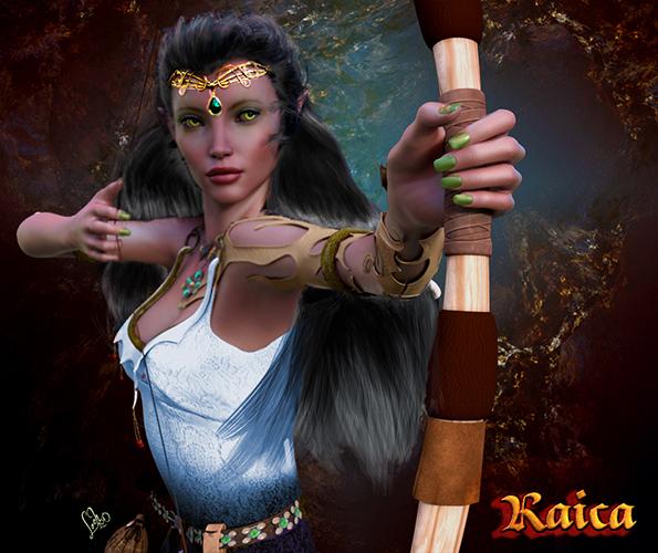
Raica is a half elf and her talent is archery but while I like the pose and the angle, I didn't put the arrow in because it blocked too much of her face. I suppose I could say it's a magical arrow too. lol!
I'm glad you started with an arrow. That makes me feel a little better. My first thought when I saw the image was STOP, she might accidentally dry fire the bow. As an archer myself, it is a huge mistake to pull back on the bowstring without an arrow. It is one of the first things I tell my students to NOT do after we talk about all of the safety issues, because as soon as someone picks up the bow the first thing they usually try to do is pull back on the bowstring. Of course, this is even more important now than the era or fantasy period of your elf. Wood doesn't break quite like fiberglass and if a wooden bow breaks, it doesn't do quite as much damage as the current fiberglass bows can do when they break. Other than the missing arrow, it looks pretty good.
I've also started my own live stream where I demonstrate photoshop techniques and DAZ stuff. My next stream is on Wed at noon Central, y'all should come on by if you get the chance www.twitch.tv/kathrynloch But the stream has been keeping me busy too.
I'll have to look into this. Maybe I can improve my postwork skills.
WHEW! No wonder why I'm tired!
I would SAY!! You need a break.
Okay just getting the rust off, and in hopes that we see more of Kathryn...here's a romance image. Not quite a cover but let's just work with what we have shall we? As always, I love your feedback guys and gals. :) - Edited and uploaded more complete cover.

I really like this cover. While really cool looking, I agree with Kathryn that the tattoo doesn't really fit the noir feel to the image, however, I don't think it looks completely out of place. I actually kind of like the whole look to the cover so I guess I'm on the fence about the tattoo. I'm not actually sure I would like the cover as much without the tattoo.
Book CoversManne! Great to see ya hun!
Thanks everyone for the feedback on Heart's War - honestly I'm getting to the point where I'm sick of this cover. lol! Yes, the glitter was intentional, it's a layer style I made I followed suggestions and removed it.
But things are stupid crazy here. My dad took a turn for the worse and is sedated on a ventilator with really bad pneumonia. So it's wait and see. We'll probably have to go through this multiple times. The man's 76 y/o, and after 50 years of smoking, there's only so far to go here.
Very sorry to hear this, that's difficult.

My health unfortunately isn't doing so well either, I know stress is a huge part of it. But when I got my new computer/reading glasses I told the eye-doc I was worried about my vision because lately it looks like the room is always filled with smoke. Yes, I do smoke as well (working on that) but this is a bit much. Sometimes I get phantom smells and other times downright hallucinations - especially when I'm tired. Well, the eye-doc said that's text-book symptopms of Migraine with Aura. The funny thing is, my pain tolerance must be pretty high because I'm not noticing a headache as much as I am the symptoms. But when she shined the light in my eyes - holy cow did that hurt like crazy! But I'm super sensitive to light and sound right now - which is why the new forums here kill me. I had every thing set to dark backgrounds and light text but they changed stuff again and I haven't figured out how to put it back. Also sensitive to smells like you wouldn't believe, It's fun how things that never bothered me before are now suddenly huge issues. The hallucinations can be downright scary though, I keep seeing someone in my house, the bad thing is even my cats and dogs react to it . . . er . . . whatever it is. I write about the paranormal in my books, but that's fiction, it takes a lot to convince me about stuff like that in real life - now.... not so sure any more. lol! So I'm trying to get all my ducks in a row to see a doc. The fun part is going to be all the stupid tests. *sigh*
My condolenses also on the stress induced illnesses. I can totally relate! Take your time and only do what you can, sounds like you're on the right track with finding a doc who can help.
All of this has totally taken the wind out of my sales when it comes to writing. I've been trying but writing new stuff is like pulling teeth right now. However I'm trying to get the mojo going again by working on my book covers and reformatting stuff in InDesign. I decided to enter two books in the upcoming Rita Contest for RWA. This contest is special for me because Romance Writers of America is one of the largest author organizations in the nation and was co-founded by my mentor Rita Gallagher and her daughter, Rita Clay Estrada. When I was active in my local writer's guild, me and two friends would travel once a month from Beaumont to Rita Gallagher's house in Houston for our critique group. We did that for over a year and I learned a lot. Unfortunatley, Rita Gallagher passed away in 2004 or thereabouts. But the Rita contest in RWA is named after Rita Clay Estrada and is a huge deal in the romance industry. Even making the finals is a huge accomplishment - I doubt I'll ever make it but it's important for me to enter. Last year I entered one book but after all was said and done, I found out my historical was entered into contemporary - why, I have no clue, but it was too late to fix the mix up.
This year I'm entering Spirit of Dragons and Haunted Heart into the paranormal category. Last year the contest filled up within two weeks of opening, and I had to go on the waiting list in case someone didn't send their books in. I sent mine so they were there just in case and it paid off as I was able to get a spot when books didn't arrive by the deadline. This year, I entered early so now I'm working on making sure these books are all spiffy. Because we have to enter print books, I go through Createspace and have them shipped directly to RWA in Houston. Of course I'm going over them again and again to make sure they're as good as I can get them.
Sweet!
So as soon as I finish the Heart's War cover, the new Heart's Ransom print file (and I'll update the ebook too) is ready to for upload.
Oh good news on the Heart's Ransom audiobook! I checked yesterday and it was ranked in the top 5,000 on Audible (may not soud like much but believe me that's huge) and was in the top 100 (72 at the time) on Amazon's audibook list and that's huge too. So it's doing well on sales.
Manne, I'll think about changing the plants - I think it might be too far gone, but if it turns out I need to do an overhaul and start over, then I'll change that. I think the depth of field is a little wonky and I had to do a bit of a guassian blur because at the time my renders were going two hours and not completing so I was getting a lot of grain. Not sure what was up with that but I moved to DAZ 4.9 Public Beta and knock on wood that hasn't been an issue lately.
If you're rending using Iray, 2 things I found that help are: Turning on the Optix Prime Acceleration on the Advanced Render settings tab, and turning off my virus scan's real-time scanner when rendering as it was scanning every write to the drive. Your background doesn't look huge so that wouldn't account for it, but sometimes (for me) the addition of hair makes everything slow to a crawl. I have a utility I turn on to see how much actual memory my scene is taking to see if it's over-running the amount of memory in my video card, if it is, I can pretty much expect to do nothing with my computer for the next couple of hours while it renders as it will totally ignore my video card and do a straight CPU render.
So here's what I have for Heart's War right now.
I like this font better in the full sized picture but in the thumbnail it is difficult to read. But that's probably not the font and more the effect that's on it.
I did get sidetracked with a little fun project - I did some character art for the HowReRoll live stream on Twitch I was telling y'all about. I figured it was good practice so why not? lol! Here are those images.
I've also started my own live stream where I demonstrate photoshop techniques and DAZ stuff. My next stream is on Wed at noon Central, y'all should come on by if you get the chance www.twitch.tv/kathrynloch But the stream has been keeping me busy too.
WHEW! No wonder why I'm tired!
Take some time and don't forget to REST when you can.
 Carrara renders in book trailer
Thank you for this comment!
I had no intention to post a link for the book product page but it happened anyhow. Your comment made me look at the product page once more and you are absolutely right. The order of the text has been changed now but it will need some time to spread over all Amazon stores. Thanks again, I really appreciate it! Sometimes, one needs another pair of eyes to see things clearly.
The current front cover image seems like some "ordinary" postcard or something, showing a nice landscape and not much more. This image contains many elements of the story however. There is the cottage, the crooked willow tree near the stream, the castle and if you would have a magnifier, even a fly, dragonflies etc. The rook plays a central part in the tale but it is not the main character. I could think of many alternatives for the front cover but it is also a matter of taste and making choices at a certain time but I always welcome opinions as one wants to keep developing.
In an effort to prevent this from becoming rather off-topic, another render.
It is the same scene as the book's front image but here, the camera points to the East in stead of the West. The renders are all about the first few pages of the book. Later, a boy is introduced in the tale and the story gradually focuses more on people and plot...
 Carrara renders in book trailer
Gorgeous. That would make a much better cover (the left side) than the one you currently have. It has the rook, as the central character, nicely framed. It says to me, "this is a book about a rook."
Unfortunately the current cover, and also the blurb says very little about the story. (Come to this with the eyes of a potential reader: You're trying to sell us the book, but you tell us things we don't want to know and don't care about. The quote right at the end -- which I have to click buttons to see -- is a great hook. It tells me everything. Move that to the beginning, don't say "from the back cover" - you're just wasting space, and lose the word "Just", it's negative.
Sorry to sound mercenary, but if you want the book to sell, you have to sell the book. You only have 6 lines to make your sales pitch (before the More button) and grab the attention of the potential reader. Use it wisely.
"A tale about a young rook
that is found by a boy
who encounters a girl and a dog.
[...] and a shiny black marble."That's your hook. That's what'll get them wanting to know more.
Book CoversManne! Great to see ya hun!
Thanks everyone for the feedback on Heart's War - honestly I'm getting to the point where I'm sick of this cover. lol! Yes, the glitter was intentional, it's a layer style I made I followed suggestions and removed it.
But things are stupid crazy here. My dad took a turn for the worse and is sedated on a ventilator with really bad pneumonia. So it's wait and see. We'll probably have to go through this multiple times. The man's 76 y/o, and after 50 years of smoking, there's only so far to go here. My health unfortunately isn't doing so well either, I know stress is a huge part of it. But when I got my new computer/reading glasses I told the eye-doc I was worried about my vision because lately it looks like the room is always filled with smoke. Yes, I do smoke as well (working on that) but this is a bit much. Sometimes I get phantom smells and other times downright hallucinations - especially when I'm tired. Well, the eye-doc said that's text-book symptopms of Migraine with Aura. The funny thing is, my pain tolerance must be pretty high because I'm not noticing a headache as much as I am the symptoms. But when she shined the light in my eyes - holy cow did that hurt like crazy! But I'm super sensitive to light and sound right now - which is why the new forums here kill me. I had every thing set to dark backgrounds and light text but they changed stuff again and I haven't figured out how to put it back. Also sensitive to smells like you wouldn't believe, It's fun how things that never bothered me before are now suddenly huge issues. The hallucinations can be downright scary though, I keep seeing someone in my house, the bad thing is even my cats and dogs react to it . . . er . . . whatever it is. I write about the paranormal in my books, but that's fiction, it takes a lot to convince me about stuff like that in real life - now.... not so sure any more. lol! So I'm trying to get all my ducks in a row to see a doc. The fun part is going to be all the stupid tests. *sigh*
All of this has totally taken the wind out of my sales when it comes to writing. I've been trying but writing new stuff is like pulling teeth right now. However I'm trying to get the mojo going again by working on my book covers and reformatting stuff in InDesign. I decided to enter two books in the upcoming Rita Contest for RWA. This contest is special for me because Romance Writers of America is one of the largest author organizations in the nation and was co-founded by my mentor Rita Gallagher and her daughter, Rita Clay Estrada. When I was active in my local writer's guild, me and two friends would travel once a month from Beaumont to Rita Gallagher's house in Houston for our critique group. We did that for over a year and I learned a lot. Unfortunatley, Rita Gallagher passed away in 2004 or thereabouts. But the Rita contest in RWA is named after Rita Clay Estrada and is a huge deal in the romance industry. Even making the finals is a huge accomplishment - I doubt I'll ever make it but it's important for me to enter. Last year I entered one book but after all was said and done, I found out my historical was entered into contemporary - why, I have no clue, but it was too late to fix the mix up.
This year I'm entering Spirit of Dragons and Haunted Heart into the paranormal category. Last year the contest filled up within two weeks of opening, and I had to go on the waiting list in case someone didn't send their books in. I sent mine so they were there just in case and it paid off as I was able to get a spot when books didn't arrive by the deadline. This year, I entered early so now I'm working on making sure these books are all spiffy. Because we have to enter print books, I go through Createspace and have them shipped directly to RWA in Houston. Of course I'm going over them again and again to make sure they're as good as I can get them.
So as soon as I finish the Heart's War cover, the new Heart's Ransom print file (and I'll update the ebook too) is ready to for upload.
Oh good news on the Heart's Ransom audiobook! I checked yesterday and it was ranked in the top 5,000 on Audible (may not soud like much but believe me that's huge) and was in the top 100 (72 at the time) on Amazon's audibook list and that's huge too. So it's doing well on sales.
Manne, I'll think about changing the plants - I think it might be too far gone, but if it turns out I need to do an overhaul and start over, then I'll change that. I think the depth of field is a little wonky and I had to do a bit of a guassian blur because at the time my renders were going two hours and not completing so I was getting a lot of grain. Not sure what was up with that but I moved to DAZ 4.9 Public Beta and knock on wood that hasn't been an issue lately.
So here's what I have for Heart's War right now.
I did get sidetracked with a little fun project - I did some character art for the HowReRoll live stream on Twitch I was telling y'all about. I figured it was good practice so why not? lol! Here are those images.
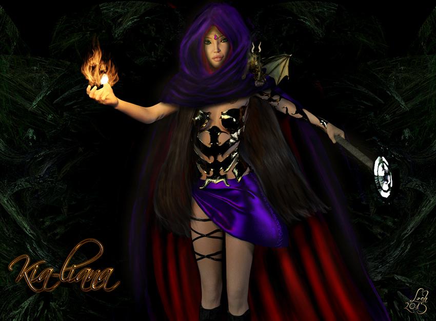
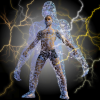
Kia is an elven mage. I ended up doing the cloak and the hair by hand in Photoshop. I just couldn't get either of them to look nice in DAZ. The flames I also did with the Photoshop render.

Marlow is monk and eastern martial arts are her fighting style. She was really tough because of the shuriken coming straight at the camera.

Radovan's armor is from the Knight Guard package and I had to redo the shield texture. He's a Cleric so I used the symbol of St. Cuthbert that he follows. In D&D, Clerics can't used edged weapons, only blunt like morning stars and macesI had to remake it in Photoshop because the images I had weren't very good. In Daz I crossed two Dwarven Hammers and rendered them, then I brought everything into photoshop and made it into a texture that would fit the shield, with it's own spec, bump, and normal maps. I pulled it back into Daz a a texture and rendered accordingly. .
Raica is a half elf and her talent is archery but while I like the pose and the angle, I didn't put the arrow in because it blocked too much of her face. I suppose I could say it's a magical arrow too. lol!
I've also started my own live stream where I demonstrate photoshop techniques and DAZ stuff. My next stream is on Wed at noon Central, y'all should come on by if you get the chance www.twitch.tv/kathrynloch But the stream has been keeping me busy too.
WHEW! No wonder why I'm tired!
lol!
Cheers,
Kath
It's Not Raining MenJoe Quick has a package that has starter suits for Gen4 Genesis and another for G2 M & F for free on sharecg. He includes other figures as well.
On a side note, the past couple years I have gone out of my way to do images with a central male figure, instead of the female, just to get the guys into the contests I enter. The most recent was at Fantasy Attic Halloween Contest theme Pinups and did a male monster relaxing in his den. I make a point of including males for images, whether just to show off on a thread or in a contest. Lack of clothes is an issue, but I love morphs and adjustments and use them to their full extent to get things to fit properly. I also love dynamics which make fitting so much easier in Daz.
It's Not Raining MenIt was an ad with V7 in a bikini (or possibly underwear) that made me find DAZ a few months ago and I vastly prefer the female forms over male. So I don't really have a problem with the abundance of "female products" in the store or that they are recieving most of the promoting. So DAZ's current marketing strategy at least worked on me...
With that said, I recognise the demand for male products. I'm still new and haven't done a lot of renders but even so there's already a couple times I've had to exclude a male from a render because I didn't have anything apropriate to put him in, or simply skip the render completely for the same reason when the male was going to be a central part of it.
What can be done about the male content shortage has already been said several times here so I won't go into that.
I'm now expecting to see that male only render contest appear in the near future, and why not with the catchy name "It IS raining men"? And in the spirit of crowdfunding I am more than willing to contribute with $10 to the prize pool.
Daz Studio Pro BETA - version 4.9.0.21!.
I fail to understand why DAZ keeps announcing a path to go but then takes actions that seem in direct conflict to those announcements.
Old genesis generation products with outdated metadata categories from 2011, 2012 and 2013 should not have been added to DAZ Connect.
Those products are NOT READY for the cloud. All the outdated duplicate categories are now forced on everyones system.
One thing you'll see throughout the beta is the metadata syncing. Basically, if you connect (or if you're connected already) Studio will be informed of, and automatically download, updated metadata. This is marked vendor data so it won't conflict or overwrite changes or user created data you make.
How does this help? We understand that there were lots of reasons Smart Content originally left a bad taste in peoples' mouths: unstable and self-corrupting database (no longer an issue with it being replaced with Postgres), some saw it as harder or clunky to organize (streamlined and better / more developed tools for it), and even if all those things are good, lots of bad and inconsistent meta data. That is why we have what we are calling our "Librarian". She is on a super beefy machine with every product in the store that works with Studio, and going through and cleaning up metadata for every product. We have over 3000 products with updated metadata ready to go and more fixed daily. Why is this not already pushed up? Its beta and one of the many things we need to test and see how it does, so you'll start to see those older or messed up metadata products magically fix themselves as you use the beta. This also means new products with messed up meta data can get fixed quickly and those changes propogated out as soon as they are done from the central database. I don't know how long it will all take to reach our goal of every product having good and correct metadata, but it is something we have already done a massive dent into, and you'll be seeing that come down the pipeline in the coming weeks.
Daz Studio Pro BETA - version 4.9.0.21!Greetings,
Okay, I'm looking at the "edit preference" window and I see a tab for cms settings, could someone explain what it is, plus what is cluster directory and port. How does this affect Studio and the content library, and computer.
Hold my hand ....
You don't want to edit that. That's information about where their database will store its data, and unless you're running your own instance of PostgreSQL (I've done that a few times with DAZ Studio, to try stuff out), you really don't want to edit that.
CMS is Content Management System. The 'cluster directory' is essentially where the internal database will store its highly optimized index of information that lets DAZ Studio provide Smart Content and a ton of related features. Content Library uses the database for categories, and some other features IIRC. The only effect on your computer is that the database server will start up when you run a program (DAZ Studio, Install Manager) that talks to it, and it will shut down when the last program closes.
I think they put it in the UI 'cause there were a few nutcases like me who wanted to put it all in a central PostgreSQL server... :blush:
-- Morgan
Thanks for holding my hand, CypherFox, I was just worried of loose data adding to my bandwidth use. Off to bed. I havn't used the Connect to download anything, yet. Trying to figure out where to tell it to download.
Daz Studio Pro BETA - version 4.9.0.21!Greetings,
Okay, I'm looking at the "edit preference" window and I see a tab for cms settings, could someone explain what it is, plus what is cluster directory and port. How does this affect Studio and the content library, and computer.
Hold my hand ....
You don't want to edit that. That's information about where their database will store its data, and unless you're running your own instance of PostgreSQL (I've done that a few times with DAZ Studio, to try stuff out), you really don't want to edit that.
CMS is Content Management System. The 'cluster directory' is essentially where the internal database will store its highly optimized index of information that lets DAZ Studio provide Smart Content and a ton of related features. Content Library uses the database for categories, and some other features IIRC. The only effect on your computer is that the database server will start up when you run a program (DAZ Studio, Install Manager) that talks to it, and it will shut down when the last program closes.
I think they put it in the UI 'cause there were a few nutcases like me who wanted to put it all in a central PostgreSQL server... :blush:
-- Morgan
Rotation PivotHello , I have problems with rotation of pivo . Is there any way to rotate with exact angle setting the pivot equal in the image. I used the area properties but turns every object using its center and not with reference to the fixed point.
Any way to change this point of pivo ( in green) central objects ?

Daz 3D is part of

Connect
DAZ Productions, Inc.
7533 S Center View Ct #4664
West Jordan, UT 84084Licensing Agreement | Terms of Service | Privacy Policy | EULA
© 2026 Daz Productions Inc. All Rights Reserved.