

The percentage sizing of banners is useful, it certainly makes life easier for those with small screens (or, in my case, a floating window). Thanks for the information.
Can you make a template Cath of your banner? I'd love to see if I could make one that looks better than my piddly attempt! Just curious how you got the light effects to graze over your links below the main banner. It's a hella cool effect!
Thanks honey. I'll play around with this when I get home tonight. Your a sweetheart!
Inserting a horizontal line in the sig, above any banners does go a long way to helping separate them out.
Yeah.
Actually, I am beginning to like the lack of actual formatting for things like sigs. If things work the way I think they should (haven't had time to play with it), we should have a lot of control in how things will be displayed.
Can you make a template Cath of your banner? I'd love to see if I could make one that looks better than my piddly attempt! Just curious how you got the light effects to graze over your links below the main banner. It's a hella cool effect!
Thanks honey. I'll play around with this when I get home tonight. Your a sweetheart!
AWESOME SAUCE... I'll go for it tonight for sure. Thanks honey!
The percentage sizing of banners is useful, it certainly makes life easier for those with small screens (or, in my case, a floating window). Thanks for the information.
Inserting a horizontal line in the sig, above any banners does go a long way to helping separate them out.
Yeah.
Actually, I am beginning to like the lack of actual formatting for things like sigs. If things work the way I think they should (haven't had time to play with it), we should have a lot of control in how things will be displayed.
I've been fussing with that, and some things are not sticking the way they should. like the HTML "br" for next line, is just ignored, and new paragraph sometimes as well. The sig thing is very touchy with forcing text or pics to be on a second line (next line, whatever). Yes, I'm still fussing with it.
(EDIT) And aparently, plane text is not wrapped, lol. So much for a screen-cap, still getting "Internal error" things, It's been off and on.
Has anyone seen a 'New Posts' button or link? I know there's 'Recent Discussions', but that appears to be every thread ever posted, all in chronological order (1500+ threads), and it's not quite the same thing.
I always used to go straight to New Posts - ie. any thread replied to since my last visit. With Recent Discussions, I have no idea when they were last replied to.
So DAZ . . . if New Posts doesn't exist, could we please have it back?
No, the forum ought to have a proper, visible search function.
I thought the store was bad enough with it's endless side-to-side scrolling etc (the first rule of web design I was ever taught was to avoid horizontal scrolling), but the new forum design almost makes the store look user-friendly. I used to enjoy browsing the forum and have learned a lot here, but I imagine I'll be learning a lot less now - partly because only half the information is visible at a glance, and partly because the design is such hard work that it's no fun at all to hang around here.
I have spent many contented hours (too many, probably!) looking at the various competition threads and similar threads where you'd expect to see a lot of renders (Novica's review thread was a favourite, and Daz should probably be paying her a comission if other people have spent as much money as I've done on the strength of it!), but most threads now feature thumbnails so small that I have to click on each one individually to see if I even like them enough to take a closer look. Life's just too short.
I realise there are probably workarounds for a lot of the flaws in the new forum, but we're supposed to be an art community. I can live with faffing around with lighting and material settings etc when creating renders, that's expected, but we shouldn't have to be jumping through hoops to get information out of the forum or any enjoyment out of participating in it.
No, the forum ought to have a proper, visible search function.
I thought the store was bad enough with it's endless side-to-side scrolling etc (the first rule of web design I was ever taught was to avoid horizontal scrolling), but the new forum design almost makes the store look user-friendly. I used to enjoy browsing the forum and have learned a lot here, but I imagine I'll be learning a lot less now - partly because only half the information is visible at a glance, and partly because the design is such hard work that it's no fun at all to hang around here.
I have spent many contented hours (too many, probably!) looking at the various competition threads and similar threads where you'd expect to see a lot of renders (Novica's review thread was a favourite, and Daz should probably be paying her a comission if other people have spent as much money as I've done on the strength of it!), but most threads now feature thumbnails so small that I have to click on each one individually to see if I even like them enough to take a closer look. Life's just too short.
I realise there are probably workarounds for a lot of the flaws in the new forum, but we're supposed to be an art community. I can live with faffing around with lighting and material settings etc when creating renders, that's expected, but we shouldn't have to be jumping through hoops to get information out of the forum or any enjoyment out of participating in it.
^^^ This. X1000. You have said everything I've been thinking for the last week.
In fact, I use DAZ to make web-comics, and so do a few other people over at ComicFury (where my comic is being hosted). On their forum there is a CGI help thread started by one of the pioneers in the DAZ-for-comics arena, Centcomm (she's been doing this since 2007 or maybe before that). We've started all posting Q&As there because eveyrone on CF who used to come here for help finds this place so unwieldy that we no longer consider it efficient to come here looking for help.
No, the forum ought to have a proper, visible search function.
I thought the store was bad enough with it's endless side-to-side scrolling etc (the first rule of web design I was ever taught was to avoid horizontal scrolling), but the new forum design almost makes the store look user-friendly. I used to enjoy browsing the forum and have learned a lot here, but I imagine I'll be learning a lot less now - partly because only half the information is visible at a glance, and partly because the design is such hard work that it's no fun at all to hang around here.
I have spent many contented hours (too many, probably!) looking at the various competition threads and similar threads where you'd expect to see a lot of renders (Novica's review thread was a favourite, and Daz should probably be paying her a comission if other people have spent as much money as I've done on the strength of it!), but most threads now feature thumbnails so small that I have to click on each one individually to see if I even like them enough to take a closer look. Life's just too short.
I realise there are probably workarounds for a lot of the flaws in the new forum, but we're supposed to be an art community. I can live with faffing around with lighting and material settings etc when creating renders, that's expected, but we shouldn't have to be jumping through hoops to get information out of the forum or any enjoyment out of participating in it.
I'm willing to wait...if the 'sticky' is a permanent thing, then yeah...complaints are justified. It shouldn't be that difficult to turn that link into a search box...
Thanks, Richard for putting the link on the first page.
Here is a FireFox search engine plugin...drop in your FireFox profile > searchplugins folder and restart FF. It should show up in the list of Search Engines and then allow you to search the forums from the FF search bar.
New posts are usually bumped to the top of the recent discussions list, and say new next to them
It's not the same, though, and it's not yet reliable; I'm having to remember to click on "Mark Forums Viewed" every time I log off for the night, otherwise I can click and click and click on pages in the Recent Discussions list and, like I just did a little while ago, after six pages I'm still getting a few threads showing up marked "oh, here's another one you haven't read".
It's an extra thing I have to do now, that I didn't need to bother about before. What's the opposite of "progress", again...?
Can you make a template Cath of your banner? I'd love to see if I could make one that looks better than my piddly attempt! Just curious how you got the light effects to graze over your links below the main banner. It's a hella cool effect!
I don't see this "ligth effect". All I see is a line appear under each link when I hover over it. Maybe it only appears on the dark theme?
No, the forum ought to have a proper, visible search function.
I thought the store was bad enough with it's endless side-to-side scrolling etc (the first rule of web design I was ever taught was to avoid horizontal scrolling), but the new forum design almost makes the store look user-friendly. I used to enjoy browsing the forum and have learned a lot here, but I imagine I'll be learning a lot less now - partly because only half the information is visible at a glance, and partly because the design is such hard work that it's no fun at all to hang around here.
I have spent many contented hours (too many, probably!) looking at the various competition threads and similar threads where you'd expect to see a lot of renders (Novica's review thread was a favourite, and Daz should probably be paying her a comission if other people have spent as much money as I've done on the strength of it!), but most threads now feature thumbnails so small that I have to click on each one individually to see if I even like them enough to take a closer look. Life's just too short.
I realise there are probably workarounds for a lot of the flaws in the new forum, but we're supposed to be an art community. I can live with faffing around with lighting and material settings etc when creating renders, that's expected, but we shouldn't have to be jumping through hoops to get information out of the forum or any enjoyment out of participating in it.
I'm willing to wait...if the 'sticky' is a permanent thing, then yeah...complaints are justified. It shouldn't be that difficult to turn that link into a search box...
Thanks, Richard for putting the link on the first page.
Here is a FireFox search engine plugin...drop in your FireFox profile > searchplugins folder and restart FF. It should show up in the list of Search Engines and then allow you to search the forums from the FF search bar.
Much better then some link I need to hunt down every time, thanks so much.
If you guys only wanna read what you are posting to then go to your profile page, select the gear and click on view users posts and that will only show the threads you've posted to.
KK...I can't let my daughter see the new animated item in your sig...she'll want one too. (she's a red-head with similar temper...but lacking the curls)
My first thought, lol. What hair style is that, and Pleas tell me it works in Daz Studio on G2F or G3F (yea, genuinely wishing really gig there). Brave Merida hear, hmmm. Nope, not going to be as dynamic as Disney can do, and not going to look that good either.
Mac4D, That did it, in the margins, rather then running off the page, lol. It no longer looks like a cheesy ad slapped in between posts. Now I just got to real in my sig.
...it took the Pixar crew about three years just to develop Merida's hair which included programming custom software and building custom hardware just for that task (they speak about the hair as being a character of it's own). It uses a very sophisticated curves based system similar to Garibaldi. I would not even want to imagine how many polys her hair would be if converted to .obj (most defiantly more than the systems many of us have could handle).
For my Daz version of the character I used two instances of Bolina Hair layered on top of each other which is a pain to pose but a lot lighter on the system resources than if I created it in Garibaldi and converted to a .obj.
Inserting a horizontal line in the sig, above any banners does go a long way to helping separate them out.
Yeah.
Actually, I am beginning to like the lack of actual formatting for things like sigs. If things work the way I think they should (haven't had time to play with it), we should have a lot of control in how things will be displayed.
...the bleed over between the post body and the user information block still looks very sloppy. There needs to be a hard vertical separation between the two so .that names don't bleed over into the text area and sigs/banners format properly.
KK...I can't let my daughter see the new animated item in your sig...she'll want one too. (she's a red-head with similar temper...but lacking the curls)
My first thought, lol. What hair style is that, and Pleas tell me it works in Daz Studio on G2F or G3F (yea, genuinely wishing really gig there). Brave Merida hear, hmmm. Nope, not going to be as dynamic as Disney can do, and not going to look that good either.
Mac4D, That did it, in the margins, rather then running off the page, lol. It no longer looks like a cheesy ad slapped in between posts. Now I just got to real in my sig.
...it took the Pixar crew about three years just to develop Merida's hair which included programming custom software and building custom hardware just for that task (they speak about the hair as being a character of it's own). It uses a very sophisticated curves based system similar to Garibaldi. I would not even want to imagine how many polys her hair would be if converted to .obj (most defiantly more than the systems many of us have could handle).
For my Daz version of the character I used two instances of Bolina Hair layered on top of each other which is a pain to pose but a lot lighter on the system resources than if I created it in Garibaldi and converted to a .obj.
Comments
The percentage sizing of banners is useful, it certainly makes life easier for those with small screens (or, in my case, a floating window). Thanks for the information.
You can make your banner free online , use 2000 x 100 to use with % scale LINK HERE
Yeah.
Actually, I am beginning to like the lack of actual formatting for things like sigs. If things work the way I think they should (haven't had time to play with it), we should have a lot of control in how things will be displayed.
AWESOME SAUCE... I'll go for it tonight for sure. Thanks honey!
Your welcome .
Will the animation forum be up again or is that one gone.
They merged it with the art forum
I'm not seeing a search function...
Try
http://www.daz3d.com/forums/search?Search
Somebody ought to sticky that by now...
I've been fussing with that, and some things are not sticking the way they should. like the HTML "br" for next line, is just ignored, and new paragraph sometimes as well. The sig thing is very touchy with forcing text or pics to be on a second line (next line, whatever). Yes, I'm still fussing with it.
(EDIT) And aparently, plane text is not wrapped, lol. So much for a screen-cap, still getting "Internal error" things, It's been off and on.
Has anyone seen a 'New Posts' button or link? I know there's 'Recent Discussions', but that appears to be every thread ever posted, all in chronological order (1500+ threads), and it's not quite the same thing.
I always used to go straight to New Posts - ie. any thread replied to since my last visit. With Recent Discussions, I have no idea when they were last replied to.
So DAZ . . . if New Posts doesn't exist, could we please have it back?
New posts are usually bumped to the top of the recent discussions list, and say new next to them
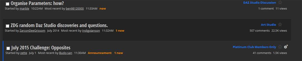
Added it to the first post of this thread
No, the forum ought to have a proper, visible search function.
I thought the store was bad enough with it's endless side-to-side scrolling etc (the first rule of web design I was ever taught was to avoid horizontal scrolling), but the new forum design almost makes the store look user-friendly. I used to enjoy browsing the forum and have learned a lot here, but I imagine I'll be learning a lot less now - partly because only half the information is visible at a glance, and partly because the design is such hard work that it's no fun at all to hang around here.
I have spent many contented hours (too many, probably!) looking at the various competition threads and similar threads where you'd expect to see a lot of renders (Novica's review thread was a favourite, and Daz should probably be paying her a comission if other people have spent as much money as I've done on the strength of it!), but most threads now feature thumbnails so small that I have to click on each one individually to see if I even like them enough to take a closer look. Life's just too short.
I realise there are probably workarounds for a lot of the flaws in the new forum, but we're supposed to be an art community. I can live with faffing around with lighting and material settings etc when creating renders, that's expected, but we shouldn't have to be jumping through hoops to get information out of the forum or any enjoyment out of participating in it.
^^^ This. X1000. You have said everything I've been thinking for the last week.
In fact, I use DAZ to make web-comics, and so do a few other people over at ComicFury (where my comic is being hosted). On their forum there is a CGI help thread started by one of the pioneers in the DAZ-for-comics arena, Centcomm (she's been doing this since 2007 or maybe before that). We've started all posting Q&As there because eveyrone on CF who used to come here for help finds this place so unwieldy that we no longer consider it efficient to come here looking for help.
I'm willing to wait...if the 'sticky' is a permanent thing, then yeah...complaints are justified. It shouldn't be that difficult to turn that link into a search box...
Thanks, Richard for putting the link on the first page.
Here is a FireFox search engine plugin...drop in your FireFox profile > searchplugins folder and restart FF. It should show up in the list of Search Engines and then allow you to search the forums from the FF search bar.
It's not the same, though, and it's not yet reliable; I'm having to remember to click on "Mark Forums Viewed" every time I log off for the night, otherwise I can click and click and click on pages in the Recent Discussions list and, like I just did a little while ago, after six pages I'm still getting a few threads showing up marked "oh, here's another one you haven't read".
It's an extra thing I have to do now, that I didn't need to bother about before. What's the opposite of "progress", again...?
Since we aren't supposed to have political discussions here I can't say...but it does begin with a 'C' and end in 'ess'....
(Well, actually it was just a generalised snarky who-wrote-this-pile-of-dingo's-kidneys comment...)
I don't see this "ligth effect". All I see is a line appear under each link when I hover over it. Maybe it only appears on the dark theme?
Dana
Much better then some link I need to hunt down every time, thanks so much.
oh, I think Timov had the proper term, lol. "You have. You've devolved." lol.
You're welcome.
It should work in SeaMonkey and FF derivatives and maybe even IE.
If you guys only wanna read what you are posting to then go to your profile page, select the gear and click on view users posts and that will only show the threads you've posted to.
Or easier still click on you name over there <<<< and click the gear icon on that page
sowwy...
...it took the Pixar crew about three years just to develop Merida's hair which included programming custom software and building custom hardware just for that task (they speak about the hair as being a character of it's own). It uses a very sophisticated curves based system similar to Garibaldi. I would not even want to imagine how many polys her hair would be if converted to .obj (most defiantly more than the systems many of us have could handle).
For my Daz version of the character I used two instances of Bolina Hair layered on top of each other which is a pain to pose but a lot lighter on the system resources than if I created it in Garibaldi and converted to a .obj.
...the bleed over between the post body and the user information block still looks very sloppy. There needs to be a hard vertical separation between the two so .that names don't bleed over into the text area and sigs/banners format properly.
And where is your version?
Dana
...is here a way to keep SCAYT spell checking active during a forum session without having to turn it on each time you write a comment?
I haven't found one, if there is...