Desk, Hooded Nib Pens, Poses, Fountain Pens and Ink Bottle
 richardandtracy
Posts: 7,855
richardandtracy
Posts: 7,855
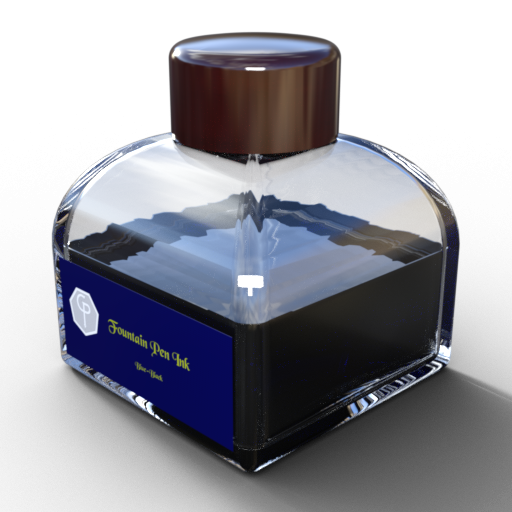
I thoroughly enjoy writing with a Fountain Pen. I was reminded that I haven't seen an ink bottle available as a freebie, so thought I ought to cure that omission. The bottle comes with six or seven ink colours. The colours are blue, black, blue-black, red, green, turquoise and purple. If the cap is hidden, the bottle thread becomes visible, and the ink level can be raised or lowered.
I hope you find it useful.
Regards,
Richard
Post edited by richardandtracy on
Daz 3D is part of 
Connect
DAZ Productions, Inc.
7533 S Center View Ct #4664
West Jordan, UT 84084
Licensing Agreement | Terms of Service | Privacy Policy | EULA
© 2026 Daz Productions Inc. All Rights Reserved.
Comments
As a fellow fountain pen lover, I say a great big "Thank You!"
A few years ago I had intended to write an article for the UK magazine "Model Engineer's Workshop", and in doing so designed a fountain pen that would be made in the course of the article. Unfortunately, I ran into a medical problem (now sorted) that prevented me from standing at my lathe, which meant I couldn't make the pen or take photos to illustrate the article. As a result, the article fell by the wayside.
Converting the pen design to DAZ Studio could well mean the design work was not wasted.
The pen? Inspired by the 1920's Parker 'Big Red' Duofold, but uses a modern filler unit.
Hopefully I can get it done in the next couple of weeks.
I thought I would give a taster of the pen models:
I have converted my pen model to DAZ Studio and done a few materials. All of the materials shown are similar to the original 1920's pen materials as seen on the original Parker Duofold Lucky Curve.
The first colour was black from the vulcanised hard rubber of the pen. Then 'Red Hard Rubber' was developed, more of an orange colour. This 'Big Red' propelled Parker into the first rank of pen manufacturers. After this yellow hard rubber was created, with the Mandarin Yellow - a material that self destructed over time. Finally, Celluloid became available, and after 4 years maturation, the blue and white coloured layers of the 'True Blue' could be turned from solid slabs and it became hugely popular, so popular Parker released their own homage in the 2000's, the 'Duofold Centennial True Blue LE' pen.
The pen True Blue is my first effort at using alternative UV's in a model.
I need to create wearable presets for the pens, but thought you might like a preview.
Regards,
Richard
Cool thanks, those pen are looking really good.
Nice, yes please! :-)
Wow... very neat.
My brother Collects and Restores pre-war Fountain Pens. He always has me searching the European Flea Markets for Pens and Parts (he lives in the states). Nice to see some available in Daz World
I've just been looking at a model I created in 2010 of the Onoto 2000/3000 pen (1909-1924/5-ish, few Onoto records survived a fire during the London Blitz so nobody is entirely sure) modellled from a print of the 1922 production drawings I got hold of. This is the style of pen Winston Churchill is known to have used, because once he wrote to his wife 'Please send me a new Onoto as I have foolishly broken mine.', that was 1916. There was another a few years ago that was brought up from a wreck sunk by a U-boat in 1917 and sold on E-bay. The revived Onoto Pens company have got it working again - it was submerged from 1917 to 1989. I have three of these pens, two in working order and a third that belonged to my grandmother.
I think I may see if I could convert the old models to DS. Probably no more difficult than the pen above inspired by the Parker Duofold. However, as it was even earlier, the filler is not the modern cartridge convertor I modelled above, so I can't save time there. As you can't see anything of the filler, there is no need to model it, which means I have to remove most of the inner components present.
Anyway, the uncapped pen is as below:
Regards,
Richard
Neat!
What kind of filler is it?
The Onoto has a strange push to fill vacuum filler invented by George Sweetster in 1906. He was a music-hall artist who's act included roller-scating in drag [the mind boggles].
Anyway, the filler he invented had a chamber above a seal. You unscrewd and then pulled on the end of the pen, and the flexible rubber seal was pulled to the top of the pen, then you pushed down, which created a vacuum above the seal if the cork ring at the right of the image below was intact. When the rod was pushed fully home, the seal got to an enlarged section of the barrel (where it's shown) which relieved the vacuum by allowing flow around the outside of the seal, and pulled the ink in. To stop it leaking there was a secondary valve enabled by screwing the end of the pen fully home and preventing any ink getting to the feed.
The problem with these pens is the fact the barrel is wet, so if the air above the ink warms up from the hand holding the pen, it expands and pushes ink out in huge blobs. Made worse by the feed being unable to absorb any ink in a finned collector - because there isn't one. Not ideal. And it gets progressively worse as the pen empties. I have splattered ink everywhere with one of these pens at work... Modern pens with finned collectors and an air gap between the ink container and barrel warm up much more slowly and don't blob.
The nib on these pens, though, is gorgeously soft & flexible, allowing for great expression in the writing. Nothing like a hard modern nib.
Regards,
Richard
Found I needed another pen tidy and a writing pad. So modelled them up, have done a few (20 odd) material, wearable & full body poses, and come up with this preview:
Regards,
Richard.
Looking good :-)
Looking forward to this one!
Oooohhh....
Looking forward to "The Write Stuff" Poses and Props from RichardandTracy
**Remember**
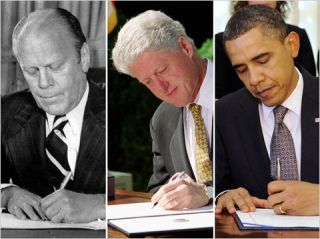
You can't just "mirror" the poses for lefties, we jack it all up when it comes to trying to write...
You can & can't mirror poses for lefties. Sounds stupid, I know, but I'll explain.
My eldest daughter is a leftie, and I have got her to show me how she writes. With a ballpoint (BP) or pencil, she writes with her hand in the mirror position to a right hander (like Clinton above), though the pen is more vertical than with a fountain pen (FP). With an FP, she writes in one of three ways. 1) As if a mirrored right hander, but lifting her hand off the page. This is awkward and not for long periods of writing. 2) hooking her hand around the top of the page (Ford & Obama above), or 3) one she doesn't use often, which is to rotate the paper 180 degrees about the vertical axis so it's upsidedown relative to her, and then writes upside down. One of her leftie friends only writes that way. Option 4 I'm not even contemplating is the Leonardo way - write in mirror writing. But that would be 1) anyway.
I think I will release 1) with the package. The rest will come later, as will ones for G8M. It is actually pretty hard to get these poses right, getting her hand to grip the pen (before making it a smart prop) took close on to 90 minutes to get just right, which is a fair chunk of time to concentrate on just the hand. I also want to do other poses people do when writing - scratching behind the ear/eye, sucking the end of the pen, sucking the nib (does happen, however daft it seems), using the pen to remove ear wax, putting the pen behind the ear... There are a few. Big problem is the desk & chair I use when doing the poses. The table in the image above is an elderly one that really needs re-mapping and re-texturing https://www.daz3d.com/l-xv-furniture-pack. Think I'll need to fit them to a good quality freebie set, maybe this (renderosity.com/freestuff/items/83325/office-furniture-set), though a proper Georgian Desk seems much more appropriate for using an old style fountain pen.
I have scanned in 7 fake starts to letters that I'll turn into textures and material presets for the pad of paper. One is in red ink, and purports to be a letter from the bank due to an overdrawn account. Maybe one page needs to be notes done a la Leonardo.
The Onoto 2000/3000 model is into DS and textured, but I'm getting an oddity. I think I need to alter the material smoothing angle, as I'm getting unexpected triangulation visible between facets where the finger hold blends into the barrel. The edge is about 60 degrees, but I think I'm getting an attempt at smoothing (angle set to 89 degrees at the moment). Means the Onoto will have to have different materials to the Big Red pen. No real hardship, but it will take a little time to sort it. Also, a number of Onoto's had 9ct gold overlays. These were usually chased, so the default DAZ Uber shader won't be sufficient and doing a normal/displacement map will take a while, to the extent it may be worth doing the Onoto as a different package.
Regards,
Richard.
Great that the ink levels can adjust. Makes for better realism with multiple well-bottles in the scene.
Yep, I agree. Having managed to use up various bottle of ink in the last couple of years, I only have, lets see... 17 different colours/shades at the moment. Certainly nowhere near enough for one colour per pen. Possibly I ought to think about different bottle shapes too. The Visconti mushroom shaped bottle is quite a sight to behold :
Regards,
Richard
I have completed three packages. Let's see if I can upload them. First, the pen based on the Parker Duofold Big Red'.
To download the zip file, you'll need to download the freebie at Renderosity . Unfortunately the zip file is too big to attach.
Regards
Richard.
Now the pen based on the 1916 Onoto 3000:
Well, this one uploaded, so do enjoy it!
Regards,
Richard
The final package won't upload, being bigger than the first, so can I direct you to it here. This package relies on you having the Big Red and ink bottle too. The pad has six other 'letter' materials for the front of the pad, and defaults to ruled lines. It is a dumb prop otherwise, not possible to tear a page off or anything else fancy . The populated pen tidy's shown are scene subsets.
Regards,
Richard.
Thank you, sets looks lovely :-)
For your wish for a Georigan Desk, it is free by Ness Period Reproductions. It is an older freebie. I send you to the freebie wiki which has a picture of the desk and the chair.
Georgian Desk - Poser and Daz Studio Free Resources Wiki (miraheze.org)
Georgian Chair - Poser and Daz Studio Free Resources Wiki (miraheze.org)
My pleasure richard. Thank God and the Queen for the wayback machine. Ness's stuff was so very hard to get to but when he shutdown and forced us to go hunting. There they were all tucked away on the best library source the world has ever know. I feel like I am in Alexandra in it's golden days. I have found so many wonderful props, clothing, vehicles. Oh so many mysteries and treasures. To bad the newer websites do not play as nice. But there are times.There are times. Humans are such shallow people when it comes to keeping and reusing things. I don't understand leaving or removing something you have spent so much time on. Happy Holidays and Merry Christmas every one.
I have done another 12 poses with 6 being right handed people, the other six being left handed. Three of each are writing, the other three are absently rubbing, thinking or stretching. I think I have got the hand shape and position correct for left handers - it has been checked by my left handed daughter.
The desk is the Georgian Desk linked to by DollyGirl above, scaled to 86.5% in the vertical direction, and the desk chair. All textures converted to iRay.
Regards,
Richard.
Sweet Richard. You have such a good eye for natural body positions.
All your stuff is great and very useful. Many Thanks!
WOW!!!!
Looks great! The main requirement (to me, as a Lefty) is that it looks awkward!