Daz 3D is part of 
Connect
DAZ Productions, Inc.
7533 S Center View Ct #4664
West Jordan, UT 84084
Licensing Agreement | Terms of Service | Privacy Policy | EULA
© 2026 Daz Productions Inc. All Rights Reserved.
Comments
EEEK! The dreaded "crossbar 'I'"!
https://cdn.shopify.com/s/files/1/0152/5779/6662/files/bl001.jpg?1883
https://blambot.com/pages/lettering-tips
I enjoyed reading it. It was definitely a fun D&D game brought to life. I found the dialogue and personalities to be quite likable by the third chapter. I like the addition of the new characters, as they give the others someone else to play off.
I definitely understand the urge to just plow forward and never go back to redo things you have already finished. But, if you ever get the urge to go back and touch things up, consider revisiting Chapter 1. It needs a lot of work regarding pacing and storytelling. You really should have started with a long shot of the forest with a small glow of the campfire and then moved in for a few panels. We needed an establishing shot to show us where they were and to set the mood. As it is, you just jumped right in with a medium-shot of the hero. And the background was just so dark that I could hardly make out the trees. As for pacing, you have very wide panels and could easily fit in more dialogue, rather than bopping back and forth between one speaker then the next. And something else to think about: Think about a movie or TV show. Do you ever really just see two heads talking like this? No, they are usually doing something. In this case, you could have put a pot of coffee or stew on the fire and Fracas could have come in and given his report while fixing himself some drink/food. Or Matt could have gone back to cleaning his weapon. Or something. In theatre, they call this stuff "a bit," meaning it's a bit of unscripted action that just keeps people from standing around talking. You've gotta remember, comics are a visual medium, so you need to give us things to look at. Characters should be moving and doing things; it helps make them relatable. Final bit of criticism, pay more attention to their mouths: Fracas hardly ever opens his mouth while he's talking. That seems odd.
Now, I hope that didn't come off as overly critical. I enjoyed what I read (and I did read all of it, which means I liked it). It's just that, in creator-run comics, we have to be the writer, director, cinematographer, scene designer and then letterer and editor (because it is, after all, a comic BOOK, not a comic MOVIE). That's a lot to handle, and it takes practice to master. The good news is, you improved as you went on. There were more establishing shots, the lighting and framing got a bit better, and your characterizations improved, too. So keep at it! You're on the road and success is in your sights!
Thanks so very, very much! I gobbled up all of your criticism and take it to heart.
I do a ton of webinars/products about comics.
https://www.daz3d.com/comic-book-creation--foundation-course-part-1
https://www.daz3d.com/comic-book-creation--foundation-course-part-2
I say - adds these to your wishlist and when they go on sale explore these!
They are loaded with tips, tricks and ideas.
Drew has a lot of great material that can help people. Do you ever attend the free Visual Narratives workshops over at https://digitalartlive.com/ ?
Thanks. I'm always concerned that I come off as being overly critical and nitpicky. ;-)
No, but I'm going to, as this is a labor of love, and I hope to make it as good as I can!
I've learned a ton from Drew's webinars and the workshops.
I especially like the community feedback in the workshops - even if it's not your own work getting feedback, you can learn new things from everyone's pieces. It's also great to have a sense of "hey, I have heard that person's voice now" type of community when someone has talked about something "by microphone".
As for the Comic webinars, they touch a lot of topics that aren't on your mind usually when you start doing a comic, or even when you are in the midst of doing one. Some are really big issues, and others are seemingsly small issues with huge impact. I also like that the examples are phrased in a way that stick ti the mind (or at least, they stick to mine). I can also recommend the "Academy" over at DA - https://digitalartlive.com/plans/visual-narratives-academy/
Here's a cover I've been working on for a comics fanzine. It features my characters giving Santa a helping hand.
This is a proof: I still need to add a few details (like maybe some stars and Christmas wishes written on the side of the sleigh or on the back cover – maybe).
BTW: This cover is actually an homage to a cover published by DC comics back in the 1970s:
In fact, my original design included the huge moon and I wanted to create the winter scene (house and trees), but the smaller moon worked better with my cover and I ran out of time to create the house, so I just used a silhouette of a skyline. The coloring on the skyline, btw, was a happy accident. I originally was going to go very dark, but while I was playing around with the blending modes and the layer order, I discovered this cool effect by making them lighter (not darker) than the sky. Once I had that general idea, it was easy to tweak it into what you see above.
It's interetsing to see ideas overlap, but I guess the sleigh is such a staple, that shot is more common than I would have thought.
I had a similar idea for a Holiday message.
Yeah, the sleigh is a pretty classic motif for any sort of Christmas card or illustration. And it's a lot of fun to work with. I like your rocket sled approach and all the chaos of the gifts flying off the back of the sleigh. Lots of nice action in this scene. And I love the "HoliDaze" wording. HAH. Very funny stuff.
Here's a downsampled version of the cover (this is only 2500 pixels wide: the printed one is 6600 wide – after all, it's for print). I spent the day making a lot of changes:
Lots of great advice in this thread and nice to see a variety of comics.
The first comic that I created in May 2019 was so bad. To get better I started to create shorter panels and shorter stories. Small improvements overtime will make a big change.
I've also learned from all of Drew Spence's tutorials, which have helped alot and reading other peoples comics and then deconstructing their comics to improve my own.
If your dream is to create your own comic books and sell your comic books then keep practicing and putting out content.
Never give up and your dream will become a reality.
For various reasons, I returned to a very old comic strip I was working on. Some of you old-timers might remember it... At any rate, the bottom two panels were created in the past, whereas the top panel was created this week. I could streamline the architecture more to make it more stark like I did in the third panel, but I'm not sure I want to. To me, I think it still blends together pretty well. I think the various angles do well to service the story, and I like the dialogue (remember, this is set in 1947, so him calling her "a dizzy dame" is perfectly appropriate for that era).
I'm interested in what you all think of it.
The more I look at it the more I'm convinced that it doesn't work. Time to hit it one more time.
The scaling looks weird. In the top shot, the bike is HUGE. Imagine trying to fit more than one car down that city street.
He looks as tall on the bike as one story of that buildings.
In the bottom shot, the angle is strange looking- like both the perspective and scale are unbalanced.
-
Even if, on purpose, it's then- not enough to suggest some kind of pop sensibility.
I'm not getting an artsy vibe.
And the 3 flips on the "180 rule" is also doing something.
I'd need to really see more of the book to judge this one page in context.
Thanks. I've come to a similar conclusion that panel 1 needs to be redone. The scale issue came from having to push the cycle back farther in the frame (it was originally much closer to us, but that part of the street is now below the edge of the panel). Moving things about distorted the scale too much. For me, I think the issue is that there is too much detail in the buildings and the street doesn't go back far enough. I'm going to remake this panel and use a more minimalist style that is closer to that used in panel 3. Funny thing is, my original render for this panel was more minimalist, but I changed my mind and added more detail when I changed the camera angle to show more of a long shot. Time to get back to basics on this panel.
And thanks for the other comments. Even though I don't completely agree with them, it is good to hear them.
I do want to respond to your comment about the "180-rule." I do not see that the layout of this page has problems with that because the cycle in both panels 1 and 3 are pointing the same direction. Panel 2 is a silhouette and, therefore, is essentially exempt from that. Yeah, you could make an argument that he should be facing the other way, but then he would be moving right-to-left, which is is really contrary to how we read and it would probably give the impression that he was retreating rather than advancing. Of course, that's just an opinion because there really isn't a solid way to interpret that. In this case, the silhouette panel exists to convey that he's speeding through the town at night, thus reinforcing the fact that he's racing to his destination. I can't swear the panel works entirely, but I think it does contribute to the story and gives the page a sense of movement. The entire point of the 180-rule is not to confuse the reader between jump cuts in a movie or tv show. I just don't see that, in a scene with a single figue in a single locale doing a single thing, that there is a risk of that. But, again, I could be wrong.
Panel 3 seems to be a matter of taste. I'm using extreme foreshortening on the figure and cycle; there is definitely nothing photorealistic about this. Most people seem to like it.
Again, even though I don't necessarily agree with your comments, it is good to hear them because it always helps to hear other reactions. Thanks for taking the time to comment, and I hope you'll respond once I post the update in a few days.
----------------------------------
And, since you asked for more context, here are two other pages from the comic.
This one takes place two pager later, after he arrives at the warehouse and enters the building.
And here's one from three pages later as he confronts the crook who is searching for something in the warehouse.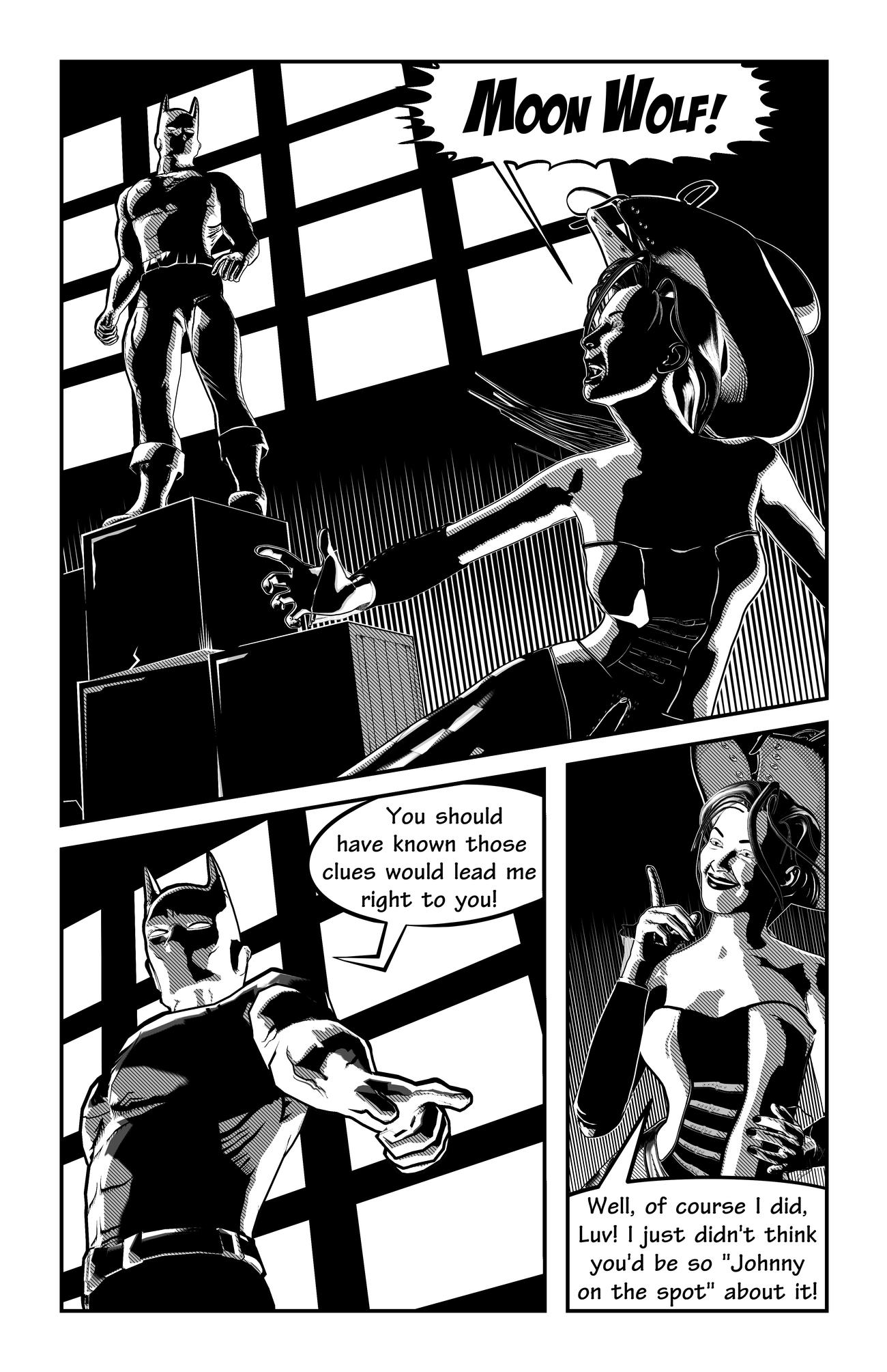
----------------
BTW: I have decided to reletter the comic with an all CAPS typeface that would be more in keeping with a comic from 1947 (when the story is set). Also, some extraneous lines on his side need to be removed from panel 2 on the last page (problem with the underlying texture map). And I might clean up the white bands on her corset in panel 1 of this page.
I think the "180 rule" was a problem for me, in part for the style change.
I think that impacted the effect too. Each panel or tier is done with a different style. I think the buildings are probably the culprit (high detail, sketchy graphic and then low detail). Like, it's obvious there's a different modeling engine at work for the buildings or at least 3 different techniques being used. That's probably what really made the panels lose their connection and maybe not just the camera jumping around and going from far above to side view to extreme close, upward angles.
If you look, it's like a standard isometric view (above and angled) then suddenly a very vanilla side view and then a super dynamic upward angle.
That should work so maybe it's a combination of things...a visual inconsistency- if you knwo what I mean.
I would almost swear the text was changing sizes too- that would be something if that was an optical illusion. lol
-----------------------
The other two pages look great! Real consistent and solidly done. My eye does a weird zig zag on the 'opening the door' page.
I read the text first- the huge balloon and then glanced down and saw the doorway- then raced back up to the right, high panel (he's looking at the body)
and then down to the "Imported silk" panel and then further down and noticed the body laying in the rays of light.
--------------
I think some of the imagery is incredible.
As I say that, you're onto something. That room looks HUGE from the massive black space around that doorway. You captured something special there.
Well, overall, this is just my own opinion. Obviously, it's your title to do with as you please.
And it does look like you're set up for a lot of great options on what to do and where to go.
It's definitely a style thing. It's the exact same file and the exact same general render settings for the entire page. It all comes down to just needing to scrap the top and start over. I think I'm going to simplify the layout and only go with two panels. I can move the dialogue around to other pages to make it work. And the text should be the same size (don't have the program open, so I can't confirm that 100%), but I think it's just the inconsistent padding inside the word balloons. I'll deal with that, too. I'm very interested on your take on the updated page when I get it done.
Thanks for the comments on the other pages. Those were actually the first two comics pages I ever made using Poser and Manga Studio. I stepped away from this comic to work on other things, but now I want to finish this story. Working with space and openness is definitely a goal for this story. It's all about shadows and light.
Thanks for confirming that the page didn't work. Back to the drawing board.
Sure. You seem very advanced and skillful. It's just that you haven't chosen an exact style yet.
I think once you make some choices, you'll be turning out something special.
Interesting choice of words. I don't think one "chooses" an exact style for your work. I think you discover your style as you work (this is different from chooses the style for a project, which I do think you do). As for the page in question (with the motorcycle), I was experimenting to see how far I could push things. Obviously, I pushed in the wrong direction. If it was just a matter of slamming out a comic story, I could do that because I can quite easily replicate the same baseline style throughout a comic. But then I wouldn't have tried something like the vast blackness with just a white doorway. Nor would I have tried the gradient at the bottom of the panels when he confronts the lovely lady thief.
Anyway, thanks for your comments. And I do hope you'll comment on the updated page when I get it finished.
I don't think one "chooses" an exact style for your work.
I think this is all relative. Well, let me say firstly, if you're the forum member I think you are, then you've shared a good amount of art and I meant style-wise for your current project, not overall.
There's always choices. After you experiment, are you not going to choose a ...choice?
I mean, converting renders to any kind of drawing is a choice. A style choice.
You looking for what looks best (or fits).
Part of that search is your experimentation.
That leads to a good question or two.
Are you making semi-random stuff or experimenting and choosing from what you made for your style?
Or do you have an idea in mind (as in a pre-existing style) and looking/searching/testing/experimenting for a way to get there?
It could also be that an artist is searching for a way to create the style of another artist/trend/look and their technique(s) or how-close-they-come will end up being their style.
Or maybe a pitstop along the way. You know, you're looking for one thing and stumble across another.
---------------
Style is such a good question and thought. What constitutes an artists' style?
The range of what they've created and released as finished or stuff that's sitting underwraps, on a hard drive, in a folder, under a tarp?
What sticks and becomes what they are known for?
What does it take to establish a style?
---------
A number of works?
Years doing it?
Impact?
I tell my students that style is the accumulation of all the choices you make while you're playing
I think that's an excellent answer.
I think this topic could spawn some long and interesting discussions. Reading what you wrote, I think you meant something slightly different than how I interpreted it, and thanks for clarifying it. I did think you meant overall style and not project style (which is what I meant about it developing). Of course, you're right, we all do choose the style that is appropriate for a certain project. I certainly wouldn't choose a loose pencil sketch for a hard SF comic (and let's not digress into how an artist could make that work: of course it could work and the tension of the unexpected treatment could be wonderful; that's not the point). If I were doing an SF comic, I would probably choose to do something more crisp and clean and reserve a loose pencil-sketch for something more romantic or set in the middle ages. Something where the art style would enhance the visual language of the story. Or, to put it in the extreme, doing Conan the Barbarian in the Richie Rich/Casper style would probably not be a good stylistic choice for an ongoing, serious Conan comic.
Now, to answer some of your questions: sometimes I do just make semi-random stuff and see what happens. I try odd settings or head down some path to see where it leads. In the case of that first panel of the page that didn't work, I started down my normal path and kind of got seduced by the brickwork and the electric lines: they were doing interesting things and I started playing around more and more with exposure and the threshold settings to see what would happen. I went too far astray from where the rest of the book was.
In other cases, whereas I don't seek to imitate or copy professional artists, I do seek inspiration from specific artists. This series is inspired by the bold black inks of both Alex Toth, particularly in his work from Creepy and Eerie, more than his work on Zorro or Bravo for Adventure. Oddly enough, as I was laying out some new thumbnails for this story (previously I only had a loose plot), I wound up channeling someone else who uses a lot of heavy blacks: Frank Miller. I ran into some plot problems about how to introduce some more bad guys into the story and wound up seeking inspiration from some of Frank's old cinematic tricks back in his Daredevil days. It will probably be a bit of time before I can get to those pages, but the inspiration was definitely there.
Talk more soon.
I've been asked to create some marketing materials that showcase some of the line art styles I use on a frequent basis. So... do you guys think this is a fair representation of my work?
And, I guess, if you saw this, would you want to know more about how I created them using Poser and Clip Studio Paint?
@mmitchell_houston those are typical for you but its all very much the same in terms of representing what you do. I think it would be more interesting to see as well some of your works with technical stuff (space/vehicles) or that dragon cave, to see that the style works on different topics
Thanks! Those are great observations. This particular illustration was designed to focus on figure work and showcase different finishes that can be applied to the same base render process. But I'll make sure the dragon cave gets featured elsewhere in the marketing materials (I'm flattered you remember it). I actually can't use the space art because I created that in Daz Studio and Photoshop, and the marketing material promotes Poser and Clip Studio Paint. However, you have inspired me to sit down and create another space (or mech warrior) illustration using Poser and CSP. Great tips!
BTW: The promoter went with the four panel version (cut off the color pic).