Daz 3D is part of 
Connect
DAZ Productions, Inc.
7533 S Center View Ct #4664
West Jordan, UT 84084
Licensing Agreement | Terms of Service | Privacy Policy | EULA
© 2026 Daz Productions Inc. All Rights Reserved.
Comments
I am sorry that my participation in the discussions is a bit slow these days, I don't find the time that I wish to spend on the great work I see everywhere.
I am really impressed by the progress, both in your initial pictures every month and then in the refinement steps you do. This setup is well thought out. With the mirror, the big windows and the big space there is a lot of latitude to play with light now, as somebody already mentioned. I remember that your hardware is a very limiting factor. So if it should not work out, I still can imagine the missing light because of the nice arrangement :)
One thing I would play with - just to see how it turns out - is turning the dancer 180 degrees so that she is facing the windows (light). So if there was light, it would light her front. Not that a backside couldn't look nice, but if you wanted to emphasize her buttocks, you would probably have chosen a bigger size ;) (joking)
@Shinji Ikari 9th @dtrscbrutal
Thank you much, I really appreciate the comments. And yeah the character is a morph. Also yes the armor was going into the floor and clipping into the bodysuit.
So version 2 & 3 here included your suggestions, I almost got the hair to hang sideways but it was still slightly off, I changed the hair because even with her head upright, the original hairstyle was intersecting her chest. I adjusted her pose in version 2 so the armor issue isn't showing. Also brought in the right wall and it definitely gives a tighter feel, but it seems like some depth/distance is lost which I kind of wanted to have to give a long travelled feel to it-I'm curious to hear opinion on that...if it's better with the wider or narrower wall. Version 3-Not fully rendered (with red hair) is like ver,2 but slightly different angle and i chose to try hiding the armor because it was causing problems. I can't decide which one is better, any input is appreciated.
I kind of like the shorter hair, it feels like it would be more practical for what she's doing in this.
Camera angle in both are good, and could let you maybe add someone trying to fallow her, even trying to take a shot at her if you have a way to do tracers if you went that way.
The downside of the camera angle is that you can see that the lights on the floor and roof are meeting the edge of the surface in the middle of a lighting panel. checking the offsets on those surfaces should let you adjust that as long as the walls are seperate from them.
@testingtesterson35 I think version 3 is very good. Consider a slight camera rotation to the right/counterclockwise to bring the figure fully in frame. I suggest if you do carry the figure off frame, do it vertically and not horizontal.
Placing the character on the light the way you have is brilliant IMHO. The way the light hits her from above and below really anchors her in the space.
Shinji raises some valid points. I like the original more "messy" hair if you can make it work with the pose change (personal taste). That is about all I can offer.
I'd already done these revisions before I saw the suggestion about moving her over into the frame, which I'll try on the next version i'm working on now (my schedule gets pretty crazy in a couple days so i'm trying to get as much done now as possible while i'm free). I can't adjust where the lights meet, through the offset, without affecting the entire area and there was no alternative that really looked better that I could pull off...Thanks for the suggestions again though, I'll be trying the other ones next. I really wanted to see her with some metallic surface which highlights the light more, and pulls the attention on her (that's why I chose a hairstyle that reflects the light)... and the torso armor was a no-go, so i'm testing her with cybernetic arms to see how it reflects. Also, as Shinji suggested I'll add something/someone chasing her in the next revison.
@ariochsnowpaw You may already know this, and I'm not sure if this is necessarily the best idea for this situation, so please chime in if someone disagrees (I'm still new to these concepts so I don't want to misinform anyone). But along with what the others mentioned (like removing everything that isn't visible from the scene, and rendering separate layers), to reduce memory consumption you could try reducing the texture size of any texture maps that aren't going to be lit strongly. If you can't see the details of something, often times the original size 4096x4096 of the texture image is unnecessarily large. You can make a copy of the image of each surface from the textures folder and take them in a photo editor and reduce the size by factor of 2 then put them in the same folder with a different name, and select the new file from the surface tab for each texture. If you are going to light the walls/bed/floor etc than you may need to keep them at higher res.
Sorry I haven't gotten to feedback for others yet but I often only have a little bit of time on the weekend to play. Such amazing pictures.
@sueya, this is sooo good right out of the gate. Obviously godrays coming in through the windows would be awesome but (as I'm learning with my hardware) they are incredibly time intensive if your machine can't employ multiple cores or Nvidia cards. I would suggest that the overhead lights could be 'turned on' using emissive or point light and that would give some depth in the reflections. You should also adjust her hair so it's falling back like she's in motion. If the stone wall with the windows has a normal map I'd suggest turning up the intensity of the normals to give it more texture. I really love this image.
@testingtesterson35, I can't imagine how you thought of making that duct. Stellar use of simple materials and killer creativity. I liked the cramped feel of the first one better but posing the figure in those narrow confines was a bit of an issue. The hair is a bit glossy especially at the top so maybe tweaking the cutout opacity on it to higher than 1 could help. Not much else I can add....plenty of things you could try but it's really a great concept.
@dtrscbrutal, you rank right up there in the incredible creativity pantheon. The bikini strap seems a little painted on and it would be nice if it had some volume to it but if it doesn't have a normal map that you can tweak you might not have anything you can do about that. Can't really find anything else to nitpick. Quite the visual and lighting tour de force. Great work.
@Shinji Ikari 9th, very cool set and nice work with all the emissive monitors. I do think that some rim lighting behind the monitors to pick up the edges would give a little more depth to the whole scene. Emissive lights are very problematic for lighting a subject unless you put them very close or turn tham way up so his face isn't really picking up as much light from the monitors as we would see if we were standing in the screen. One trick I've learned is to make an emissive light, put it literally inches from the subjects face and then drop a black image into the cutout opacity so that it is not visible in the scene but still casts light on the face. You can set the temperature and luminance to make it match the color and intensity you'd expect from the monitors.
I've spent the past week playing with ways to improve the render times on my image but it turns out that the volumetric ends up being the render assassin. The point light in the volumetrics for the candle flame was incredibly processor intensive. With some changes I got my rendering time down to where I could get a 68% completion in 13 hours. On the hardware side I discovered that even though I have an 8 core MacPro it would seem my iRay will only use 1 core. The settings options don't let me set for any others. Because Mac and Nvidia are having an ongoing spat I don't have any option for an Nvidia so I see a rebuild of my PC gaming machine in my future. In any case I was able to get another pass at it. I moved the bed back so she wasn't quite as buried in that dark left corner. I had to kill the candle and I agree with @Fisherman_B...I was hoping the orange light would be a color contrast for the green nightshirt but it just wasn't playing out well. I changed the temperature of the sunlight through the window to a warmer color instead and turned the light source to mesh to give me softer shadows.
Lonely Dawn v.2
Hi everyone :-)
Thanks for the links... I am still reading Szark's article (wow!), as I mentioned before, not very much into the techniques (more like intuitively trying it all- but that's me now) and there is a bunch of info to look at... thanks again...
This is the first time I'm playing with lighting within DAZ... it is FUN...
All the critiques and comments are very much welcome!
Here they are my tests... (light variations on the same theme)
1)Elated
2)Mildness
I started the composition last night and it took me around 5 hours to render them all (not to mention all the tries in the making). I'd played with the dome (intensity and lighting resolution and the shadows within the environment (mostly because I clicked on IDG vibrant light probes to try it - curious!- and then I'd noticed there is no way to revert the effect or is it? and so... :-P) I also added a distant light, a PointLight, a linearPointLight-->to create the warmth effect inside the hand and a SpotLight (to practice with them all ;-P)
I had reduced the size of each one of them (btw).
Hope they both express that particular state of being (the name of each image) when you look at each.
No postwork has done (except for the adding of my artist sign on each of them) and converting them to jpg :-)
Note: I don't quite understand the rules on this particular issue: by entries/submissions what does it mean no more than two images? cant the above images be counted as just one (as there are only variations on the theme, are they my only two permitted images or am I able to post corrected versions of them and then picked just one for the final post for the challenge?) more exactly, what are 2 entries about? (I'd made another version of lighting called Sublime and I am not quite sure if it is ok for me to post it)
Again, many thanks in advance...
P.S. (note added) As this is the first version, I did not pay too much attention to the quality of the render (my apologies)... this is why I prefer to do some postwork (besides the practice of patience, which somehow I prefer to reserve to other things in life)... to take away the noise, etc and reduce the effort my mac has to put into a raw high-quality one
Your images are so inspiring!
@ariochsnowpaw, I like your concept very much :-)... wondering: have you tried to render each element (environment-character+bed- rest of props) separately (with the same lighting scheme) and then layered them all? Maybe that way your rendered time will get shorter (?) - New at DAZ, so perhaps this suggestion does not make any sense. I am also curious about the picture in the wall... wondering if the image could depict something quite contrasting (something that helps us understand and feel the loneliness of the character even more?). Hope this helps.
@testingtesterson35, I like how you are using the character within the environment to create that feeling of anxiety... for me, her head position in your first version made me feel really really cloistered... hope this helps...
@sueya, agreed with everyone else, your composition has a great start and a lot of potential!
@dtrscbrutal, I can feel a lot of 'heated energy' within your 'activation' so far... like it a bunch! (It is perfect to me... wondering though if the light/shadow contrast in the left hand/arm was intended to be that hard?) Hope this helps...
@sisyphus1977xx, welcome to the challenge!!! Wondering if by morning and moonlight setups, besides your interesting poses, your character could tell a story with their wearables also (?). Hope this helps...
@shinji ikari 9th, what an intriguing composition... agreed with everyone else :-)
@no nose, a hand can express so many things (as the extension of our hearts)... so cool that you had chosen it! Wondering if perhaps rotating the vista a little bit could show the delicacy of your pose more accurately and give you more surface to explore the shadow game (?), hope this helps...
Off I go... have a wonderful weekend, everyone...
According to this month's topic Lighting, I tried to let light (and the absence thereof) do as much of the expression work as possible. To achieve this, I recreated all materials of the assets I used, to maximize their interaction with the light. This is the result, a portrait - my entry for this month (or perhaps the first of two, I have gazillions of ideas)
Lady Moonlight
Edit:
Not an Entry
Bravo @Fisherman_B. I have a new found respect for those Godrays lately...LOL. It is an excellent composition and the detail work involved in reworking all of those textures certainly has paid off. Stark contrast and sharp shadows give a sense of cold winter moonlight. I almost need to put on a jacket looking at it. My only idea for something to make it pop a little more would be to try a light bump map on the gown and sleeves to give it some fabric feel to it or something like silk for specularity (I have no idea how I'd go about the latter though). As always, breathtaking and haunting.
Quandary
Created in DAZ Studio and rendered with iRay.
@testingtesterson35 Love the metal reflections. I could go either way with the bodysuit/cyborg arms they are both good choices IMHO. Could you use the inside of a scaled cube and a single texture for the crawlspace and get the same effect?
Great tip on the resizing of textures.
@ariochsnowpaw Thank you so much! I was never entirely happy with her top, I even took a deformer to it, which I have had good results with in the past, but it was a no-go here. I will come back at it with a fresh eye in a day or two.
I like the changes you have made on your image, much improved lighting on the figure. I think it not only enhances the figure's pose but adds to the moody atmosphere as well.
Rendering on 1 core, ouch. I admire your tenacity on making this image work.
@Angelik_M Very beautiful images, great magical mood in both, I like what you are doing with the light. Wonderful pose. It looks to me that the darker garment (veil?) is intersecting/clipping with the figure's raised leg in a few places. The humming bird is great, but I wonder if it might fade into the dark background too much.
Thank you very much for the input on my entry, and yes lots of energy there. I think you make a valid point about the arm/hand shadow in my image. I will likely do more work on it soon.
I am assuming that two separate images means two entries, I know you can keep making revisions to your image(s). Perhaps @Kismet2012 will be along soon to answer.
@Fisherman_B Another great image! Almost monochromatic, excellent choice for "Lady Moonlight". Love the lighting. (Vray?)
You might consider a slight change to the thumb pose of her upper hand to take the shadow off her breast.
Are you using any DOF in this image, or is it just the volumetric lighting that is softening the background? It is a great effect.
@amyw12 Very nice image! I really like how you are not showing us the monster, letting our imagination fill in the blanks, very Alfred Hitchcock/ cinematic, cool stuff. The wounded and vulnerable pose and props are enhanced by the way you lit the scene.
Is the item on the ground between the characters significant? If yes, I suggest you play that up more, I can't see what it is. One minor thing, you might zoom in and take a look at the fingers of her hand, they might be sunk into the floor a little too much.
I like how the camera angle really plays up the drama, well done!
NOT AN ENTRY
Surprising how a few changes can speed up rendering.
Original render using the bulbs in the ceiling light set to Emissive.
2019-02-03 21:47:29.240 Total Rendering Time: 2 days 3 hours 31 minutes 52.2 seconds
0% converged.
Click on image for full size.
Last render. All the surfaces have had their reflective settings lowered. I shut off the Emissive surfaces (I had made the Ceiling an Emissive which dropped the render time to 1 hr 35 mins and then added a Point Light which increased it to 1 hr 45 mins) leaving just the Point Light
2019-02-06 18:02:16.299 Total Rendering Time: 1 hours 8 minutes 48.31 seconds
Click on image for full size.
Wow! That is pretty incredible. Great info as always @Fishtales. Thanks!
@dtrscbrutal
Thank you. As a side note I just pulled the render back into Studio and it seems I have left the Ceiling as an Emissive set at 0.01 cd/cm^2 to get some ambient light in the background. I thought I had done but wasn't sure when I posted the images. I always change the Luminance Units from cd/m^2 to cd/cm^2 on all lights in all my renders too. Tone Mapping also plays a big part in all my renders. That one was set to 60/6.0/200 (speed/f/stop/iso)
well after a bit of trouble following a video tutorial, I came up with this idea.
She is very nicely posed. Are you using 3Delight or Iray?
I like the addition of the wall in your daylight version. It helps to ground her and really brings the focus to your model. Warming the light also cut down on some of the harshness tha was present in the first version and matches the colour of the wall. She is posed quite well and I love the attitude she is exuding.
I am not sure you need a wall in the night version. That model's pose is different and did not give me the impression she was leaning against anything. I do like the changes in the lighting you made with this version. You have brought out some details in her face.
A subtle difference but his head is standing out from the monitor better than before.
Interesting concept and definitely a tight squeeze.
I took your image into GIMP. I love the perspective of the view going down the long tunnel but as you can see your model is off the Rule of Thirds line. She is squeezed way over towards the edge of the image. Considering this is a tight squeeze image that may be what you are going for but you might want to consider moving her over slightly.
I would also suggest searching images of people crawling through caves or obstacle courses. I think her shoulder and elbow are way to far in front of her.
This is a very interesting image. I cannot wait to see what you do next.
Making adjustments is so tricky. I agree the perspective in your first version of the long "hallway" (for lack of a better term) is better. I like the red hair in the 3rd version. It is a reall shot of colour in an otherwise monochromatic scene and really draws the eyes to your model. Her pose is much better too and I am glad you lost the armour. I'm not sure it is necessary and is a bit of a distraction (to me anyway).
If you went back to the camera angle of the first image, with the adjustments to your model in the 3rd version and maybe moved her to our right slightly you might get the effect you want.
Looking forward to the next set of changes.
Getting rid of the candle enhances the feel of loneliness in this image. The candle represented a small amount of hope and now that hope is gone.
A really lovely image.
They are both quite dynamic images and really demonstrate the difference lighting can make.
Elated has a lightness to it (no pun intended) with the highlights on the fabric and overall brightness.
Mildness really allows the figure and that lovely pale blue ribbon to standout out from the background.
Did you render these images using Iray or 3Delight?
A lovely monochromatic image. My only critique is the fronds in the upper right corner. They keep drawing my eye away from your lovely lady. I think it is the touch of the colour green in a predominantly blue image.
Great job on the posing and composition.
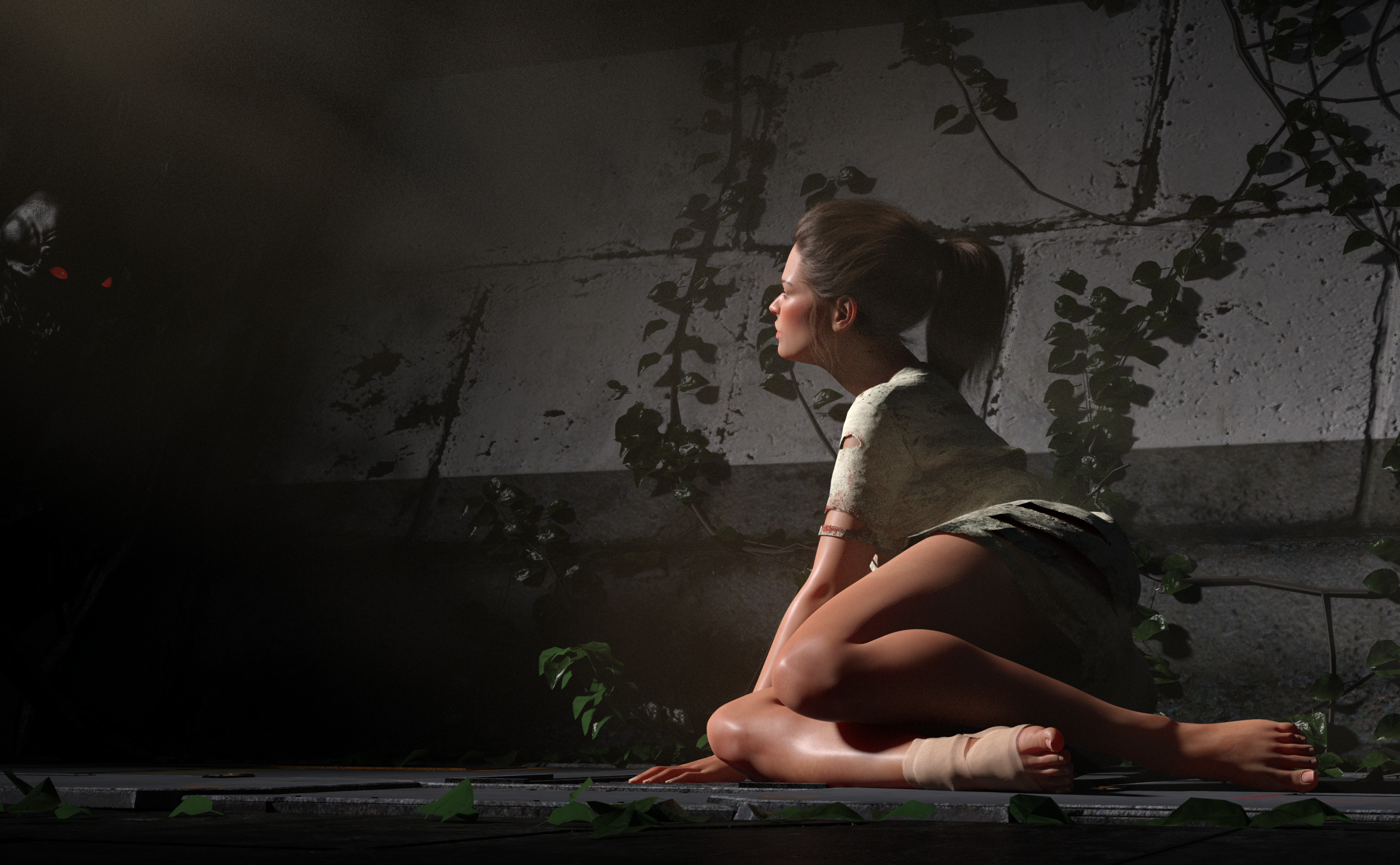
A really compelling scene. I almost missed the monster(?) with the red eyes. I agree with dtrscbrutal that her fingers/hand may be intersecting with the ground. It is such a fine line to get that contact and make it look real without going too far and have it in the ground.
I like the interesting shadows you managed to create in this image. You might want to consider moving your model to one of the Rule of Thirds points. I took your image into GIMP to give you an idea of where they fall.
Here's my new one with the revisions taking all the suggestions into consideration. @Kismet2012-I didn't see your second comment about the wall width until now so I'll have to try in another revision. Her pose is adjusted and I checked some references of people crawling through tight spaces as you suggested. I moved her fully into the frame, placed her on the left-thirds line and added an alien-monster on the right-thirds line as the chaser. The hair gloss reflectivity I dialed down. It was a toss-up between metal or mesh suit, so I went with a hybrid of the two using the geometry editor. Thanks for these ideas everyone, they help balance the composition much better.
@dtrscbrutal A scaled cube is pretty close to it. This one has added geometry along the corners/edges where you can see it pops out to create a sense of separation and to give some added dimension... And then adding a few objects, which are duplicated for the obstacles along the floor. A texture with some emissive spots which gets tiled and you pretty much have it.
@Angelik M - The pose is very playful and it's a great scene. The pink sky is beautiful and bring a nice depth to the picture but overpowers the skin tones a little. The darker sky makes it hard to see the Hummingbird. You could try backlighting the Hummingbird to pick out it's wing edges in the second one to help it pop. And I think Kismet is right...she has some fabric through her leg. I look forward to seeing where you go with it.
@amyw12 - Great lighting on lunch...errr...soon to be lunch...ummm...the girl. Fingers are a little into the floor. I almost missed the monster as well. A little more glow to the eyes or really soft backlighting ( I know, I always say backlighting).
@testingtesterson35 - I wasn't sure about the monster because I had this whole spy infiltrating the enemy stronghold story going in my head but it works. Much more dynamic. Great work on the hybrid for the arms...now I want to buy both outfits just so I can have the one you made.
@no nose - Save that lighting setup....you'll be able to turn the Daz Horse into a zebra without buying an add on pack. I really think that's a fun trick with the lighting and I might need to play with that sometime. I would suggest adding some ambient light so her face is a little less starkly banded...the hint of her features in the dark bands would make it feel less interrupted.