Daz 3D is part of 
Connect
DAZ Productions, Inc.
7533 S Center View Ct #4664
West Jordan, UT 84084
Licensing Agreement | Terms of Service | Privacy Policy | EULA
© 2026 Daz Productions Inc. All Rights Reserved.
Comments
Very nice work with the glowing light and the light points it scatters on the one girl.
As already mentioned I would think this can be imprved with the lightsphere moved into the lower right third lines crossing (either tweek the camera or turn the girl with the sphere a bit) I belive that will be enough, everythign else is close enough to the points.
While the light scattered from the sphere looks very good on the girl holding it, it looks a bit off on the second one.
To make the forest part a bit more integrated to the scene I would suggest adding some plant stuff in the intermediate distance which gives you what I call a DOF stabilizer, something that gives the eye relation to the distances that are displayed.
Very nice start there and interesting inspiration:D
You are working here with a huge piece of empty space on the left side. That can be done, if it is done by choice . On top of that she is looking outside the image, which increases the imbalace further. If you go back to your inspiration that imbalace (he's on the right side as well and looking away but not to one side) is filled with that pistol wich is quite intentional because that is what is on his mind. the place you put the pistol is crowded and in the dark which leaves the empty space just that, empty
Now I understand you don't want an exact copy of the original so there are some other options eg. turn her around looking to the other side of the room (probably needs some light changes as well. or place her on the other side of the room eg sitting on that bench thing at the foot of the bed looking the way she does now, would need some light adjustments as well.
Unclutter and light the place with the pistol more. These are my suggestions, I'm looking forward to what you do with that :D
For the size relation I would suggest scaling the ship in front up even more and at the same time moring it further out so that there is only part of the third large thruster to be seen. Maybe try DOF as well, though I guess its a bit hard to decide the focus poin then. As for the lasers I would think using bloom would help (though I think use ony bloom or DOF) one option would be to add bloom in post Some stars in that nivers might be good as well :D
Haha this is a bit odd but why not :D
Ok your characters are getting a bit lost in that uge setting and they are not really haven any interaction with each other. You probably want to convey the size of those invaders. Now I wonder, is there any good reason the two humans are sitting so far apart? I would suggest moving them closer together maybe even have them looking together on a mobile screen? That way you can zoom in way towards your humans. If you place the invaders about behind the humans ( eg both on one side of the house) you can still convey that size difference very much.
Now that moving cross walls I suggest to add some effect (likely some glowing stuff) to make it look more interesting and out of the ordinary.
you can try as well to put the interesting stuff (e.g. the screen the heads of the humans, the place where moving through walls take place onto the third lline crossing spots)
Prompted by @Linwelly I have altered the camera angle so we can see the face of the woman facing the camera more clearly. I have also removed the wall lights by moving the camera down.
I made a few changes which I hope were the right changes. Thank you for your imput.
I posted the first picture and then realized that I had one girl out of portioned so this is my fix of that one.
Nice suggestions @Linwelly. I think you nailed the problem..with the panoramic view it's too much like watching a high school play. I had another camera looking over the black knights shoulder but his back didn't prove very interesting, LOL. I've bunched the action closer together and pulled the camera in tighter. The Queen's guard was looking more like he was cowering than had just been struck down so I adjusted his pose and put some expression into it.
The scene is lit by 3 emissive spheres, a backlight on the character, and a spotlight on the background to add color gradient on the background. HDRI environmental lighting is turned off. The character stands in the middle of a giant white hemisphere. The scattering of lights from the surface of this hemisphere makes the shadows softer on the character. This method gives you a lot of control over the lighting, which add a HDRI-like quality to the render. It does, however, increase the render time by 2-4 times.
I morphed the character and created the hair shader but do not own the other props & material in the scene.
Hi everyone.
I'd started playing with Daz back in November. Noticed this 'forum-challenge' when trying to understand it better... thanks for the links and tutorials!
beautiful artworks btw :-)
This is something I'd started this week while learning about Cassie... any comments are very much welcome. (Does it elicit any thought/emotion/reaction?)
Name: 'Pals'
Postwork in CSP and Photoshop
Hi, everyone!
(guess my first post didn't make it LOL). So... have been playing with DAZ since November. Found this 'forum-challenge' when trying to learn more about it... thanks for the links (very useful)... beautiful artwork btw ☺️
This is my first public post... started this week while learning about Cassie... any comments are very much welcome (Does it elicit any thought/emotion/reaction?)
Name: 'Pals' (postwork in CSP and Photoshop)
Thanks in advance... (Note-edit: apparently the flower emoticon is reproduced by the system as '?????'/question marks LOL, so I had changed it for a wink)
@Linwelly I appreciate the input very much, will have a new version up in a day or two.
@sueya I like being able to see the characters face more but would like to see the items on the table as well. Do you need the empty space at the bottom of your scene?
@vpaintersue You evened that lighting out very well! Your layering of the background is very good too, and the characters being closer really adds to them sharing this experience IMHO. That is a very nice render!
@ariochsnowpaw I think you are going in the right direction. I still want to see some light glinting off that blade.
@frank1998220 Welcome to the new user challenge.
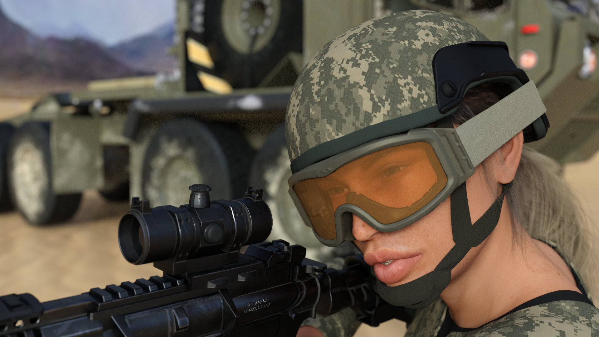
You have a very nice portrait going there. Nice morph. Some pretty advanced stuff going on with the lighting, it looks great, but to my eye the back light might be a little intense. (personal taste) I think her screen left eye needs a bit of an adjustment, it looks to be maxed out to the side, the screen right eye is fine. I think there might be a bit of poke through with the hair on her the screen right shoulder and perhaps the hair folds/bends are too high at the shoulders. I think that hair is going to be challenging with that kind of thing. I have often found the hair line a problem but your character's is great and the garment fit is excellent. Great start!
@Angelik_M Welcome to the new user challenge also.
I like the image you've created! It definitely elicits a emotional reaction for me, very sweet. The background seems dark compared to the lighting on the girl, and the light does not carry through to the background, which looks odd to me. I am not sure what you are using for a background, so this might be a challenge, but I think your image would look better if it was all lit from the same source. I think the girls pose is a bit aloof and stiff, I would like to see her reacting to her pal more. The tigers pose and expression is excellent! The tiger really looks like it cares about her. Great start!
So many great entries since my last visit!
It was funny to reat thrue the commends and see that all of my intentions are said by other people here.
@sueya ...Mhh don't want to be mean, but I don't like the new camera angle. The whole scene looks unbalanced now. Have you tried to move the woman, who is sitting with here back to us, more to the right, to bring her in the RoT. I would also zoom out to have more space around the women.
@vpaintersue I love this image. The blured background and this comic stile looks great. No mather what the other say to the picture, I find it great...especially the light effect and reflection from the magic ball.
@ Now the scene is much more focused. :) The light is a little weak. It looks more like a spotlight who only lights the people and the rim between the dark ground and the gras of the background looks a little harsh.
@frank1998220 For me it looks good, I like how the hard backlight shine thru her hair.
@Angelik_M I totally agree with dtrscbrutal :)
@dtrscbrutal Great scene and I think ariochsnowpaw idea to crop the left side of the room will help to bring the pistol more in focus.
Now to myself. The scene went not well.
I have spend a lot of time, to tweak the scene, but finally I decided to skip the whole battle scene because I was not good enough to make it look good.
After I have managed to imply a star field background (do anyone knows, where it have done? I would like to credit him) I'm not sure, if it looks better with or without the simulated sunlight.
Thanks @dtrscbrutal for the welcome and comments, and daybird too :-)
This was my first post My end result composition was created mainly through contrast... focusing on her serene and kind smile and the fierce tenderness of her feline soul mate. :-)
Yep, perhaps the background is too dark over here (as I know the landscape, I was not paying attention to the real picture, thanks for letting me know). The main light source came from her heart... as it was warmth by the love of the tiger.
And this is my second post:
This time, as per your suggestions I've been playing with a composition mainly through color and soft lighting contrast (besides the obvious positioning of the main characters) intending to convey the cheerful shared spirit between these two souls. (Does it elicits some emotional response? Is anyone curious about their relationship?)
Both images have postwork within CSP and Photoshop.
Any comment will be very much welcome... thanks in advance. (Happy Sunday!)
P.S (added) I am into an intuitive phase, so, technical/theoretical conditions are not quite processed by my brain nowadays LOL... I would like to comment on your artwork... so I have been reading your posts now (not only looking at your beautiful images).., will post some ideas later... (amazing community! <3)
I have moved the girl in front to the right and the table to the left so you can see the glasses and the pitcher.
This may be my last version as I don't think I have time to do much more this week.
Thank you for your insight. I appreciate all the comments and the help.
This is my Koi project. I spent three weeks fussing with Koi in a pond, tweaking fins and posing tails. I must have sifted through 20 or 30 different HDRI's trying light the little fellas. After a week of test renders the best I ended up with looked like a handfull of half melted mutant gumballs in a puddle! *cries. So I went with something just as Zen, but not as melty lol!
Novbre
New version. I basically collapsed the entire canvas, then re-lit the interior and raised the camera. Hopefully it is a more efficient and better composed image.
@daybird That is a very good background. Sometimes less is more.
@Angelik_M I really like the new pose and expression! It is clear they care a lot about each other.
@Novbre Great character! What figure? I like the pose, expression, and background, they complement each other well.
Thanks dtrscbrutal! It's the wise sensei for G3M with a couple of tweaks. The skin texture and displacement for this character are amazing.
As daybird mentioned, nearly every noticeable critique has been mentioned by someone already it seems...
@dtrscbrutal I recall the movie "Heat" from the 90's and your render definately captures the mood of that scene. Excellent work. The lighting especially-how it casts across her skin and accentuates the gun which really stands out now. Even with a vertical crop it has a very cinematic feel to it, maybe because of how the scene extends to the distant outdoor horizon. Her pose and the scene all flow together nicely. The perspective feels just right imo, and tonally everything seems to balance out well with strong enough contrast to make her and the weapon stand out. Also, nice attention to detail with the liquid in the glass shifted according to the angle she's holding it and the bottle being one glass shy of full.
@Novbre LOL @ "handfull of melted mutant gumballs in a puddle"! Glad you found something that worked well though, as this does. You're great with the poses. I guess you may need a moment of meditative zen yourself after dealing with the frustration of melted mutant gumballs :).
@daybird I think your ship and scene are looking great at this point. I definately prefer the one with simulated sunlight, it makes the ship look larger, bolder and more realistic as a whole. When I compare the two side-by-side, the one with sunlight makes the other look like a prop whereas the sunlit one looks like an actual live flying spacecraft. Also the contrast in light/shadow it creates makes the scene more dynamic looking and draws a connection between the spacecraft and the rest of the scene.
This will most likely be the final version of this one. Changes done are morphing Ruby some to try and make her look younger (Team leader she may be, but she's also about two years younger then the rest of her year in the show the characters my crew are based on are from.), and changing the shader settings on the rest of the team's hair.
Final edition of my poor damsel about to be in a whole lot of distress, cuz we're about out of month. I got some glint on the blade for you @dtrscbrutal. Tried a few things but finally decided that postwork was gonna give me the best result.
Thanks to everyone for the awesome suggestions. This type of a pulled back panorama has always been my bane because of having trouble finding a balance of composition and still not leaving it feel empty. Great learning experience for me.
Got hit with this last minute idea even though I would not be able to do much more with it before the end of the month.
Sorry, not as active this month.
Got tied-up with a lot of other projects for work. (Spherical camera for VR rendering is AWESOME! If you have a VR unit, try it! Try it now!)
I made some of the changes I was hoping to make a while back, nowhere near all of them. Also, it seems to be hard for me to get the detail of cloth to not look cartoony in renders that aren't close-ups.
@Novbre Thanks for the info. Agree with you on the skin texture and displacement.
@testingtesterson35 I really appreciate your comments, very validating. I knew starting out with that image it was going to be a challenge. Like several others in this this months challenge, it got more complex than I thought it would.
@Shinji Ikari 9th Very cinematic image, you captured the action well. Good job. How did you do the cybernetic arm on the character screen left? It looks great!
Your second image has some good action and some lighting I really like. Perhaps expand on that in a new image for next months challenge?
@ariochsnowpaw Love the glinting blade! Getting the balance right in a dynamic scene like yours is difficult. I think you achieved that. Well done!
I also wanted to express my thanks again for your encouraging post earlier in the thread.
@tycide Definitely improved, the details really pop on the close up!
I have had some good results bringing up the details like that by upping the bump mapping and also lighting angle changes. Solid image.
I got the arm from Genesis 2 Female Bot Armor and did some retexturing to get the look that I have.
This challenge is now closed,
I hope you had fun with this, see you next challenge