Daz 3D is part of 
Connect
DAZ Productions, Inc.
7533 S Center View Ct #4664
West Jordan, UT 84084
Licensing Agreement | Terms of Service | Privacy Policy | EULA
© 2026 Daz Productions Inc. All Rights Reserved.
Comments
@tycide
That's a great idea to add a 3rd Borg and find a way to balance all 3 figures on thirds-lines. I can maybe zoom the camera back more and play with the perspective until all 3 are lined up accordingly but I also would have to maybe change the other elements so they merge at the focal point the way I had them before, if i wanted to keep that combined effect (cloud lines, terrain slopes, water ripples, and river bend). This 3rd render I did combined those elements tonally using a different style of atmospheric haze so they blend together. I also changed the pose, terrain texture, and added the diplacement.
The 4th render here is when I started experimenting with changing the camera angle and If I understood you correctly, moving the camera in that direction you can see in this 4th render how drastically the terrain angles upwards so the Borg can't really shift much in that direction unless I totally alter the terrain again.
In the 4th I beefed up the Borg to make her a more threatening presence. I also changed the texture again so the foreground and background terrains look more similar like you mentioned about your own image earlier. I'll have to keep messing with the angles to see if it will work, but maybe there's a way.
Thanks for the advice and it's interesting information-the stuff you share from your military background. From what I gathered you also use 3D modeling/graphic design in your current job now which is really cool.
Fisherman, I like the one you called final render, without the post edit.
daybird, the first pic you posted should be on the products page, makes me wanna try it out myself. ;)
Shinji. I like the way Yang looks, like "damn my gun doesnt work", and the 4th character behind the corner, like the spy who was waiting for the others to arrive.
For the leading character with the big gun: maybe adjust the right knee pose. Is that a standing pose or just in the movement?
Don't get me wrong, no offense meant, but what is that blonde girl doing?
If thats in motion next she'll move the left leg in front, foot will slip down that rock, she stumbles over her feet and maybe kills the ally in front.
If thats standing still, the recoil will do the job of pushing her down.
testingtesterson, nice choice of hair and that right hand pose on the last one.
Maybe I should do one myself...
Thanks for your feedback p-schmidt (das klingt ziemlich Deutsch :)
You should definitely do one - the more people participate, the more we learn. Looking forward to your entry :)
Rendered this last night, but didn't get around to posting it until now. I'll have to see about what I can do about Weiss's footing, I normaly don't have my characters try to move amungst rubble piles like I am in this one. Maybe I'll use a contaner of some sort stuck in the rubble to give her a bit of support, I don't know.
Hello fellow Dazers,
This is my submission Titled: Ronso Forest. All the content of this image and it's rendering was done with Daz3d.
I've had Daz3d for a while but had very little time to learn it, so I consider myself a noobie. My submission is a modified Midnight lycan SKU:34229 with the planet edesa SKU:53563 background and the TerraDome 3 Iray SKU:33443 desert sky material.
I attempted to use the camera's depth of field option from a tutorial http://flipmode3d.com/depth-of-field-daz-studio/ ; so that the figure would be the focus. But I feel I made the background to blurry in an attempt to draw your eyes to the character. I was thinking those alien plants just beyond the grass should be a bit clearer and the trees in back should be as they are, what do you think? My other problem is I'm not quite understanding the depth of field slide bars and making the plants more visible while leaving the trees blurry has confounded me. After you select the figure (while using camera set for the DOF) do you have to keep that figure selected while tweeking the DOF? I used the body as the focuse should I have used the head instead? It's rough on my video card when tweeking DOF with the Iray viewer, the recalculating down time between tweeks is annoying and slows down the process, any advice on making this a smoother transition or is there a faster way to get a "Quick view" of DOF without rendering each tweek?
I know the rule of thirds would apply better here by trimming some of the image from the left side but I made it long like that on purpose because i wanted it for my pc wallpaper :p Having said that, how much should I trim off to make it a better balance? should the character be lined up better with one of the major points on the right side and add a bit more background to his right or would it be better to leave him just as he is now? Would it have been better to move the camera in more to focus on his face/body?
Now for the Lighting, I kept the sky a desert brown thinking a blue sky would be to stark a contrast between the orange trees and grass. I feel the characters brown colors are enough to attract attention without it being to dominating a presence in the image, if anything I think he blends in nicely with the other colors (It has nice autum/fall color scheme-though it was not intentional-hurry for happy endings). Lighting has always been my bane when doing images, I really don't understand it at all, just recently I leanred in the enviormental section, in redering tab, that you could turn the light dome to chang where the source is coming from. Usually my pictures come out to dark and I could really use guidance and practice tutorial links for light tutorials.
Well Thanks for this contest, I can't wait to get input from people on how to better compose my image project! Any and all critque welcome.
Your Brethern in Daz,
Jacob
P.S. For you Final Fantasy X fans, yes I tryed to make my own Ronso Character. Long Live Kimahri Ronso!
I like the start that you have going here, and don't worry if you don't get your DoF right the first time, I still have problems with it at times when I try and make use of it.
A trick that I saw somewhere (think it might have been a coment someone made last year during one of the challenges, or it might have been the tutorial you mentioned but I can't be sure.), is to make a duplicate of the camera that you're going to be rendering from. Now take this second camera, parent it to the first camera then turn it(the second camera) so that it is eather pointing streight down, or to the left or right of the parent camera. Now keeping the second camera at the angle that you've set it to while looking though it, position it so that you can see what you're wanting to have in focus. Finaly while still looking though the second camera, select the first from the scene tab, locate DoF under the settings to activate if you havn't yet and make your adjustments. If you positioned the camera your looking though right you should be able to see where things are affected. Hope this helps.
@cheetahka_cee5351f0f , @Shinji Ikari 9th
The DOF technique you're talking about is demonstrated here along with strength of settings to use:
I also attached a pic.
You just watch the main DOF camera from another camera or perspective view and see the actual depth of field from the outside as you make adjustments to it. It physically shows you 2 planes that move as you adjust the size of the field on the main camera settings....everything in-between the 2 planes will be clear and everything outside of those 2 planes will be blurry so there is no guesswork there and doesn't requre pre-rendering. To visualize the strength of blur i think you do have to turn on iray preview mode though.
@daybird
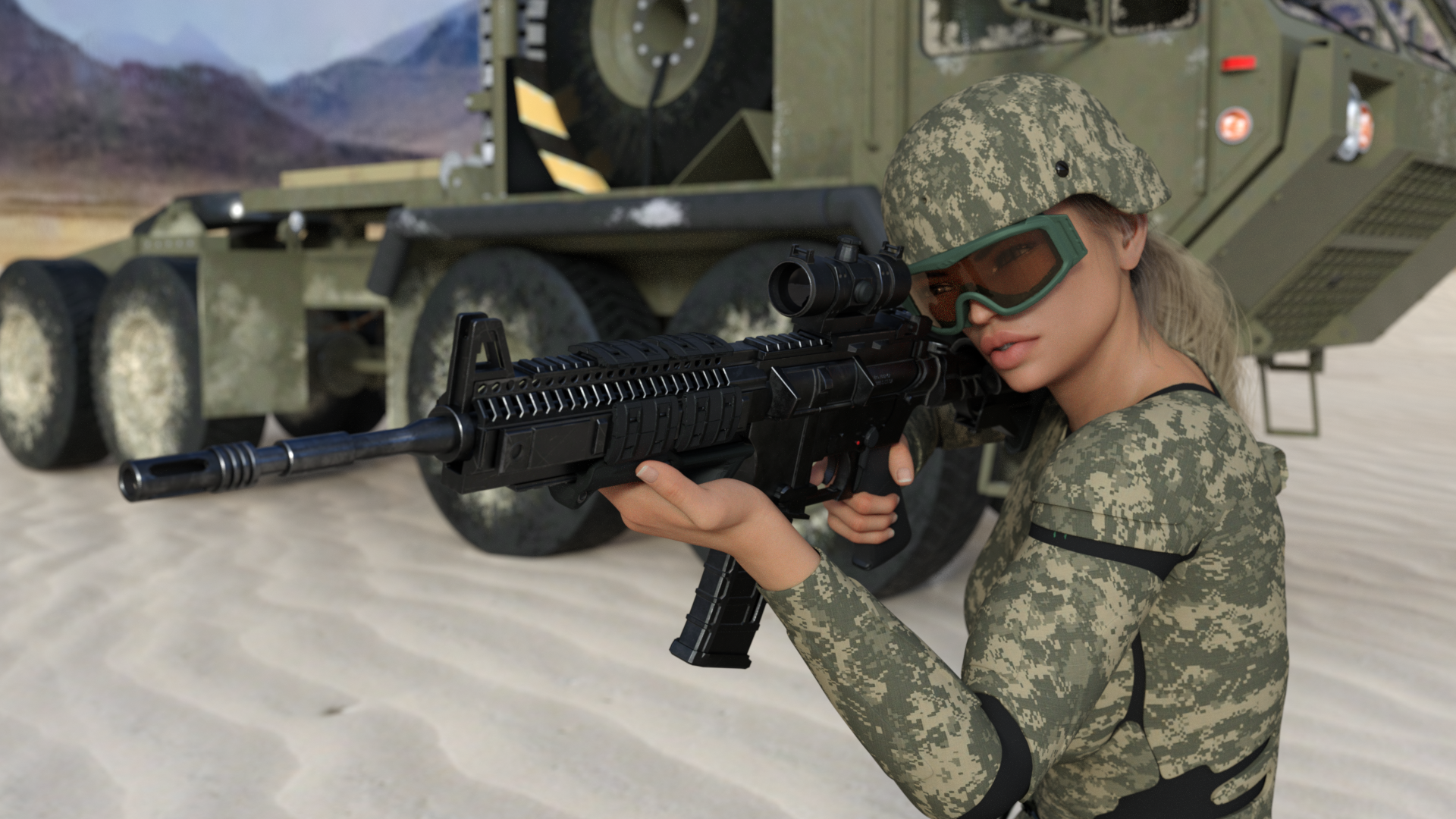
The helmets are weird, they don't fully cover the ears, mostly just the brain-pan part of the skull, they are swooped out to allow for headsets to be worn underneath. The ones many swat teams use are cut away in this area, and it's super strange to me.
I know what you mean with poses, because once I start, I'll be there the rest of the night tweaking endlessly.
-----
@Fisherman_B
You are probably right about the scale, that is the thing that drives me crazy more than anything else about the artistic aspects of 3D Art, everything is built to looks rather than specs (mostly). I'm coming into this from the Industrial Design / Reverse Engineering side of 3D Modeling, and I just expect everything to be the right size, to within like 0.1mm accuracy, a reasonable tolerance. (yeah, not really that reasonable for art) :p
The reflections are probably a byproduct of my laziness, I need to stop using distant lights for everything and start using emissive planes. Plus tweaking the materials isn't that hard, I just always forget to do it.
-----
@dtrscbrutal
This version of the helmet is just a processed scan capture... The texture is oriented vertically due to the UV island orientation, and the UV map is garbled all over the place. I'm still learning many of the nuances of getting CAD models converted to Quads, then UV mapped. I've been working on a surfaces version rebuilt from the point cloud that is a much cleaner mesh. UVs are still interesting in places though.
The carbine is probably too large, I'll check the measurements on it and scale it to be correct. The model is Kacia for G8F.
Thanks!
-----
@Novbre
I will look into the dirt shaders, that sounds far too useful not to have.
I suck at post-work, so I avoid it like crazy, but I probably need to get better at it if I hope to get my renders to the AAA level.
I wouldn't have even noticed the makeup/eyebrows thing. I didn't run into many females while deployed, I was just used to seeing them in garrison.
I scanned in some ESS goggles today to try and put on her to hide the eyebrows until I can figure out how to unperfect them. I think I got an eyebrow utility during all the xmas sales... I'm still sorting through all that stuff.
@testingtesterson35
Thanks for giving it a shot, I was a little worried what the terrain outside the image looked like when suggesting this, and it looks like it didn't want to play along. I'd say keep the composition elements, they look good. I was just curious what the alternative would give (and I was hoping it would keep all the lines).
Oh, I'll talk for ages about army stuff, any chance I get. Whenever someone wants to distract me for a few hours, they'll just bring something military up and I'm trapped. I can't stop talking.
At work I use SolidWorks and Geomagic Design. I handle all the advanced surfacing projects, any high-precision reverse engineering (using a FARO Laser scanner), and do a lot of the concept designs for buildings, interior rennovations, and video sets. I also get most of the "arts and crafts" projects, like this giveaway..."can"? (instagram link)
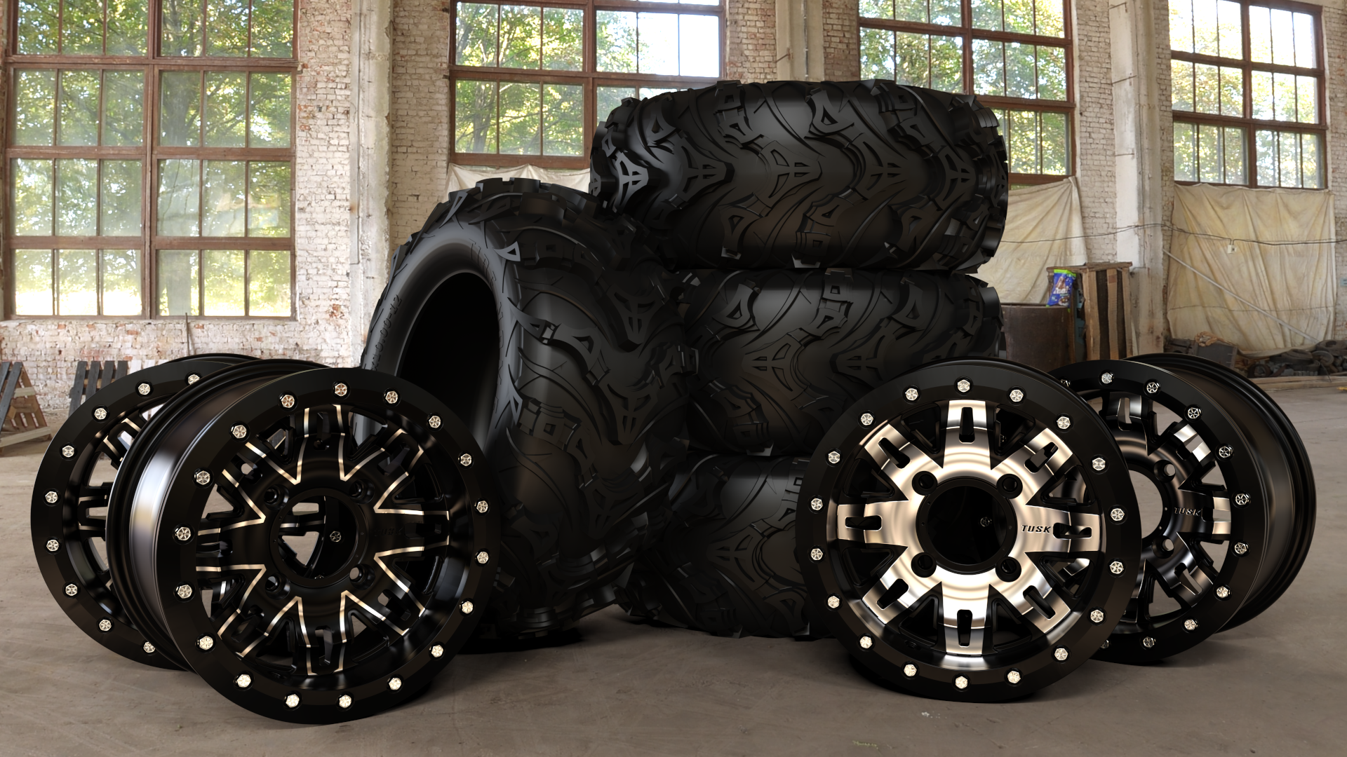
My primary duty there is Industrial Design, creating aftermarket parts for motorcycles, UTVs, and ATVs. Lately it's been wheels and tires:
(Rendered in DS) :) (not an entry, just an example)
Recently I did get to make a short animation that we used for our new kevlar tires, they wanted it super simple and had me reduce the textures a bunch. It's a cutaway that shows the inside. Its in the middle of this instagram video.
(7 hours of render for a 4 second clip... yay!) :p
Anyway, sorry... I'll talk or type forever about army or work stuff. I should probably go work on fixing my renders and models. (Instead of just talking about it.)
Version F just out of the Iray engine. Added in some boards within the rubble to try and brace Blake's leg, and Weiss's feet.
I got them by doing some geometry editing on a pallet prop that I had to leave myself with one of the boards from it, and then creating an instance of it once placed for the second one.
Yeah, usually I don't use that name but didn't paid attention when registering here, was just here for the store and yeah, stuck with Daz for 1.5 years now. (dachte ich mir bei dir aber auch als du Düsseldorf sagtest)
Alright alright, maybe I will do that and come up with some entry. ;)
You can change your username on your account page if you prefer another handle
Here
Version G up with some changes to Ruby's hair.
So... not much progress on making corrections yet, but I do have a blooper render to share. (Is there a fancy name for these? Like Blender, or blunder, or something someone more clever than me has come up with?)
I didn't check the refraction index setting on the goggle lens, or do a preview... so I got this:
Look Into My EYES...
Also, @daybird, you are right, now that I'm looking at it closer... her helmet isn't seated correctly.
@tycide Man that's good work right there. The videos were great and the kevlar tires are really cool. Did you design the tires in this image you posted??--that looks insane how chunky and deep the tread is on them and those are some massive looking tread-lanes like they could climb boulders but still has a sporty foward-fast handling look of the center pattern. I need a set of those for my car haha...I didn't realize people put rims that look that nice on atvs either. (no need to apologize your stuff is fascinating...and i write the occasional unintentional essay sometimes too).
Oh and i added a 3rd Borg on the right-thirds line, your suggestion was perfect for that compositionally and I like her emissive colors better but i'm pretty sure the borg can see the girl. I'll have to decide how to work that out...maybe the story changes.
Wow this forum moves fast and I render slow...LOL
Thank for the help on the horizon in the background Daybird...I was so intent on the characters positioning I forgot to even look at the background.
The DOF was still giving me fits because I got it so off the first time I almost had to make a new camera to fix it. I'm still not sure what I broke but some repositioning and test renders got it back on track.
So...here's my second try...
To The Victor (rev. 2)
@testingtesterson35 Yeah, I designed those. They are mud tires, so they are intended primarily for soft/fluid terrain. The rims have been really popular, they are aluminum, low-cost, and high value. Plus they look decent.
My thought is mb swap the borg for another human? Like waving their arms trying to get the borgs attention to distract it from the hiding girl? I don't know if that would lessen the tension of what you were going for or not.
I do like the distant borg a lot... so I'm not sure that's the answer.
Thank you for the input and video on Depth of Field (DoF)!
I had to actually move the character way back (closer to the trees) before I could get better control for the range of the blurr I wanted between the character, plants and trees. I also changed his pose as the other felt to static and I also set the render image aspect ratio to golden rule landscape. This shortened my picture from the wall paper effect I initially wanted but not practical for this composition. I set the character along the the rule of thirds line. Do you think this is a good spot for him to hold interest to lead the eye? I also changed the direction of the sun in the render tab-->environment-->rotate option because when I moved him it had an undesirable shadow effect along his face and chest.
Any other changes/tweeks someone would care to suggest to make this a stronger image? I'd though about adding some baby ronso in there but I don't have any means to change the character model to a youth/toddler state. Thanks again for all your input!
@Shinji Ikari 9th:
What relative emphasis do you want to place on each of the characters? Because of the sepia toning, hue is not helping distinguish elements of the image, so saturation, lightness, texture, and silhouette havve to pick up the slack. To my eye, the outer pair pop from the background quite readily, whereas the inner two took more work to process. Particularly troubling bits for me were the middle-left character's pants and the middle-right character's upper half. To my eye, the pants are the focus. They're the brightest bit that's close to the center of the image, and only the tracers and the chrome arm top them overall, and those are off to the edges. Meanwhile, the middle-right character's upper half is doing a great job at pretending to be the brick wall behind her. My eye readily picks out her gun, but the rest of her upper body fades into a mush of dark.
Also, I know it's a limitation of working with what you have, but I'm not a fan of that stream of brass.When I first saw it I parsed it as a rope or cord connecting the gun in her right hand to something in her left.
Lastly, this might be the DoF trick you were thinking of ; )
@ariochsnowpaw:
I recommend finding something to blend the foreground and the background - right now there's a pretty sharp line in the lower right. You're previous version had a tree with grass around it nicely filling the gap and breaking the silhouette. Due to the position of the dark-haired fighter, I expect moving the tree would lead to too much visual clutter there. I recommend trying a grass or bush prop. Since it's in shadow, you probably don't need to match colour all that closely.
I like how you are developing the idea for your picture. However, perhaps it is not a very efficient workflow. In most cases I use a different approach. When I want to create a picture, I treat this plan like a project. I think of the scene and the story. I take a pen and draw a very rough sketch, so I know the props / actors and their place. This doesnt need great drawing skills, simple geometric objects do the job. It is more like a reminder where to put what and getting an idea about perspective, proportions, depth etc. It helps me alot to reduce iterations and trial & error later. At the same time I start to think about the color scheme and lighting that could fit the scene. When I start to create the scene digitally, I already know what should be where. The software is just my tool to finish and polish the idea. There are projects that may require a digital scene right in the beginning, to be able to move primitive objects with some lighting, to see where shadows will be etc. But this is an exception, at least for the sort of images I do. Now I eventually add items that can support the idea or help somehow. Sometimes I move things to other locations when I see that the added light changes things. This is the time for the first quick test renders. When I realize that I don't like how things turn out, or I don't manage to express what my initial idea was, I even abandon the project to come back to it another day when I have fresh eyes and a fresh mind or after I improved the skill that is missing right now to do what I would like to do.
I am not saying that this is the only or better way to do a render project. It is just that in my opinion this particular aspect, how to approach a project, is the most important one. So I am curious to learn and adapt parts of different approaches.
Damn, so many cool entries. After the holidays, we have so much work(especially with this huge load of snow in south germany -.- ), that I did not found time , to do much on my scene, but I see, others were much more diligent.
@testingtesterson
I have my problems with your scene. The idea is interesting, but it do not work for me.
First of all, the landscape seems not right for the situation. For me the river bank does not hide her frem the sight of the borgs. Have you controled that? Simply move your point of view to the eyes of the borgs and look at the position of the girl. Grass would help, but does not match in this landscape...maybe some rocks or garbash?
Second thing is this disturbing focal length (?) and how the water points to her( that looks oddly )...yeah, I know, I'm a little to old school in such things *hihi*
Her pose is not bad, but If I was in her situation, I would look fearsome to the position, where I could hear noises. When I read all that it sound harsher than I mean it, but i always have problems to find the right words.
@cheetahka_cee5351f0f
I like your colors and the character but I found the first pose of him better.
Don't know why, but it looks like he is out of balance and falls to his right side. The pose looks a little lost, because I see no reason why he is so in rage. Maybe it would help to let him focus the camera with his eyes.
Another thing is the grass, it'looks like heavy wind is blowing it to the right side, but I miss this movement in the trees and his hair. To be honest, I don't know by myself, how it's possible to create such an effect on static props like the trees.
@rcbcgreenpanzer Thanks for you're feadback. I think that the septa toning as you put it is from the image based lighting that I'm using in the scene that is a sunset based one from this, Version A had used a night time one from here but it was pointed out that Blake was too hard to see in the shadows with that one so I switched to the sunset that I'm using now. The links should take those who are curious to the product pages in question.
You are correct with the image that you attached on what I was trying to discribe earlier. The reason that I use the two cameras when I use DoF is so that if I exit out of the program (after saving of coarse.) and need to make adjustments to the DoF settings then I've already have a fixed view of where things are and don't have to mess with getting the perspective view in the right place and the right angle to make the changes.
@Fisherman_B You are correct. From an efficiency standpoint, knowing where you want to go from the start, with a sketch, palette, and plan is the quickest way I can think of to create a great render.
It also requires some skills that I am weak like at... like colors, and planning.
Usually I don't have a solid idea of what I'm trying to make.
My approach is very random, and to be honest, rarely leads to anything useful. (I have a whole lot of garbage in my render library) It's mostly 3D doodling. I just like to play around with things and see what they do/look like.
Occasionally, something will give me an idea. Then I have something to work towards. Usually I'll try and sketch things out at that point... but it almost always winds up looking totally different in the end.
Generally, I just try to build things as they would be in reality, and then find a camera angle that works. I will readily admit, it is a lot of wasted rendering (and probably time, but usually I have it render while I'm sleeping or at work).
When others are availble to give input, I find workshopping the image usually gives me the best results, everyone is going to notice something different. That's what is really great about this forum.
Poolside conversation
I have kept my image simple for now but may consider adding some glasses on the table.
I may also need to tone down the lighting.
Used 3Delight as usual
@sueya:
To me, your image is dominated by the blank, white wall. I would recommend moving or turning the camera down and a bit to the left. With enough effort put into the lighting and secondary detailing, one can draw the eye away from where it lands to somewhere further away. Right now, the light is bright against a light spot on the wall, which is in turn lighter than its surroundings; smooth against a matte, mottled background; and has a shadow that leads the eye from the center to it. Additionally, because you have one light shining from above, that light enclosure is different from the others, which gives it the initial impression of being important.
Recommendations:
- Put dim lights in each of the enclosures. This gives them a reason to be there as well as providing more background lighting.
- Move your camera down and to the left, probably to the point where the chairs don't get cut off. This should put the subjects into the center area, making them likely the first thing the eye focusses on.
- Move your main light down and away from the wall. Putting their shadows onto the wall should help drwa the eye back too them, as well as breaking up the vast expanse.
I would agree with rbc on the focus as well as the Recommendations . I would zoom in some to better show the people (the focus of your image).
Sueya, I love your idea about adding in other pieces. That will help bring the image together and add some details to it. Its a very nice start, I cant wait to see how it goes as you progress.
@cheetahka_cee5351f0f
I love your images! They are so a alive with colour! I love the richness of them!
~ Novbre