More Non-photorealisitic Renders (NPR II)

16791112100

Comments

  • philebusphilebus Posts: 241
    kenmo said:

    I modeled the spaceship in Hexagon3D and further detailed, textured in 3DCoast 4.8. I modeled the crane in MOI3D last year. Base render was done in 3DCoat with figure, buildings, atmosphere, birds, distant spaceships via Photoshop chicanery.

    I really love this one. From the great looking spacecraft to the blending of colour and atmosphere - first class stuff!

  • Wanderer said:

    @mmitchell_houston - I'm not sure I follow. This thread is for NPR work, and I'm still getting the basics of photo-realism down. Other than that, I commented on how wonderful I thought the images were in general, so I'm not sure why I'm not allowed to do that in here. Others have commented. Maybe I should have been more specific? I don't get what commercial use has to do with my comment. 

    Wanderer said:

    There's some amazing work being posted in this thread. Perhaps I can one day post some of my own, but I'm still getting the basics of making a decent PR image. 8p

    I thought all the products at Daz were okay for commercial use (as in, images created can be used commercially -- resale and video game usage has always been prohibited or require an extended license). Also, this really doesn't belong in this thread (although I don't mind the occassional diversion).


    I think this is a manifistation of "The Bug" at work. When I read the post, it was a question about whether models could be used for commercial work. But that's not even what got quoted. I say let's ignore it and move on.

  • WandererWanderer Posts: 956
    edited March 2018

    That's fine. I was, to say the least, confused.cheeky

    Post edited by Wanderer on
  • The effect I found earlier works quite well on architectural shots:


    And it isn't bad on portraits, either:

    The effect is nice, but really, really light looking. And in the larger renders, there is a lot of unflattering noise coming from the bump maps on the fabric. One of the things I've found in my NPR work (and bear in mind that I work in a very start b&w style) is that, almost always, "Bump maps are not your friends." In other words, they bring detail that doesn't contribute the a clean NPR image. One other thought on your style: Consider rendering with much stronger shadows. I think your sketch filters would pick up more details that way.

    Thanks for sharing – looking forward to seeing more.

  • tkdrobert said:
    tkdrobert said:

    Macross Battle

    Macross Battle

    I love this piece! That purple nebula takes it to another level, giving our eyes something to anchor on as we explore the scene. Great work on the blasts, too. What program are you using for this?

    I used Clip Paint Studio mostly with some help from PhotoShop.  The explosions are actually psd’s I found on a web site.  I’ll have to look it up again.  With a free account, I’m only allowed to download 2 psd’s a day.

    Edit: The site for PNG's is: https://pngtree.com/

    Thanks for the share. I'll take a look soon and see what they've got.

  • tkdrobert said:
    tkdrobert said:

    Kaiju Painted

    Kaiju (Painted)


    Very cool composition. I really like the monster and you're on the right track, but this is a place where a few edits might be in order before you start applying filters. First, and it's minor, I would suggest closing the door inside the  copter – unless this is part of a series where we are going to see another angle, that little glimpse of the monster through the copter windscreen is a distraction. Just fill that space with black. Secondly, I just don't like the effect of the water. I wish I could be more specific, but it just looks so stylized that it could pass for weird grass. Also, more blue would help sell it as water. Finally, if ever there was a time to play with motion blur, those blades are it. This looks too static as it is.

    Wow -- I seem to be a negative Nellie today, but I really do like the composition. It's got a great sense of energy and that monster is FANTASTIC.

    I didn't notice the door thing until you pointed it out.  I closed the door that is facing the viewer but didn't even look at the other one. 

    How would I blur the blades?  Use the lasso tool on them and then apply the motion blur?  I guess I could lasso the water too and enhance the color.  To be honest, I don't think I'm going to revisit this particilar render, because I was just experimenting with the new monster.  However, for future refernce, I'm intersted in your imput as always.

    Isn't it amazing (and frustrating) when that happens? I did a huge, complex render once and combined it with a background image... only to have someone point out that the light source in the background was the opposite of the shadows I'd built into my scene! Personally, I'd vote for moving on to the next monster-attack scene and just leave this one as is. Looking forward to seeing more soon.

  • tkdroberttkdrobert Posts: 3,532

    Call the Ball

    Call The Ball (Painted)

  • WandererWanderer Posts: 956

    @tkdrobert - As usual, your work reminds me of so many things from my childhood. It's like you found a treasure trove of a book and comic store that closed down many years ago, and you're just sitting there going through all the great stuff and deciding which inspires you the most. I love it. I cannot get enough.

  • WandererWanderer Posts: 956

    @kenmo - This is quite cool. The style, composition, etc. Could almost be cover art for an album/CD. (Yes, okay, I'm that old.) Your modeling is good.  "Chicanery" heh

    kenmo said:

    I modeled the spaceship in Hexagon3D and further detailed, textured in 3DCoast 4.8. I modeled the crane in MOI3D last year. Base render was done in 3DCoat with figure, buildings, atmosphere, birds, distant spaceships via Photoshop chicanery.


  • tkdroberttkdrobert Posts: 3,532
    Wanderer said:

    @tkdrobert - As usual, your work reminds me of so many things from my childhood. It's like you found a treasure trove of a book and comic store that closed down many years ago, and you're just sitting there going through all the great stuff and deciding which inspires you the most. I love it. I cannot get enough.

    I'm glad you like it.

  • WandererWanderer Posts: 956

    @murgatroyd - Exit, stage left even. (sorry, I couldn't help it) I think the thing you've come up with is interesting, but I would second at least some of what mmitchell_houston said. I'm not as sharp or as experienced with this stuff, but what he's saying sounds near what I was thinking already when I read his comments. I think the architectural use appeals more to me, from a distance, where the portrait use I like bigger and closer. I think it is a bit light, but depending on what you're after, that might not be bad. I wish it could somehow be more bold. If you could find a way to make it really pop, I would like it more. But, having said that, I go back to what I said before. I think it's really interesting. I don't know about the noise being a problem (again, I'm not as sharp as some).

    @mmitchell_houston - The Conan-inspired pieces are interesting also. Yeah, that hair... The black and white is an interesting choice. I look forward to seeing where it goes.

  • vrba79vrba79 Posts: 1,297
    edited March 2018

    Some of you might remember my "No Budget Toontorial" from a while back, well this is the same method, but with the shader's outline property disabled, and then combined with that spiffy Geometry Shell toon outline freebie. The end result is quite stunning, if I do say so myself, as it not only looks great on characters, but also scenery.

    Post edited by Chohole on
  • kenmokenmo Posts: 895
    edited March 2018
    vrba79 said:

    Some of you might remember my "No Budget Toontorial" from a while back, well this is the same method, but with the shader's outline property disabled, and then combined with that spiffy Geometry Shell toon outline freebie. The end result is quite stunning, if I do say so myself, as it not only looks great on characters, but also scenery.

    h:10

    Nice one...

    Post edited by Chohole on
  • kenmokenmo Posts: 895
    edited March 2018

    I modeled the airship in Moi3D and added 3D details to the ship using Hexagon3D 2.5. Further detailing and texturing done with 3DCoat 4.8. Image was rendered in 3DC with additional chicanery via Photoshop & Topaz Studio Impression....

    Post edited by Chohole on
  • kenmokenmo Posts: 895
    Wanderer said:

    @kenmo - This is quite cool. The style, composition, etc. Could almost be cover art for an album/CD. (Yes, okay, I'm that old.) Your modeling is good.  "Chicanery" heh

    kenmo said:

    I modeled the spaceship in Hexagon3D and further detailed, textured in 3DCoast 4.8. I modeled the crane in MOI3D last year. Base render was done in 3DCoat with figure, buildings, atmosphere, birds, distant spaceships via Photoshop chicanery.


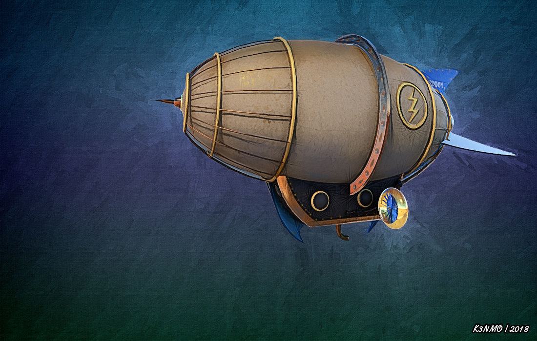
    Thanks kindly for your very kind words...

  • WandererWanderer Posts: 956
    kenmo said:
    vrba79 said:

    Some of you might remember my "No Budget Toontorial" from a while back, well this is the same method, but with the shader's outline property disabled, and then combined with that spiffy Geometry Shell toon outline freebie. The end result is quite stunning, if I do say so myself, as it not only looks great on characters, but also scenery.

    Nice one...

    I second this. 

  • WandererWanderer Posts: 956

    @kenmo - This last one is nice, too. 

  • dreamfarmerdreamfarmer Posts: 2,128

    My NPR fragments from above, assembled.A couple more pages assembled, too but I don't want to be spammy. This is three layers of Oso3d+Oso3d+Sketchy, layered with Soft Light and filtered by Topaz Clean, and then partially filtered one more time in Comic Life.

  • kenmokenmo Posts: 895

    My NPR fragments from above, assembled.A couple more pages assembled, too but I don't want to be spammy. This is three layers of Oso3d+Oso3d+Sketchy, layered with Soft Light and filtered by Topaz Clean, and then partially filtered one more time in Comic Life.

    Wow...awesome!!!!

  • kenmokenmo Posts: 895


    The airship is a 3D model I completely created from scratch using Moi3D with details added using Hexagon3D & 3DCoat 4.8.

    The castle building I modeled in Groboto3D 4.0 and textured in 3D Coat 4.8.

    The airship and castle were rendered serparately and then composited via Photoshop. Further processing done with ArtRage 5 & Topaz Studio Impression.

  • tkdroberttkdrobert Posts: 3,532

    EDF Andromeda

    EDF Andromeda

  • dreamfarmerdreamfarmer Posts: 2,128

    I love the original models, Kenmo! And that Andromeda looks like something from a rather HQ Saturday morning cartoon.

  • kenmokenmo Posts: 895
    tkdrobert said:

    EDF Andromeda

    EDF Andromeda


    Amazing piece of art...


  • tkdroberttkdrobert Posts: 3,532
    kenmo said:
    tkdrobert said:

    EDF Andromeda

    EDF Andromeda


    Amazing piece of art...


    Thanks @kenmo and @dreamfarmer.  This style takes a lot of work, but I don't mind because it looks good.

  • wsterdanwsterdan Posts: 2,339
    tkdrobert said:
    kenmo said:
    tkdrobert said:

    Thanks @kenmo and @dreamfarmer.  This style takes a lot of work, but I don't mind because it looks good.

    That it most certainly does! Gorgeous!

    — Walt Sterdan

  • tkdroberttkdrobert Posts: 3,532
    wsterdan said:
    tkdrobert said:
    kenmo said:
    tkdrobert said:

    Thanks @kenmo and @dreamfarmer.  This style takes a lot of work, but I don't mind because it looks good.

    That it most certainly does! Gorgeous!

    — Walt Sterdan

    I love the ship designs from Star Blazers / Space Battleship Yamato.  They are some of the best in scifi IMHO.

  • ArtiniArtini Posts: 8,528

    Looks great, tkdrobert.

    Would you mind, to describe a little, how did you do it?


  • tkdroberttkdrobert Posts: 3,532
    edited March 2018
    Artini said:

    Looks great, tkdrobert.

    Would you mind, to describe a little, how did you do it?


    OK, I'll try. 

    First, I render the ship in 3delight and saved it in PNG format (no background). 

    Next, I open the PNG up in FotoScetcher (free).  I use the Ink2 setting (you have to tweek the settings to get the look you want) to render a black and white inked copy of the original.     

    Then I open up the original DAZ render in Clip Paint Studio and make a copy.  I also open the inked version.  For the inked version, you can use a setting under the "Edit" menu to turn the white invisible.  I think it's called "Convert Brightness to Opacity." 

    Next, I copy the modified Inked version over to the original PNG as a layer.  The inked version is layered over the original PNG and I usually lower the opacity to my liking.

    Then, I create a new "vector" layer and I create the outlines/line work (explaining exactly how I do this would require a turorial by itself.  I'll try to update with the one I used to learn this.)  This is the most time consuming part, but if you make the effort, it will give you the best results.

    Next, I created the background combining a bunch of free backgrounds that I downloaded for free from Clip Paint Studio.  I can't remember what blending modes I used.

    Once all that is done, I save it to PSD format and open it up in PhotoShop.

    Now here is where it gets murky, because I don't always do the exact same thing for every render.

    At this point I usually merge the Line, Ink, and original PNG (copy) layers together (but not the background). 

    Then, I use the Topaz Simplicity 4 plugin and raise the "Structure" setting to about 1.5. This setting is under adjust. 

    Then, I use the Nix Collection (free) plugin to open Color Efex Pro and play with the "Tonal Contrast" settings.  (Technically you can get the same results playing with settings in PhotoShop)

    At this stage, I sometimes use the Poster Edges filter that comes with PhotoShop.  Depends on how it looks.

    Finally, I will tweak the Vibrance and Brightness/Contrast settings.


    I know it looks like a lot of steps, but it's the workflow I've come up with after over a year of experimenting and I like the results.  I use this workflow for anime/cartoon/comic book type renders.  My painting renders have a different workflow.

    Post edited by tkdrobert on
  • murgatroyd314murgatroyd314 Posts: 1,431

    The effect I found earlier works quite well on architectural shots:


    And it isn't bad on portraits, either:

    The effect is nice, but really, really light looking. And in the larger renders, there is a lot of unflattering noise coming from the bump maps on the fabric. One of the things I've found in my NPR work (and bear in mind that I work in a very start b&w style) is that, almost always, "Bump maps are not your friends." In other words, they bring detail that doesn't contribute the a clean NPR image. One other thought on your style: Consider rendering with much stronger shadows. I think your sketch filters would pick up more details that way.

    Thanks for sharing – looking forward to seeing more.

    I tried some strong shadows, and it turns out they're the exact opposite of what I want. The edges of the shadows show up as bold lines, while everything within the shadow is washed out. The key to making this work, which I'm still working on implementing, is to maximize contrast along actual edges and places where lines are wanted, and minimize it elsewhere. Textures with actual texture are a good thing, while large areas of undifferentiated color end up flat white with a bit of noise.

    Here's my latest:

    Playing around with curves at multiple points in the process helps, as does rendering at double size and downscaling at the end. Next step is to find a better backdrop - though it doesn't show up directly, it has a big effect on the outline.


    180329drawn2.png
    463 x 750 - 177K
  • ArtiniArtini Posts: 8,528

    Thanks a lot for the description, tkdrobert.

    Now I see, why it is so complicating.


This discussion has been closed.