Daz 3D is part of 
Connect
DAZ Productions, Inc.
7533 S Center View Ct #4664
West Jordan, UT 84084
Licensing Agreement | Terms of Service | Privacy Policy | EULA
© 2026 Daz Productions Inc. All Rights Reserved.
Comments
Meh... one more. This is page 11. Previous pages are a few posts back.
And the covers, sample page and poster.
The Legends Pacific brings together the heroes introduced in the Gold Venus series, Gold Venus, Trick Arrow, and Man O' Metal, and introduces Yin Yang, a kung fu master, Dr. Frost, who controls ice, the Shark, whose real name is Triton, the son of Neptune, and Dreamtime, who is the Austrailain aboriginal Goddess Wogal.
Two posters are needed, as Dreamtime has the ability to swap a mortal's body with their Dreaming avitar.
EDIT: And because I just love this poster...
TIP: Time Is Not On Your Side
Real artists ship - Steve Jobs
Minerva, Goddess of Wisdom, Art, and Rendering
Saturn, God of time and comic book making
Just as comics' word balloons force you to consider adding dead space to your renders, something that's a no-no in normal renders, so to do the panels themselves force you to look at the creation process in a new light.
The average comic book page has about 4 panels. The average comic book has about 22 pages. 4 * 22 = 88 panels that must be rendered just to do a single book. At a speed of 1 panel per day, that's nearly 3 months to finish a comic book (not counting the four covers, front, back, inside, and back inside).
A big difference between creating a comic book and doing a render is you are forced to balance the needs of the artistic process with the need to finish it. This is, of course, assuming you actually want to finish it.
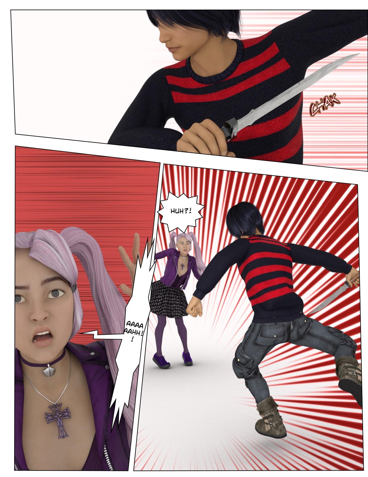
I got the renders done to reproduce three pages from a manga today. I'm hoping to lay them out tonight and see how they look.
OK. Here are three manga pages reworked with Daz3d art. I'll stick the originals at the bottom.
(Source: NORAGAMI #1)
Then, a few pages later...
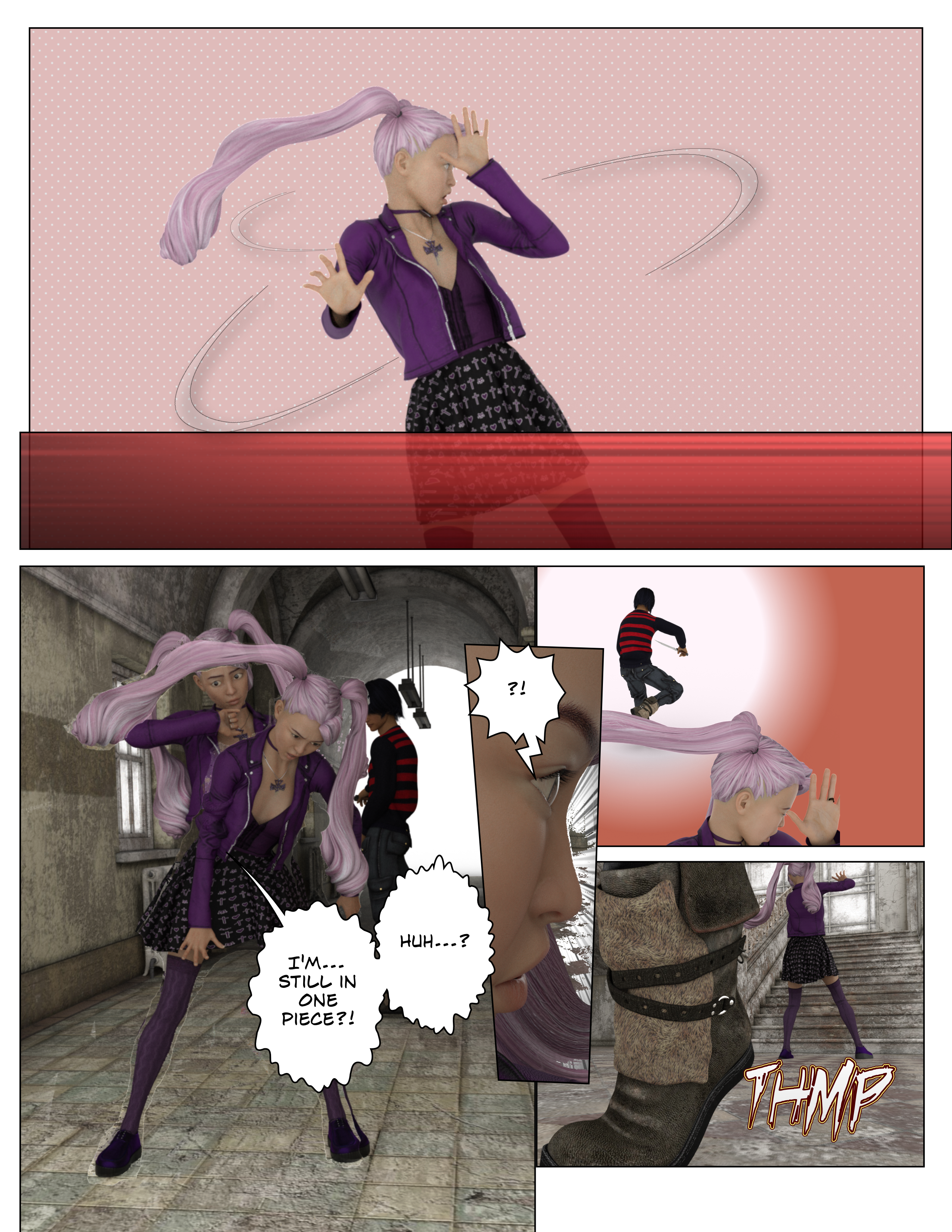
The poses themselves have some flaws and weaknesses because I didn't want to spend too much time fiddling with reproductions. I put the panels together in Comic Life and the only non-renders I used were bits included there. I decided NOT to use any filters, just so I could make myself look at the most barbie doll-3d-comics. Also, I think I used the default 8.5x11 layout in Comic Life while the manga page is somewhat narrower, and so I have panel widths that are a little wonky.
I found this super educational and I feel a little awe now for the Paneling Power of NORAGAMI's writer. I feel like those panels take my mediocre renders and make them kind of... work?
I may run through and apply some Comic Life built in filters just to see if that looks better, or weirder. Just because I don't love the photorealism mixed in with the patterns and lettering. (I don't love it but I could learn to accept it. I just have no idea if anybody else could....)
Great experiment and practice idea @dreamfarmer, and it works well. Interesting how much "free space" or uncluttered space there is in the manga layouts - never really considered that, but it sort of hits home in your renders.
Looks great, dreamfarmer. I like your use of Comic Life's halftones and other fills.
You mentioned you want to get rid of the photorealistic shading, I did a tutorial on that on page 1 of this thread. It uses the Visual Style Shaders product and the free Geometery Shell Outline shader. The results can be seen in my avatar. If you don't want to pay for the VSS product, vrba79 has been experimenting with the free shaders that come with DAZ. It takes a little more work to do it that way, but the results are nice. He has a tutorial on page 5 of this thread.
Whether you decide to go that route or the Comic Life filters route, I hope we get to see more of your work.
Nice experiment there dreamfarmer, its as well shows the struggle you had with getting close to the characters. In the last page you're closest to the original from the camera settings. This gave me as well an ideal of the importance on lines in the manga storytelling which is rather difficult to reproduce with DS even if you user some comic shader or other.
I agree with @Linwelly on the importance of the line work. You can quickly go down a rabbit hole on Japanese comic idiosyncrociesas compared to Western. (How each approaches motion for one). I happen to like the style and have tried some experiments, but the line work doesn't seem to get to where I want it. I've seen some nice results from Pwtoon, Linerender and sketchy, but for me, the rendering is the slowest part of the process, so if I have to tweak one of those and re-render, that's a lot more time than if I have a vector line that I can edit.
Yeah, in the process of thinking about this upcoming project I’ve done renders with VSS, with LR9k, with PWtoon and with DzToon. I’ve got Sketchy shaders, too, but since I think consistency of look is pretty important so I haven’t delved into those too much. Also have FilterForge and Topaz stuff... just upgraded to Clip Studio EX because of its line extractor... honestly the reason I got into Daz a couple years ago was ‘I wasted the last twenty years not practicing art, how can I make this illustrated project??’
Anyhow, @Oso3d has a new toon-making shader coming out soon designed to go with filters so I’ll probably be trying that next. It probably won’t be quite what I want (which seems to be a pet mangaka living in my closet— unfortunately the 10 year old would rather draw ‘alternate futures of Europe’) but I think it could be interesting. And as he points out the big benefit of using shaders rather than filters is that renders are a lot smarter about depth and shadow...
Looking mighty fine...
I have Clip Studio and have been debating trying their line extractor. Like everyhting else, fidlding with the settings to coax out what I want is the issue. The examples above were with a couple of filter forge items. Then remove the parts I don't like with a clipping mask. I also am considering taking the FF lines and changing them into vector in CSP so they can be modified/cleaned up with the line tool. That seems more efficient than any PS technique I've seen. My goal is a complete, finished, page a day. Does it get me closer to that, or farther is one factor, after does it "look good" to me. I'm sure I'll try the new toon shader, but I've found that the Daz rendering is the slowest part of my work flow. No gripe on Daz, it isn't made for this, and I've found it very useful for things like storyboards where you can set up mulitple shots in a scene then crank them all out once you have your set up as you like.
Yeah, for the above I found myself having all three characters in a scene with a couple of scene elements and then just turning off visibility for everything unnecessary. I didn’t add pants until lower bodies became visible and sometimes the body parts not in render were kind of all tangled up. Definitely not the sort of work I’d do for a scene-based fender or an animation!
It's interesting how jarring it is to see the empty space when everything is in color. So that got me thinking... maybe the empty space wouldn't feel so out of place if everything were black and white? So (I hope you don't mind) I took this page and quickly changed it to black and white to see what happened. What do you guys think?
I think the B&W looks good. But I also think switching to nonphotorealistic shaders will help. I think the jarring effect is generated, at least in part, by combining the photorealistic people with the cartoon background.
To follow up on this thought, I think the reverse, a cartoon person on a photorealistic background, works just fine.
Huh. I have never really liked realistic backgrounds with toon characters. Though I know lightly filtered photos make up the backgrounds of quite a few visual novels.
I think the black and white does work better. I'm not going to re-render those panels with a toon shader but I think I will spend a bit of time tonight applying the Comic Life BW line shaders to the samples just to see how those look. And once Oso3d's new shaders come out I'll use those for another set of sample reproductions-- just because it's so darn educational to actually really SEE what's happening with the paneling.
I've usually used DAZ to set the base for what I want to accomplish, knowing that it takes postwork to truly transform a 3D look to a 2D look. That said, there's tricks I've done to accomplish that faster (or without needing that much postwork). Here's a very brief overview of some of them:
Looking forward to it. ;)
Nice work. He looks like a manga version of Adam Ant.
@giselle3000 I like what you did there, and while there is a lot of postprocessing this shows the importance to adapt the charater to the manga style, when you want to go for manga.
Oh, wow! You're right and I didn't even know this guy! BTW, I packaged Aoshi as a character preset which you can get over here. Though he does require a lot of products to look exactly like this. Ironically, someone also mentioned Aoshi looked like Spike from Buffy the Vampire Slayer, so I did some renders to give him that look. It seems Aoshi might be very versatile.
@Linwelly, for sure. Unlike comics and graphic novels, manga characters usually have an exagerated anatomy. Men tend to have long torsos, long arms and fingers. Small noses, sharp chins and big eyes will also help sell the look.
Looks good. I don't currently have all of those products, but it gives me something to work toward so that I don't need to depend 100% on the Hiro 5 character I'm currently using.
Here's the backup story to Legends Pacific: Wild Boy, Lord of the Dinosaurs.
Wild Boy is a Dream Warrior who, when he sleeps, inhabits a dream world. A dream world is a dream that is shared by many people. Everyone Wild Boy meets is a dreamer taking part in the shared dream. The name of the shared dream is Wild World.
@magicjava, looks good. Though if you don't mind my advice, I'd suggest keeping the text clean and simple. Some of those fonts don't mix too well, but learning about typography is a long process. Nonetheless, an easy way to pair fonts would be to check recommendations. Just google: "font pairings" and you'll get great suggestions. Rule of thumb: If you have a complicated background use a simple font (clean, no textures). If you have a simple background, then you can get away with using a complicated font (with textures or decorative).
Here's some examples of type heavy book covers (meaning the emphasis is in the text, leaving the background simple):
Notice in this one that, despite there being an image, the background is still simple enough to render the decorative text readable.
Same with this one. There was a space left for the text, where the background is very simple, thereby making it readable and avoiding the "clutter" feeing.
Now let's take a look at the opposite, meaning a cover where you want the image to be the center of attention, not the text. Notice how they rarely use decorative text, opting for a simple typography that's readable.
I see what you’re say, but I originally had a simple font for those pictures and it looked so... bland. You can see the original font for the poster on page 3 of this thread.
But yeah, it’s too noisy. I’ll see what I can do.
Ok, here are the new covers based on feedback. Let me know what you think.
I think you should take the advice I gave earlier in this thread about designing titles.
The two problems are ..
1) THEY ARE STILL FONTS. Make a logo and/or title instead.
2) They (I don't even know how you did it, but..) Your titles look rendered, like they are made from the same stuff as the graphics. The easiest way to make the title sit above your graphics is to have them come from another medium. Any medium. The resolutions match, where you have little jagged edges in your renders AND little jaggies in your title. The title should be rendered separate (really not rendered, but hey.) AND HUGE, if you're not going to go with smooth vector graphics, then they should be made HUGE and scaled down.
------------
Aside from that, it's all designer's eye and general rules of logo and art and lettering.
Too many fonts- too many effects. You're trying too hard. Too much going on. Every name and reference doesn't need its own effect and flipped font.
Readers need to be able to clearly read the name of your comic from across the room. Fonts should be legible small and large. Of course some artists break the rules, but that doesn't mean they aren't breaking a rule when they push those boundaries.
-------------
Overall you seem like you're trying to be Stan Lee and create a whole Marvel Universe of characters before establishing...a...Marvel Universe....lol
If that's your goal, then I would start with an overall title that has the story design to showcase many teams so the book title isn't about any particular person or team. Maybe the city or planet or the name of a MONSTROUS set of loosely linked characters....like Justice League....
or The Do-Gooder Squad. [please don't use that].
----------------
From a creative perspective you need some branding ideas or to inject some motifs. Like a thing you always do so anyone would know it's one of your books.
For instance, Marvel uses adjectives. The Uncanny, The Amazing, The Spectacular, the invincible....etc....
DC doesn't always name their books after the main protagonist.
Indies like cool sounding nouns. A book will be called Paradox, and paradox ain't the name of anybody in the book. lol
Everything is part of your look. Why does wildboy have a disc behind his title? Is that disc shape on all your books?
Is it random?
Should that disc shape be a ripped piece of animal skin?
Should the W in Wild be made from Fangs or elephant tusks?
Even if you went with something as simple as a clawed-slash mark across the boy- anything would make it unique to your series and turn a Font into a logo.
So in other words, the WORDS themselves could be simple and use basic clean fonts and the stuff around the lettering could give you that extra oomph and capture the tone of your series.
@griffinavid - I particularly like the advice you give in the last group of ideas - re motifs. You give concrete examples (W as fangs, disk made of animal skin) that really bring the point home.
Yeah I always feel funny putting that much stuff out there.
I keep wanting to type stuff, but then I read it back and delete the post.lol