What layout and setup do you use for Daz?
 pkappetein
Posts: 506
pkappetein
Posts: 506
in The Commons
I am trying to find a nice setup, in order to use Daz.
Wnat kind of layout and tabs are the most common items used?
I am currently using this, but i am jumping all over the place to find the tabs etc.
Wondering if there is a better way of handing this..
Daz 3D is part of 
Connect
DAZ Productions, Inc.
7533 S Center View Ct #4664
West Jordan, UT 84084
Licensing Agreement | Terms of Service | Privacy Policy | EULA
© 2026 Daz Productions Inc. All Rights Reserved.
Comments
I used the same dark gray interface as you have there, but I removed the install tab and smart content tabs. I install thru the Install Manager and not Connect, so the install tab isn't necessary for me. I also find the Smart Content to be, well, not so smart. it's just easier for me to find what I'm looking for the old fashioned way. I also don't use the constantly rendering Aux window. I stress my gfx card enough just thru regular rendering ;). I've found that I do the least amount of jumping around with my tabs the way I have them set up. Also this way I can always have the Content tab, the scene tab and the parameters tabs all showing at the same time, which are my most-used windows.
Laurie
I'm nuts about customization, and have consolidated DAZ's redundant libraries and content folders even putting both the redundant "My libraries" under the same roof as I had D/S since the second version as you can see in my content tree!
I am a creature of habit, which is sad I know, but also everytime I change a layout it deletes my scripts which I hate. I use Hollywood Blvd with Highway Style.
I removed everything to do with Connect, including the SQL components; I don't want anything related to DRM on my system.
I have 3 2560x1440; the middle is where Studio usually is.
I've got a custom set up, though it started from City Lights.
I make regular use of tabs, and even keep some tabs up I only use occasionally (Scene info, for one) I keep the Aux Viewport tab in the same group as the Environment, DFormers, and Measure Metrics - I just keep that in the back so that it only draws when I need it to. (If it's not the active tab, it won't draw)
I've also modified the colors a bit, so that the highlight color is blue, rather than orange-yellow. And it's not super dark (working on too dark a screen for too long actually gives me a headache. Same with websites that are too dark.)
I tried using the folders, but i get lost in there.. at least with the smart content i see the main groups etc. so its easier for me.
tried the folder structur before, and got complety lost.. coudn't find anything
I just make all my own categories so I only have to find things once lol.
All of my tabs are on top I can't seem to function with them on the sides. My work space is a constant work in progress though as I learn more and do more my workflow changes and I have to re organize everything. One thing that remains consistant is I use a much paler grey for my viewport.
..I use the Darkside theme and dual displays On the right display, I have the main viewport with just the render settings and scene tab pane. to the left of the viewport. On the right display I have the Content Library, Parameters, Surfaces, and Camera panes. I don't use Smart Content either as I have a lot of older content without metadata that was installed before the DIM, as well as non Daz and freebie content along with a custom library/runtime setup.
Never thought about that. Need to see how I can do that
I use Darkside and City Limits, and I've rearranged the tabs to suit me and got rid of the small second viewport and the Script IDE and Shader Mixer tabs (the latter because they interfere with correct positioning of the widgets and camera dialog when the viewport size change, which was making me crazy until Slosh clued me into that).
There is no Shaping tab shown because I hate the Shaping tab and do not use it unless I have to pull it up to test with it. The Posing tab is only there because it's the only way to access the Bake To Transforms functionality (which I need for pose + prop sets). Side-by-side tree view for content is something I started using quite recently.
They're not shown here but I use a LOT of sub-directories, not just for building and testing but to keep separate folders for all the sites where I've bought (and also one for freebies).
Me too, I just can't figure out how people can be comfortable with everything sideways like that, and many of the layout defaults are just so counter-intuitive to me. It isn't all that efficient of on-screen real estate, either — I'm old-fashioned, so I've recreated as close as I can (given the limitations of the D|S4 layout system) what we used to have way back in D|S2. Side tab group widths minimised, Viewport space maximised, I never use DIM, Connect, Smart Content, the Posing or Shaping tabs, and many other bells, whistles and gongs. And I only very rarely have problems finding anything.
Rather than pulling off panes to a second monitor, I actually stretch it out over two monitors when minimized but dragged out over two screens. With display fusion, you can also use the span window. I finder it easier than tearing off panes and placing them ad hoc on the 2nd screen.
What does my head in is the tabs on the side, so I use the "Orient tabs on the top" option. It is under Window/Workspace if you still need to locate it. I'm using pretty much the same customized folder view, and a similar layout to what I had in DS2.
...I don't really have any issues with placing undocked panes on the left display as the programme remembers my layout. Even the 4.9 Beta preserves it (I am running both 4.8 and the Beta).
So what is "display fusion"?
I have Bake to Transforms in the Parameters pane option menu, but maybe I put it theer (Window>Workspace>Customise, the command is under Parameters in the left-hand column - drag it into a menu or toolbar in one of the tabs of the right-hand column. By default shift B will also launch the command.
I removed Smart Content, and there's nothing Connect related I don't think. The library tab still isn't optimal, but I can find my content quickly.
Darkside and city limits...but with things rearranged for efficient product development
Rawn
I used the same dark gray interface as you have there, but I removed the install tab and smart content tabs. I install thru the Install Manager and not Connect, so the install tab isn't necessary for me. I also find the Smart Content to be, well, not so smart. it's just easier for me to find what I'm looking for the old fashioned way. I also don't use the constantly rendering Aux window. I stress my gfx card enough just thru regular rendering ;).
Display Fusion is software that puts a taskbar and menus across multiple monitors, among other things ;)
Laurie
Hmm, looks like I'm the only one in this thread that uses custom colors; I was hoping to get some ideas for new colors for my UI from other users...
I do like your setup colours....nice and easy on the eyes
I always mean to change the interface colors, but just never seem to get around to it. LOL
Laurie
I use some custom colours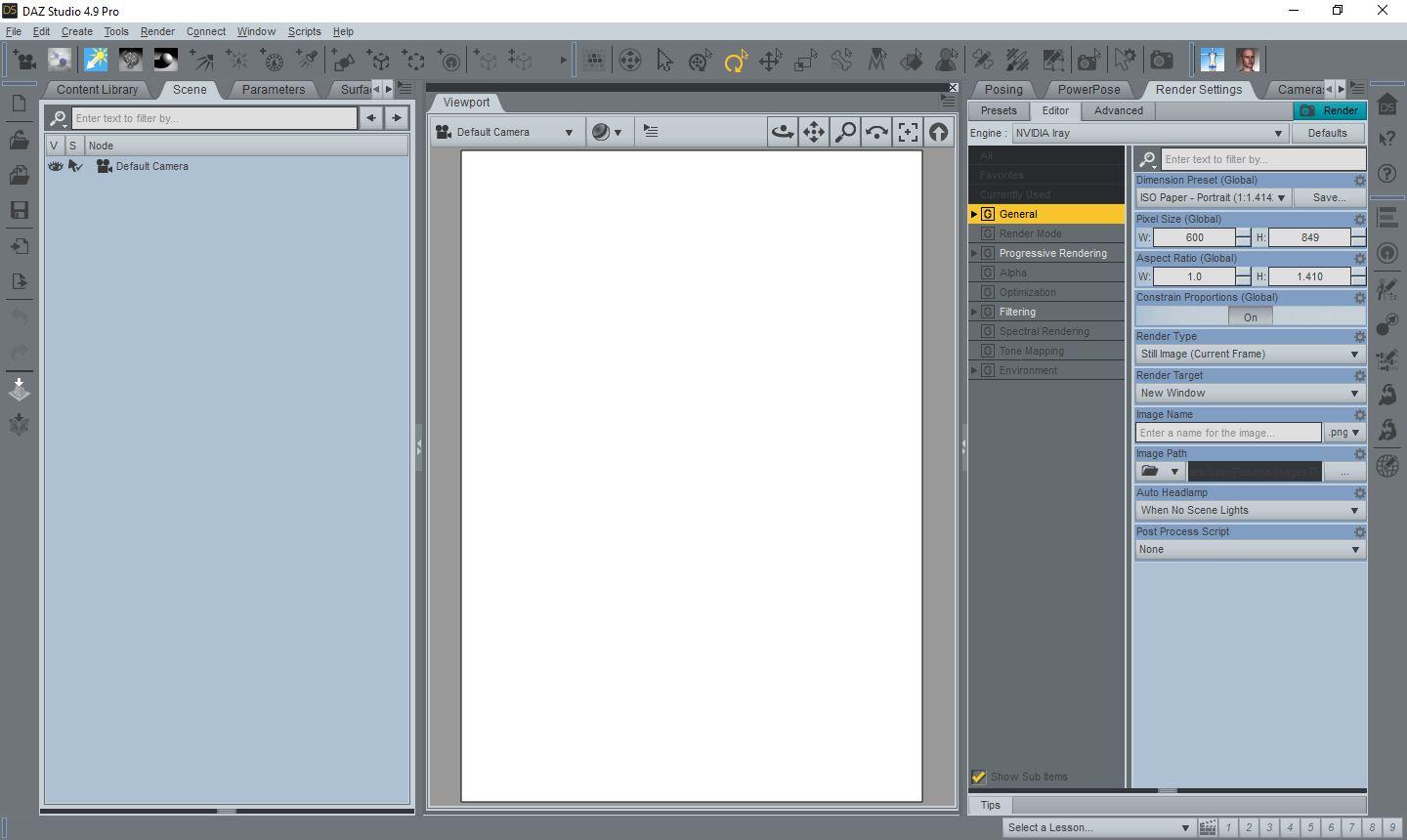
I use custom colors too, just tweaked rather than a full on set. Highlight is blue, new is green (was more obvious when "new" also highlighted in the content library) And despite using gray, I'm actually pretty sure that I manually set those particular shades. :)
I have daz set up for me to do animation with. like some of you all, I also use custom colors and custom UI with tabs on top I like to use darker colors to me they are easier to see & read. I wish daz had a option for making the fonts or text on the tabs largers . at my age they can be hard to read.
Mine is sort of custom colors. I changed the highlight to pink. Actually everything has been tweaked slightly from default. I like to keep it in the neutral gray family though so I don't give my eyes any color cast interference when I'm setting up textures. I really do like the brown thing you got going there Takezo, but I know I'd start adding green and blue tones to all my stuff to compensate for it not looking right.
Recently I've gone pretty crazy with customizing my workspace. Custom toolbars, custom menus.
Bottom bar is all for posing. While a lot of the options there are also in other places (like the tool settings panel or hidden away in a menu one has to click through) having them all right there means I can have the powerpose panel on one side, parameters on the other and I can keep it that way and not have to worry about switching through tabs or going into menus
Top right above the aux viewport are render setting presets: Preview limits the samples to 10 so I can keep the aux viewport on rendered without worrying that it will keep running and overheat my laptop.
The scripts menu was starting to get too crowded so I decided to spread things out. I now have a menu for all my most commonly used skin presets. In the near future I'll probably be adding lights and shader preset menus.
Other thing I did (actually my first foray into changing the setup way back when) is set things up so the viwport is navigatable with the middle mouse button the same way blender is: MMBclick rotates, Shift-click pans, scroll or cntrl-click zooms. I couldn't function without it at this point
Oh yeah and I made it all a bit blue, sometimes I swich things up and make it green
Here's a look at my layout of DAZ Studio. It may change as I work, but this is how it currently is on my MSI laptop.
I use custom colors as well, because I found it hard to read the defaults, at least when it's sunny and bright in the room. Unforunately I haven't found a perfect solution since changing colors of some elements affects others negatively, but here's what I'm currently trying:
Window > Style > "Customize Colors":
Set "Foreground Color" to white (so I can more easily read the text in the Content library pane among others).
Set Dark Color to black. (This is the Categorize window's color, also non-current tabs, lines, a few things in the toolbar, the backgrounds of some but not all content thumbnails, parameter backgrounds, shader mixer preview default, some other tool bars, etc. Can't set it to white like the foreground color text or I won't know what tabs are current and it would conflict with the already-categorized highlighting. Unsure what's the best color.)