First time dev. Need help with my Renders
 Lahi
Posts: 2
Lahi
Posts: 2
Hello.
So I decided to start working on my game couple of weeks back.
It is not what I expected it to be.
But it is still fun and refreshing.
So as a first-time dev I need help with my renders.
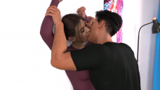
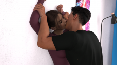
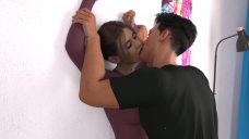
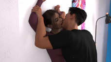
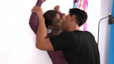
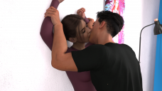
So, these are my renders of keyframes of an animation of a kissing scene I am working on.
Please watch it in a series rather than scrolling down. Like clicking next image after image.
As you can see it is an interior scene. I have used a key light and fill light and used a hdri with Done & Scene lighting. At first I went with scene only setting but then with DomeandScene I was getting more details and pop. I briefly played with using a ceiling light emissive. But it just was very flat. I even uploaded my lighting setup and render settings.
So, what I am looking for is -
1.) Ways to improve the lighting. This is my main reason for posting here. To make it more interesting and engaging. Somehow it feels bit too bright and slightly off. I played around with exposure in tone mapping, and it is becoming too dark or bright. There seems to be no middle ground. I want to add more soul to it. If that makes any sense.
2.) Ways to improve the interaction between lips and mouth. Somone suggested me to use d-former and trying to get some kind of interaction, like skin stretch and things like that. But I am not sure how to go about it or to even begin. Can anyone guide me please? It is a 450 second animation and I want to make it more interactive.
3.) Anything to make it better. I mean anything. I worked on these for a long time and really want to make them as good as possible. Any tip. Any suggestion. I will take.
I am really thankful for any piece of advice or opinion. Someday I will build a Lego set in your name. I promise. And like a really big one.
Daz 3D is part of 
Connect
DAZ Productions, Inc.
7533 S Center View Ct #4664
West Jordan, UT 84084
Licensing Agreement | Terms of Service | Privacy Policy | EULA
© 2026 Daz Productions Inc. All Rights Reserved.
Comments
Lahi,
Congrats for stepping forward and sharing your renders! It takes a fair amount of self-confidence and humility to ask for suggestions and feedback. A lot of us are still learning, and the Daz Forum is a great way to accomplish this. If you haven't tried it yet, joining the New Users Contest and Events discussions is a great way to pick up good tips. The event moderators there are knowledgeable and kind enough to share.
When I started out with Daz, I came from a photography background. This was at the height of the pandemic and lock downs. Daz turned out to be a great tool for learning about posing and light -- exactly what you're doing here. Below are suggestions. If things aren't clear, please don't hesitate to follow up.
Cheers!
[1] Posing and Body Language
This is a scene of passion where the characters take on difference stance: domination and submission.
The man's pose communicates domination. It looks good. However, while the woman's submission clearly
comes across, it may be too passive. Perhaps submission combined with yearning would be a more
potent mix -- like sugar and spice.
Hands, they tell a story. The woman's left hand is relaxed. Why not dial in a pose that communicates
desire, such as fingers that are reaching ... arching ... clawing ... trying to touch those
heights of passion. As to the right hand, why not bring it into frame, and have the two people
clasp their hands tightly, fingers intertwined.
[2] Lighting and Mood
Contrasting brightness and shadows are tools to bring focus to a scene. As it is, everything is washed
in high lights, likely from the HDRI lighting you used.
Instead, magine the scene in general bathed in shadows and the lighting system spotlighting
the two characters. Maybe there's a window off-camera. It could cast long line of shadow that
rake the wall on the right and point towards the characters (leading lines). This is a good
mental image to set as a goal.
Starting with colors, tone down the wall to a neutral grey. The gray hue lets the man's black shirt
and the woman's purple stand out. Then, starting afresh, bring in a three-point lighting system:
Key light - A cone-shaped light for high contrast and deep shadows, not a soft and diffused light.
Set it to the woman's left, beyond the stand lamp, outside the camera frame. This placing
generates shadows that lie across the wall, going from the woman's left towards the right
of the scene. If the light is strong enough, it will "paint" a rim outline around
the characters, helping them stand out from the neutral gray background of the wall.
All together these contrasts add "heat" and work to heighten the passion of the scene.
Fill light - With only the key light, the right sides facing the camera (woman's point of reference)
are thrown in darkness. Set a fill light off-camera to the woman's right, pointing leftwards.
It can be soft, to offset the harsh shadows of the key light. But limit it to the two
characters, leaving their shadows on the wall (from the key light) in high contrast.
The diffuse light softens the scene, adding "coolness", and echoing the tenderness
that's mixed in with the passion.
Specular light - The reflective sufaces in this scene are primarily the characters hair, brows and
eyelashes. Like the fill light, the specular light should be set on the woman's right,
perhaps obliquely from above her head pointing down, slightly behind the man and focused
on the woman's face. When this light is tinted -- red hues suggest passion, blue ones
tenderness -- you can add another layer of emotion to the scene.
[2] Deformations
I'm not the best person to offer suggestions, but I do want to point out that the man's elbow pit
look unnaturally deformed.
Thank you Csaa, for much for such a detailed explaination. Also this is my lighting setup. My main problem was it was an interior scene in morning. So I dont want it to be too dark. So I knida went too heavy with lighting. I am struggling with how to properly lit it in line with time of day.
Let me apply your suggestions and get back to you.
Actualy I set up two planes as emmisive ghost lights. This is my scene set up. And it is happening in middle of day.
I increases luminenece to show that it is day time but somehow it is making everything too bright. But when I tone it down, it is geting too dark or flat. I dont know how to get the effect of a morning scene inside a building.
The larger a ghost light is the more diffuse the light will be since light is coming from every point on the ghostlight, so there isn't really an opportunity for any part of the figures to be in shadows, hence it will look 'flat',. If you scale the ghost lights down they will act more like a light bulb and cast chadows. If reducing the size of the ghostlights reduces the overall light you can increase the emission of the ghostlight ( aka a brighter bulb ).
Lahi,
I don't mean to quibble, but "morning" light doesn't really translate directly to indoor lighting. It could be bright outside, but in a room with curtains drawn, the ambient light would be dim. That said, I assume you, as the director, have a mental image of your scene, and when you say "Also this is my lighting setup", it sounds like you're set on achieving that particular vision. If that's the case ... good. And you should stick to your interpretation because you're in the creative seat.
If you still want to move from flat lighting to one with some shadows to introduce drama in the scene, the three point lighting system is the easiest to use. Daz3D aims for photo realism and the lights that come with it are very effective and offer great flexibility. If you need a tutorial on three point lighting, here's a good, short video. The video tutorial constructs a single scene, starting from darkness and working towards something close to "morning light". Daz's lighting system is a great tool to explore and try out various lighting effects.
Sticking with ghostlights, background's suggestion also works well. Physically, light intensity is determined by the size of the source (the bulb), its distance and the opaqueness of the medium (air, or a screen) between light source and subject. Intense light casts sharp and deep shadows; diffuse light (such as Daz ghost light) introduce softer shadows. There's so much more about physical lighting, but that's the basics of it.
Cheers!