Skin technique DAZ
 OutlawComics
Posts: 16
OutlawComics
Posts: 16
Hello everyone,
I've been practicing DAZ for a few years now, but I've never achieved the level of skin TAB109 achieves.
Is there anyone on this forum familiar with this technique? I think it would help many other content creators, including me.
Thank you again for your future help.
Thank you.
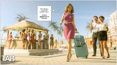
Cancun_22.jpg
3840 x 2160 - 2M
Daz 3D is part of 
Connect
DAZ Productions, Inc.
7533 S Center View Ct #4664
West Jordan, UT 84084
Licensing Agreement | Terms of Service | Privacy Policy | EULA
© 2026 Daz Productions Inc. All Rights Reserved.
Comments
It's hard to diagnose the technique so to speak from one image alone. Maybe describe what in particular are you drawn to about the skin in this image - the blown out lighting, the orange, the homogenous skin color/featureless skin textures?
What I'm looking for is how to recreate this magnificent skin.
The texture, etc.
I'll show you a picture of mine; you'll see, I'm sad.
To me TAB109 looks post processed with photoshop or AI. You can notice a "smoothness" that's more typical in paintings than in renderings.
Thank you for your reply. I won't hide the fact that I asked him the question, and he confirmed that he does everything on DAZ.
When I asked him about the technical aspects, he replied, "Lol."
I won't hide the fact that I have a lot of trouble with texture in general, and I have a hard time finding a video that logically discusses this area.
P.S.: I want to point out that I am an autistic person, and I am very focused on finicky things. If that helps, I'll be happy to hear that.
Your image is definitely too bright, that will "wash out" details, and depending on the settings for the skin, lighting being too bright can kill details in the skin, and make it look unrealistic. Try reducing the intensity of the main light to see if that helps.
It would help everyone to give you some tips if we know what character you are using. Unfortunately, DAZ doesn't require vendors to develop their characters/assests under a uniform lighting environment. This leads to different characters requiring different lighting conditions to look their best, or adjusting the shaders/materials for different lighting conditions.
As noted above, your reference image is also has lighting that is a bit too bright/harsh. In this case though, it may be intentional to make the image look like a amateur/quick photo. What is it specifically that you like about that image? The details of the main characters knees, her hair, other?
You also might want to check the calibration on your monitor. Since both of your sample images are a bit overexposed it might indicate your monitor is a bit too dark (if that isn't a stylistic choice). Just do a search for manual monitor calibration and you can find some easy instructions for calibrating your monitor.
If there is an image in my gallery that matches what you want to achieve, let me know which one and we can go from there. Otherwise I will bow out of the conversation and defer to the excellent advise everyone else will give, as my style is may not be exactly what you are looking for based on your example images.
Hello Dust, thank you very much for your advice.
It's true that I generally use the intensity to the maximum, and I have trouble understanding the three-light technique, to be honest with you.
Yes, this drawing you did interests me enormously.
In fact, the question I'm asking myself is: how do you achieve this result? And especially this skin texture?
When I see your image, I feel like I'm looking at a poster of a video game character.
Thanks again for your help, it's really nice.
Maybe I am blind, but to my eyes this doesnt look any worse than the image you posted in the original post, in terms of skin texture quality.
it looks worse in terms of composition.
What problem are you having with texture? In your OP example image there is barely any texture to speak of because as others pointed out the lighting is rather harsh, blowing out some of the details - it looks almost stylized as a result. Do you want less texture detail so as to create a more stylized image like in the OP? - or do you want more detail towards photorealism? Stylized textures would have less details in the image texture maps, and realistic textures would have more detail.
The framing of your experience as one hinging only on "skin texture" and nothing else suggests you might need to broaden your video search to videos explaining lighting and skin shaders too. I would avoid a Daz specific video and focus more broadly on concepts in 3D, but that's just me.
Personally, I dont have any formal understanding of lighting nor skin shaders. For example, I dont know what a 3 point light set up is. I assume it just means there is three lights up in there, but I dont really care to find out either, and generally only use HDRIs to light scenes. Maybe I throw in a sphere with an emmissive shader on it if I want another light or two in the mix.
"Lol" as a response is not without merit. Maybe formal theory isnt a substitute for just looking at the render and adjusting it until it looks good.
Wow! thanks so much for your kind words.
I'm amazed, you picked an image that was the result of helping another person a few years ago, so I actually have pretty good documentation/information on the creation of the image. For simplicity, I'll just post the relevant information from my previous posts below.
Now back too the lighting. Below is an example with the same pose you used (I don't have the same hair and outfit) to give you an example of the results using just the default HDRI that comes with DS/Iray. I tried to use a similarly dark outfit, and a bow (that needed shader adjustment). The dome is rotated to 140 degrees. which helps to give some very nice highlight and shadows to the details on the surfaces of the outfit, and the figures skin (I also adjusted the Environment value to 1.8). The HDRI also provides a lower level fill light that both helps to keep most areas of the image well lit, while not washing out the shadows that are key to keeping the 3Dness of the image. The HDRi also provides something for the reflective surfaces to reflect.and adds interest to the image (our minds instinctively notice when pure white is all that is reflected, even though looking at the image we often can't easily identify what makes it feel "wrong"). Note too, that this HDRI provides rim lighting on the right side of the image. Anymore, I usually try to keep the main light at a greater angle from the camera position rather than close to the camera. True, by doing so sometimes some really nice or interesting features on the clothing on the figure will be more difficult to see. However the big trade off is that the images in general are more visually appealing, detailed, and it's easier to get them to stand out from the background. Of course this is all just stylistic preference, but I thought it might be worth mentioning.
I hope something here helps a little!
I actually kind of liked what I came up with on the sample image above. I thought it might help porrmojo. and possible others, if I just finished the image, and gave a few details on what I did.
One important thing in any image is to make the figure look/feel balanced, and the pose look proper/natural. Without that, regardless of how detailed the image is, things will always feel a bit off. I had to adjust the legs and feet just a bit to get a better feel of balance, and a bit of body language to match the facial expressions (could be a bit better, but it seems to work now). I also had to do quite a bit of re-posing of the arms and hands/fingers to get everything to match how a real archer might be posed (the draw hand/fingers to me were at a very uncomfortable/un-natural position). I should have probably put her left index finger over the arrow, which is common to make sure the arrow stays in place, but I have also been quite successful in keeping the arrow in place with proper handling with the draw hand/fingers. I also did some minor adjustments of the head and eyes.
I added several items to the figure to make her a little more interesting. and of course she needed an arrow too. I also added five spot lights to give a rim light effect on the figures right side (see first image below). This helps the figure to stand out from the the background. The scene she is in is Muelsfell Modular Red Rock Canyon from E-Arckham. I modified almost all of the visible shaders in the scene to get the look I wanted. The most important modifications were to slightly darken the base color of the cliff and background rocks. This also helps the figure to stand out better, and become the focus of the scene. Speaking of focus, I also enabled DOF and adjusted it to help make the figure stand out (note the tip of the arrow is slightly out of focus, this helps to give the arrow length and depth too). I should probably also note that I enabled just a slight bit of bloom in the render, and set the pixel radius to 1. I also added a SY Swift Steam Iray prop between the figure anf the cliff to add a very subtle effect to help set the foreground apart from the background (Opacity was set to 0.1 and Base Color was set to a very light brown).
The raw render before post processing is the second image below.. I added the image with no post processing so you can compare it to the post processed image which is the third image below. The post processing was done in GIMP steps I used were:
1. Adjusted levels to improve contrast and brightness. This image was a bit dark, and normally I would adjust the exposure value in Tone Mapping, but I thought this would provide a bit better example of how adjusting level can make an image much better.
2. Copied and pasted the levels adjusted image to a new layer.
3. Added vignette to the base (1st) image using the Vignette filter in the G'MIC QT plugin in GIMP.
4. Ran the unsharp mask filter on the top layer (pasted layer) to enhance the details.
5. Added vignette to the base (1st) image using the Vignette filter in the G'MIC QT plugin in GIMP.
6. Ran the "Light Glow" filter in the G'MIC QT plugin in GIMP to help highlight the figure.
7. Set the opacity of the top figure to 23%
8. Added signature.
I hope you find this somewhat helpful
PS: Please click on images to see the details at full resolution.
Light set up
Base un-processed image
Final Image
Here is the link to the entire thread I did this for: How can I get a render as detailed as this?
Hello Duster, thank you so much for sharing your experience, which is truly amazing.
I'll try to take note of your feedback, which is really cool.
I welcome you to my Discord page, if you'd like to chat with me: OutlawComics
It would be a great pleasure to chat with you anyway.
You have a lot of talent.