New face of Daz?
 Peter Wade
Posts: 1,695
Peter Wade
Posts: 1,695
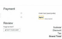
Another website redesign, mostly OK but I think they've made a bit of a mess of the checkout page. I'm attaching an extract fom how it shows on my screen, the payment heading is way out of alignment with the options, and there is stupidly big gap between the check boxes for credit card and Pay Pal. It's useable but I think it looks a bit amateurish.
Also I'm getting messages saying only secure content is displayed on the screen after checkout and on my product library page.
I'm usiing IE 11 on Windows 7.
Daz 3D is part of 
Connect
DAZ Productions, Inc.
7533 S Center View Ct #4664
West Jordan, UT 84084
Licensing Agreement | Terms of Service | Privacy Policy | EULA
© 2026 Daz Productions Inc. All Rights Reserved.
Comments
The font size keeps shrinking with each new store iteration. Pretty soon the only way to be able to read it will be to have a wall-sized monitor.
the font size actually got a lot bigger for a bit. now it's back down to more normal sizes.
Sorry I agree with Morpheon. The actually text on the forum messages is much smaller, I have to zoom in to read it comfortably.
I also think the font size is small. In the forums and the shop it is about at the lower limit where I can read it comfortably. Curiously, the one place I can find where it isn't as small is the Product Library descriptions (but the product list is small font). They must have missed that one.
I think the text is OK in size, but it shouldn't be smaller. The quoted text is too small however.
But I guess it's also a matter of monitor size and resolution (mine is 27" / 1080x1920). I can imagine that on a Laptop it may be too small.
That's a valid point too. I haven't tried on any of my secondary devices yet.
I am using a 1600x900 display. I am currently scrolled in to the extent that I only see nine complete lines and a partial one when checking for new posts (oops sorry Recent Discussions)
Of course I could move my monitor closer, it's currently about 23 inches away, which is in the optimum recommended distance
I'm near sighted and use the16 inch distance so I don't have to wear glasses when I'm on the computer. lol. Prolly part of the equation for me.
But the old font was really huge and there were many times only two post would show up on the forum per page. Even if it was only 1 sentence each response. I can read a thread a bit more naturally now. Reminds me I need to test search, that annoyed me a ton.
Search spacing is a bit better, but the inclusion of pictures still kinda jacks up the results in many cases. Some posts have a handful of pictures so it dominates the page.