Anyone Have Thoughts On Lettering?
 ShawnBooth
Posts: 465
ShawnBooth
Posts: 465
I've been experimenting with various lettering types for my comic book. I feel the standard really doesn't flow/work well with my style. I have seen multitudes of styles and haven't been happy with a whole lot.
Any thoughts on what would work well? Thoughts on what I have on this following image?
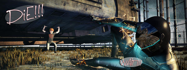
catch_the_train_00000.jpg
2000 x 750 - 2M
Daz 3D is part of 
Connect
DAZ Productions, Inc.
7533 S Center View Ct #4664
West Jordan, UT 84084
Licensing Agreement | Terms of Service | Privacy Policy | EULA
© 2026 Daz Productions Inc. All Rights Reserved.
Comments
I don't like the colored backgrounds on the lettering. The font is very stylized.
My taste in word bubbles for comics is exactly the opposite.
Drop in some white bubbles, use Comic Sans?
Of course, people might want to stomp on your head if you do so.
Classic white bubbles for wording probably isn't a bad idea, however. Looking at Christopher Moeller's iron empires stuff at the moment, which is pretty serious stuff... the best panels are black letters on white background. It's clear and direct, and there's no mistaking what it is. When the thought bubbles use different colors other than white, it gets muddy and I don't like it.
Font's a trickier thing. Moeller's stuff is all caps. Looking at the X-Men stuff that Joss Whedon wrote... also all caps. I would vote for something that is very clean and direct, like Comic Sans!
First - Thank you so much for taking the time to respond and share your opinion. I really appreciate it.
I did state that traditional lettering doesn't work for me. I hate seeing opaque white bubbles with "comic sans" fonts (there are so many comic book fonts available now that using comic sans is like using Papyrus for your business) in conjunction with 3D rendered artwork. It doesn't work in my opinion.
The books you cited are all traditional comic art comics and the traditional lettering/bubbles works for them.
I do agree all lettering should be all caps - the font I used in the above image just types out that way. This was a test for style and what not. I also forgot the whips on each bubble. Would you say you'd like to see the opacity brought back up to 100% on the bubbles I used?
The big advantage to using white bubbles is that it provides instantly obvious contrast to most backgrounds. I didn't even notice the "WAIT!!!" bubble in your picture until the third time I looked, after noticing that you were talking about "bubbles", plural.
Fair enough. Excellent point.
In 90's, Marvel moved over to computer lettering. And they experimented with a lot of computer tricks, like translucent bubbles.
They don't do that any more :)
Any thoughts on all text being outside of the panel? As in, no bubbles at all?
http://www.blambot.com/grammar.shtml
That's the best tutorial on basic comic lettering I've ever come across. Blambot is a great resource for fonts both free and pay, and you will never want to use Comic Sans or anything else once you've used his.
Yes, if there is one thing that nearly all professional comic book letterers and those who are passionate about comics agree on it is:
DON'T EVER USE COMIC SANS!
But everything is a matter of opinion. There are so many free fonts available, you should be able to find something that you like. I think as long as it is readable and doesn't draw too much attention to itself, it serves its purpose.
http://www.balloontales.com/tips/index.html?type=lettering
No...just no. Too often it will bleed into the background and lose meaning, impact or just get totally lost.
Greetings,
No...just no. Too often it will bleed into the background and lose meaning, impact or just get totally lost.I think you missed the 'outside the panel'. So you'd have your comic, with the scene, and an extra 30 pixels of white above/below it, where you'd have the text, placed somehow to indicate who's issuing it. At least that's how I read the question, as opposed to 'no background, just text overlayed on the image', which...yeah, just no.
I didn't see the 'WAIT' at *ALL* until another poster pointed it out, so I don't think the translucent background is working either...
-- Morgan
I didn't see the 'WAIT' at *ALL* until another poster pointed it out, so I don't think the translucent background is working either...
-- Morgan
My strong opinion on that is that if your speech bubbles aren't part of the art, with tails pointing to who is talking, then it's not really a comic book, it's just a regular book with lots of pictures. :)
There's a reason for white bubbles with black text. It's readable, and it mimics the printed page of an actual book. That's why it works. It doesn't need to be reinvented. Let the art speak for itself.
Yes, comic books are a visual medium, but all joking about Comic Sans aside, the text shouldn't be part of the art unless it's sound effects or purely meant as visual IMO.
EDIT: Looking at Batwoman from the New 52 run (which is one of the more experimental DC comics in terms of art)... unless it's freaky kind of stuff going on, it's white bubbles with black text. And that's pretty neat artwork underneath. They didn't need to change the standard text because it works.
Yes, maybe the standard black on white doesn't excite you, but you're also writing for an audience and the audience does matter.
In this case, making the classic work for you is pretty important IMO.
In my opinion, Words outside the pictures in a comic usually comes across just as pretentious. "Oh look at me going in a different way then comics have for the nearly 100 years of the art form!" You'll see it in some indie comics, in some of the Vertigo Glut when DC launched it...So it depends on the feel you're going for.
I second SnowSultan's recommendation of Blambot. Even in the free realm, they have some nice fonts, and if you're doing this in a "I want to be professional way"..you want a good font that isn't Comic Sans which screams amateur.
http://new.comicraft.com/ is another vendor of professional level comic fonts. They're not free, though. They're the big time, mind you.
Another good place to learn stuff is : http://kleinletters.com/ Todd Klein is one of the greatest comic book letterers in the world. He'll often post thoughts, lessons, stuff to think on...
I agree with you. By "part of the art", I meant, "in the picture", not off to the side or having a separate caption where the dialogue doesn't interact with the characters. But even though the text should be readable (Black on white works great for that), it shouldn't call undo attention to itself, like the first thing you say is, hey look at that cool font and neat speech bubbles. In that way it should "fit in" or complement the art. I've seen some comic pages that were beautifully drawn, but the speech bubbles were obviously computer drawn, perfectly rectangular, and the text was readable, but again obviously computer generated and in my opinion rather generic looking. It just didn't seem to fit together.
Comic sans is perfectly readable, but as was mentioned, there are many free alternatives that will do the trick. :)
https://www.google.com/webhp?sourceid=chrome-instant&rlz=1C1PRFA_enUS450US536&ion=1&espv=2&ie=UTF-8#q=why+you+should+not+use+comic+sans
The first thing I think of when looking at 'outside' text...narrative.
So unless the whole story is told by a narrator, then, again, no.
Thank you. You all have been a tremendous help with valid points.
Opaque white bubbles and black text (traditional) they will be. No sense attempting to reinvent the wheel.
Again, thank you.
Pure white is not best for all people.
http://uxmovement.com/content/6-surprising-bad-practices-that-hurt-dyslexic-users/
Thank you. I will adjust for -
Thank you. I will adjust for -
You're welcome. Everything little bit can help, life has so many hurdles for too many people.
I like using the Comic Life program, they have updated [I'm using the earlier version]. It's at plasq.com, not expensive, has free trial.
It's been very easy to use.
I have a personal "long term project" where I'm slowly re-drawing Comic Sans. :)
There are some very good fonts on MyFonts.com by Comicraft. Expensive though.