Daz 3D is part of 
Connect
DAZ Productions, Inc.
7533 S Center View Ct #4664
West Jordan, UT 84084
Licensing Agreement | Terms of Service | Privacy Policy | EULA
© 2026 Daz Productions Inc. All Rights Reserved.
Comments
Hansmar : After comparing the two images, the second version looks better.
Hansmar - I blink-compared the two, the second has better light.
yellow Pen....Great Mars render the terrain material works well
Hansmar....Lovely perspective street viewthe pot thing on the left is much better not being blue
drachenlords...simply super render excellent work
Melanie, Mermaid and Spuddy: Thank you.
Drachenlords: really perfect done. I hope this will come true soon.
Hansmar - I also like the 2nd version.
Hansmar - I agree that the second version is the better one.
0h, I forgot you Hansmar - sorry.
Yes, your second is better I think.
Entry # 2 The Mocking Jay
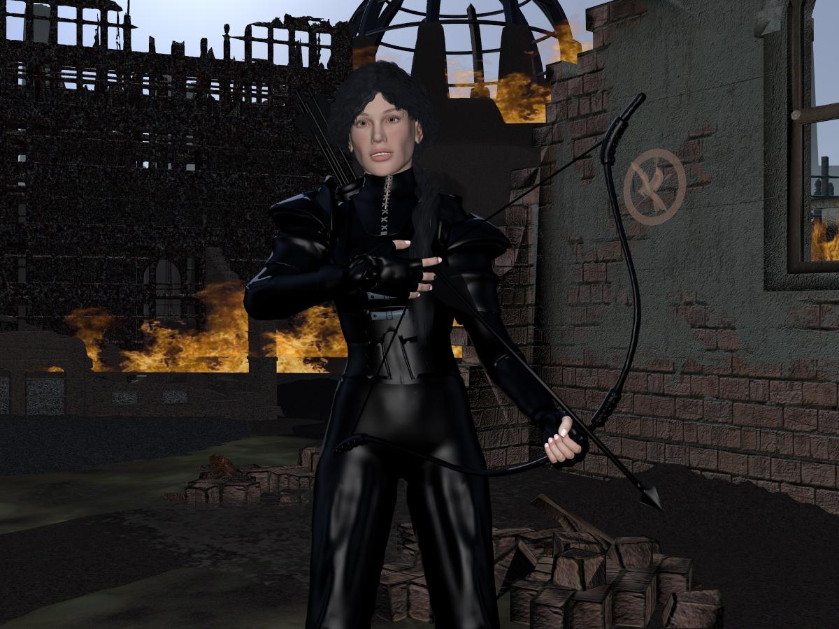
A depiction from one of my favorite book series. She never looked forwards, just didn't except what was behind her.
S Ray - very nice entry, I like the effect of the bones showing thru the pants, or are those folds in the pants.
S Ray - well done scene, good idea.
SRay : Cool idea, very well done.
Let the Hunger Games Begin! Excellent work S Ray
I read the books decades ago. The movies were good but the books better. I cried when Willow died (book). The movies didn't do justice to her.
Hello everyone. Hope you all are doing well and staying healthy. Avoid large crowds and all that. Just popping in to say hi. Let me know when this contest ends,
SRay: I love the Movies... well done.
Apoc: Hello, nice to see you
Thanks all, for nice comments.
S Ray: Mocking Jay looks like a seriously tough girl to me. I like the background a lot and the shininess of her clothes. But perhaps another light on her migh make her appearance less 'flat'? I mean, it looks like there is a light directly from the front on her, which makes all her flesh rather pale. Perhaps a light a bit more from the side might give more shadow on one side and therefore more depth to the person? But, that's of course just my suggestion. It's fully your choice.
Good eye, I agree. I did a premium render with soft shadows & a high ray depth. I was over a 3 day render so I left it as is.
Entry #3 Strange Object
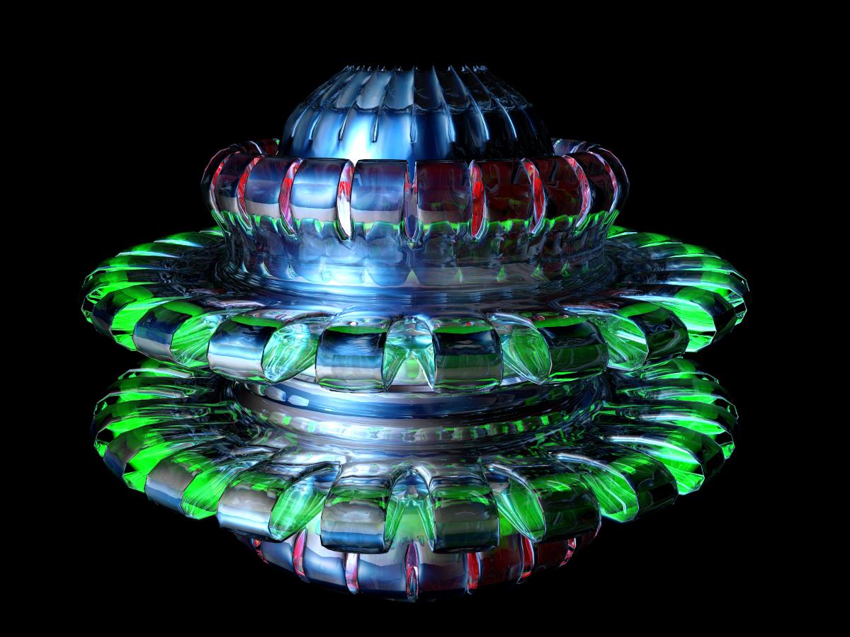
A glimpse of things to come.
S Ray...Two really lovely entries esp your fuel cell come thingy come transporter come whatever
S Ray - cool idea, very nicely done, nice colours in front of the black backdrop.
S Ray : Strange Object : great idea, beautiful entry.
S Ray, beautifully colored object and interesting shape too.
S Ray, I can really understand your decision here! I often accept suboptimal results too, because redoing takes more time and effort than I am willing to put into it. Your new one is a nice strang object. The colours and rendering are awesome.
A rather challenging theme and very interesting interpretations by all..
Just a few comments on the entries I especially liked:
drachenlords "First Day After" is both poignant and timely. Love the discarded masks and the DOF. Really nice looking pigeon too…
adbc’s “Looking Up”-very retro and reminds me of something from a Twilight Zone show.
Hansmar’s "sea cave" - interesting concept, I really like the old tech meets new theme and very nice POV.
Horo’s spiky terrain is a very cool image I especially like the rusty effluent texture. Excellent atmospheric work as well.
Here is my first entry: “A New Horizon” which users the starship bridge model by Stonemason. Genesis 1 figures, uniforms and hair from DAZ3D. Illuminated by four dome lights and an Omni light illuminating the background planet image. Rendered at Normal AA just over four hours.
Thanks for taking a look!
Bryce Gallery: https://postimg.cc/gallery/10dulcbue/
Voyager 4 Gallery: https://postimg.cc/gallery/16xw3g6au/
My second entry: "Advanced Scout”.
Genesis 2 male, clothing and hair from DAZ3D. Vegetation from X Frog. Spy glass modeled in Modo. Clouds created by applying a volumetric texture to a large sphere.
Illuminated by the sun and Use Sky IBL. Fill light provided by an inward facing only dome light that surrounds the foreground objects.
Rendered at 64 RPP, in about 11 hours.
Good luck to all the entrants!
Dan Whiteside, Thanks for your positive words. 'A New Horizon' is a great render. Wonderful spaceship and good view. 'Advanced Scout' Is a very nice scene too. However, I think thre s too much ambience in the vegetation in the foreground. These plants are too bright, I think.
SRay: beautiful Colors and a nice Object.
Dan: I agree with Hansmar - your first entry is beautiful, but the plants in the foreground at your second entry have too much ambience, but that's my opinion... it's your picture and your decision.
Dan - two excellent entries. The first is outstanding the second very nice, though the foreground is a bit on bright bright side (as we should look into the future) but the artist decides. The clouds look great.
Dan : thank you for your comment. Two outstanding entries, I agree with Hansmar and Horo and yes it's entirely your decision.
Dan, those are excellent renders. I really like the first one but the second is very much a Bryce render. I too think that your plants in the foreground are on the bright side. It makes the image seem overly saturated.
S Ray - cool idea, nice colorful object, love the lighting.
Dan - two excellent entries.