The Paper Tiger Roars
 katiedelongwriter
Posts: 65
katiedelongwriter
Posts: 65
Hello all,
I don't post around the forums much, though I'm a semi-regular participant in the render contests. This seems like the spot to chart your regular ongoing progress and growth. I've got a background in various kinds of performing arts, art, and graphic design, and am workign on getting my skills up to snuff so that I can create unusual imagery without needing to be dependent upon collaborators. I am disabled, so it's doubly important to have as much control and independence over the creative process, since I need to adapt processes as much as possible to compensate for symptoms and medical flare-ups. But I've had the opportunity to work on a lot of fun projects, too. My partner and I are authors, and I originally picked up graphic design as a way of illustrating book covers for us. I've since accumulated more clients, and worked on other canvases, including bookmarks, totes, jewelry, etc. So when I design, I tend to design with an eye toward designs that can be adapted to other formats. And Daz is the ultimate in that. I love its flexibility. I am also currently designing a tarot deck, the Memento Mori Tarot.
Areas I am most eager for critique and improvement:
Simulation: I have a basic working knowledge of DForce, but when it comes time to fine-tune the settings, use push transformers, or simulate water, I am still pretty new.
Asset Creation: I wish to learn to design my own hair and clothing, particularly, but ideally sets, too.
Lighting: I know how to place lights to great effect, however I am still struggling to correlate settings/values with what is needed to achieve the proper dramatic effect in a scene, especially for scenes with a harsh fall off/high contrast look. I want to be less reliant on Daz's default environmental lights.
Clouds and smoke: I am currently exploring how to make the most out of my cloud and smoke props to create a defined foreground in some cases, and to add visual interest to the negative space of the backdrop in others. I need more practice placing, lighting, the props that I have, as well as utilizing the shaders I have to get more nuanced colorful effects- currently they don't seem to apply right, and I'm not sure if it's just that they are applying, but too thin, or what. Hence needing to explore this area for improvement, since I know it's nothing to do with the product itself.
Program Vocabulary: I am still learning the boundaries of the respective programs on the market. What's best in daz, versus cararra, versus Bryce, etc. Currently, I am learning Daz, Howler, and augmenting with postwork in Photoshop.
My preferred styles are fantasy, science fiction, because those are the kinds of books my partner and I write. So that's most of the imagery I create.
I can't think of anything else to add, so I'll start off with a few renders from this year.
Daz 3D is part of 
Connect
DAZ Productions, Inc.
7533 S Center View Ct #4664
West Jordan, UT 84084
Licensing Agreement | Terms of Service | Privacy Policy | EULA
© 2026 Daz Productions Inc. All Rights Reserved.
Comments
I just wanted to welcome you to the Art Studio and I hope to see more works. My first impressions is that you use a lot of colours which I think can work wonders with fantasy topics!
Welcome! I love the colours of your 2nd render!
Two more in-progresses.
Yep, I tend to use a lot of bright colors, high contrasts. Some of that is that I currently find it easier to create color via clouds than via sculpted lighting, so ideally if I had more control over the lighting, it might mean having more flexibility over different type of compositions.
And a commission for an author. He writes speculative fiction across a variety of genres- urban fantasy, scifi, horror, dark fantasy, magical realism- so I built out imagery and logo to try to express the breadth of his core brand, while still feeling like peices of art you might find on the book covers.
I spent the day researching EXR files in an attempt to get them to work- I still haven't managed it, but I'm so intrigued. I'm not sure if it's that my lighting is off (render looked completely black, even after importing all the EXRs into PS and setting to "Add", so clearly no light data was recorded in the file, despite the image having at least some light available), or if it saved wrong. That's okay. Not every test works out. Will test with other stuff and see how that goes. At the least, it's an opportunity to experiment. I need to set up a Youtube playlist for the tutorials I've been stumbling across, so it's easier to refer back to them later and I don't have to dig through dozens of forum posts. I'm wishing we had moved my DUFs over from the other computers I was working on- it takes so long to build a new scene, and at this point, I wish I could just refine older scenes that I didn't quite have the technical knowhow to get the lighting right. It's probably too big a PITA to move them now, though, compared to just moving forward with the skills engrained from the start. it's all a process. Right now, I particularly want to get the hang of backlighting hair and bodies, coloring light, and creating harsh shadows on the face, so this week's experiments will likely be oriented with that in mind.
I'm not thrilled with how this came out. The clothing and sword is from an earlier gen- no d-force, no shaping morphs to add realism, and the sword locks to his hand in a position that to me looks too far forward, but won't actually let me pull it back further into his grip. So to me it looks very... off... and made it impossible to get posing that looked natural when the clothing made everything seem like it was a gumby molded into place. But I did do the backlighting, color temperature programming, etc. in render, so it still represents a step forward as far as creating a mood with lighting in render. I'm not sure whether I'll enter it as my second entry in the forum "Scene" render contest. It might not be a bad idea, since it's so very different from the other render I submitted despite using several similar props in large part to force me to approach the lighting differently, but again, I'm still not thrilled with it. We'll see how I feel when deadline rolls in.
I'm not thrilled with how this came out. The clothing and sword is from an earlier gen- no d-force, no shaping morphs to add realism, and the sword locks to his hand in a position that to me looks too far forward, but won't actually let me pull it back further into his grip. So to me it looks very... off... and made it impossible to get posing that looked natural when the clothing made everything seem like it was a gumby molded into place. But I did do the backlighting, color temperature programming, etc. in render, so it still represents a step forward as far as creating a mood with lighting in render. I'm not sure whether I'll enter it as my second entry in the forum "Scene" render contest. It might not be a bad idea, since it's so very different from the other render I submitted despite using several similar props in large part to force me to approach the lighting differently, but again, I'm still not thrilled with it. We'll see how I feel when deadline rolls in.
Really happy with how this came out. I have been meaning to start working on a tarot deck anyways, and I think this is the first of the new cards' imagery, though I haven't fully settled on which card yet. Very little postwork needed- not like teh smoke in the other one. This useda different set of props, and a combination of lighting techniques, including backlighting, HDRIs, spotlighting, and ghost lights in the cups of wine.
I like the last one a lot, it has some evocative elements to it, like the abstract elements and patterns you use.
Thanks, Paintbox. I wanted it to have the feel of a W or Vogue editorial- bold, chaotic patterns, a less vivid color palette to make space for the additional business, most of the color concentrated around the foreground figures and the cups for visual interest. I guess the promo videos and whatnot for American Horror Story Coven are probably another good touchstone- very unique sense of set and place, emphasizing surreal imagery and glamorous/macabre contrast in choice of thematic elements. I'm a fashion nut so that aesthetic drives me wild. And the ability to replicate it in Daz is one of the things that drew me to the program. Eventually, I'd like to be able to design/edit more custom clothing to be able to really step up this aesthetic with clothes that have couture elements. I've still got a ways to go. But this really shows how much is possible, if you're a little creative with surfaces/shaders, lighting, and atmosphere props.
Spent today working on the proof of concept for the tarot deck- branding for the box, banners, etc. using Daz, and refashioning renders from the thread into cards. I can have a Thoth tarot edition prepared within a few months most like, and work on the full Rider Waithe after that.
An old render, fine-tuned for the tarot now that I have fonts and such picked out. I'm not sure most tarot practitioners would have this interpretation of Temperance, but what the hey, it's mine. Temperance is the balance of different elements in tension, for one's overall wellbeing and health. Since my conception for this tarot is for it to be based around images of renewal and motion with imagery hinting at action- rebirth, death, renewal, etc. it made sense for Temperance to be at least somewhat themed similarly to Death, with interpretations of life and death in tension. That's something I know a lot about, thanks to some of the disabilities I live with. I've survived a lot, and temperance to me isn't this peaceful card that other tarot readers seem to read it as. To me, Temperance has always been more about the difficult work involved in "being happy", which makes it especially important to matters of health/disability, where a significant amount of invisible work goes into maintaining our baseline health and survival, compared to others, and where we may be especially prone to neglecting ourselves, or being neglected by others. I need to think of a more coherent way to talk about this interpretation for at least a little bit when I compile the book that goes with the deck. Otherwise, I imagine other people might be confused by a Grim Reaper depicting "Temperance".
I like it! Nice colours and lighting, and I like the filter despite generally not being a huge fan of filters. I like how his skin and eyes came out; only the blade of his sword is a little strange now. It feels like honed metal should be less "swirly".
The garments don't look unnatural to me, at least in this pose.
Re posing of the sword: Easiest way to go about it is probably to load the sword by itself, without the figure selected. Then you can manually navigate it to his hand and place it exactly as you want. Parent the sword to the characters hand after manually posing it.
On a different note, I find the size of your logo awkward. Lovely as the logo is, its large size distracts and throws off the composition of several of your renders. Obviously just my subjective opinion :)
Thank you! I really appreciate the notes! You gave me a lot of great feedback! The metal on the sword is the default shader the sword came with- but I've got dozens of other metal shaders to try, and I usually do swap 'em out. I might go back and rerender with a different sword metal, and just impose the sword over it to get what we need from it, see if that dresses the image up enough. I agree with you that this metal shader is sort of flat- it has the sort of look of a mottled or damask steel, and combined with the painted filters I usually use to achieve a unified texture for the final composition, that flattens the overall effect. It needs to be brighter, flatter, more reflective.
Ordinarily, I like the props that parent to a hand automatically- but on this one, it sits too far forward. So doing it manually the way you said would definitely yield a better result. Just comparing this to the Empress, where I manually placed the props, the grip in Empress looks so much more natural, even though it was all manually done.
Regarding the watermark, I agree- personally, I hate watermarks, but since these images are intended for book covers for the most part, and they get shared among authors, I have to factor that industry in mind. Unfortunately, piracy of images is rampant in the book industry, including people who will crop out smaller watermarks- you need to watermark it big in order to ensure that people won't save your image as "mood" and upload it to pinterest, and then "forget" they haven't paid for licensing to use it in ads or whatnot. Or even crop it into smaller pieces to edit into their own promotional material outside of the original image. So since these images are being shared without the additional context cues of their future typography or whatnot, I don't want to discover that when someone does choose to license them for a cover later, they change their mind after discovering that some other author has basically claimed squatters rights over the image, and diluted the branding effect that comes with expensive custom art. I post watermarkless versions on my Patreon for viewing, along with discussions of what went into the piece, on the premise that those images are less likely to be reposted than images shared to forums, facebook, twitter, etc. But for images elsewhere, it's preferable to have the distracting watermark than to discover that I've lost a hundred dollars or more in commissions because an author stole the image, and now the new client views the image as "pre-owned" because other people view it as part of the other author's brand. I 100% agree with you though- back during my makeup artist days, I used to beg and barter for watermarkless images from the people I worked with for just the same reason. Watermarks are the bane of my existence, and seeing the compositions without them, yeah, there's no question, the compositions are so much cleaner and prettier without.
Re watermarks: Ah, that makes a lot of sense. Being a total hobbyist, I never even thought about all that.
Even as a hobbyist, it is good to watermark, because people might come across your work (it gets saved, pinned, reshared etc) and they will never know it was you. Whether it's subtle or big, it is worth it imo
Yep, lots of reasons why watermarks may be necessary for many designers- though how big, and what nature is 100% up for discussion and critique. Everyone's got their own personal ideas and limits regarding aesthetics versus protection/branding, and they may even change/fluctuate over time. I don't necessarily expect my watermark right now will be the same as my watermark a year from now, and even image to image it changes- I generally flip B&W according to which has the most contrast with the image it's over (for readability), and if needed, fine-tune drop shadows for further contrast or aesthetics, size it smaller if it's sooo close to hitting a good balance between aeshetics and function. (If it's gonna be ugly no matter what, I don't generally worry about the size too much- I veer on the side of readability, because on some sites when the images are shared, they're shared as thumbnails, so a small WM can get lost.)
Tonight's insomniac rendering. I'm finally getting more control over lighting. I was really thrilled to get this one in the monthly render challenge. Even figured out why my dForce simulations have been crashing so much. (I think. At least I got part of it.)
Revisited with slightly more alert eyes, rerendered with reworked simulation on her gown to achieve more natural fall around her breasts. That was surprisingly painful to execute, trying to get enough loose fabric for the drape. As I joked to my partner- "I'm LGBT, and I have NEVER been less attracted to people with large breasts." It's so much more finicky getting the transforms to allow enough material for the hang to prevent them from vacuum-sealing. I ended up using, I think, three morphs- Collar, Chest, and Breast, as well as loosening the Stomach morphs too, to try to give the shader a slightly more diaphonous texture to its construction.
Two tarot cards from this week. Testing a surrealist composition style for one, and a space hdri for the other. I need to figure out how to scale the HDRI down- it looks good, but so low-res, I wish it weren't stretching it so blurry to scale it to my render size.
Two recents. One for the tarot deck, the other just for fun.
Also, putting it in here because I have anxiety that feeds into my imposter syndrome, the bronze image posted a few weeks back was in the New Users Monthly challenge, and showcased. That makes the second month in a row I had one chosen to showcase. I'm pretty proud of that, since computers don't come naturally to me. Working with Daz introduces so many new challenges, and it's nice seeing measurable signs of progress, and changes in my comfort level, even though I still feel like I've barely plumbed a tenth of the settings the program has to offer.
Love all the images, but the 20s render is absolutely gorgeously done!
Thanks. It's for one of the forum challenges. I was pretty happy with how it came out. I have another render that's fairly similar- a full body crop, full color, slightly more urban fantasy-styled, darker walls, stained glass, magic effects. But the simple one of her looking at her fingertips really resonated with me, because that's a weekly tradition in some segments of the Jewish faith, looking at the light of the Shabbat candles reflecting on your nails, as a way of bringing that meditative quiet to you despite the world's chaos. I was rendering on Shabbat, and found a little bit of that peace for myself rigging that lighting and camera depth so that the entire world revolves around her fingertips, with those sharp highlights and focus.
I'm no Tarot expert by any means, but I'm a little bit familiar with it... what were your thoughts behind your latest render and how it represents The Chariot? Just curious.
I themed that card off art nuveau imagery of Artemas/Diana for that one, who was known to drive a chariot pulled by hinds (the headdress is reminescent of antlers- hinds don't have antlers, but I kind of hate gender essentialism, so I worked with them anyways), and added a compass in hand, since the Chariot often comes up in situations involving travel. The mirrored composition is in part because the card often represents internal conflicts rather than external, finding your way through new ways of thinking of things and looking at things. I chose to do the art nuveau backdrop rather than a more literal scenic backdrop in part to set off those ideas, and in part because in my interpretations, travel isn't always literal. For instance, I'm disabled, and because of the restrictions that puts on me due to needing to be close to specialized medical care and ongoing supplies of fairly difficult to come by medications, and having immigration restrictions to where I could theoretically decide to move to lest I be a "burden" to that other place, physical travel isn't usually an option even outside of pandemics- so reading for The Chariot in my own readings isn't like, "travel" as in "go to Europe", sometimes it has other meanings- ending up at a different emotional place than where I started, needing exposure to nature or changes of scenery in whatever capacity I'm currently able to manage, seeking wisdom from alternate sources than the usual authoritative figures. In my interpretations, it's usually a companion to The Star, indicating a potential for recharging and healing, albeit not through the conventional means the Star promises in traditional interpretations, but through intuitive means such as bodywork, therapy, nature, visualization, emotional growth, etc. In my readings, the Star takes on a different meaning, promising peace or acceptance with whatever your new "normal" state of health is, after a period of turmoil, whereas the Chariot is in part the process of getting there.
I haven't really talked about it on this forum a whole lot, but the tarot I'm designing is very personally influenced- while it does draw from some traditional lore and themes in places, a lot of the interpretations and imagery are heavily influenced by areas in which I felt let down by traditional tarot, since traditional tarot doesn't always leave room for the nuances and realities of the way some people, sometimes including myself, move through society. How am I to interpret a card that promises I "will be healed" or "will recover from illness", when it's a medical fact that my life-threatening conditions will be lifelong? It makes way more sense to accept that the desire to heal me is a bias on the part of those who chose that interpretation- and look instead at what growth and health looks like, in the context of a medical condition that there is no recovery from. How am I to interpret a card that says I "will travel", when I am quite literally restricted from traveling? Alternative views and interpretations are required, because as the tarot is written, those who have written its insights are not able to offer insight into lives like mine- because they do not understand me, and are just as prey to the cultural values that devalue lives like mine. There's other axes of complications too, that I am aiming to avoid, but this discussion works to illustrate one facet of it. I know a lot of the imagery I've picked for my cards isn't what most people think of when they think of the tarot's imagery- but then, I don't use the tarot the way most people do, either. I use it more as guided internal questioning, rather than foretelling.
Really interesting! I was thinking about rendering Tarot cards as well. I feel like it would make sense to set up some structure around it (eg a card a month) but then again I'm not sure I could keep up with a schedule like that.
It's not too bad if you just keep pushing through it- you can always replace the design at a later point if you create a better one, but it's easier to work with something than nothing. But then, I did have to take a break myself, due to some ballooning personal issues.
But I've been having fun lately with some new pretties, and I'm super excited to be getting back to it.
Oh wow, gorgous colours!
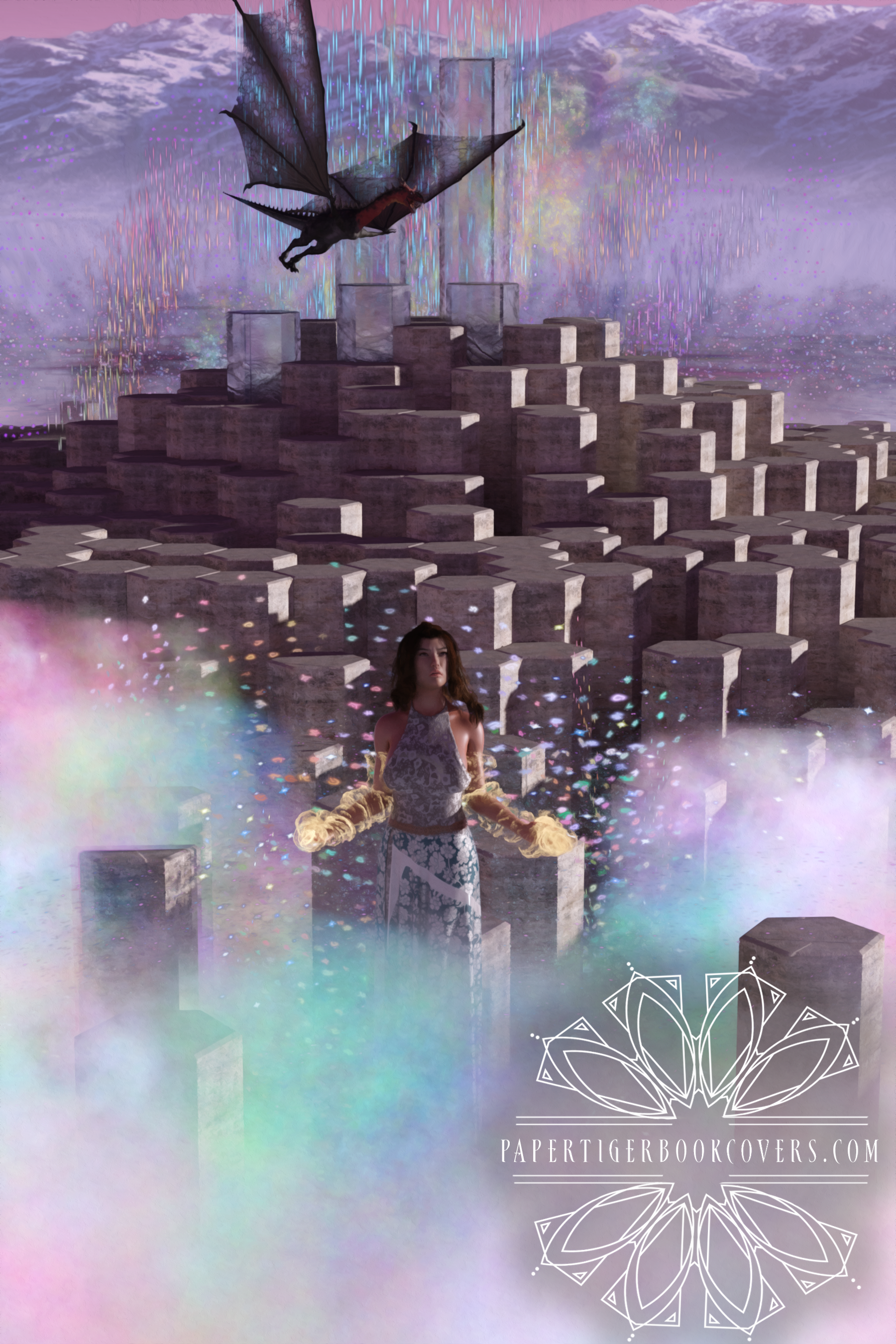
Thanks, Hylas! From the Intermediate New User challenge. Some subtle atmoshere stuff, and lots of postwork to get the gradient of colors on the magic. I was happy with how this came out, especially because I work in genres where this kind of art would absolutely work as a book cover.
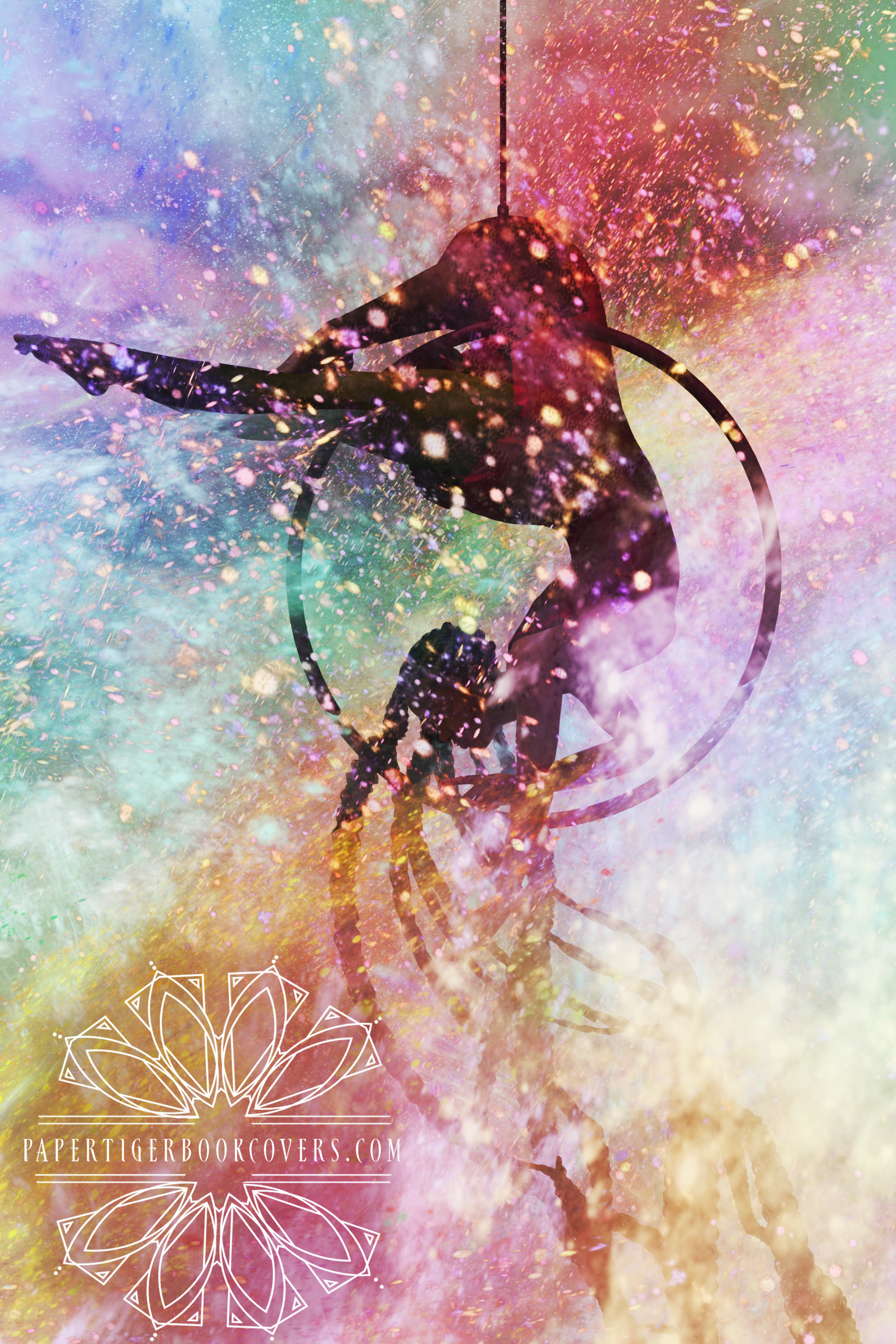
From this month's challenge, first entry. I hope to do more, once I've gotten the geometry editor down. But I was happy with how this came out- I like the starkness of the colors, and vivid loops of the colors and magic.