Need some help with post work...
I decided I would give rendering each major piece of scene separately a shot, even though I couldn't get it to work well the last time. The first picture I'm uploading is everything rendered in daz all at the same time, the way it should look (minus the needed alterations, of course). The next shot is the main character, the background and the villain in the distance rendered in 3 separate pngs and put together in GIMP. Notice the borders around the characters. Is there an easy way to get rid of these, or should I just stick to editing the first picture. Thanks in advance, James.
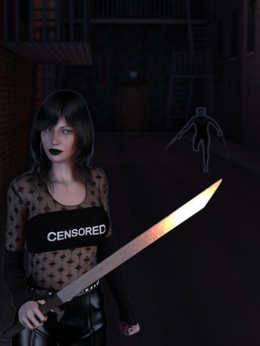

Cover.jpg
1200 x 1600 - 1M
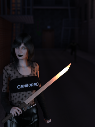

New_Cover_HQ_2.png
600 x 800 - 477K


Comments
Firstly, I'd set your background colour to black as this will eliminate most of the unpleasant border issues. You can do this by clicking on the small icon at the top of the Daz preview window which looks like horizontal lines stacked atop each other.
If you don't mind me asking though, is the figure in the background supposed to be practically invisible? He's only visible in the right picture because of the fringe, but on the left he blends into the background like a chameleon. As a rule of thumb, if it's not intended to be visible it's usually easier to hide it from the render and speed things up.
I would like to help but I have no clue how to do that in Gimp.
I use photoshop for editing and merging layers.
You're not doing anything green-screen stuff, are you?
Thanks. It didn't even occur to me that I needed to change the bg color. really need to lighten the background lighting a bit. He needs to be visible but not to the point you can make out details.
Are you using a depth of field camera? That will blur things and make it harder to get a crisp outline. You would be better off blurring in post work.
Thanks for the help guys, not sure if I'm gonna add any blur or not at this point, but here is my current progress (a bit of postwork has been done) taking most of your advice and re-rendering it. Any other good ideas on how to make this look good? It's the cover for my book
Well, I took a look at it in my image editor, I'd add lights and shadows ... fix the dark figure [hard to run with one leg] ... make its cyber eyes brighter so they'll shine in the dark ... in post work, adjust the contrast and brightness to get the desired ambiance. The burn tool might help to lighten a few spots too.
I see both legs but the Foreshortening causes one to look odd, you can just see the tip of the toes. The part that bothers me is the figure seems to have lost part of it's left hip (on right of figure).
Interesting, it looked to me like a good part of the leg was missing. Okay, then I'd go for changing the angle abit.
The damaged hip could be something explained in the story though ;-)
I noticed that too, about his legs. Not sure how it happened, maybe it's just the angle.. good thing it's really easy to fix. Interesting you mention the eyes, Patience, cause I actually had to tone them down. Maybe I went too far. Oh.. and I just noticed something... somehow the visibility got turned off on his hip.
Here is my latest version. I think I like it, but I still feel there should be more... but maybe not. If anyone else has any good ideas to make this really pop, I'm all ears.
Okay, let me repeat ... LIGHTS ... maybe it's just my laptop but all it sees is the lady and a black background.
In the image editor I can adjust the contrast and lights and see something in the background.
btw - one can make various surfaces "lighter" also by adjusting the ambient channel on the Surface Tab. A spot render will quickly show the difference. For eg. if you wanted the railings or raindrops or ? to show up a little more.
Yeah on certain screens its really dark. I should probably stop editing on my desktop, it's a bit too light, I can see everything fine. I'll try my laptop and see how things look. I really didn't want the background to be super bright, but it's obvious people are having a hard time seeing it.
I've casually mentioned that I could use a new laptop to certain folk but 'til that day ...
Hope you don't mind, this looked better in the image editor than in Windows Viewer? so I dunno ... if you mind let me know and I'll take it down. But I was trying to show you what I meant by some of what I was saying. Obviously I can't do the shadows and all that ... but anyhoo ...
edit to add: Also check her clutched fist ... thumb!
[Leg is much better :-) ]
i appreciate the help. I think I'm gonna go back to the drawing board on the lighting.
dakkuuan to me your last image is just fine. Patience55 to me your edited version is way to bright for the effect dakkuuan is after. Patience55 are you enlarging the images to see full size? The Thumbnail is very dark to me as well but at full size I see it fine and understand that Darkness is part of the over all design of the image. That said, dakkuuan please remember that when you Publish the image it will be re-sized to fit whatever the medium is to be used. Test the image in the size it will be as you work to see if it will darken to much at that time. Re-sizing can and will effect the final image.
Here is the work in it's final size. I was considering getting a shadow to come from the bad guy, but I think that might be better adding that in post than in render.
Getting there ;-)
Jaderail the edited version wasn't a render and there is a limit to what my image editor will do. More subtle light differences are better achieved in D/S for sure.
To consider also this 'book cover' ... digital or print? Because the printers are going to be seeing even my bright edit as a lot of black ink.
Jaderail ... thank you ... as you may recall I have posted a lot of images in here and thank you, yes I do know about clicking on them lol ...
Also Dreamlight has some good lighting tutorials including information about black and white renders.
....................................................
He who invented the Light, also invented the Dark.
If one goes around in the Dark for 3 days, one's hearing will improve.
[of course one may bump into a few things ... but hay!]
It is digital, no worries about ink. I have a real artist in mind if I can ever get it published with a publisher.
Okay, kool :-)
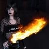
Okay after some work, I think I'm done. Not too sure on the fire though, what does everyone think?
Love it!!!
Looks excellent to me. Well done.
Thanks guys =)
Here is the final product guys. It's been re-published with the new title and cover. It's called Heroine by James O'Rell. If your interested, it's free until Dec 27th at 3am EST on Amazon Kindle. Thanks for all of your help.